Hello! Welcome to your second lesson in the "Visual Design and the Brain" module.
In our last session, we explored the fascinating first steps of vision—how your brain acts like a feature detection factory, breaking down everything you see into fundamental elements like lines, movement, and color. We learned that the visual cortex doesn't see a "logo" but rather detects its constituent parts.
Today, we're zooming in on one of those key elements: color. Your learning outcome is to describe the psychological effects of different colors on emotions and their application in branding. We will move from the how of seeing color to the why it matters in marketing. We'll explore why red can make your heart beat faster, why blue can feel trustworthy, and how brands strategically use these effects to shape your perceptions and guide your decisions.
This is a cornerstone of neurophysiological marketing. Understanding color psychology will allow you to deconstruct advertising, build powerful brand identities, and, crucially, explain the science behind these creative choices to any audience.
1. From Perception to Emotion: The Brain's Reaction to Color
In the last lesson, we established that cone cells in your retina detect different wavelengths of light, sending signals to the visual cortex. But the process doesn't stop at simple identification. The brain immediately begins associating these colors with emotions, memories, and even physiological responses.
To briefly revisit this connection between the eye, brain, and emotion, please read the short introduction from the article below.
The Psychology of Color & Branding
This article from PopNeuro, 'The Psychology of Color & Branding,' provides a concise bridge from our last lesson to this one. It recaps how the brain processes color and introduces the idea that different colors have a significant impact on our emotions.
Please read from the beginning of the article down to the end of the paragraph that begins 'One of the most interesting findings...'. This will reinforce the neural pathway and set the stage for our discussion on emotional impact.
As the article notes, this connection isn't just psychological; it's physical. Certain colors have deep evolutionary roots and can measurably alter our state. Red, the color of blood and fire, can signal danger or attraction, while green, the color of vegetation, often represents safety and growth.
The Influence of Color on Human Behavior: A Deep Dive
The article 'The Influence of Color on Human Behavior' by iMotions expands on this biological link. It explains how color perception can directly influence our heart rate and stress levels.
Read the section titled 'The Science Behind Color Perception'. Focus on the bullet points that list the physiological effects of red, blue, green, and yellow.
This is the "why" that empowers your communication. When you suggest using blue, you're not just suggesting a color; you're recommending a tool to lower stress and build trust, based on how the brain and body respond.
2. A Spectrum of Meaning: The Psychology of Individual Colors
Now that we've established the scientific basis, let's explore the specific emotional and behavioral associations of the most common colors used in branding. Each color carries a unique profile of positive and negative connotations that marketers can tap into.
The image below provides a fantastic overview of these associations. Think of it as a cheat sheet for color psychology.
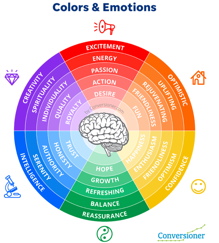
To dive deeper into each color with real-world brand examples, we'll turn to a video from Brand Master Academy. It provides a clear, marketing-focused breakdown that is directly applicable to your work.
How To Use Color Psychology In Marketing And Branding (Choose Your Brand Colors)
The video 'How To Use Color Psychology In Marketing And Branding' offers a detailed walkthrough of each major color's personality traits and provides examples of well-known brands that use them effectively.
Please watch from 2:29 to 16:11. The video is clearly segmented by color. As you watch, note the positive and negative attributes for each color. You don't need to memorize them all, but try to grasp the core personality of each one (e.g., Red = Urgency/Passion, Blue = Trust/Calm).
Here's a quick summary of the key takeaways for some major colors:
- Red: Evokes strong emotions. It creates a sense of urgency (used for sales), stimulates appetite, and signals passion and energy. Negative side: danger, anger.
- Blue: The most popular corporate color. It conveys trust, security, and stability. Often used by banks and tech companies. Negative side: coldness, unfriendliness.
- Yellow: Associated with optimism, warmth, and youthfulness. It's an attention-grabber. Negative side: can cause visual fatigue or anxiety.
- Green: Strongly tied to nature, health, and tranquility. Used for eco-friendly products and to create a relaxing effect. Negative side: blandness, stagnation.
- Black: Signifies luxury, power, and sophistication. Used by high-end brands to create a sense of elegance. Negative side: oppression, mourning.
Test your understanding!
A financial tech startup wants to launch a new mobile payment app. Their primary goal is to make users feel that their money is safe and that the company is dependable. Based only on color psychology, which color would be their strongest choice for the logo and app interface, and why? Which color would likely be the worst choice?
Show answer
Best Choice: Blue. The psychological association with trust, security, dependability, and logic makes it the ideal choice for a financial institution. Brands like PayPal, Visa, and American Express leverage this exact association.
Worst Choice: Red or Orange. Red's association with urgency, danger, and warning (think of "account in the red") could create anxiety. Orange is often associated with affordability or youthfulness ("cheap"), which could undermine the feeling of security and premium trust needed for a financial app.
3. Strategy and Context: Applying Color Psychology Effectively
Knowing what colors mean is only half the battle. A master of neurophysiological marketing knows how to apply this knowledge strategically. Choosing a color isn't about your personal favorite; it's about aligning with the brand's identity, target audience, and cultural context.
The Importance of Context and Culture
A common mistake is assuming that a color's meaning is universal. As you will be working with diverse markets, this is a critical point to master.
The Influence of Color on Human Behavior: A Deep Dive
The iMotions article we looked at earlier has an excellent section highlighting how color perception changes across cultures. This is essential for any global branding effort.
Please read the section 'Cultural and Contextual Differences in Color Perception'. Pay close attention to how the meanings of white, red, and black change dramatically between Western and Eastern cultures.
For example, while white means purity in many Western cultures, it's the color of mourning in much of East Asia. Using white for a celebratory product launch in Japan could be a disastrous cultural misstep. Always research your target market!
A Framework for Choosing Brand Colors
So, how do you make a strategic choice? The final part of the Brand Master Academy video provides a simple, powerful framework.
How To Use Color Psychology In Marketing And Branding (Choose Your Brand Colors)
Let's return to the Brand Master Academy video to learn a three-step process for selecting brand colors.
Watch from 16:11 to 21:03. The video outlines a process that involves understanding your audience, defining your brand's position, and crafting its personality. This is a practical guide you can directly apply in your work.
In essence, the process is:
- Understand Your Audience: Who are you trying to connect with? What are their values and expectations?
- Define Your Brand's Position: How do you want to be seen relative to competitors? Do you want to fit in or stand out?
- Craft Your Brand's Personality: If your brand were a person, what traits would it have? (e.g., sophisticated, playful, rugged). Then, choose the color that best embodies those traits.
The Cadbury chocolate example is a perfect illustration of this.
🔸 The ONLY Colour Theory Video You Ever Need To Watch!
This video from Satori Graphics provides an excellent case study on Cadbury's use of purple. It perfectly demonstrates the strategic application of color psychology.
Please watch from 17:15 to 18:35. Notice how Cadbury's choice of purple aligns with their target audience (predominantly female) and their desired brand perception (luxury, sophistication).
Conclusion
Today we've connected the dots from the brain's basic processing of light to the complex art of building a multi-million dollar brand. You've seen that color is a powerful tool for communicating emotion and shaping behavior, a language that speaks directly to the brain's predictive and associative nature.
Key Takeaways:
- Color perception is not just identification; it triggers immediate emotional and physiological responses rooted in evolution and learned associations.
- Each color has a complex psychological profile of positive and negative traits that marketers can leverage (e.g., Blue for trust, Red for urgency).
- The application of color in branding must be strategic, based on a deep understanding of the target audience, brand personality, and competitive landscape.
- Cultural context is paramount. The meaning of a color can change drastically from one culture to another, making research a crucial step in global branding.
How to Communicate This:
When presenting to a client or stakeholder, frame color choice as a strategic business decision, not an aesthetic one. Instead of saying, "I think green looks fresh," say, "We selected this shade of green to consciously tap into the brain's association with nature and health, reinforcing our brand's core message of 'organic and sustainable.' This helps build trust and aligns our product with the values of our health-conscious consumer."
In our next lesson, we will continue exploring how the brain organizes visual information. We'll move beyond individual elements and look at how we perceive them as a whole by covering the Gestalt principles of visual perception. You'll learn why your brain sees a group of dots as a single shape and how to use principles like proximity and closure to design a clear and effective advertisement.