Hello! Welcome to the third lesson in our "Visual Design and the Brain" module.
In our last two lessons, we established how the brain processes fundamental visual elements like lines, shapes, and—most recently—color. We saw how a single color can trigger specific emotions and physiological responses. But an advertisement is rarely just a single block of color. It's a collection of images, text, logos, and shapes.
Today, we'll explore how the brain takes this visual chaos and effortlessly organizes it into a coherent message. This lesson addresses the learning outcome: Apply the Gestalt principles of visual perception (e.g., proximity, closure) to create a coherent and effective advertisement layout.
We'll uncover the brain's automatic "rules" for grouping and simplifying visual information. Understanding these rules is like learning the grammar of visual design. It will enable you to not only create effective layouts but also to clearly articulate why they work to any audience, a key part of your overall goal.
1. The Brain as an Organizer: Introduction to Gestalt
The brain is fundamentally lazy; it's always looking for shortcuts to make sense of the world while using the least amount of energy possible. When faced with a complex visual scene, it doesn't analyze every single element individually. Instead, it automatically groups and arranges them into simpler, recognizable patterns. This process is described by Gestalt psychology.
The core idea was developed in the 1920s by German psychologists who found that our brains are wired to perceive whole forms, not just disconnected parts. A common phrase associated with the theory is "the whole is greater than the sum of its parts." However, a more accurate translation of the original idea is that "the whole is other than the sum of its parts." This means that when individual elements combine, they can create an entirely new form with its own meaning.
To get a quick overview of this concept and its main principles, let's watch a short video.
Gestalt Psychology and Why It's Essential for Good Design
This video from HubSpot Marketing, 'Gestalt Psychology and Why It's Essential for Good Design,' provides a concise introduction to the topic. It clearly explains the core idea and lists the six principles we'll be covering.
Please watch the video from the beginning to 01:53. Focus on understanding the fundamental concept: your brain perceives a bicycle, not a random collection of handlebars, pedals, and wheels.
When a design ignores these principles, it feels confusing or "off," forcing the brain to work harder. When a design uses them well, the message is perceived instantly and effortlessly. Let's explore these principles one by one.
2. The Core Principles of Visual Grouping
We will now examine the key Gestalt principles. For each one, we'll see how it works and how it's used in branding and advertising. A great way to see these in action is through logo design, which is a highly concentrated form of visual communication.
3. The Psychology of Logo Design: Gestalt Theory | Theory
The video 'The Psychology of Logo Design: Gestalt Theory' by Canva provides excellent, concise examples for each principle using famous logos. We will use this video as a guide as we walk through the principles.
You can watch this video in segments as we discuss each principle below, or watch from 01:58 to 05:00 straight through. I will point out the relevant timestamp for each principle.
Principle 1: Figure-Ground (Canva video: 01:58)
The brain instinctively separates objects into a figure (the main object of focus) and a ground (the background). It decides what's in front and what's behind to create a sense of depth and focus. Marketers use this to direct your attention.
A clever application of this is using negative space, where the background itself forms a meaningful shape.
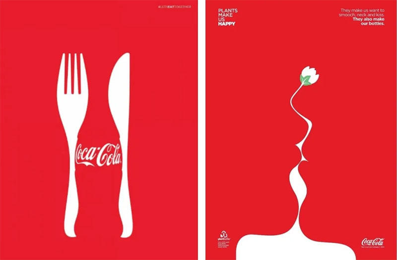
Principle 2: Proximity (Canva video: 02:29)
Objects that are close together are perceived as a group. This is the most basic way to create relationships between elements. In an ad, placing the product image, the brand name, and the price close together makes the brain process them as a single "offer." The Unilever logo, composed of 25 smaller icons forming a 'U', is a perfect example.
Principle 3: Similarity (Canva video: 03:05)
Objects that share visual characteristics—such as color, shape, size, or font—are perceived as a group. This creates a sense of harmony and connection. For instance, on a website, all the clickable links might be the same color, telling your brain, "These things all do the same kind of action."
Conversely, you can break the law of similarity to make something stand out. If you have a screen full of blue buttons and one red one, your attention is immediately drawn to the red button. This is often used for "Buy Now" or other critical calls-to-action.
Principle 4: Closure (Canva video: 03:20)
The brain prefers complete shapes. If an object is incomplete, our mind will automatically fill in the missing gaps to create a familiar form. This is a powerful tool because it requires the viewer to participate in creating the image, making it more engaging and memorable. The WWF panda logo is a classic example—our brain completes the shape of the panda's back even though the lines aren't there.
Principle 5: Continuity (Canva video: 03:53)
The eye is drawn to follow a line or a curve. Elements arranged on a line or a smooth curve are perceived as more related than elements not on the line or curve. This principle can be used to guide the viewer's eye through an ad, from the headline to the product image and finally to the logo. The sweeping curve in the Coca-Cola logo does this beautifully, creating a single, flowing word.
Principle 6: Symmetry (Canva video: 04:32)
Symmetrical and ordered objects are perceived as belonging together. The brain finds symmetry and order aesthetically pleasing and stable, and it requires less cognitive effort to process. Many car logos and fashion brands use symmetry to convey balance, elegance, and reliability.
The image below provides a great summary of these principles. You can think of it as a quick reference guide.

3. Putting It All Together: Analyzing Ad Layouts
Now let's apply this knowledge. When you look at an advertisement, you can deconstruct it using these principles to understand why it's designed the way it is.
Let's read a short article that provides more marketing-specific examples.
5 Ways You Can Use Gestalt Principles For Powerful Imagery
The article '5 Ways You Can Use Gestalt Principles For Powerful Imagery' from NeuroscienceMarketing.com offers clear advertising examples for the principles we've discussed. It reinforces the concepts with different visuals.
Please read the sections for each of the five laws presented: Proximity, Similarity, Closure, Continuity, and Figure/Ground. Notice how each principle is used to either group elements for cohesion or to break a pattern to draw attention.
Test your understanding!
Take a look at the "Easter Egg" ad (Example #8) in the article "18 Examples of ads using Gestalt's laws of perceptual..." from Confect.io. Which two Gestalt principles are most prominently at play in this ad, and how do they work together to convey the message?
Ad showing a phone being plugged into a charger that looks like a cracked Easter egg
This is just one of many examples in the linked article.
Show answer
- Closure: The charger's shape, combined with the broken yellow line, strongly implies the shape of an Easter egg. Your brain "closes" the shape and makes the connection to the holiday theme.
- Proximity: The phone, the charger "egg," and the cable are all positioned very close to one another. This tells your brain to view them as a single, related unit—a "charging set."
Together, these principles create a clever and relevant seasonal ad. The viewer instantly gets the "Easter" theme (Closure) and understands what product is being offered (Proximity).
Conclusion
Today, we've peeled back the curtain on the automatic organizing principles of the brain. You've learned that effective visual design isn't just about aesthetics; it's about understanding and leveraging the brain's innate tendency to seek patterns and reduce complexity. By using Gestalt principles, marketers can create layouts that are easy to process, guide attention effectively, and make a message more memorable.
Key Takeaways:
- The brain actively organizes visual information into a "gestalt," or a unified whole, which is perceived differently than its individual components.
- Proximity and Similarity are the primary tools for grouping related items and creating visual structure.
- Closure and Continuity engage the viewer, guiding their eye and making them mentally complete the image, which enhances memory.
- Figure-Ground is fundamental for creating a focal point and directing attention.
- Symmetry creates a sense of balance, harmony, and stability, which can be associated with the brand itself.
How to Communicate This:
Your ability to explain these concepts is crucial. Instead of saying, "This ad looks clean," you can now say: "This ad is effective because it uses the principle of Proximity to group the product and its benefits, reducing cognitive load. It then guides the eye from the headline to the call-to-action using Continuity, making the user's journey through the ad effortless." This demonstrates a deeper, science-backed understanding.
In our next lesson, we'll build directly on this foundation. Now that we know how the brain groups visual elements, we will explore the common patterns in which it scans them. We'll cover topics like the F-pattern in web design and how to place the most important information where the eyes naturally fall first.