Welcome to Module 3! In our last module, you honed your skills in creating high-demand digital assets and, crucially, learned how to articulate the strategic rationale behind your design choices. This ability to explain the "why" is what separates a designer from a strategist, and it's a theme we will carry forward.
Today's lesson builds directly on that foundation. We will tackle the first step in designing any larger digital product: translating a brand's identity into a functional, accessible UI color palette. This is a core skill for any web or app designer, moving you from creating standalone assets to building cohesive visual systems. For a freelancer, mastering this process allows you to confidently take on website projects, justify your color choices with objective rules, and ensure your designs are usable by everyone.
1. The Anatomy of a UI Color Palette
A professional UI color palette is more than a random collection of pleasing colors; it's a structured system. Just as in financial reporting where accounts are categorized for clarity, UI colors are grouped by their function. This systematic approach ensures consistency and makes the design process far more efficient.
The video "How I make UI color palettes" from the UX Tools channel provides an excellent overview of the standard categories used in a UI palette.
Watch the introduction from the main categories. Pay attention to the distinct roles of brand, supporting, and neutral colors.
To summarize, your palette will consist of three key types:
- Brand Colors: These are the star players, derived from the company's logo and branding. They are used for key interactive elements like buttons, active links, and prominent icons to build brand recognition.
- Supporting Colors: These are functional or "semantic" colors. They communicate specific states to the user, such as success (green), warnings (orange/yellow), errors (red), or information (blue).
- Neutral Colors: These are the workhorses. A range of grays will make up the vast majority of your interface—for text, backgrounds, borders, and dividers. They provide the canvas upon which the brand and supporting colors shine.
2. From One Color to a Full System: The Generation Process
The most powerful skill in building a palette is the ability to take a single starting color—usually the primary brand color—and systematically generate all the variations you need. This isn't guesswork; it's a repeatable process.
Step 2.1: Find Your Starting Point and Choose Your Tool (HSB)
Your journey begins with a single base color. If you're working with an existing brand, you can use a color picker tool on their logo or marketing materials. If you're starting from scratch, you'd choose a color that reflects the brand's desired personality.
To modify this color predictably, we'll work in the HSB (Hue, Saturation, Brightness) color model, which is far more intuitive than Hex or RGB for this task.
Let's continue with the UX Tools video to understand how to select a base color and why HSB is the right tool for the job.
Watch the next two sections: Find a starting point: This explains how to identify your primary brand color. Use HSB: This explains what Hue, Saturation, and Brightness are and why this model gives you finer control.
Step 2.2: The Rules of Variation
There's a "secret" to creating shades that look natural and harmonious, and it's based on how light and shadow work in the real world. This isn't abstract theory; it's a practical framework.
Color in UI Design: A (Practical) Framework | Marvel Blog
This article from the Marvel Blog provides the simple but powerful rules for generating color variations. This will give you a mental model that makes the process predictable.
Read the sections "The Rules" and "The Most Important Thing". Focus on the core principles for creating darker and lighter variations by manipulating saturation and brightness in opposite directions.
As the article explains, the key takeaway is:
- To create a DARKER variation: Decrease Brightness and increase Saturation.
- To create a LIGHTER variation: Increase Brightness and decrease Saturation.
Step 2.3: Generating a Full Color Scale
With these rules in mind, you can now generate a full scale of 5 to 10 shades for your brand color, your neutrals, and your supporting colors. A common convention is a 9-step scale labeled 100 (lightest) to 900 (darkest), with your base color at 500.
The UX Tools video demonstrates a brilliant, systematic method for generating these scales in Figma's color picker.
Watch these two key demonstrations: Make a bunch of shades: Observe the "arc" technique used to pick shades along a diagonal line in the color picker. This is a direct application of the rules you just read about. Create your neutrals: See how the exact same process is applied to create a scale of grays.
3. Accessibility is Not Optional: Checking Contrast
A beautiful palette is useless if it's illegible. The Web Content Accessibility Guidelines (WCAG) provide minimum standards for color contrast to ensure that users with visual impairments can read your text and see your UI elements. As a designer, it is your responsibility to meet these standards.
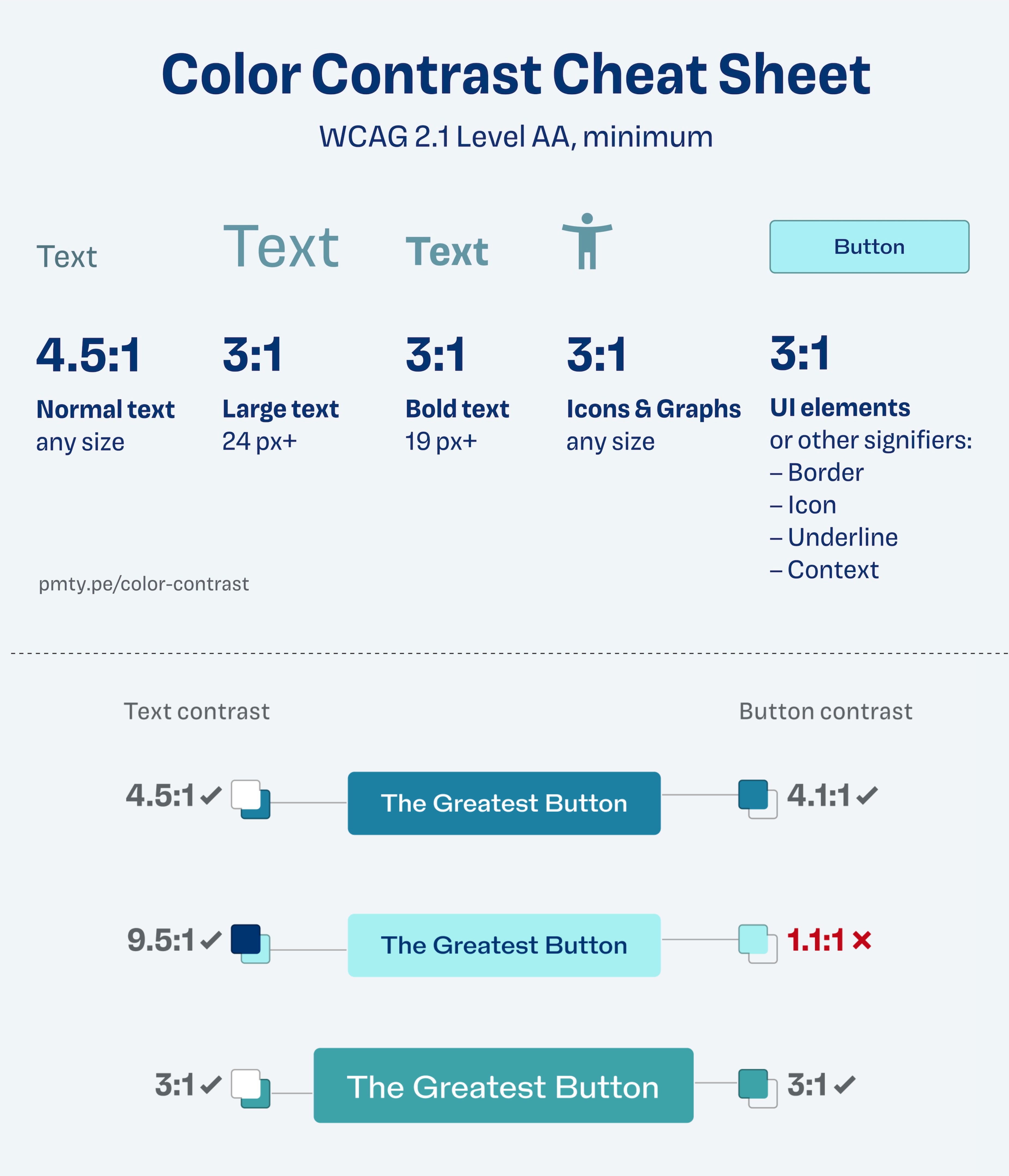
Fortunately, Figma has plugins that make checking this easy.
How to create a colour palette for your Figma Design system UI
The video "How to create a colour palette for your Figma Design system" by Brom Sulaiman shows a popular plugin for this task.
Watch the section from the accessibility check. Note how the Able plugin is used to check the contrast between a text layer and a background layer directly in Figma.
You must test critical combinations. For example:
- Does your primary button color (e.g., Brand-500) have a 3:1 contrast with its text (e.g., White)?
- Does your body text color (e.g., Neutral-800) have a 4.5:1 contrast with the background (e.g., White)?
- If a color fails the test, you'll need to tweak its shade (usually by adjusting brightness) until it passes.
4. Practical Exercise: Build Your Brand's UI Palette
Let's apply this entire process. You will take the brand identity from your own bespoke gifting business and build a foundational UI color palette in Figma.
Your Task:
- Set Up Your File: In Figma, create a new page named "Brand Foundation" or similar. Create a frame where you will build your palette.
- Choose Your Base Brand Color: Use the color picker to grab the main color from your business's logo or a recent marketing asset you've created. Place a square with this color in your frame. This will be your "500" shade.
- Generate a Brand Color Scale:
- Using the HSB color model and the "arc" method from the UX Tools video, create a 9-step scale (100-900) for your brand color.
- Generate a Neutral Scale:
- Choose a mid-gray for your "500" neutral shade. A good starting point is
HSB(0, 0, 50). - Generate a 9-step scale (100-900) for your neutrals.
- Advanced tip: For a more cohesive feel, try adding a subtle hint of your brand's hue to your grays, as described in the article "A beginner's guide to applying color in UI design" (resource LINK).
- Choose a mid-gray for your "500" neutral shade. A good starting point is
- Select Supporting Colors:
- Choose base "500" shades for Error (red), Success (green), and Warning (orange/yellow).
- Crucially: Use the HSB values to match their Saturation and Brightness levels closely to your base brand color to ensure they feel like part of the same family.
- Create Color Styles in Figma:
- Organize your palette by saving each color as a Color Style. Use a hierarchical naming convention like
Brand/Primary/500,Neutral/Gray/900, orSemantic/Error/500. This is shown in the video by Brom Sulaiman (organizing styles ).
- Organize your palette by saving each color as a Color Style. Use a hierarchical naming convention like
- Test for Accessibility:
- Install the Able plugin in Figma.
- Test at least three critical combinations:
- Your darkest neutral (
Neutral/900) on a white background. (Should pass 4.5:1 for body text). - White text on your primary brand color (
Brand/500). (Should pass 3:1 for button text). - White text on your error color (
Semantic/Error/500).
- Your darkest neutral (
- If any fail, adjust the brightness of your color styles until they pass, and update the style.
By the end of this exercise, you will have a professional, accessible, and reusable UI color palette ready for any digital project for your brand.
Conclusion
In this lesson, you've moved from using color for single assets to building a strategic, scalable system for an entire interface. You learned to deconstruct a palette into functional categories, to systematically generate a full range of shades from a single color using the HSB model, and most importantly, to validate your choices against objective accessibility standards. This process brings a level of rigor and intentionality to your work that clients will value.
Key Takeaways:
- A UI palette is a system of Brand, Supporting, and Neutral colors.
- Use the HSB color model to create predictable variations.
- Darker shades generally have lower brightness and higher saturation; lighter shades have higher brightness and lower saturation.
- Always test your color combinations to ensure they meet WCAG AA contrast ratios (4.5:1 for normal text, 3:1 for large text).
- Use Figma Color Styles and a clear naming convention to keep your palette organized and reusable.
Preview of the Next Lesson:
With your color system established, the next foundational element of visual design is typography. In the next lesson, we will explore how to select and pair typefaces for a web interface, defining a typographic scale for headings and body text that creates clear hierarchy and works in harmony with your new color palette.