Welcome back! In our last lesson, you built a systematic and accessible color palette for your brand. That was the first major step in creating a professional design system. Now, we'll build the second foundational layer: typography. If color gives a design its mood, typography gives it its voice.
Today's lesson will guide you through selecting typefaces that reflect your brand's personality and organizing them into a structured typographic scale. This process is not about random font picking; it's a methodical approach to creating clarity, hierarchy, and visual harmony in your designs. For you, this means moving beyond the aesthetics of your gifting business's print materials and mastering the logic that governs readable and professional web interfaces.
1. Finding Your Voice: How to Select and Pair Typefaces
Before we can even think about font sizes, we must first choose the typefaces themselves. This decision should be driven by brand strategy, not just visual preference. Your background in understanding business models will be an asset here, as we'll start by defining the brand's personality.
The Step-by-Step Guide for Pairing Fonts
This guide from Learn UI Design provides an excellent, structured process for choosing fonts that will resonate with your analytical approach. It breaks down a subjective-feeling task into logical steps.
Read the first four sections, from "1. Determine your brand" to "4. Add an additional font...". As you read, focus on: Brand Adjectives: How to translate intangible brand feelings into concrete words. Think about your own bespoke gifting business. Is it "Luxurious, Elegant, Personal" or "Modern, Minimalist, Clean"? Subtlety over Novelty: The difference between a font that subtly conveys a brand and a "novelty" font that shouts it in an unprofessional way. Legibility for Body Text: The technical qualities that make a font easy to read in long paragraphs, such as x-height and open counters. Pairing for Contrast: The common strategy of pairing a serif with a sans-serif to have each font fulfill a different role and add a layer of sophistication.
This process gives you a defensible rationale for your font choices—a key skill for communicating with clients. You're not just picking fonts you like; you're selecting typographic tools that align with a stated business and brand strategy.
2. Creating Harmony: Defining a Typographic Scale
Once you have your chosen typefaces (typically one for headings and one for body text), the next step is to create a set of predefined sizes. A typographic scale ensures that the size relationships between your headings, subheadings, and paragraphs are consistent and mathematically harmonious. This is analogous to establishing clear reporting hierarchies in a financial statement; every element has a defined level of importance.
There are two primary ways to approach this: using a modular scale ratio or using a more pragmatic, grid-based system.
The Modular Scale Approach
This method uses a starting base size (usually for your body text, e.g., 16px) and a ratio (e.g., 1.250) to calculate all other font sizes by multiplication or division.
Typographic scaling: Definition, Figma tutorial, and examples
This article from LogRocket explains the mathematical concept behind typographic scales.
Read the sections "What is typographic scaling?" and "Types of typography scales." This will give you the core theory. Don't worry about memorizing the ratios; the key is to understand that different ratios create different levels of visual contrast.
Tools like type-scale.com (mentioned in the video "Create the Perfect Typography Scale" by Mizko) can quickly generate these scales for you. This is a great way to explore possibilities, but for our practical work, we will use a method that integrates more directly with the grid system you'll learn about in the next lesson.
The Grid-Aligned Approach
For UI design, it's often more practical to build a scale where font sizes and, crucially, line heights align with a base unit, like 8px. This ensures vertical rhythm and makes layout construction much easier.
We will now walk through building a scale using this method directly in Figma.
Typography Scale and Line Height Web Design Figma (1/2)
The video "Typography Scale and Line Height" by 404roy provides a clear, hands-on demonstration of building a practical type scale in Figma.
Watch the following sections to see the process from start to finish: Creating the base: Learn how to set up your base paragraph style (16px font size) and, most importantly, set its line height to a multiple of 8 (e.g., 24px). This is the cornerstone of your scale. Building the scale: Observe how the rest of the scale is built out, from small caption text to large display headings. Notice that every line height is a multiple of 8 (e.g., 32, 40, 48). Refining with letter spacing: Learn the professional touch of adjusting letter spacing (tracking) for better readability—tightening it for large headlines and loosening it for small text. Creating styles: Finally, see how to convert these text properties into reusable Text Styles in Figma for efficiency and consistency.
This method provides a robust foundation that not only looks good but also aligns perfectly with the structured layout systems used in web development.
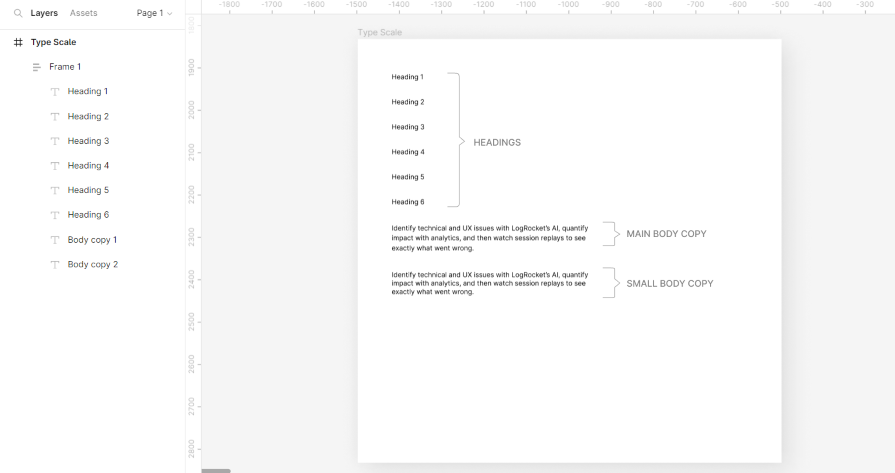
3. Practical Exercise: Build Your Brand's Typographic System
Now it's time to apply this systematic approach to your own brand. You will select fonts and build a complete, reusable typographic scale in Figma.

Your Task:
-
Open Your Figma File: Navigate to the "Brand Foundation" page you created in the last lesson, where your color palette lives. You'll build your type system right alongside it.
-
Define and Select:
- Based on your bespoke gifting business, write down 3-5 brand adjectives (e.g., "Handcrafted," "Elegant," "Personalized").
- Choose two typefaces: one for headings and one for body text. A serif and sans-serif pairing is a classic choice. In a text box in Figma, write a brief sentence justifying why their letterforms and characteristics align with your brand adjectives. (e.g., "I chose Playfair Display for headings because its high-contrast strokes feel elegant, and Lato for body text because its open, friendly structure is highly legible and feels welcoming.")
-
Build Your Type Scale:
- Following the method in the "Typography Scale and Line Height" video, create text layers for your full scale. A good starting set is:
- Headings: H1, H2, H3, H4
- Body: Body-Large, Body-Regular, Body-Small
- Utility: Caption, Button
- Set your Body-Regular text to a
16pxfont size and a24pxline height. - Define the sizes for the rest of your scale. You can use the values from the video as a starting point, but feel free to adjust.
- Crucially, ensure every
line-heightyou set is a multiple of 8.
- Following the method in the "Typography Scale and Line Height" video, create text layers for your full scale. A good starting set is:
-
Create and Organize Text Styles:
- Convert each text element into a Figma Text Style.
- Use a clear, hierarchical naming convention. For example:
Headings/H1Headings/H2Body/RegularBody/Small
- Apply your chosen heading font to the Heading styles and your body font to the Body styles.
By the end of this exercise, you will have a complete set of color and text styles in Figma, forming the core of a professional design system for your brand.
Conclusion
In this lesson, you've learned a structured, strategic process for building the typographic foundation of a user interface. You now know how to select and pair fonts based on brand identity and create a harmonious, hierarchical typographic scale that ensures consistency and readability. This systematic approach transforms typography from a purely aesthetic choice into a logical component of your design system.
Key Takeaways:
- Brand Drives Typography: Start by defining brand adjectives to guide your font selection.
- Pair for Contrast and Purpose: Often, a sans-serif for body text (legibility) and a serif for headings (character), or vice-versa, creates a versatile and professional pairing.
- A Scale Creates Harmony: Use a mathematical scale (based on a ratio or a grid unit) to define font sizes, ensuring visual consistency.
- Line Height is Key: For UI design, setting line heights to a multiple of a base unit (like 8px) is critical for creating vertical rhythm in your layouts.
- Use Figma Styles: Always save your typographic decisions as Text Styles for efficiency and scalability.
Preview of the Next Lesson:
Your work setting line heights to multiples of 8 has perfectly prepared you for our next topic. We will dive into the 8-point grid system, learning how to use it to structure a web page layout with precision and consistency. You will see how your color and type systems snap perfectly into this grid, creating a truly cohesive design.