In our last lesson, you established the architectural backbone of your designs by setting up a professional 8-point grid system. You now have the structure; today, we'll learn how to use that structure with intent. We'll explore how the space between elements is just as important as the elements themselves.
This lesson focuses on two foundational principles of design: proximity and negative space. Mastering these will allow you to group related information, create separation between unrelated items, and ultimately guide a user's attention. For someone with your background in finance, think of it this way: a well-structured financial report uses spacing and indentation to group related line items, making it scannable and easy to understand. In UI design, we do the same, but our goal is to create clarity and guide the user's eye.
By the end of this lesson, you will be able to apply the principles of proximity and negative space to create a clear and effective visual hierarchy in a user interface.
1. The Principle of Proximity: Grouping Through Closeness
The human brain is wired to find patterns. One of the most powerful and subconscious patterns we recognize is grouping. The Gestalt principle of proximity states that objects that are close to one another are perceived as a single group.
This is a fundamental tool for creating logical structure without needing lines or boxes. To see this principle in action, watch this short video from the Nielsen Norman Group, a leader in user experience research.
Proximity: Gestalt Principle for User Interface Design
This video, "Proximity: Gestalt Principle for User Interface Design," provides a concise and clear explanation of the principle and its direct application in UI.
Please watch the entire video from start to finish. Pay close attention to: How proximity is strong enough to overpower other visual cues like color and shape. The examples of how spacing is used to group related menu items and separate distinct functions like a "Search" button. The problems that arise from having too much or too little space.
As the video demonstrates, proximity isn't just about grouping; it's also about separation. The space between groups is what defines them as distinct. This "empty" space has a name, and it's our next key topic.
2. Negative Space: The Active Element of Emptiness
Negative space (often called white space) is the unmarked area around and between the elements in your design. It's not "wasted" space; it is an active and powerful tool that brings clarity, focus, and a sense of sophistication to a layout.
- It reduces cognitive load, making interfaces feel less cluttered and easier to scan.
- It creates the groupings and relationships dictated by the principle of proximity.
- It can draw attention to key elements by giving them "room to breathe."
Let's dive deeper into how to wield this tool effectively.
Visual Hierarchy 101: The Designer's Guide to ...
This article from the Design Bootcamp publication on Medium has an excellent section on white space.
Please read the section titled "4. White Space: The Power of Nothing." Focus on understanding: The difference between Micro and Macro white space. The "Grouping and Separation" strategy: using minimal space for related items and more space for unrelated ones. The common mistakes, especially cramming too much content into a small area.
3. Creating Visual Hierarchy
When you strategically combine proximity and negative space, you create visual hierarchy. This is the art of arranging elements to communicate their order of importance, guiding the user's eye from the most critical information to the least.
Your goal as a designer is to make this path intuitive. A user should be able to glance at a screen and instantly understand:
- What is the most important element? (e.g., a headline or a primary button)
- Which elements are related? (e.g., a product image, its title, and its price)
- Which elements are separate functions? (e.g., a main navigation menu vs. a user profile menu)
Take a look at this image. It perfectly illustrates the difference that a clear visual hierarchy makes.
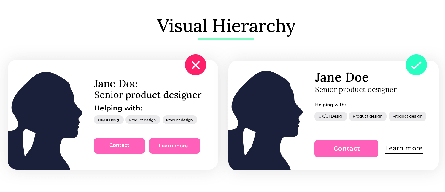
To formalize this concept, let's read a brief section from a UX audit guide.
User Experience Audit Checklist: 10 Checks + Scoring Template
This article provides a structured way to evaluate user experience. The section on visual hierarchy is particularly relevant.
Please read the section "5. Clear Visual Hierarchy." Focus on the subsections: "How It Works": Note how "Spacing and Grouping" is listed as a core tactic alongside size and color. "Actionable Tips": The "squint test" is a powerful, practical technique. Try it on any website: squint your eyes until the text blurs. The elements that still stand out form the top of your visual hierarchy. Does this match the user's goals?
4. A System for Spacing: The "Outside-In" Method
You know you need to use different amounts of space to create hierarchy, and you have your 8-point grid to provide the units. But how do you decide whether to use 8px, 16px, or 40px?
A great practical method is to think about spacing hierarchically, moving from the largest containers to the smallest elements. The more related two elements are, the less space should be between them.
This video from Jesse Showalter demonstrates a brilliant "Outside-In" method for applying this logic.
In "Master Spacing in UI Design," Jesse Showalter provides a five-level framework for thinking about spacing in a systematic way.
Watch this core segment explaining his method: The Outside-In Method: Pay close attention to the five categories he defines: Wrappers, Containers, Groups, Cards/Rows, and Elements. Notice how the spacing value decreases as he moves "inward" from large page sections to individual elements within a card. This is proximity in action, executed using your 8-point grid system.
This tiered approach provides a logical system, removing guesswork and ensuring consistency—a perfect bridge between your analytical and creative skills.
5. Exercise: Audit and Re-Design a Product Card
Now it's time to apply these principles. Your task is to find a real-world example of a product listing, audit its use of space, and then redesign it in Figma using a clear spacing hierarchy. This is a common task for freelance projects, especially in e-commerce and for businesses like your own.
Part 1: Audit (5 mins)
- Go to a marketplace website like Etsy, Amazon, or a site related to your bespoke gifting business.
- Find the main product listings page (where you see a grid of many products).
- Take a screenshot of a single product "card" or listing.
- Perform the "squint test". What stands out? Is it the image, the price, or the title?
- Analyze the use of proximity:
- Are the product title and price grouped tightly together?
- Is the seller's name or shop rating clearly associated with the product, but distinct from the price?
- How is this entire product card separated from the one next to it? Is there enough negative space?
Part 2: Re-Design in Figma (15 mins)
- In your Figma file, on a new frame, recreate the basic elements from your screenshot (you can use a grey rectangle for the image, and placeholder text for the title, price, etc.). Don't worry about fonts or colors for now.
- Create a "Before" version: Arrange the elements with inconsistent, arbitrary spacing (e.g., 7px here, 19px there) to mimic a cluttered layout.
- Create an "After" version: Duplicate the "Before" elements and rearrange them using the principles from this lesson.
- Use your 8-point grid. Ensure all spacing is a multiple of 4 or 8.
- Apply a spacing hierarchy. Use the "Outside-In" logic. For example:
- Elements: 4px between the star rating icon and the number of reviews.
- Groups: 8px between the product title and the price.
- Containers: 16px of internal padding around the edges of the card.
- Wrappers: 24px or 32px of margin separating this card from the next one.
- Annotate your work. Use the text tool to add small notes indicating the spacing you used (e.g., "8px," "16px"). This is excellent practice for documenting your decisions and for developer handoff.
This exercise will solidify your understanding of how to transform a cluttered interface into a clean, scannable, and professional design by simply controlling the space.
Conclusion
Today, you've learned to wield one of the most powerful and subtle tools in a designer's toolkit: space. You've moved beyond simply placing elements on a grid to arranging them with intention and meaning.
Key Takeaways:
- Proximity: Objects that are close together are perceived as being related. Use this to create logical groups without needing to draw boxes.
- Negative Space: This is not empty space; it's an active design element that reduces clutter, creates focus, and defines relationships between groups.
- Visual Hierarchy: By mastering proximity and negative space, you guide the user's eye, communicating what's important and how information is structured.
- Systematic Spacing: Apply spacing in a hierarchical manner (e.g., small gaps for related items, large gaps for separate sections) using your 8-point grid system to maintain consistency.
Preview of the Next Lesson:
You now have the fundamental principles to analyze visual design critically. In the next lesson, we'll formalize this process. You will learn how to audit an existing landing page's visual effectiveness using a structured scorecard. You'll move from analyzing a single component to evaluating an entire screen, preparing you to offer valuable, data-driven critiques to future clients.