Welcome to your next lesson! In our previous session, you learned how to use proximity and negative space to create a clear visual hierarchy within a small component. You've started to develop a critical eye for how spacing influences user perception.
Today, we're scaling up that skill from a single component to an entire landing page. You'll learn how to conduct a visual audit—a systematic process for evaluating a design's effectiveness. This is a crucial skill for any freelancer, as it allows you to quickly demonstrate value to a potential client by identifying concrete areas for improvement. Your background in finance and audit gives you a distinct advantage here; you're already trained to perform structured evaluations and identify inconsistencies. We'll simply be applying that same logical rigor to a visual interface.
By the end of this lesson, you will be able to audit the visual effectiveness of an existing landing page using a structured scorecard, turning your design intuition into an objective, actionable report.
1. What is a Visual Audit?
A visual or UI/UX audit is a professional assessment of a digital product's user interface. Instead of just saying "this looks good" or "this is confusing," an audit uses established principles and a structured framework to identify specific sources of user friction and opportunities for improvement.
For a freelancer, offering a "micro-audit" of a client's key page (like their homepage) can be a powerful, high-value service to land your first projects. It's quick, demonstrates your expertise, and provides immediate value.
To understand the benefits and process, let's start with a short video that explains the 'why' behind audits.
UI UX Audit Process - How to Stop Skipping Them [Free UX Audit Checklist]
This video from Headway, titled "UI UX Audit Process," provides a great overview of the value that audits bring to a project.
Please watch the section from the benefits of auditing. Focus on how audits can: Uncover "hidden" insights that are causing customer frustration. Address usability and accessibility issues. Identify inconsistent patterns that slow down development and confuse users.
An audit moves your feedback from subjective opinion to expert analysis. The key to this is using a consistent checklist or scorecard.
2. Your Audit Toolkit: The C.L.E.A.R. Scorecard
To make your audit structured and repeatable, we will use the C.L.E.A.R. framework, which you expressed an interest in. It's an excellent tool for evaluating the visual effectiveness of any screen.

Here's how we can turn this framework into a practical scorecard. We'll use a simple scoring system for each category, which you can apply to any landing page you review.
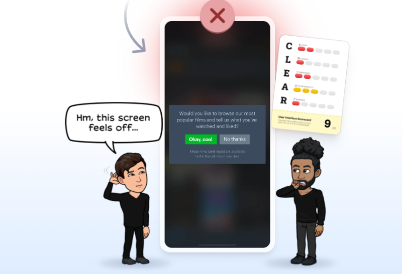
Let's define our scorecard based on the C.L.E.A.R. principles and the best practices we've been discussing.
User Experience Audit Checklist: 10 Checks + Scoring Template
This article from Roastmyweb provides a simple, effective scoring system we can adopt for our C.L.E.A.R. framework.
Read the introductory section, focusing on the Scoring Template. We will adopt this 0-2 scale for our audit: 0 = Broken or missing 1 = Partially works, but creates friction 2 = Clear and usable
Here is the C.L.E.A.R. Visual Audit Scorecard you will use. For each section of a landing page (e.g., Hero, Features, Testimonials), you'll score these five aspects:
| Category | Question | Score (0-2) |
|---|---|---|
| Copy | Is the headline and body text clear, concise, and user-focused? Does it communicate value? | |
| Layout | Is there a clear visual hierarchy? Does the use of proximity and negative space group related items and separate distinct ones effectively? | |
| Emphasis | Do the most important elements (especially the primary Call-to-Action) stand out? Is it immediately obvious what the user should do next? | |
| Accessibility | Is text readable (sufficient size and contrast)? Are interactive elements easy to identify? (We'll cover this in more depth later, but for now, trust your eye). | |
| Reward | Does the design build trust and motivate action? Look for elements of Social Proof (testimonials, reviews, user counts) and other psychological principles. |
To strengthen your analysis of the "Reward" category, you can start thinking through the lens of cognitive biases, a topic we'll explore fully in Module 5.
Cognitive Bias in Product Design: Strategic UX Guide - Boundev
This guide from Boundev provides a fantastic introduction to how psychological principles are used in product design.
For now, quickly review the main table of biases under the heading "What Cognitive Bias Means for Product Teams." Then, read the section on "Social Proof: The Trust Multiplier." This will give you a concrete factor to look for when evaluating the "Reward" aspect of a design.
3. The Professional Audit Workflow in Action
Now that you have your scorecard, let's see how a professional designer executes an audit. This process involves identifying issues, capturing evidence, annotating your findings, and producing a prioritized list of recommendations.
The following video is a comprehensive case study. We will watch specific clips that demonstrate the core workflow.
UI UX Audit & Analysis Tutorial | GYMSHARK Case Study Included | 2022
In "UI UX Audit & Analysis Tutorial," Ari Pxl conducts a detailed audit of the Gymshark website. We'll use this as a model for our own process.
Watch these three key segments to understand the workflow: The Template: First, see how he sets up his Figma file. He has a space for screenshots and a structured area for findings, comments, and recommendations. This organized approach is vital. Finding and Documenting Issues: Next, watch him analyze the navigation. Notice how he identifies an issue (e.g., location detection, repeated elements), takes a screenshot, pastes it into Figma, and adds a numbered, annotated comment explaining the problem. This creates a clear visual record. Creating Recommendations: Finally, observe how he translates his findings into a prioritized action plan. He assigns a severity and effort rating to each issue and suggests a high-level solution. This is the ultimate deliverable for a client.
This workflow—Identify, Capture, Annotate, Recommend—is exactly what you'll practice in the exercise.
4. Exercise: Your First Landing Page Audit
It's time to put on your auditor's hat. Your task is to conduct a "micro-audit" on the landing page of a real business, ideally one within your bespoke gifting and events niche.
Your Task:
- Choose Your Target: Find a landing page for a business in the events, wedding, or gifting industry. It could be an event planner, a custom stationer, or even a competitor to your own past business.
- Set Up Your Figma File:
- Create a new Page in your Figma file and name it
Visual Audit: [Company Name]. - Create a simple text frame to serve as your C.L.E.A.R. Scorecard. List the five categories.
- Create a new Page in your Figma file and name it
- Conduct the Audit (Follow the Pro Workflow):
- Take a full-page screenshot of the landing page and paste it into your Figma file for reference.
- Analyze the page section by section (e.g., hero, about section, services, contact form).
- When you spot an issue related to C.L.E.A.R. (e.g., confusing layout, weak call-to-action), take a small screenshot of that specific area.
- Paste the small screenshot into your file and add a text annotation next to it, explaining the problem. For example: "Emphasis Issue: The primary 'Book a Consultation' button has the same visual weight as the secondary 'Learn More' link, causing confusion."
- Score the Page:
- Based on your findings, assign a score (0, 1, or 2) to each of the five C.L.E.A.R. categories.
- Calculate a total score out of 10.
- Write Recommendations:
- Below your scorecard, write 2-3 high-level recommendations based on the lowest-scoring categories. For example: "Recommendation: Increase the visual weight of the primary CTA in the hero section by using a solid background color and increasing its size to improve emphasis."
This exercise directly simulates a valuable freelance service you can offer. It combines your analytical skills with your growing design knowledge to produce a tangible, strategic deliverable.
Conclusion
Excellent work today. You've made a significant leap from analyzing individual elements to evaluating an entire user interface with a professional, structured methodology. This process transforms subjective feedback into objective, data-driven analysis, a skill highly valued by clients.
Key Takeaways:
- A visual audit is a systematic evaluation of a UI's effectiveness.
- A structured scorecard, like the C.L.E.A.R. framework, provides an objective basis for your analysis.
- The professional workflow is to Identify, Capture, Annotate, and Recommend.
- The final deliverable of an audit is not just a list of problems, but a prioritized set of actionable recommendations.
Preview of the Next Lesson:
In this lesson, you identified issues across the C.L.E.A.R. framework. In our next session, we'll dive deeper into the "Layout" and "Emphasis" categories. You will learn to analyze a user interface to identify how specific visual cues—like color, size, and placement—are intentionally used to guide user attention and influence behavior.