Welcome back! In our last lesson, you created a mini style guide, which documents the what of a design—the specific colors and fonts to be used. Today, we shift our focus from the what to the why.
This lesson addresses the final outcome of this module: to document design decisions and rationale for a completed digital asset project. Moving beyond just creating beautiful visuals, this skill is about articulating the strategic thinking behind your work. For a freelancer, this is paramount. It’s how you demonstrate value to clients, justify your fees, and build the compelling case studies that will win you future projects. Your background in finance and audit has trained you to be rigorous and logical; we'll now apply that same discipline to explain and defend your creative choices.
1. The "Why" Behind the Work: From Designer to Strategist
When a client or stakeholder asks, "Why did you make the button green?" the answer "Because it looks nice" is insufficient. A professional response connects the choice to a goal. For example: "I chose green because it's the brand's primary color for action, and its high contrast against the white background ensures it meets accessibility standards and grabs the user's attention, guiding them to the most important action on the page."
This is design rationale. It’s the story of your thought process, linking your decisions to project goals, user needs, or established design principles.
Advice for explaining design rationale
The video "Advice for explaining design rationale" by Femke van Schoonhoven provides a great introduction to this topic. It explains why rationale is essential and, most importantly, what to anchor your explanations to.
Watch these two key segments: Why it's important: This sets the stage, explaining the role of rationale in portfolios and stakeholder communication. Tying rationale to problems: This is the most crucial part. Pay close attention to how she advises linking every decision back to either a core problem or a research insight.
As Femke explains, every decision is a trade-off. Documenting your rationale shows that you have considered different options and made a deliberate, goal-oriented choice. This transforms you from someone who simply executes tasks into a strategic partner.
2. Structuring Your Rationale: Frameworks for Clear Thinking
Just as in accounting, where frameworks ensure consistency and clarity, design rationale benefits from structure. Random notes are hard to follow; a structured explanation is persuasive and easy to understand.
Design Rationale Documentation
This article from Pencil & Paper provides a thorough introduction to the concept of design rationale. It will resonate with your analytical mindset by breaking down the logic behind design choices.
Read the introduction up to (but not including) the "Example of design rationale" section. Focus on the definitions, the benefits of documenting, and the different "modes of expression."
The article you just read establishes that rationale is a blend of different kinds of logic: design-centric, business strategy, and technical feasibility. Let's look at a couple of simple frameworks to help organize this logic.
The Decision Breakdown Framework
A simple way to structure a single design decision is to break it down into its core parts. This helps ensure you've considered all angles.

The C.L.E.A.R. Framework for Problem-Solving
You've expressed interest in the C.L.E.A.R. framework, and it's a perfect tool for structuring rationale, especially when your design is intended to solve a problem. It creates a powerful narrative.
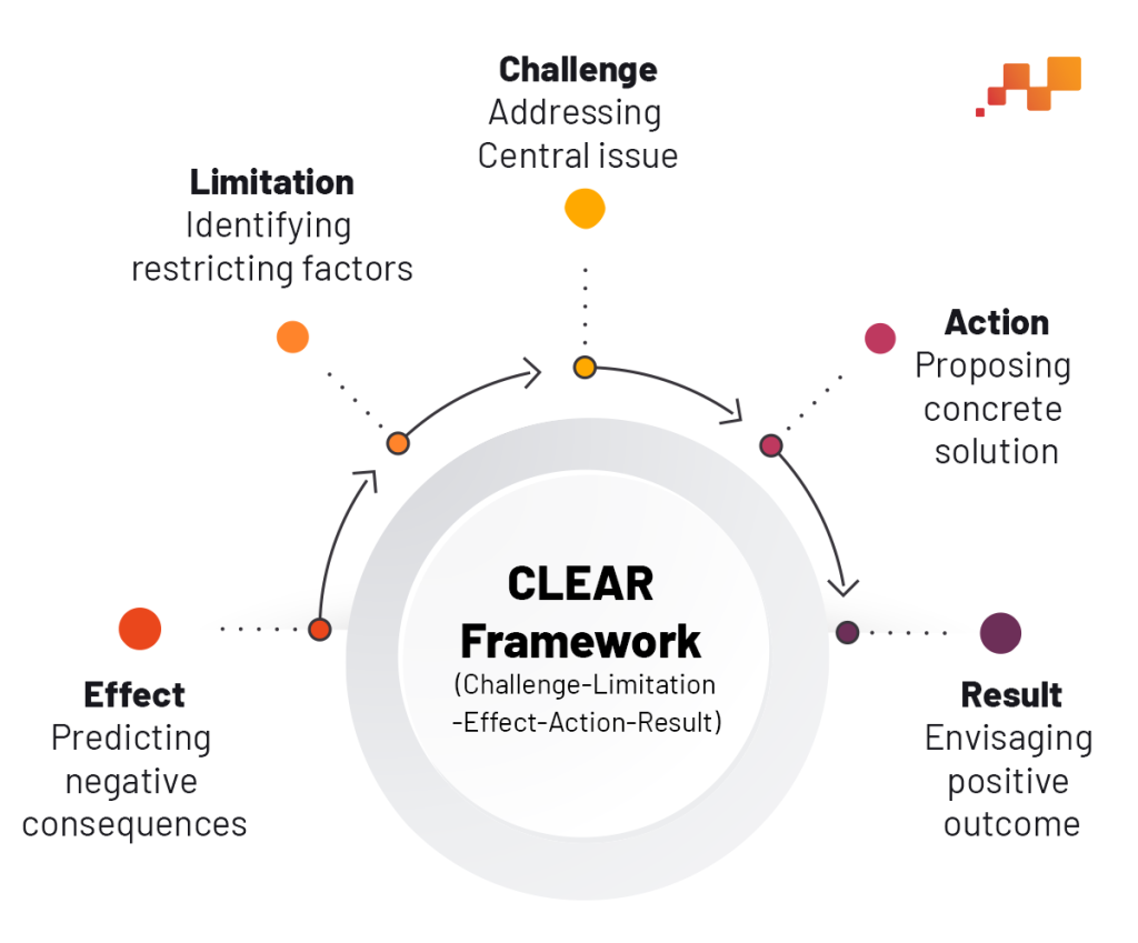
Here's how you can use it to explain a design choice:
- Challenge: What was the core problem or goal? (e.g., "The client's Instagram posts weren't getting noticed.")
- Limitation: What were the constraints? (e.g., "We had to stick to the existing brand fonts and logo.")
- Effect: What was the negative impact of the challenge? (e.g., "Low engagement and brand recall.")
- Action: What specific design decision did you make? (e.g., "I introduced a bold, high-contrast color overlay to make the images pop in a busy feed.")
- Result: What is the intended positive outcome? (e.g., "This should increase visual presence and stop users from scrolling past, boosting engagement.")
3. How and What to Document in Figma
Now, let's make this practical. You don't need a separate 20-page document for a social media post. The best place to document your rationale is right next to your design in Figma. This creates a "living document" that is easy for you, your clients, and future collaborators to understand.
You can do this using simple text boxes and arrows, a technique often called "annotating" your design.
Advice for explaining design rationale
Let's revisit Femke's video to see exactly how to apply this in practice.
Watch the section on where to include rationale. Notice her suggestions to "sprinkle it all throughout" your case study and to use annotations directly on your visuals. This is the method we'll use.
So, what exactly should you be annotating? Think of it as proactively answering the questions a sharp client or manager might ask.
How to Manage a Freelance Product Designers: 9 tips to avoid ...
This article by Diego M. is written from a manager's perspective, listing questions they would ask a designer. For you, this is a goldmine. By learning to answer these questions about your own work, you demonstrate senior-level thinking.
Read the "Questions for your designer" subsections under these four headings: Encourage your designer to steal like an artist (Rationale for inspiration) Remind your designer to safeguard color contrast (Rationale for accessibility) Check if your designer is using a grid system (Rationale for layout and spacing) Be strict in requiring Figma files organized (Rationale for file structure)
Based on these readings, here is a checklist of common design decisions to document for a digital asset:
- Color Choice: Why this color? Does it align with the brand? Does it have sufficient contrast for accessibility?
- Typography: Why this font size and weight? How does it create hierarchy?
- Layout & Spacing: Why are elements placed this way? What grid system is used to ensure harmony?
- Imagery/Iconography: Why was this image or icon style chosen? What emotion or message does it convey?
- Call to Action (CTA): Why is the CTA button designed and placed this way? How does it encourage action?
4. Practical Exercise: Annotate Your Design
It's time to put this into practice. You'll take a design you've already created for your bespoke gifting business and document your rationale.
- Choose a Design: Open the Figma file containing an Instagram post, digital invitation, or web banner you've previously designed.
- Duplicate Your Work: Create a copy of your main design frame. We'll add annotations to this new frame.
- Add Annotations: Using the Text tool (
T) and drawing arrows with the Pen tool (P), add at least four annotations to your design. Each annotation should explain the rationale behind a specific choice. - Structure Your Rationale:
- For at least one of your annotations, try to use the simplified Challenge/Action/Result structure from the C.L.E.A.R. framework.
- Refer to the checklist from the previous section to guide what you document.
Example:
Imagine you're annotating the "Shop Now" button on a promotional banner:
Annotation Text:
Button Design Rationale
- Challenge: The original banner had a weak CTA that blended in with the background.
- Action: I used the brand's vibrant secondary color (
#FF5733) to make the button stand out. The text is white for maximum contrast (AA compliant), and the button is placed in the bottom right, following the natural F-pattern reading flow.- Result: This prominent CTA clearly directs the user to the most important action, aiming to increase click-through rate.
This exercise will produce a single, annotated image that not only shows your design but also proves the thinking behind it—a perfect piece for a future portfolio case study.
Conclusion
Congratulations on completing Module 2! You've gone from Figma fundamentals to creating and exporting high-demand digital assets, and now, to articulating their strategic value. Documenting your rationale is the bridge between being a graphic artist and a UI/UX designer. It forces you to be more intentional, improves your communication with clients, and provides the raw material for the case studies that will define your freelance career.
Key Takeaways:
- Design rationale is the explanation of why a design decision was made, connecting it to specific goals.
- Documenting rationale builds client trust and demonstrates strategic value.
- Frameworks like C.L.E.A.R. and the Decision Breakdown model help structure your thinking.
- The most effective way to document is by annotating your designs directly in Figma.
- Proactively answer questions about color, typography, layout, and accessibility.
Preview of the Next Module:
You're now equipped with the core skills to start seeking out your first freelance gigs for digital assets. In our next module, "Applied Visual Design for Web Interfaces," we will build on this foundation. The first lesson will focus on how to translate an existing brand's visual identity into a digital UI color palette, ensuring WCAG accessibility—a critical skill for designing larger projects like websites and a key piece of rationale you'll need to document constantly.