Welcome to the final lesson of this module! In our last session, you created the architectural blueprint for a landing page by wireframing its key sections. You learned how to prioritize structure and hierarchy over aesthetics, setting a solid foundation for a user-centric design.
Today, we'll build upon that foundation. We're moving from the grayscale skeleton of the wireframe to the vibrant, persuasive "first impression" of a website: the high-fidelity hero section. This is the single most important part of a landing page, responsible for grabbing attention and convincing a visitor to stay. Your goal is to design a hero section that masterfully balances compelling brand aesthetics with a crystal-clear value proposition—a task that uniquely combines your creative eye with your analytical business sense.
We will take the wireframe you created for your "Custom-Crafted Digital Wedding Invitations" service and transform it into a polished, professional design in Figma.
1. Strategy Before Style: The Message is the Foundation
Before a single color is chosen or a font is selected, an effective hero section is built on a powerful message. A common mistake is to design a beautiful layout and then try to fit words into it. We will do the opposite. The message comes first, and the visuals serve to amplify it. This approach is sometimes called "typeframing."
The goal is to answer the user's immediate, subconscious questions: "What is this?" "Is this for me?" and "How does this make my life better?"
Hero Sections That Really Convert - SquarePlanet Academy
This article from SquarePlanet Academy (by designer Michał Malewicz) perfectly explains why starting with the message is non-negotiable.
Read the section titled "Start with a typeframe, not a visual" to understand this 'copy-first' philosophy. Then, jump to the section "Content sections" which breaks down the five essential elements of a high-converting hero message.
As the article outlines, a powerful hero message typically contains five key ingredients:
- Kicker: A small, introductory line, often used for social proof (e.g., "Join 1,000+ happy couples").
- Headline: The main value proposition. It must be brief and incredibly clear.
- Description: A short paragraph that expands on the headline, clarifying how you solve the user's problem.
- Call to Action (CTA): The primary button that tells the user what to do next.
- Emotional Connection: The visual element that supports and enhances the message.
The difference between vague, "word salad" copy and a clear, benefit-driven message is the difference between a bounce and a conversion.
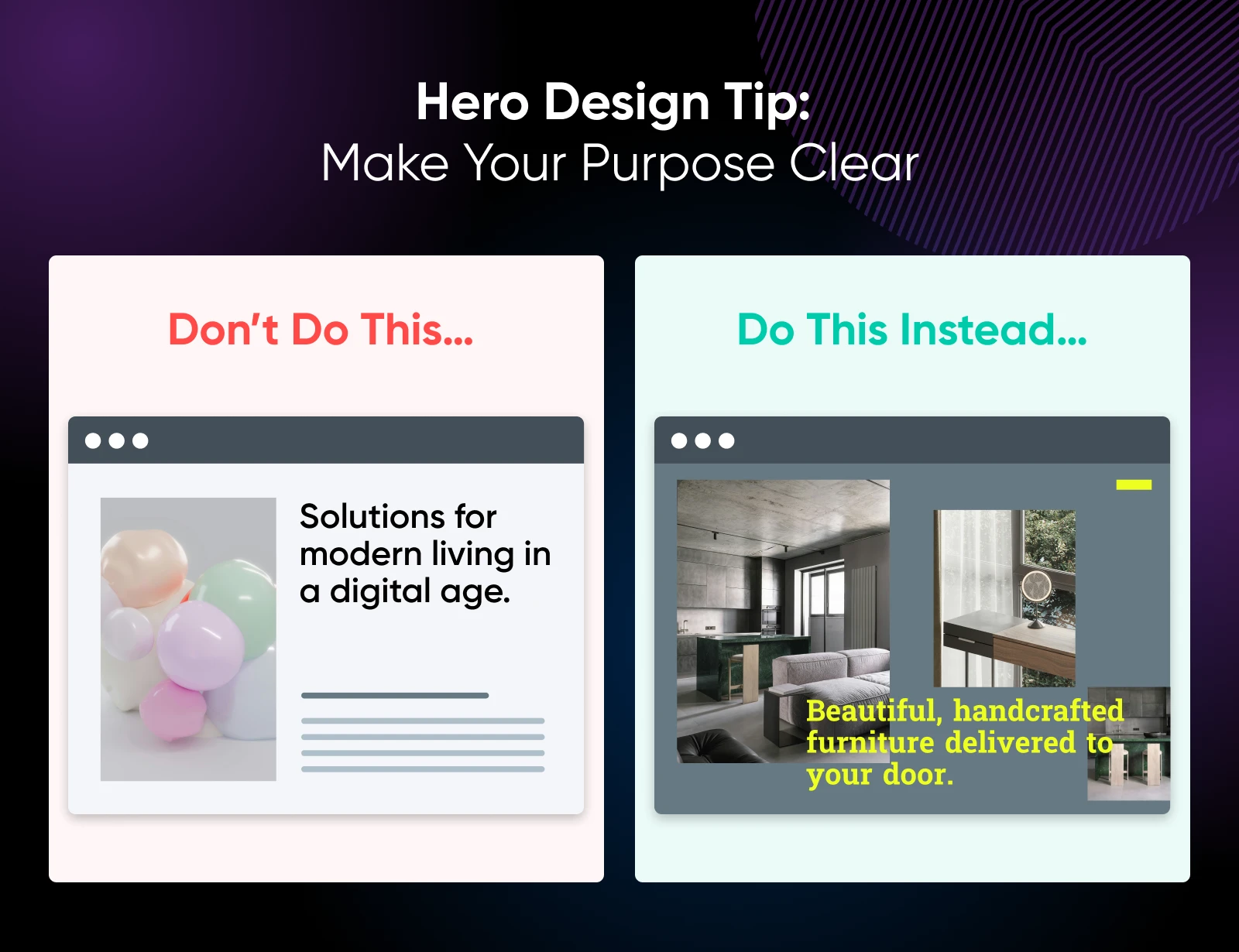
Your Turn: Craft Your Message
Based on the five elements above, let's write the copy for your "Custom-Crafted Digital Wedding Invitations" hero section. Take a few minutes to write a version for each of the following:
- Kicker:
- Headline:
- Description:
- Primary CTA Button Text:
This exercise forces you to distill your business value into its most potent form, a crucial skill that draws directly on your background in structuring and presenting information clearly.
2. Crafting the Visual: Concept and Psychology
With your core message defined, you can now devise a visual strategy. The hero image or video isn't just decoration; it's a co-star to your headline, working to create an emotional connection and reinforce your value proposition.
Design The Perfect Hero Section (With Example)
The video "Design The Perfect Hero Section (With Example)" from Flux Academy provides an excellent framework for thinking about the purpose and concept of your hero visual.
Please watch these two key parts: Clarifying the goal: This section explains how to distill client goals into a clear value proposition and CTA. You've just done this by writing your copy. Coming up with a concept: Pay close attention to how the presenter brainstorms multiple visual ideas to evoke different emotional reactions.
Now, let's add a layer of design psychology to your visual strategy. How you use imagery, particularly of people, can subconsciously guide your user's attention.
Your brain HATES these websites
The video "Your brain HATES these websites" by Malewicz dives into the science of effective hero visuals.
Watch the section from how to use visuals. Focus on these powerful concepts: Using people vs. abstract shapes: Why images of people create a stronger emotional connection. The Gaze Principle: How we instinctively follow the gaze of people in photos, and how you can use this to direct attention towards your CTA. CTA Color Matching: A subtle but powerful technique to create visual harmony by matching a color in your image to your CTA button.
Your Turn: Brainstorm Your Visuals
Considering your service (Digital Wedding Invitations), brainstorm 2-3 visual concepts. Think about the feeling you want to evoke.
- Concept 1: e.g., A close-up of a beautifully designed phone screen showing the animated invitation, held by a person with elegant, manicured hands. (Feeling: Sophistication, quality)
- Concept 2: e.g., A happy, stylish couple looking at their phone together and smiling. Their gaze could be directed towards the phone screen, which is where your CTA will be placed nearby. (Feeling: Joy, shared experience)
- Concept 3: e.g., A dynamic composition showing elements of the digital invitation (florals, custom typography) floating around a central phone mockup. (Feeling: Creativity, magic)
3. Execution: Building Your High-Fidelity Hero Section in Figma
It's time to bring your message and visual strategy together. We will now transform the low-fidelity wireframe from your previous exercise into a polished, high-fidelity design.
You'll be applying brand elements, selecting compelling imagery, and arranging your layout with precision. This is where your aesthetic sense for crafting and design truly shines.
How to Design a Hero Section in Figma A Step-by-Step Guide for ...
This guide from Assaptr is a great practical reference for the steps we're about to take. You don't need to read it cover-to-cover; use it as a resource to consult.
Skim through these sections to get an overview of the technical process in Figma: Step 1: Setting Up Your Figma Canvas (You've already done most of this). Step 2: Designing the Layout (Focus on the parts about Typography and Color). Step 3: Adding Visual Elements (Focus on Background Images and Overlays).
Your Task: Design in Figma
Open the Figma file with the landing page wireframe you created in the last lesson. We'll be working on the hero section.
-
Establish a Mini Brand Identity:
- Colors: Choose a primary brand color (e.g., a dusty rose, sage green, or deep navy) and a neutral color for text (a dark grey is often better than pure black). Create Color Styles in Figma.
- Typography: Choose a sophisticated headline font (e.g., from Google Fonts, something like Playfair Display or Lora) and a clean, readable body font (e.g., Montserrat or Lato). Create Text Styles for your headline, description, and button.
-
Select and Place Your Hero Image:
- Go to a free stock photo site like Unsplash, Pexels, or Freepik and find a high-quality image that matches one of your brainstormed concepts.
- Replace the placeholder rectangle in your wireframe with this image.
- Pro-Tip: If your text is hard to read against the image, place a semi-transparent dark overlay on top of the image or apply a background blur to the image itself to increase contrast.
-
Implement Your Copy and Styles:
- Replace the wireframe text blocks with the copy you wrote in Part 1.
- Apply the Color and Text Styles you just created. Ensure your headline is the most prominent element.
-
Design the CTA and Navigation:
- Design your primary CTA button using your brand color. Make it stand out.
- Refine the navigation bar. You can simply use a text-based logo for now and list 2-3 navigation links (e.g., "Designs," "Pricing," "Contact").
-
Refine Layout and Hierarchy:
- Use the principles you've learned (size, color, spacing, Gaze Principle) to guide the user's eye from the headline to the description to the CTA.
- Ensure everything is aligned to your grid. Use Auto Layout on your text elements and button to maintain proper spacing.
Your final design should be a balance of elegance (brand aesthetics) and clarity (value proposition), looking like a professional and trustworthy service.
Conclusion
Fantastic work! You have successfully designed the most critical piece of digital real estate a business has. You learned to move beyond just arranging elements and started thinking like a conversion-focused designer—defining the message first, creating a visual strategy to support it, and then executing with polish in Figma.
Key Takeaways:
- A hero section's first job is to deliver a clear value proposition in seconds.
- The "typeframe" method—designing the copy before the visuals—ensures your design serves the message.
- Visuals aren't just decoration; they are a tool to create an emotional connection and amplify your headline.
- Psychological principles like the Gaze Principle and CTA Color Matching are subtle techniques that can significantly improve a design's effectiveness.
- A high-fidelity design is a synthesis of strategy (copy), art (visuals), and technical skill (Figma).
Preview of the Next Lesson:
You've now wireframed a landing page structure and designed a high-fidelity hero section. In the next module, we will expand our focus to the entire landing page. Your first lesson will be to audit an existing landing page using the C.L.E.A.R. framework, a structured method for identifying persuasive design gaps—something I know you're looking forward to.