Welcome to the first lesson of our fourth module, where we shift our focus from creating individual components to analyzing and optimizing a complete landing page. In the last module, you did an excellent job designing a high-fidelity hero section, learning to blend brand aesthetics with a clear value proposition. You moved from a structural wireframe to a polished "first impression."
Today, we're going to put on a different hat—one that should feel quite familiar given your background in finance and audit. Instead of creating, we will be critically evaluating. You'll learn how to conduct a UX audit on an existing landing page to find "persuasive design gaps." This is a highly valuable and marketable skill for a freelance designer, as it directly connects design improvements to a business's bottom line. To do this, we'll use the C.L.E.A.R. framework, a powerful tool from Growth.Design that you were interested in exploring.
1. What is a Landing Page Audit?
A landing page audit is a systematic inspection of a webpage with a single goal: to identify areas where the design fails to persuade visitors to take a specific action, such as signing up or making a purchase. This process is often called Conversion Rate Optimization (CRO).
Given your background, you can think of this as an audit of a business's most important digital asset. Instead of looking for financial discrepancies, you're looking for "leaks" in the user experience that cause potential customers to leave.
To understand why this is so critical for businesses, let's start with a short video.
Alex Hormozi's Advice on Landing Pages
This clip from Arsh Sanwarwala's channel, featuring advice from business strategist Alex Hormozi, explains the business case for focusing on conversion rates.
Watch the first part of the video, from the future of marketing. Notice the argument that improving your conversion rate is often more powerful than simply getting more traffic. This is the core reason why landing page audits are so valuable.
Now that you understand the "why," let's look at the "what" and "how" of a typical UX audit process.
UI UX Audit & Analysis Tutorial | GYMSHARK Case Study Included | 2022
The video "UI UX Audit & Analysis Tutorial" by Ari Pxl provides a great overview of what a UX audit entails.
Watch the introductory section from What is UX auditing?. This will give you a clear definition of the process, its goals, and its cost-effective benefits.
As you can see, a UX audit is an expert review. It leverages your knowledge of best practices to identify issues and recommend solutions. To make this process structured and repeatable, we need a framework.
2. The C.L.E.A.R. Framework for Persuasive Design
You specifically mentioned an interest in frameworks from Growth.Design, and for auditing persuasive design, their C.L.E.A.R. framework is perfect. It provides five lenses through which to evaluate any user interface.

Here’s what each letter stands for:
- C - Copywriting: Is the text clear, concise, and persuasive? Does it speak to the user's needs and motivations? Does it create a compelling value proposition?
- L - Layout: Is the page well-organized and easy to scan? Does the structure guide the user's eye towards the most important action?
- E - Emphasis: What elements grab the most attention? Are they the right elements (like the headline and Call-to-Action)? Is there a clear visual hierarchy?
- A - Accessibility: Can people with different abilities and on different devices easily use the page? This includes things like color contrast, font size, and mobile-friendliness.
- R - Reward: Is the benefit of taking action obvious and compelling? Does the page build trust and reduce friction, making the user feel confident in their decision?
To see how these principles apply directly to a landing page audit, let's turn to a practical guide.
Landing Page Conversion Rate Optimization: A Practical Guide
This article provides an excellent, structured approach to auditing a landing page. It aligns perfectly with the C.L.E.A.R. framework.
First, read the section "Setting the Stage for Higher Conversions," which explains the importance of establishing a baseline and understanding the audience before an audit. Then, focus on the section "Audit Your Landing Page Framework." Pay close attention to the table titled "Key Elements of a Landing Page Audit." As you read it, try to map each "Element" to one of the C.L.E.A.R. principles. For example, "Headline & Sub-headline" clearly falls under Copywriting, while "Visuals & Design" relates to Layout and Emphasis.
3. Your Task: Conduct a C.L.E.A.R. Audit
Now it's time for the "action-first" part of the lesson. You're going to conduct your own audit using the C.L.E.A.R. framework. This exercise is designed to be directly relevant to your freelance goals and your background.
Step 1: Choose Your Subject
Find a landing page for a business in a field that interests you, ideally a competitor or an inspiration for your bespoke gifting and crafting business. This will make the audit immediately useful for your own entrepreneurial ventures. A few ideas:
- A custom wedding invitation designer (digital or print).
- An event planning service.
- An online gift box or subscription service.
Step 2: Set Up Your Scorecard
Just as an auditor uses a checklist, you will use a scorecard. You can create a simple table in a document or directly in Figma.
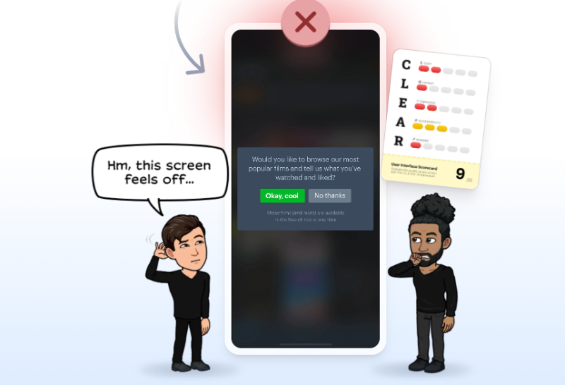
Create a scorecard with the following columns: UI Section, C, L, E, A, R, Total Score, and Notes/Issues.
| UI Section | C (1-5) | L (1-5) | E (1-5) | A (1-5) | R (1-5) | Total ( /25) | Notes/Issues |
|---|---|---|---|---|---|---|---|
| Hero Section | |||||||
| Features/Benefits | |||||||
| Social Proof | |||||||
| Call-to-Action |
Step 3: Perform the Audit
Go through your chosen landing page, section by section. For each section, rate it from 1 (very poor) to 5 (excellent) on each of the C.L.E.A.R. dimensions.
- Copywriting: Is the headline compelling? Is the body text focused on benefits?
- Layout: Is it cluttered or clean? Is the information presented logically?
- Emphasis: Does the main CTA button stand out? Is your eye drawn to the value proposition?
- Accessibility: Check color contrast (you can use a Figma plugin like "Stark" or a web tool). Is the text large enough to read easily? How does it look on your phone?
- Reward: Are there testimonials or trust signals? Is it clear what happens after you click the CTA?
Step 4: Document and Analyze Your Findings
In the "Notes/Issues" column, document every persuasive design gap you find. Be specific. This process should feel very similar to documenting findings in a financial audit.
- Instead of: "The layout is bad."
- Write: "The hero section is cluttered with three competing CTAs, creating decision paralysis. The main value proposition is lost."
For each issue, take a screenshot of the relevant part of the page and annotate it to highlight the problem. This creates a powerful visual report for a potential client. The Gymshark audit video you watched earlier is a great model for this documentation process.
To see a masterclass in presenting this kind of analysis, explore the following case study from Growth.Design.
60 UX Case Studies To Improve Your Product Skills
This is the library of case studies you were interested in. Their format is the gold standard for communicating UX audit findings in a compelling, story-driven way.
Find and read the case study titled "The psychology behind highly effective landing pages". Notice how they break down the user's journey, identify psychological principles at play, and suggest concrete improvements. This is what your notes and annotated screenshots will build toward.
Conclusion
Excellent work today. You've learned how to move from being a creator to a critic, applying a systematic framework to analyze a design's effectiveness. This ability to diagnose problems and recommend data-driven solutions is a cornerstone of a successful freelance career, leveraging your analytical strengths in a new, creative domain.
Key Takeaways:
- A landing page audit is a systematic evaluation aimed at improving conversion by identifying persuasive design gaps.
- The C.L.E.A.R. framework provides a robust structure for auditing a UI through five lenses: Copywriting, Layout, Emphasis, Accessibility, and Reward.
- A proper audit involves a structured scorecard, specific documentation of issues, and visual evidence (annotated screenshots).
- Presenting your audit findings effectively is as important as the audit itself, transforming analysis into a compelling story for clients.
Preview of the Next Lesson:
Your audit will likely uncover several issues related to copywriting. In our next lesson, we will address this head-on by learning to write effective microcopy for headlines, CTAs, and form labels. You'll learn the formulas and psychological triggers that turn passive visitors into engaged customers.