Welcome back! In our last lesson, you did an excellent job stepping into the role of a design auditor, using the C.L.E.A.R. framework to systematically identify persuasive design gaps on a landing page. Your analytical skills from finance were on full display as you diagnosed issues in copy, layout, and emphasis.
Today, we will address the "C" in C.L.E.A.R. head-on. This lesson is all about turning those identified copywriting weaknesses into strengths. You will learn to write effective microcopy—the small but powerful words on headlines, call-to-action (CTA) buttons, and form labels that guide users and drive conversions. Mastering this skill is fundamental to your goal of delivering high-value, quick-win freelance projects.
1. The Power of "Copy-First" Design
In your audit work, you documented findings with precision. Think of microcopy in the same way: every word is a strategic asset with a direct impact on the business's bottom line. The most effective designers don't just fill in text boxes at the end; they often start with the message itself.
This "copy-first" approach ensures that the design serves the message, not the other way around. To understand why this is so critical for building high-converting pages, let's hear a perspective on how professional agencies structure their workflow.
The NEW Way Of Landing Pages in 2026
This video, "The NEW Way Of Landing Pages in 2026," from the Arsh Sanwarwala | ThrillX channel, makes a strong case for prioritizing copy.
Watch from pillar number one. Pay close attention to the core idea: they finalize the offer and the copy first, and only then build the design around it. This is a foundational concept for conversion-focused design.
This approach shifts the focus from "How can we make this look good?" to "What do we need to say, and how can design make that message irresistible?"
2. Crafting Headlines That Stop the Scroll
Advertising legend David Ogilvy famously said, "On the average, five times as many people read the headline as read the body copy." Your headline is your first and often only chance to grab a visitor's attention and convince them to stay.
A great headline communicates a clear benefit and sparks curiosity. While creativity is important, using proven formulas can give you a reliable starting point.
Headlines, CTAs, and Microcopy That Turn Clicks into Clients
This article from Tripsix Design provides an excellent breakdown of the psychology and formulas behind effective conversion copy.
First, read the sections "Understanding Conversion Copy" and "Crafting Headlines That Stop the Scroll." Focus on the four "Headline Formulas That Convert": How-To, List, Question, and Benefit-Driven.
The article gives you several frameworks. The video you watched earlier also offered a very potent formula for benefit-driven headlines:
End Result + Time Period + Emotional Payoff
For example: "Calm your horse (End Result) in just 2 weeks (Time Period) and enjoy safer, happier rides (Emotional Payoff)."
Your Turn: Rewrite a Headline
Let's put this into practice.
- Go back to the landing page you audited in the previous lesson.
- Take its main headline.
- Rewrite it using at least two different formulas you've just learned. For instance, try one "How-To" version and one "Benefit-Driven" version.
- This is a core skill for any landing page project, whether you're building from scratch or improving an existing design.
3. Writing CTAs That Drive Action
If the headline is the hook, the Call-to-Action (CTA) is what reels the customer in. Vague, generic buttons like "Submit" or "Click Here" create uncertainty and friction. Your goal is to write CTAs that are clear, compelling, and feel like the logical next step for the user.
A strong CTA does two things:
- Reduces anxiety by clearly stating what happens next.
- Increases motivation by reminding the user of the value they're about to receive.
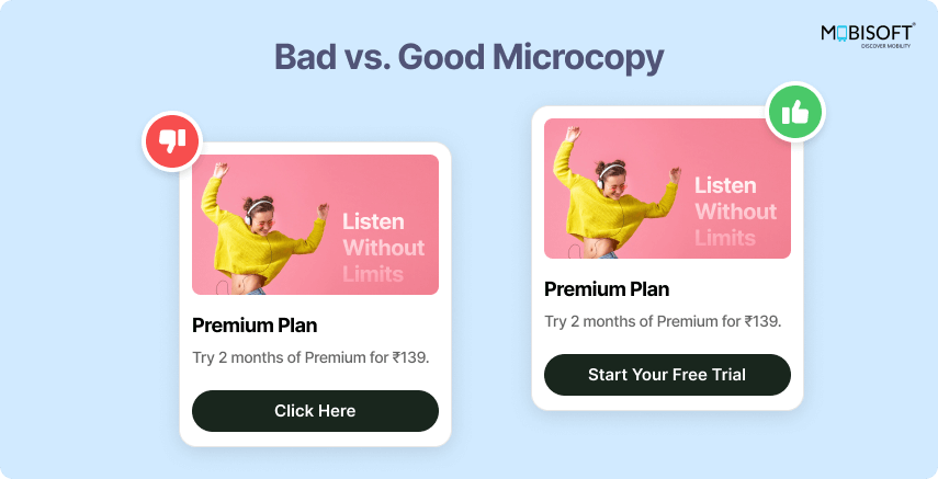
To master this, let's dive into some best practices.
How To Improve Your Microcopy: UX Writing Tips For Non-UX Writers
This Smashing Magazine article offers fantastic, practical tips for writing interface text. It's perfect for moving from theory to application.
Please read the following three sections: "Ensure Your Interface Copy Is Role-playable": This introduces the powerful idea of writing button text from the user's perspective (e.g., "Save My Spot"). "Ensure That The Button Label Accurately Reflects What Happens Next": This is a critical distinction. A button shouldn't promise the final outcome if more steps are involved. For example, use "Select a Room" instead of "Book Now" if the user still needs to choose a room. "Express Action With Verbs, Not Nouns": This simple rule makes your copy more direct and less formal. Use "Pay" instead of "Make a payment."
Your Turn: Upgrade a CTA
- Return to your audited landing page.
- Identify the primary CTA button (e.g., "Sign Up," "Learn More").
- Rewrite it using the principles you just learned:
- Make it action-oriented (use a verb).
- Focus on the value the user gets.
- Use first-person language ("Get My Free Quote").
- Ensure it accurately reflects the very next step.
4. Designing Forms That Don't Frustrate
Forms are often the final hurdle between a visitor and a conversion. Every field is a potential point of friction where a user might get confused, anxious, or simply give up. Your microcopy here plays the crucial role of a helpful guide, reducing cognitive load and building trust.
Key principles for form microcopy include:
- Transparency: Explain why you need sensitive information.
- Clarity: Use positive, direct language for instructions.
- Helpfulness: Use placeholder text to provide examples, not to repeat the label.
Headlines, CTAs, and Microcopy That Turn Clicks into Clients
Let's revisit this article, this time focusing on the smallest details.
Read the section "Microcopy: Small Words, Big Impact." Pay special attention to the "Microcopy Best Practices" examples, which show how to rephrase text to be more transparent and reassuring.
To add to this, the Smashing Magazine article has another excellent tip.
How To Improve Your Microcopy: UX Writing Tips For Non-UX Writers
One more quick tip from this resource.
Read the section "Try To Avoid Negatives." This is a simple but powerful technique. Instead of telling users what not to do ("Don't use special characters"), tell them what to do ("Use only letters and numbers"). This reduces mental processing and sounds more encouraging.
Finally, a small visual hint can also be part of your microcopy strategy.
The video "You CAN design better forms!" from Malewicz has a quick, useful tip on form fields.
Watch the short segment from tip 5. Notice how the size of the form field itself can act as a piece of micro-information, hinting at the expected input length (like for a CVV or zip code).
Your Turn: Optimize a Form
- Find a sign-up or contact form on your audited page (or any site you use).
- Review its labels, placeholders, and any helper text.
- Identify at least two areas for improvement based on the principles of transparency, clarity, and helpfulness.
- For example, you could add helper text explaining why a phone number is needed, or change a negative instruction to a positive one.
Conclusion
Fantastic work today. You've gone from diagnosing copywriting issues to actively fixing them with proven formulas and psychological principles. By focusing on headlines, CTAs, and form labels, you've targeted the highest-impact areas of a landing page. This ability to use words strategically is a massive asset for a freelancer, as it directly connects your design work to tangible business results like more leads and sales.
Key Takeaways:
- Copy-First Design: The most effective landing pages are built around a strong message.
- Headline Formulas: Use frameworks like "End Result + Time Period + Emotional Payoff" to create benefit-driven headlines that capture attention.
- Action-Oriented CTAs: Write clear, specific, and value-focused button text that uses first-person language (e.g., "Get My Free Plan").
- Frictionless Forms: Use transparent and reassuring microcopy to guide users through forms, explaining why you need data and providing clear, positive instructions.
Preview of the Next Lesson:
Now that you have the skills to write compelling copy, we will start assembling the complete landing page. In the next lesson, you will learn to design the core body sections of a landing page (features, benefits, social proof) based on the wireframes we created earlier. You'll be combining your visual design skills with your new copywriting expertise to build out the narrative of the page.