Hello! In our last lesson, you developed a keen eye for analyzing visual hierarchy, learning how designers use color, size, and placement to guide a user's attention. You can now look at a finished design and deconstruct its "invisible hand."
Today, we take a critical step from analysis to creation. You will learn to build the structural foundation of a landing page before any visual styling is applied. This process is called wireframing. Think of it as creating the architectural blueprint for your digital interface. Mastering this will ensure your designs are logical and conversion-focused from the very start, a skill that aligns perfectly with your structured, analytical background from finance and audit.
By the end of this lesson, you will be able to plan and construct a low-fidelity wireframe in Figma, blocking out the key sections of a high-converting landing page like the hero, features, social proof, and call-to-action.
1. The Blueprint: What is a Wireframe and Why is it Essential?
Before a builder lays a single brick, they work from a blueprint. A wireframe serves the exact same purpose in UI design. It's a low-fidelity, grayscale sketch that focuses purely on structure, layout, and information hierarchy. By stripping away color, fonts, and images, you force yourself—and your future clients—to focus on the most important questions:
- What is the goal of this page?
- Are the most important elements in the right place?
- Does the user's journey from top to bottom make logical sense?
Getting this right early saves enormous time and aligns everyone on the project's strategic goals.
landing page wireframe design: 10 Powerful Tips for Success 2025
This article from Linear Design provides an excellent overview of the philosophy behind wireframing.
Please read the first two sections: Start with "What Is a Landing Page Wireframe & Why It’s Your Conversion Blueprint". Pay close attention to the house-blueprint analogy. Continue to "Establishing Information Hierarchy: From Goal to Scroll". This section introduces a powerful narrative structure for landing pages: Problem → Promise → Proof → Pitch. This is a framework you will use repeatedly.
2. The Anatomy of a High-Converting Landing Page
Now that you understand the "why," let's define the "what." Most successful landing pages are not random collections of information; they are carefully structured stories that guide a user towards a single goal. These stories are told through a series of predictable sections.
This image provides a great high-level overview of a typical landing page structure.

To see how these sections are strategized and assembled in a real-world context, we'll watch a professional designer build a landing page from scratch.
Watch me build a $1M landing page in 20 minutes
In "Watch me build a $1M landing page in 20 minutes," Arsh Sanwarwala walks through his process. We'll watch key moments where he defines and structures the essential sections.
As you watch these clips, focus on the purpose of each section and where it's placed in the overall flow. The Hero Section: Notice how he constructs the "above the fold" area with a headline, body text, and a primary call-to-action (CTA). Initial Social Proof: Observe how he places company logos and results right in the hero section to immediately build trust. Pain Point & First Major Social Proof: See how he first addresses the user's problem and immediately follows it with a powerful form of social proof (video testimonials). Value Props & Second Social Proof: He then explains the benefits/features and reinforces them with another layer of social proof (written reviews). How it Works & Final CTA: Finally, he simplifies the process for the user and presents a final, clear call-to-action section to capture the conversion.
This sequence—Hero, Proof, Problem, Benefits, More Proof, CTA—is a classic, high-converting formula. Your wireframe is the tool you'll use to map out this formula visually.
3. How to Build a Wireframe in Figma
Let's move into Figma and learn the practical mechanics of creating a low-fidelity wireframe. The key is to use simple, generic shapes to represent different types of content.
- Text: Use lines or thin rectangles. A thick rectangle for a headline, and thinner lines for body text.
- Images/Videos: Use a rectangle with a cross (X) through it.
- Buttons: Use a rounded rectangle with a simple text label like "Button" or "CTA."
- Icons: Use a circle.
This video provides an excellent, step-by-step guide to these techniques.
How to Wireframe in Figma in 2026
The video "How to Wireframe in Figma" by Codex Community is a perfect practical tutorial for this task.
Please watch the following segments to learn the core techniques: Creating a Layout Grid: Setting up a 12-column grid is essential for creating an organized and aligned layout. Adding Text Placeholders: Learn how to use simple rectangles of different sizes to represent titles and paragraphs. Adding Image Placeholders: See how to create the standard "box with an X" to represent a visual element.
With these simple techniques, you have everything you need to build the structural blueprint of your landing page.
4. Exercise: Wireframe Your First Landing Page
It's time to put theory into practice. Your task is to create a low-fidelity wireframe for a landing page concept. To make this practical, let's imagine you're creating a page for a new service in your bespoke gifting business: "Custom-Crafted Digital Wedding Invitations."
Your Task:
-
Set Up Your Canvas:
- Open a new Figma file.
- Create a Desktop frame (
Frame tool > Desktop). - Apply a 12-column layout grid to your frame (as shown in the video). A margin of 90px and a gutter of 20px is a good starting point.
-
Block Out the Key Sections:
Using only grayscale rectangles, lines, and circles, construct a wireframe that includes the following sections, ordered from top to bottom:- Navigation Bar: A simple bar at the top with a placeholder for your logo on the left.
- Hero Section:
- A large rectangle for the main headline.
- Several thin lines for the sub-headline.
- A prominent, solid rectangle for the primary CTA button.
- A large box with an 'X' on the right, representing the main visual of a beautiful digital invitation.
- Social Proof (Logos): A small heading ("Featured In:") followed by 4-5 small logo placeholders (simple shapes like circles or squares).
- Benefits Section:
- A centered headline ("Why Choose Our Digital Invitations?").
- A 3-column layout. Each column should contain a circle (for an icon), a small rectangle (for a benefit title), and several lines of text (for the description).
- Testimonial Section: A large quote block with a placeholder for a photo, name, and title of a happy client.
- Final CTA Section: A final, prominent call-to-action to encourage sign-ups or purchases. This should include a headline and a clear button.
Reference:
Your final output should look something like this example in terms of fidelity and structure. Notice the use of simple shapes and the clear hierarchy.
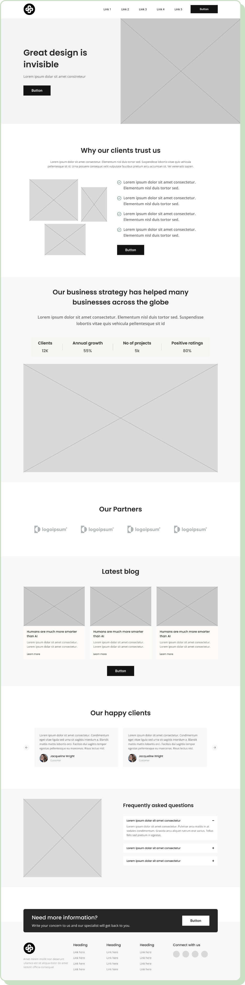
Focus on using size and spacing to create visual hierarchy. Your main headline block should be the most dominant text element, and your CTA buttons should feel important even as simple gray boxes.
Conclusion
Excellent work! You have now transitioned from analyzing design to structuring it. You've learned that a wireframe is a crucial blueprint that establishes a page's hierarchy and user flow long before visual design begins. By focusing on the core sections—Hero, Social Proof, Benefits, and CTA—you ensure your landing page tells a clear, persuasive story.
Key Takeaways:
- A wireframe is a low-fidelity structural layout focusing on hierarchy, not aesthetics.
- It acts as a blueprint to align strategy before investing time in visual design.
- High-converting landing pages follow a narrative structure, often including a Hero, Social Proof, Benefits/Features, and a strong Call-to-Action (CTA).
- In Figma, you can represent content with simple grayscale shapes: rectangles for text and images (with an 'X'), and circles for icons or avatars.
Preview of the Next Lesson:
In this lesson, you created the skeleton. In the next lesson, you'll start adding the skin. We will focus on designing a high-fidelity hero section, taking the wireframe you just built and transforming it into a polished design with brand colors, typography, and compelling imagery.