Recommended resources
The freely available resources this lesson will direct you to.
Hello! Welcome to the third lesson in our journey to creating motion graphics with code.
In our last session, we looked under the hood of SVG files. We saw how naming and grouping layers in Figma creates a clean, structured SVG with <g> tags. This preparation gives us specific, targetable "parts" of our illustration that we can manipulate.
Today, we'll learn the two fundamental ways CSS gives us to bring those parts to life. Our goal is to differentiate between CSS transitions and keyframe animations for various motion design tasks. Think of these as two different tools in your motion toolkit. Knowing which one to pick is crucial for creating the exact effect you want, whether it's a subtle UI interaction or a complex narrative animation.
The Two Flavors of Motion: State Change vs. Sequence
At its core, the difference between transitions and animations is simple:
- Transitions are for smooth changes between a start state and an end state.
- Animations are for sequences with multiple steps or keyframes between the start and end.
This image provides a perfect visual summary of this core concept.
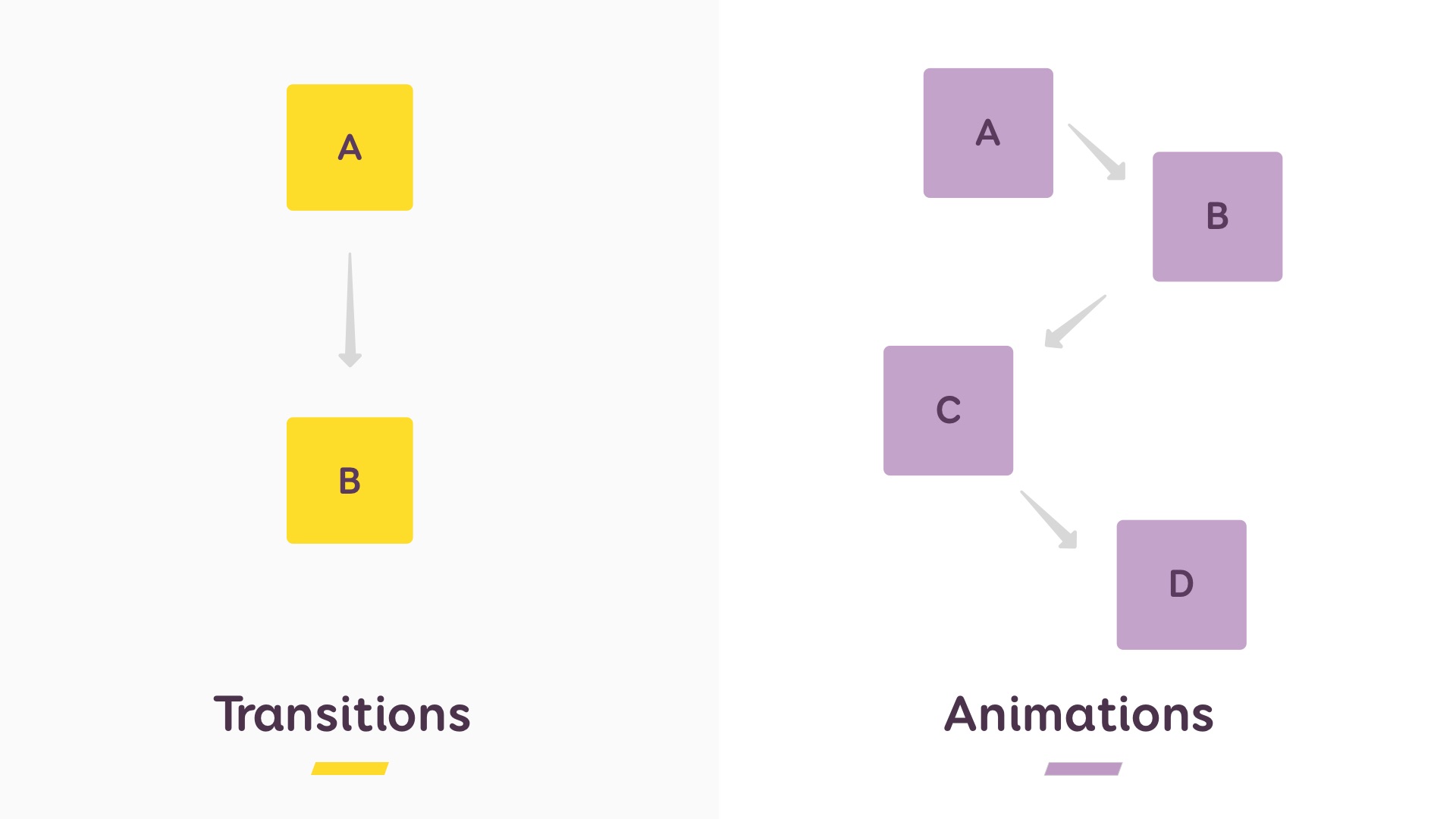
Let's break down what this means in practice.
1. CSS Transitions: The Simple State Change
A CSS transition smoothly animates a property change when an element's state changes. The key word here is state change. A transition doesn't run on its own; it needs a trigger, like a user hovering their mouse over an element (:hover), clicking on it (:active), or when a class is added to it using JavaScript.
Think of it like a light dimmer. The light is either off (state A) or on (state B). The dimmer just makes the change between those two states gradual instead of instant.
When to use transitions:
- UI Micro-interactions: Button hover effects, link color changes, focus indicators on form fields.
- Simple Reveals: A navigation menu sliding into view when a hamburger icon is clicked.
- Visual Feedback: An element subtly scaling up when selected.
These are all perfect use cases that connect to your experience in UX and product design. They make an interface feel responsive and polished.
Let's watch a short video that clearly explains this.
CSS Transition vs. Animation (CSS Basics Ep.5)
The video 'CSS Transition vs. Animation' from Code ON provides a concise explanation of the core difference, focusing on how transitions are triggered by events.
Watch from the beginning to 02:05. Pay close attention to how the video defines a transition as moving from an 'initial state to a final state, but nothing in between' and how it must be triggered by an event like a hover.
As you saw, the code is quite straightforward. You define the default state of the element, and then you define the properties you want to change on a trigger (like :hover). The transition property tells the browser how to animate that change.
/* A basic button */
.my-button {
  background-color: #3498db; /* State A */
  transform: scale(1);

  /* Tell the browser to animate background-color and transform changes */
  /* over 0.3 seconds with an 'ease' timing function. */
  transition: background-color 0.3s ease, transform 0.3s ease;
}

/* The trigger and the new state */
.my-button:hover {
  background-color: #2980b9; /* State B */
  transform: scale(1.1);
}
2. CSS Animations: The Scripted Sequence
Unlike transitions, CSS animations don't need a state change to run. They can start automatically when the page loads and can loop indefinitely. They are defined using @keyframes, which act like a storyboard or a script for your motion. You can define styles at many points along the timeline (e.g., 0%, 25%, 60%, 100%), giving you precise control over complex sequences.
This is the tool you'll use for your primary goal: creating explainer animations, title sequences, and other narrative-driven motion graphics.
When to use keyframe animations:
- Loading Spinners: A continuously rotating or pulsing icon.
- Character Animation: Making a character wave by defining the key poses of the arm.
- Explainer Scenes: Making multiple elements appear, move, and disappear in a choreographed sequence.
- Attention-Grabbing Effects: A "shake" animation on a button to draw the user's eye.
Let's dive into a more detailed video that explains how to build a keyframe animation.
Master CSS Animation Property in 11 Minutes [Full Tutorial] 🚀
The video 'Master CSS Animation Property in 11 Minutes' from CSSnippets is an excellent tutorial on how @keyframes work and the properties used to control them.
Watch these three segments: 00:57 - 03:08: This explains the @keyframes rule and how you can define multiple intermediate steps. 04:04 - 05:34: This shows a practical example of creating a @keyframes rule and applying it to an element. 05:34 - 07:28: This is a crucial overview of the different animation-* properties you can use to control the animation (like duration, delay, and iteration count). You don't need to memorize them all, but it's important to know they exist.
A keyframe animation has two parts:
- The
@keyframesrule: This is where you define the "story" of your animation. - The
animationproperty: This is where you apply that story to an element and control its playback.
/* 1. Define the animation's story using @keyframes */
@keyframes bounce-in {
  0% {
    opacity: 0;
    transform: scale(0.3);
  }
  50% {
    opacity: 1;
    transform: scale(1.05);
  }
  70% {
    transform: scale(0.9);
  }
  100% {
    transform: scale(1);
  }
}

/* 2. Apply the animation to an element */
.my-animated-element {
  /* name duration timing-function delay iterations direction fill-mode */
  animation: bounce-in 1s ease 0.5s 1 normal forwards;
}
Summary: Choosing the Right Tool for the Job
So, how do you decide which to use? It comes down to complexity and control.
For a deeper look at the specific differences and best practices, this article provides an excellent summary.
CSS Animations vs. CSS Transitions: Key Differences and When to ...
The article 'CSS Animations vs. CSS Transitions' by ITER Academy provides a clear table and use-case summary that will help solidify your understanding.
Read the sections titled 'Key Differences between Transitions and Animations' and 'When to Use Each'. The table is a particularly effective summary.
Here's a quick reference table based on that reading and what we've learned:
| Feature | CSS Transitions | CSS Animations (@keyframes) |
|---|---|---|
| Purpose | Smoothly animate between two states (A → B). | Create a complex sequence with multiple steps (A → B → C → ...). |
| Trigger | Requires a state change (:hover, :active, class change). |
Can run automatically on page load. Triggered by applying the CSS rule. |
| Control | Simple. You define the end state and the transition properties. |
High. You control every step of the animation via @keyframes. |
| Looping | No native looping. Animates to the end state and stays there (or reverts when the trigger is removed). | Can loop infinitely, a set number of times, or play in reverse. |
| Typical Use Case | UI feedback, micro-interactions, simple menu reveals. | Explainer animations, loading spinners, character movements, title sequences. |
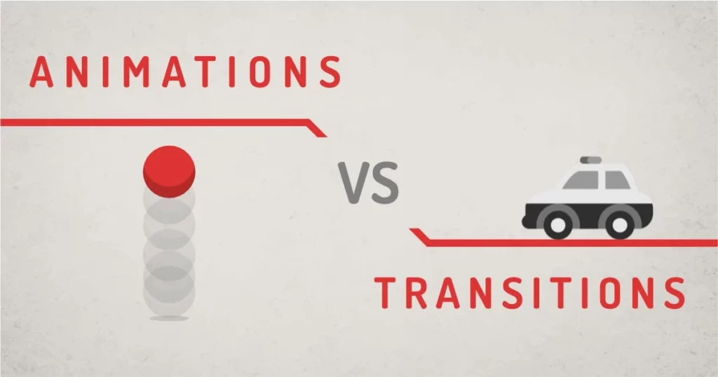
This final image gives another great visual metaphor. Think of a transition as a car moving from point A to point B, while an animation is like a ball bouncing with multiple stages in its motion.
Key Takeaways
You've now learned about the two foundational methods for creating motion on the web. This knowledge is not just technical; it's strategic.
- CSS Transitions are for simple, state-driven effects. They are your go-to for responsive UI and micro-interactions. They are simple to write and are triggered by user actions.
- CSS Animations (using
@keyframes) are for complex, scripted sequences. They give you fine-grained control over multi-step motion, can loop, and don't require a user to act. This is the tool for storytelling and more elaborate motion graphics. - Knowing the difference allows you to prompt an AI like Claude more effectively. You can now ask specifically: "Create a transition for this button's hover state" or "Write a keyframe animation that makes this logo pulse."
Next Up
In both transitions and animations, we used properties like ease to control the timing. But what does ease actually mean? In our next lesson, we will connect your existing knowledge of animation principles to their code-based equivalents. We'll explore how to visually interpret and create custom easing curves using CSS cubic-bezier values, giving you full creative control over the feel of your motion.