Recommended resources
The freely available resources this lesson will direct you to.
Hello! Welcome to the fourth and final lesson of our "Foundations" module.
In our last lesson, we distinguished between CSS transitions (for simple state changes) and animations (for complex sequences). We saw that both use timing functions, often with a simple keyword like ease, to control the "feel" of the motion.
Today, we'll dive deep into that concept. As someone with a background in design and animation, you're already intuitively familiar with easing, timing, and spacing. This lesson will bridge that knowledge to its specific implementation in code. Our goal is to visually interpret how different easing curves are represented in CSS, specifically through cubic-bezier values. By the end, you'll be able to look at a motion curve and know what the animation will feel like, and understand the code that defines it.
From Animation Principles to a Motion Graph
In animation and UI design, "easing" refers to how an object accelerates or decelerates. An object rarely moves at a constant speed; it starts, speeds up, and then slows to a stop. This makes movement feel more natural and less robotic.
In a digital context, we can represent this concept visually on a graph. The horizontal axis (X) represents time, and the vertical axis (Y) represents the progress of the animation (e.g., from 0% to 100% of its movement or change).
The best place to see this in action is in a tool you already know well: Figma. Let's watch this official Figma tutorial that breaks down the most common easing curves.
The video 'Figma Tutorial: Easing Curves' provides an excellent visual foundation. It explains how different curve shapes correspond to different motion feelings, like 'ease-in', 'ease-out', and the 'back' eases that create overshoot effects.
Watch the video from the beginning up to 02:36 to understand the standard curve types. Then, watch the segment from 03:15 to 03:51, which shows Figma's bezier curve editor. Notice how dragging the handles changes the curve and how there are numerical values associated with it—this is the core concept we'll be exploring in CSS.
As you saw, a straight line (linear) feels robotic, while curved lines create more natural acceleration and deceleration. This graph is the key to translating animation principles into code.
The cubic-bezier() Function in CSS
CSS provides keywords for the most common curves: linear, ease, ease-in, ease-out, and ease-in-out. But for full creative control, CSS gives us the cubic-bezier() function.
At first glance, it can look intimidating:animation-timing-function: cubic-bezier(0.34, 1.56, 0.64, 1);
What do those four numbers mean? They are the key to defining any curve you can imagine.
The trick is to understand that those four numbers represent two points on our Time vs. Progress graph. A cubic-bezier curve in CSS always has a fixed start point at (0,0) and a fixed end point at (1,1). The four numbers define two "control handles" that pull the curve into shape.
cubic-bezier(x1, y1, x2, y2) corresponds to:
- Control Point 1:
P1(x1, y1) - Control Point 2:
P2(x2, y2)
This image illustrates the concept perfectly.
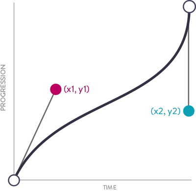
Let's watch a short video that explains this relationship between the four numbers and the curve's handles.
Pure CSS: Cubic Bezier Explained
The video 'Pure CSS: Cubic Bezier Explained' by Arjun Khara offers a concise and clear explanation of what the four numbers in a cubic-bezier function represent and how they relate to the handles you might use in a vector illustration tool.
Watch the entire video. It clearly explains how the four numbers are XY coordinates for the two handles and how to interpret the resulting curve shape. Pay special attention to the part explaining why the Y value can go above 1, which creates the 'overshoot' or 'back' easing effects we saw in the Figma video.
Reading the Curve: Steep is Fast, Flat is Slow
Now that you know the numbers define the handles that shape the curve, you can learn to "read" the motion from the curve's shape:
- A steep slope means the animation is fast. The property value is changing a lot in a short amount of time.
- A flat (horizontal) slope means the animation is slow. The property value is changing very little over time.
For an interactive way to build this intuition, let's turn to an excellent article with a built-in visualizer.
Cubic Bézier: from math to motion - The Blog of Maxime Heckel
The article 'Cubic Bézier: from math to motion' by Maxime Heckel provides one of the best interactive tools for understanding this concept. You'll be able to directly manipulate the control points and see the resulting motion.
Please read the sections 'Visualizing the motion' and 'Easing functions'. In the first section, spend most of your time playing with the 'Cubic Bezier Visualizer'. Drag the gray handles (P1 and P2) and watch how the curve and the blue dot's animation change. Try to create the standard curves: an ease-in (starts slow, ends fast) and an ease-out (starts fast, ends slow). Pull the second handle's Y-coordinate above 1. Notice how this creates the 'overshoot' effect, just as the video explained. The 'Easing functions' section confirms that keywords like ease-in are just shortcuts for specific cubic-bezier values.
Tying It All Together
You've now connected the dots from a general animation principle (easing) to a visual graph, and finally to the specific CSS cubic-bezier(x1, y1, x2, y2) function.
The key takeaway is that the function isn't "random number barf," as one author puts it. It’s a logical system for describing a shape. With a little practice, you can glance at a curve and know how the animation will behave.
To solidify this, here's one final, short article that recaps the main ideas.
How to read cubic-bezier curves
The article 'How to read cubic-bezier curves' by Val Head provides a quick, clear summary of everything we've covered. It's a great final reinforcement.
Read the short sections 'Going from the function to the graph' and 'Reading the graph'. It reinforces the core idea: steep parts of the curve are fast, and flat parts are slow.
This ability to visually interpret easing curves is a superpower. When you start prompting Claude to create animations, you can be more specific. Instead of just saying "make it move," you can say "animate it with a fast start and a slow, gentle end," and you'll know exactly what kind of cubic-bezier() values to look for in the code it generates.
Key Takeaways
- The "feel" of an animation (its easing) can be visualized as a curve on a graph of Time vs. Progress.
- In CSS, these curves are defined by the
cubic-bezier(x1, y1, x2, y2)function. - The four numbers are the (x, y) coordinates for the two control handles that shape the curve.
- You can "read" a curve: a steep slope means a fast rate of change, and a flat slope means a slow rate of change.
- Pulling the handles' Y-coordinates outside the
0to1range creates interesting effects like overshoot (>1) and anticipation (<0). - Standard keywords like
ease-inandease-outare just convenient presets for specificcubic-bezier()values.
Next Up
This lesson concludes our foundational module. We've mapped design concepts to code, understood the structure of SVGs, differentiated between transitions and animations, and now demystified easing curves.
In the next module, we'll leave theory behind and move into the practical setup. We'll start by installing and configuring VS Code with the essential tools you'll need, setting the stage for bringing your first Figma design to life with code.