Recommended resources
The freely available resources this lesson will direct you to.
Hello! Last lesson, you identified trends from successive peaks and troughs. Those turning points do more than describe direction: they show where a decline has previously stalled or an advance has previously met selling.
Today you will use that evidence to mark support and resistance as price zones, not prices that a stock must touch exactly. By the end, you should be able to explain why you drew each band on a weekly or daily chart and why you chose its boundaries. Allow about 35–40 minutes, including time on your TradingView layout.
From a turning point to an area worth watching
Support is an area where past declines have stopped and price has turned upward. Resistance is an area where past advances have stopped and price has turned downward. A swing low or high is a recorded turning point; a support or resistance zone is an interpretation of the price area around one or more such points.
A useful zone begins with evidence, not with a pleasingly round number. Several separate reactions in approximately the same area are particularly informative. A single conspicuous weekly low followed by a substantial rise can also be worth marking, but until price revisits it, that area has less evidence behind it. Neither kind of zone guarantees another reversal.
Read StockCharts’ Support & Resistance for the distinction between a recorded price and an area of market response.
Support & Resistance - ChartSchool - StockCharts.com
This ChartSchool article explains why earlier reaction highs and lows help locate support and resistance, while brief excursions beyond an exact price make zones useful.
In “Where Is Support Established?”, read the support discussion. In “Where Is Resistance Established?”, read the matching discussion. Continue to “Methods to Establish Support and Resistance?” and its “Highs and Lows” subsection: read the pivot rule together with the Halliburton example immediately below it, through the February return toward support. Finally, in “What Are Support and Resistance Zones?”, read the guidance on zones, stopping before the paragraph that begins “Returning to the Halliburton”. Focus on how the spread of actual reactions—not a fixed number of currency units—affects the width of a zone.
Notice the article’s qualification: a narrow, orderly range may allow a fairly precise level, whereas reactions spread across a wider area call for a band. “Use zones” does not mean “draw them as wide as necessary to contain every candle.” The band should represent the prices at which the chart repeatedly showed a meaningful response.
Consider this hypothetical weekly chart of a stock quoted in rupees. Three declines, separated by substantial rallies, reach lows of ₹310, ₹313, and ₹311. Around those lows, the turning candles finish near ₹314–₹316 before price rises. A support zone of approximately ₹310–₹316 describes that cluster more faithfully than a line at ₹311 or ₹315. If distinct advances later stall near ₹348, ₹351, and ₹349, you have evidence for a resistance zone around ₹348–₹351. The boundaries describe what has happened; they do not specify where the next turn must occur.
Make the width answer to the chart
The supplied weekly chart illustrates why bands are helpful. Its green resistance band sits around earlier reaction highs, while its pink support band sits around earlier reaction lows. The highs and lows do not all land on one identical price.
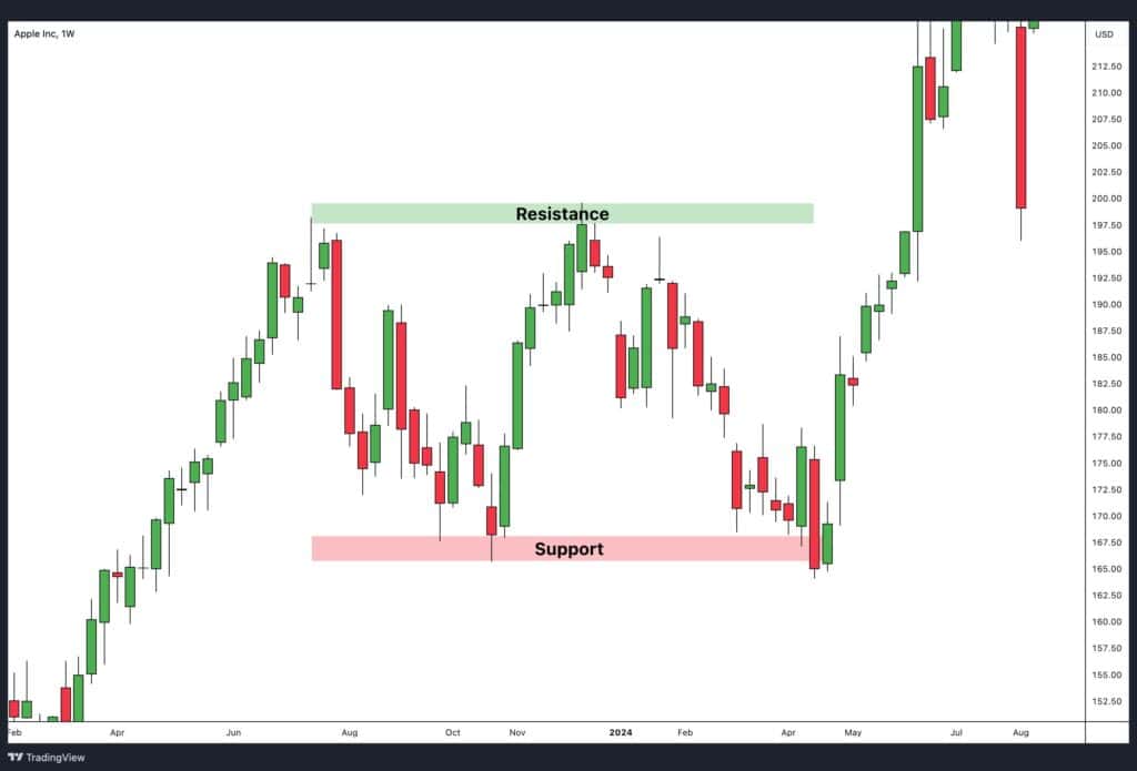
This is an illustration, not a chart of an NSE-listed stock. On your own chart, inspect both the wick extremes and the candle bodies near each turn. Wicks reveal how far price briefly travelled; bodies and closes help show where it spent or ended that period. When several turns cluster, choose boundaries that contain the main area of response. Do not mechanically connect only the lowest wicks, and do not enlarge a useful band to absorb one remote, isolated wick without considering whether it belongs to the same cluster.
The trend scale you classified last lesson also determines which turns matter. A prominent zone built from weekly pivots may be important for a position-oriented view; tiny daily reversals inside it need not become a stack of additional zones. Conversely, the daily chart can help you see where responses are concentrated within a broad weekly area. Keep the same adjusted-price setting while comparing past reactions, so that corporate-action changes do not masquerade as new price behavior.
Suppose price briefly dips just under your support band, then finishes back inside it. That movement alone does not prove the entire area has ceased to matter. Equally, calling every dip a harmless exception would make the zone impossible to assess. Keep its original, evidence-based boundaries visible and observe what price does next. We will address completed breaks and changes of role in the next lesson.
Mark zones without fitting them to the outcome
TradingView’s rectangle tool is suited to marking a horizontal area. This short platform demonstration shows the controls and why a rectangle can communicate more than a single horizontal line.
How Traders Use The Rectangle Drawing Tool: Tutorial
Watch TradingView’s “How Traders Use The Rectangle Drawing Tool: Tutorial” to see how to place a price band and adjust its edges. Its chart example contrasts an observed response area with an overly precise line.
Watch rectangle controls for where to find the tool under geometric shapes and how to place and resize it. Then watch marking a zone for the repeated candle responses and the reason to include their area rather than only one price. You do not need the later discussion of the rectangle’s middle line for this lesson.
Now spend about 10–12 minutes with one NSE-listed stock on your existing layout. The task is to produce a chart that someone else could audit, not a trade signal.
- Begin on the weekly chart. Find conspicuous completed swing lows and highs near the part of the chart you are studying. Look for separate returns to a similar area, or a single major pivot from which price moved substantially away. Do not count several adjacent candles in one turn as several independent tests.
- Draw at most a few relevant bands. Put a rectangle across the principal support response area and, if the chart supplies evidence, another across resistance. Set the top and bottom at defensible observed prices. Extend each rectangle across the period you are examining so you can see whether later candles reach it.
- Check the daily chart without letting it rewrite the weekly evidence. It may clarify whether responses clustered within a weekly band. If the daily view reveals a different, smaller-scale zone, distinguish it from the weekly one rather than silently replacing the weekly band.
- Record the reason for each mark. A useful note is: “Weekly support, ₹310–₹316: three distinct reaction lows near ₹310–₹313, with turning candles finishing around ₹314–₹316.” If you have only one strong pivot, label its zone provisional.
If a rectangle has to span an enormous price range to accommodate unrelated highs or lows, the proposed zone is probably combining different structures. If the chart is crowded with bands far from current price, retain the ones pertinent to the weekly or daily movement you are examining. And if you can identify no defensible cluster, leave the area unmarked. An empty chart is preferable to a precise-looking guess.
Where this leaves you
Support and resistance are evidence-based areas of past price response, not exact barriers. Use completed reaction lows for support and reaction highs for resistance; give more weight to meaningful, separate responses; and let their observed spread determine a zone’s width. Mark what was visible from past price action rather than adjusting the band simply to make later candles appear to respect it.
Next, you will examine what happens after price moves beyond a zone: when former resistance may act as support, or former support may act as resistance.