Recommended resources
The freely available resources this lesson will direct you to.
- DOW THEORY - What is it & how can it be applied to the stock market?www.youtube.com
- Master Trend Trading Strategy (Higher Highs and Higher Lows)www.youtube.com
- John Murphy's "Charting Made Easy" eBook | ChartSchool | StockCharts.comchartschool.stockcharts.com
- Dow Theory - ChartSchool - StockCharts.comchartschool.stockcharts.com
Hello! Your weekly and daily charts are set up, and you have chosen a price scale for each. The next question is more important than how steep a move looks: what sequence of peaks and troughs is price making?
In this lesson, you will classify a stock’s primary, intermediate, and minor trends. That distinction matters for position analysis because a stock can be rising over many months while falling over several weeks—and rising again over a few days. Allow about 35–40 minutes, including time to inspect your charts.
Read the swings before naming the trend
A peak, or swing high, is a point where an advance gives way to a decline. A trough, or swing low, is where a decline gives way to an advance. You recognize a meaningful swing only after subsequent price action makes the turn apparent; the current candle may still extend the move.
John Murphy’s concise account gives us the starting rule. In Charting Made Easy, read the paragraph after Figure 3-1 rather than trying to infer the trend from the slope of the figure.
John Murphy's "Charting Made Easy" eBook | ChartSchool | StockCharts.com
Read Murphy’s definition of trends and their broad categories; it will supply the vocabulary for the rest of the lesson.
In “How to Plot the Daily Bar Chart,” find Figure 3-1, “Construction of a Daily Bar Chart.” Immediately below it, read trend definitions. Stop before “Support and Resistance Trendlines and Channels.” Focus on the requirement that both peaks and troughs progress in the same direction.
An uptrend makes successively higher peaks and higher troughs. A downtrend makes successively lower troughs and lower peaks. If one sequence rises while the other does not, the evidence is mixed: do not force an uptrend or downtrend label onto it.
The marked chart below shows rising peaks and troughs. Notice the distinction between its evidence and its decoration: the green line helps your eye follow the rise, but the sequence of turning points is what identifies the uptrend. You do not need to draw a trendline to classify it.
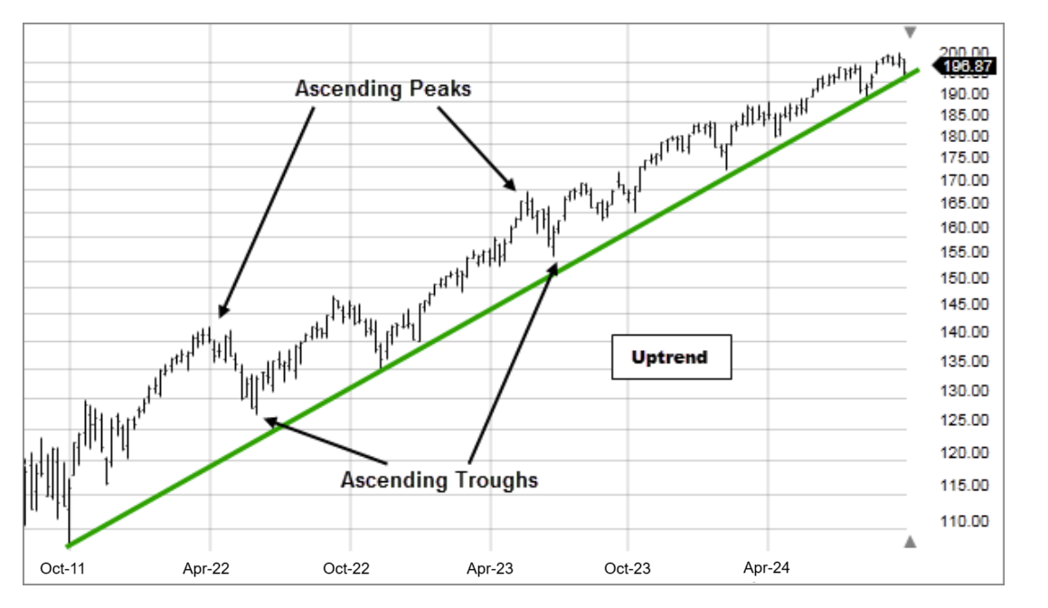
Last lesson’s scale choice can alter the visual steepness of this chart. It cannot change whether a later recorded peak is above an earlier one, provided you compare prices on the same adjusted series.
One stock can have three trend directions at once
Murphy calls the broadest trend major; in Dow terminology it is usually called primary. Beneath it are secondary, or intermediate, movements and still smaller minor fluctuations. These are nested views of price, not three competing answers to the same question.
Read the short Dow Theory account for the relationship between those views. Dow’s original discussion concerns market averages; we are using its trend vocabulary to describe an individual stock’s chart.
Dow Theory - ChartSchool - StockCharts.com
StockCharts’ Dow Theory guide distinguishes the broad move from a countertrend reaction and shorter fluctuations. Read it to see why a decline need not contradict a larger uptrend.
Under “Broad Market Movement Theorems” → “Market Movements,” read three movements, stopping before “Primary Movement.” Then, under “Secondary Movements,” read its opening explanation and inspect the correction chart immediately below it. Stop before the example paragraph beginning “In Sept-96.” Focus on direction relative to the primary trend, rather than treating the stated durations as exact cutoffs.
For a position-oriented chart, the categories work as follows:
| Layer | What you are trying to identify | Typical view |
|---|---|---|
| Primary | The broad sequence of major peaks and troughs over many months or years | Multi-year weekly chart |
| Intermediate | A substantial swing lasting weeks to months, often a correction against the primary trend | Weekly chart, checked on daily |
| Minor | Short swings lasting days to a few weeks, which may run either way inside an intermediate move | Daily chart |
The time ranges are guides, not a stopwatch test. Murphy describes a major trend as lasting more than a year and a secondary trend as lasting roughly one to three months. The Dow Theory account allows a primary move to last from a few months to years. Both emphasize the same practical point: judge a movement by its place in the larger swing structure, as well as its duration.
A secondary movement is commonly a correction during a primary rise or a rally during a primary decline. Minor moves can travel in either direction within that secondary movement. A few rising daily candles, therefore, do not establish that a weeks-long decline—or a months-long primary trend—has reversed.
Watch this brief chart demonstration before applying the idea to your own layout.
Master Trend Trading Strategy (Higher Highs and Higher Lows)
In “Master Trend Trading Strategy (Higher Highs and Higher Lows),” Mind Math Money moves from a clean swing example to messier price action. Watch for how the presenter separates a move in the prevailing direction from a pullback.
Watch rising swings for the basic peak-and-trough sequence. Continue through messier charts, concentrating on how a pullback fits within an advance. Then watch falling swings for the corresponding lower-peak, lower-trough structure. Stop there; for now, the task is classification rather than calling a reversal.
Consider a hypothetical stock whose major weekly troughs are ₹100, ₹115, and ₹135, while its major peaks are ₹140, ₹165, and ₹180. Those successive higher troughs and peaks describe a primary uptrend.
After ₹180, suppose price makes a low at ₹164, rebounds to ₹173, drops to ₹150, rebounds to ₹160, and drops to ₹143. Within this correction, the successive rebound peaks are lower (₹173 and ₹160), and the correction’s troughs descend (₹164, ₹150, and ₹143). You can therefore describe an intermediate downtrend within a primary uptrend. The ₹143 low is still above the last major trough at ₹135, but that observation alone neither proves the correction is over nor forecasts what happens next.
Zoom in further. The rebound from ₹150 to ₹160 could contain daily swings from ₹150 up to ₹156, down to ₹153, then up to ₹160. At that finer resolution, price has made a higher daily trough and a higher daily peak: a minor uptrend inside the intermediate decline. There is no contradiction. Each label refers to a different size of swing.
Classify what the chart shows today
Use your existing TradingView layout to make the classification in order of scale. Spend about 8–10 minutes on this inspection; you are recording observations, not making a trade decision.
- Start with several years on the weekly chart. Locate the conspicuous peaks and troughs separated by meaningful swings. Compare successive major peaks with major peaks and major troughs with major troughs. Record primary up, primary down, or unclear/sideways. Do not promote every one-week turn to a major pivot.
- Examine the more recent weeks to months. Look for a distinct sequence of smaller peaks and troughs. Record its intermediate direction and whether it agrees with or runs against the primary direction.
- Use the daily chart for the short swings. Identify any recent minor rising or falling sequence. Keep it subordinate to the weekly picture: a daily rally can be part of a weekly correction.
- State the evidence, not just the labels. For example: “Primary up: major weekly peaks and troughs have risen. Intermediate down: recent weekly rebound peaks and lows have fallen. Minor up: the latest daily rebound has made higher daily peaks and troughs.”
If the last apparent peak has not yet been followed by a recognizable decline, mark it provisional. Likewise, a single lower peak in an otherwise rising sequence is a reason to look more closely, not enough by itself to declare a new downtrend. Some charts genuinely lack a clear sequence at one of the three scales; “unclear” is more useful than a confident but unsupported label.
Keep the chart’s price adjustment consistent while comparing its peaks and troughs, as you did when comparing scales. Neither a dramatic-looking candle nor the slope of a drawn line should replace the actual sequence of prices.
Where this leaves you
Rising peaks and rising troughs indicate an uptrend; falling peaks and falling troughs indicate a downtrend. Classify that structure at the primary, intermediate, and minor levels separately. The most useful observation may be that those levels disagree: a short rally can live inside a correction, and a correction can live inside a primary advance.
Next, you will mark support and resistance from areas where price has repeatedly responded. Your newly identified peaks and troughs will provide the evidence for those areas.