Recommended resources
The freely available resources this lesson will direct you to.
Hello! Welcome back.
In the last lesson, you successfully directed Claude to write your first CSS animation. You now have a piece of code that brings your static SVG to life. But what is that code actually doing?
Today, we're going to transition from director to detective. Your goal is to identify and read the @keyframes rule and animation properties in the CSS generated by Claude. By the end of this lesson, you'll be able to look at the code and understand the story it's telling the browser, setting you up to become an editor in our next session.
1. Deconstructing the Animation: Story vs. Instructions
The CSS code Claude generated for you can be broken down into two essential parts:
- The Storyboard (
@keyframes): This defines the animation itself—the "what." It's a sequence of visual states, like a flipbook or a storyboard. - The Performance Instructions (
animationproperties): This tells an element how to perform the animation. It assigns the storyboard to an actor (your SVG element) and gives it directions on timing, speed, and repetition.
Let's start with the storyboard.
2. The Storyboard: The @keyframes Rule
At the heart of every CSS animation is the @keyframes rule. This is where you define the different "poses" or stages of your animation over a timeline. The timeline is represented by percentages, from 0% (the start) to 100% (the end).
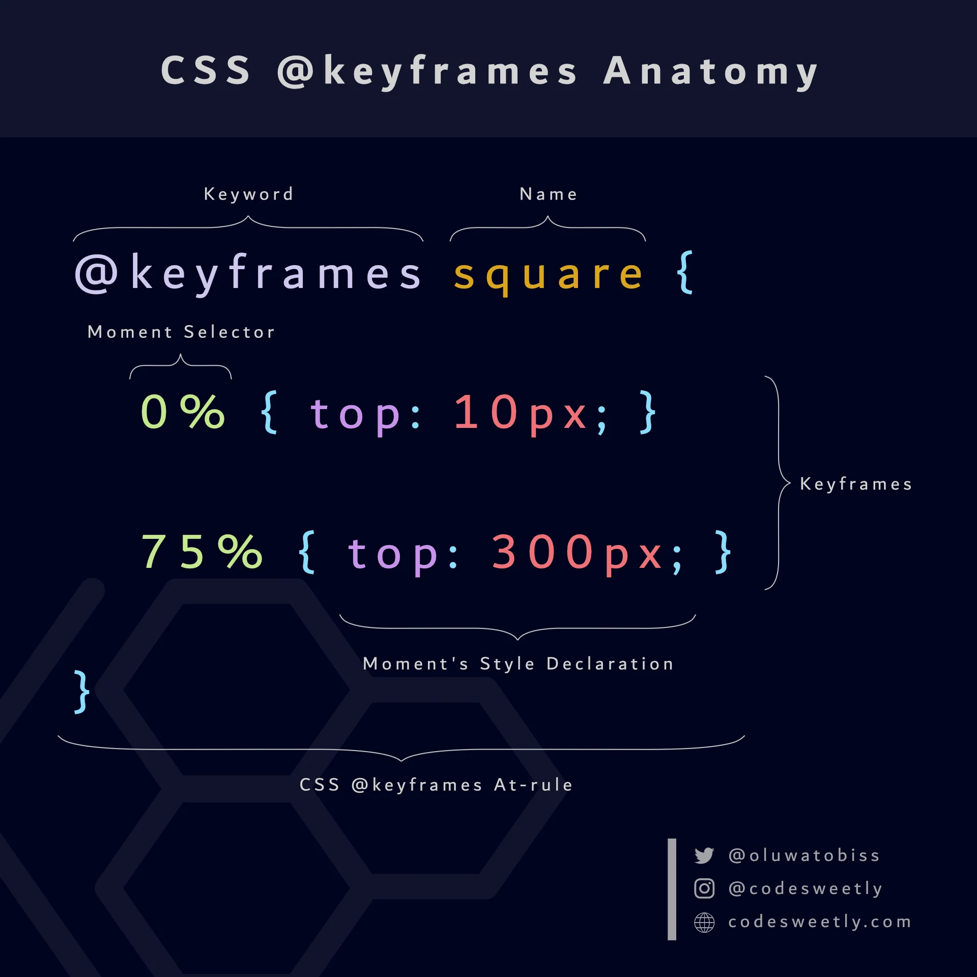
Take a look at the CSS code Claude generated for you. You should be able to find a block that starts with @keyframes followed by a name. This is your animation's core definition.
To see this in action, let's watch a quick video that explains how @keyframes are used to animate SVGs.
Make Awesome SVG Animations with CSS // 7 Useful Techniques
This clip from the Fireship YouTube channel provides a concise and practical example of defining a @keyframes animation and applying it to an SVG element.
Watch the segment from 09:22 to 10:18. Focus on how a named animation (fade-in-up) is defined with from (which is the same as 0%) and to (the same as 100%). Notice the properties being changed are opacity and transform.
The Properties of Motion: transform
As you saw in the video, two of the most powerful properties for animation are opacity and transform. While opacity is straightforward (it controls fading), transform is the real workhorse for motion. It allows you to move, scale, and rotate elements without disrupting the layout of the page.
Since your background is in design, you can think of these as the equivalent of the transform tools in Figma or Adobe Illustrator.
transform: translateX(100px);moves an element horizontally.transform: scale(1.5);makes an element 50% larger.transform: rotate(45deg);rotates an element clockwise.
You can even combine them, like transform: translateX(100px) rotate(45deg);.
Let's watch a brief overview of what transform can do.
Master CSS Animation Property in 11 Minutes [Full Tutorial] 🚀
This short clip from CSSnippets breaks down the most common uses of the transform property.
Watch from 01:54 to 03:08. You don't need to memorize the syntax, just appreciate that transform is the key CSS property we use inside our @keyframes to create movement, scaling, and rotation.
Your Turn:
Find the @keyframes block in your index.html file.
- What is the name of your animation?
- What CSS properties are being changed at each percentage step? (You'll likely see
transformand/oropacity).
3. The Performance Instructions: animation Properties
Defining a @keyframes storyboard is only half the job. You still need to tell an element to actually use it. This is done with a set of animation properties, which are applied to the CSS selector for your SVG element (e.g., #rocket-ship).
Think of these properties as the director's notes on the script:
| Property | Director's Note | Example |
|---|---|---|
animation-name |
"Perform the 'twinkle' scene." | twinkle |
animation-duration |
"The scene should last for 3 seconds." | 3s |
animation-timing-function |
"Make it smooth—slow start, fast middle, slow end." | ease-in-out |
animation-iteration-count |
"Do it forever." | infinite |
animation-delay |
"Wait 1 second before you start." | 1s |
animation-direction |
"Perform it, then do it in reverse." | alternate |
animation-fill-mode |
"Hold your final pose when you're done." | forwards |
This next video provides a fantastic walkthrough of these properties, explaining what each one does.
Master CSS Animation Property in 11 Minutes [Full Tutorial] 🚀
This tutorial from CSSnippets systematically explains each of the main animation properties. It's the perfect guide to understanding how to control your animation.
Watch from 05:20 to 07:15. As you watch, try to connect each property to the instructions you gave Claude in your prompt (e.g., your request for a 'gentle feel' corresponds to animation-timing-function: ease-in-out).
The Shorthand Property
Claude, like most developers, will almost certainly use the animation shorthand property to combine all these instructions into a single, efficient line of code. It can look a bit dense at first, but it follows a predictable order.
A typical shorthand might look like this:animation: twinkle 3s ease-in-out infinite;
Let's break that down:
twinkle:animation-name3s:animation-durationease-in-out:animation-timing-functioninfinite:animation-iteration-count
Your Turn:
- Find the CSS rule in your
<style>tag that targets the element you animated (e.g.,#star-01 { ... }). - Inside that rule, find the line that starts with
animation: .... - Based on the example above, try to identify what each value in that line is controlling.
For a handy reference, this guide provides a clear summary table of all the animation properties.
CSS Animation Properties Table
The W3Schools documentation is a classic, reliable resource for web developers. This page on CSS Animations includes a great summary table.
Scroll to the very bottom of the page to find the 'CSS Animation Properties' table. It's a perfect cheat sheet for remembering what each property does. It's a good idea to bookmark this page.
4. Visualize Your Animation with Browser Tools
Reading code is one thing, but as a visual person, you'll appreciate that you can see your animation's timeline directly in the browser. Chrome's DevTools have a powerful Animation Inspector that gives you a visual representation of your keyframes and easing curves.
Make Awesome SVG Animations with CSS // 7 Useful Techniques
The Fireship channel has another excellent tip: using the browser's built-in animation inspector. This tool is invaluable for debugging and understanding what's happening under the hood.
Watch from 02:25 to 03:00. After watching, try it yourself! Open your index.html in the browser, open DevTools (Right-click -> Inspect), and find the Animations tab to see your animation's timeline.
Using this tool will connect the abstract code you've been reading directly to the visual output you see on the screen, reinforcing your understanding.
Conclusion
You've successfully dissected the code that Claude generated. You're no longer just looking at a block of text; you can now see the underlying structure and understand the narrative of your animation.
Key Takeaways:
- A CSS animation consists of two main parts: the
@keyframesrule (the "storyboard") and theanimationproperties applied to an element (the "performance instructions"). - The
@keyframesrule defines what an element looks like at specific moments (0%,50%,100%) in the animation timeline. - The
animationproperties control the how—duration, easing, looping, and more. - Claude will likely use the shorthand
animationproperty, which combines these controls into a single line. - You can use your browser's developer tools to visually inspect and understand the animation timeline.
In our next lesson, we'll take this newfound understanding and put it into practice. Now that you can read the code, you're ready to modify it. We'll start making small, targeted edits to the CSS to refine the animation's timing, easing, and movement to better match your creative vision.