Recommended resources
The freely available resources this lesson will direct you to.
Hello! Welcome back to your journey into code-based motion design.
In our last lesson, you became an animation detective, learning to read and understand the CSS code that Claude generated. You can now identify the @keyframes storyboard and the animation properties that direct the performance.
Today, we move from detective to editor. You will modify basic animation parameters like duration, easing, and transform values directly in the CSS to refine the motion. This is the crucial step where you take an AI's output and infuse it with your own design sensibility. By the end of this lesson, you'll be comfortable tweaking code to make an animation faster, slower, smoother, or more subtle, bringing it closer to your creative vision.
Let's open your index.html file in VS Code and get ready to sculpt some code.
1. Controlling the Pace: animation-duration
The most fundamental parameter you'll tweak is duration. It controls the overall speed of your animation. A fraction of a second can be the difference between an animation that feels energetic and one that feels lazy or broken.
In your CSS, you'll find the duration value as part of the animation shorthand property. It's the value with s (seconds) or ms (milliseconds) at the end.
/* Example */


#my-element {
  /* The '3s' here is the duration */
  animation: slide-in 3s ease-out;
}
Your Turn: Experiment with Duration
- Find the
animationproperty for your animated SVG element in your CSS file. - Locate the duration value.
- Change it to something very fast, like
0.5s. Save the file and observe the change in your browser. - Now, change it to something slow, like
5s. Observe again.
Notice how dramatically this one value changes the entire feeling of the motion. But what makes a "good" duration? From a design perspective, it's about being perceptible but not wasteful of the user's time.
Tip 1: Make it shorter than you think it should be
For some excellent design-focused advice on this, let's read the first tip from Josh Collinsworth's article, 'Ten tips for better CSS transitions and animations'. He provides a great rule of thumb.
Read the first section, '1. Make it shorter than you think it should be'. Pay attention to the suggested range of 150–400ms and the idea that perception is more important than the technical value.
2. Sculpting the Feel: animation-timing-function (Easing)
As a designer, you're already familiar with easing—it's what gives motion its character and personality. In CSS, this is controlled by the animation-timing-function. This property dictates the rate of change of the animation over time.
You can use several keyword values:
linear: Constant speed. Feels robotic.ease-in: Starts slow, ends fast. Good for elements exiting the screen.ease-out: Starts fast, ends slow. Good for elements entering the screen.ease-in-out: Starts and ends slow. A good all-rounder.ease: The default. Starts fast, then slows down more gradually thanease-out.
This image gives you a great visual representation of how these curves behave.
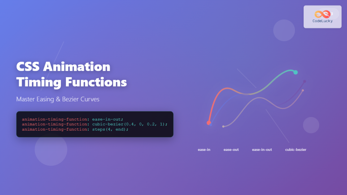
Let's see a quick video explanation of these common values.
Learn CSS Animations in 9 Minutes
This short segment from the 'Learn CSS Animations in 9 Minutes' video gives a clear, concise overview of the standard timing functions.
Watch from 03:30 to 04:21. The narrator makes a great connection to video editing, which should resonate with your understanding of motion principles.
Custom Easing with cubic-bezier()
While the keywords are useful, the real power comes from defining your own easing curve with the cubic-bezier() function. This is analogous to editing Bezier curves with the Pen Tool in Figma or Illustrator. It gives you precise control over the animation's feel.
A cubic-bezier curve is defined by four numbers that specify the coordinates of two control points on a graph. You don't need to memorize what the numbers mean, but you do need to know that this is how you create unique, custom easing.
An Interactive Guide to CSS Transitions
For a more interactive look at how timing functions work and an introduction to cubic-bezier, Josh Comeau's guide is fantastic. He uses interactive examples that let you feel the difference.
Read the sections 'Timing functions' and 'Custom curves'. Play with the interactive examples to get a visceral sense of how each timing function affects the motion.
3. Adjusting the Motion: transform Values
So far, we've adjusted the how and when. Now, let's adjust the what. The transform properties inside your @keyframes rule control the actual movement, scaling, and rotation. If an animation feels too dramatic or too subtle, this is where you make your changes.
For example, if Claude generated this:
@keyframes slide-in {
  from {
    transform: translateY(100px);
    opacity: 0;
  }
  to {
    transform: translateY(0);
    opacity: 1;
  }
}
The animation moves the element up by 100 pixels. If that feels too extreme, you could change translateY(100px) to translateY(20px) for a more subtle effect. This "less is more" approach often leads to more polished and professional results.
Let's return to Josh Collinsworth's article for his advice on this exact topic. He provides a great visual comparison.
Read the section '4. Less is more'. Pay close attention to the embedded CodePen demo comparing a pronounced animation to a subtle one. This directly illustrates the impact of tweaking transform and opacity values.
Your Turn: Tone Down the Motion
- Go to the
@keyframesrule in your CSS. - Find a
transformproperty (e.g.,scale(2),rotate(90deg),translateX(50px)). - Reduce its value significantly (e.g., change
scale(2)toscale(1.1)). - Save and observe. The animation should now feel more restrained and subtle.
4. The Live-Editing Workflow: Using Browser DevTools
Reading about these properties is one thing, but the most effective way to refine an animation is to do it visually and get immediate feedback. Your browser's built-in developer tools are your best friend here. The Animation Inspector lets you modify all these parameters in real-time.
This is the core workflow for a designer tweaking code:
- Inspect the animation in the browser.
- Modify the values live until it feels right.
- Copy the final values back into your code in VS Code.
Let's watch a video that demonstrates this powerful workflow.
How to inspect animations #DevToolsTips
This video from the Chrome for Developers channel is a complete guide to using the Animation Inspector. It's the most important tool you'll use for this part of the process.
Watch from 00:48 to 03:23. This covers everything from opening the panel to modifying timing, duration, and easing curves. As you watch, try to follow along with your own animation.
Your Turn: Refine Your Animation Live
Now, let's put it all together.
- Make sure your animation is running in your browser.
- Open the Animation Inspector:
- Right-click on your page and select "Inspect".
- In the DevTools panel, click the three-dot menu, go to "More tools," and select "Animations."
- Slow it down: In the Animations panel, change the speed from 100% to 25% to see the details more clearly.
- Tweak the easing:
- You'll see a representation of your animation on a timeline. Click the little curve icon next to the timing function (e.g.,
ease-in-out). - A
cubic-beziereditor will pop up. Drag the handles to change the curve and watch your animation update live. Experiment until you find a feel you like.
- You'll see a representation of your animation on a timeline. Click the little curve icon next to the timing function (e.g.,
- Adjust the duration: Drag the ends of the animation block in the timeline to make it shorter or longer.
- Copy your changes: The DevTools will generate new values for
animation-durationandanimation-timing-function(as acubic-beziervalue). Copy these new values from the "Styles" panel and paste them over the old values in yourstyletag in VS Code. - Save your
index.htmlfile. Your refined animation is now permanently part of your code!
Conclusion
Congratulations! You've officially moved from a director to a hands-on editor. You now possess the fundamental skill for this workflow: taking AI-generated code and refining it to meet a specific creative standard.
Key Takeaways:
- Duration (
animation-duration) controls the speed. Often, shorter is better. - Easing (
animation-timing-function) controls the feel. Usecubic-bezier()for custom curves, and tweak them visually in the browser. - Transform values (inside
@keyframes) control the magnitude of the motion. Subtle changes often look more polished. - The Browser Animation Inspector is your primary tool for visual, real-time feedback and refinement.
You now understand that refining code-based animation is an iterative loop of observing, tweaking, and saving. In our next lesson, we'll expand on this idea of iteration. You'll learn how to provide targeted feedback to Claude in subsequent prompts, guiding the AI to make the revisions for you.