Recommended resources
The freely available resources this lesson will direct you to.
- Fixing the UX Case Study: Reviewing Isha's shopping experience on the DailyObjects appwww.youtube.com
- Why good UX comes from Business goalswww.youtube.com
- Ecommerce Checkout Optimization: Complete Guide (2026) - Shopifywww.shopify.com
- What are Functional Requirements? - Interaction-Design.orgwww.interaction-design.org

Welcome back. In the previous lesson, you followed a human-centred process for improving delivery choices at checkout: investigate the difficulty, define the problem, explore options, and test what shoppers understand. Today we will look at the same feature from another angle. A promising design must help the shopper, serve a legitimate business aim, and work within the product’s actual capabilities.
This is useful interview territory. You may already be comfortable explaining a screen’s hierarchy and interaction states. Here, the challenge is to explain why that screen is worth building and what you would need to check before promising it will work.
Three views of one checkout problem
Imagine a store whose checkout offers “Standard” and “Express” delivery. The team has noticed that shoppers leave during the delivery step. As we established last lesson, that observation identifies a place to investigate, not a cause. For this lesson, suppose the team is considering whether clearer information about timing and cost would help.
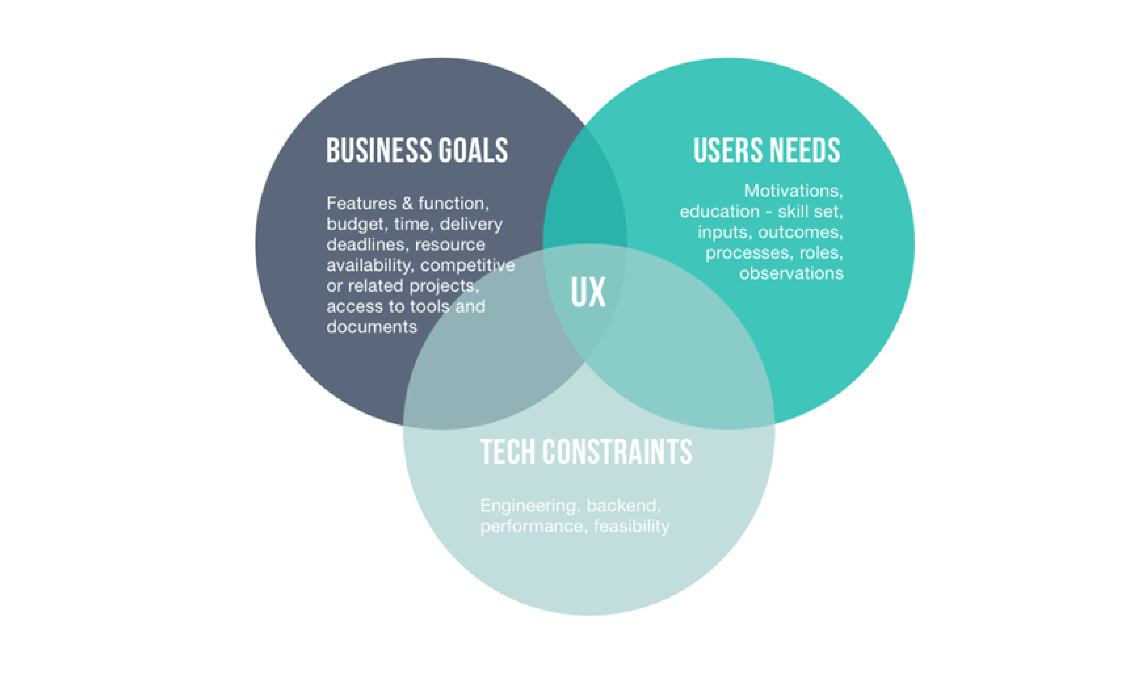
The circles are not three votes that always carry equal weight. They are three questions you must answer before recommending a design:
- User goal: What is the shopper trying to accomplish? For example: “Choose delivery that will arrive in time, at a total cost I understand.”
- Business goal: What worthwhile result is the store seeking? For example: “Help shoppers who intend to buy complete checkout,” without creating misleading promises or costly delivery complaints.
- Technical constraints: What can the checkout and delivery systems actually calculate, display, and keep accurate? For example: “Shipping rates become available only after a shopper enters an address.”
Notice the different levels of each statement. “Show arrival dates in large type” is a design proposal, not a user goal. “Increase purchases” is a business goal, not evidence about why shoppers leave. “The shipping system needs an address to return a rate” is a technical constraint, not a reason to abandon the shopper’s need for clarity.
Read the selected parts of Shopify’s Ecommerce Checkout Optimization guide for two useful distinctions: why upfront costs matter to shoppers, and why a drop-off at one checkout step calls for investigation rather than an immediate visual fix. Allow about 7 minutes.
Ecommerce Checkout Optimization: Complete Guide (2026) - Shopify
Shopify’s guide connects checkout friction to both shopper concerns and commercial outcomes. Read these short passages as background for the delivery example, not as proof of what happens in our hypothetical store.
Under “1. Make checkout faster to complete,” find the subsection “Show all costs upfront.” Read the cost passage, beginning with the sentence about unexpected costs and ending with the examples of charges revealed late. Focus on the difference between a shopper understanding the total and merely seeing a more prominent delivery button. Then go to “How to measure and improve checkout performance,” under “Checkout funnel metrics to track.” Read the funnel passage, from its opening sentence through the example of a steep fall at the shipping step. Focus on what this information can locate—and what it cannot explain.
A business measure might be the share of people who start checkout and complete an order. That is not the same as overall site conversion, which includes people who never entered checkout. Neither number, on its own, tells you whether delivery information caused a change. If the team sees a drop at the delivery step, it should also examine shopper behaviour and other possible causes, such as fees, unavailable options, or errors.
What does the technology allow you to promise?
Let us make the example more concrete. Suppose an engineer explains that the store can calculate shipping cost after receiving a delivery address. The carrier supplies a transit-time range after dispatch, but the store cannot yet calculate a dependable dispatch date for every order.
Those are hypothetical conditions for our analysis, not facts about a real store. They matter because a screen that says “Arrives Friday” would imply knowledge the system does not have. Better typography cannot make that promise reliable.
The Interaction Design Foundation explains constraints as conditions that shape how a solution must work. Read its discussion of constraints, including technology choices and qualities such as reliability and performance. Allow about 6 minutes.
What are Functional Requirements? - Interaction-Design.org
The Interaction Design Foundation’s discussion helps separate a desired checkout function from the conditions under which that function must operate.
Find “What are Constraints?” and begin at the explanation that constraints are conditions and limits. Continue through the subsections “Technology Constraints” and “Quality of Service Constraints,” ending at the example of a measurable task-completion requirement. As you read, distinguish what the delivery feature should do from how reliably it must do it.
For our feature, “display delivery choices and their prices” describes something the system should do. “Do not present an uncertain arrival day as guaranteed” describes a reliability requirement that limits how the feature should behave. “Calculate rates only after an address is entered” describes a system dependency the interface must accommodate.
A designer does not need to guess the shipping architecture. The productive questions for an engineer or delivery specialist are specific:
- What information is needed to return a shipping price and eligible options?
- Can the system provide an arrival date, or only a transit-time range after dispatch?
- What happens when a rate cannot be returned or an estimate changes?
These questions protect the shopper as well as the business. A confident but unreliable date might help someone choose an option in the moment, yet leave them with a late order and less trust in the store.
Compare proposals against all three views
Now consider three possible responses to the checkout problem.
| Proposal | What it might help | What needs checking |
|---|---|---|
| Make “Express” visually prominent | Shoppers may notice an available option. | Does prominence address their uncertainty about arrival and total cost? |
| Show a guaranteed arrival day for every option | Shoppers could compare dates easily. | Can the system actually support that guarantee for every eligible order? |
| Show the calculated price after address entry and state timing at the level of certainty available | Shoppers can compare options without being given a false promise. | Is the wording understandable, and does the information arrive early enough to help them decide? |
The third proposal is not automatically the winner. It is simply better aligned with the capabilities we have assumed. If the team later confirms that dependable arrival dates are available, it could consider showing them. If shoppers still cannot understand a dispatch-relative range, the team would need to investigate that difficulty rather than declare the wording solved.
This is where UI skill becomes part of a broader decision. You could make a cost and timing comparison easy to scan, keep the selected option unmistakable, and show a useful state while a rate is loading. But first you need to know which information is accurate and which uncertainty must remain visible.
The following interview-style critique illustrates what happens when the link between a user difficulty, a business objective, and proposed changes is unclear. The case concerns shopping add-ons rather than delivery; watch for the reasoning question, not a layout technique to copy. Allow about 4 minutes.
Fixing the UX Case Study: Reviewing Isha's shopping experience on the DailyObjects app
In “Fixing the UX Case Study,” UX Anudeep reviews an e-commerce project and presses the designer to connect specific changes to the stated shopper problem and business objective. It is a useful example of the kind of follow-up question an interviewer may ask.
Watch the case critique. Notice how improving the ability to undo an add-on relates to a shopper difficulty, while changes elsewhere in the shopping journey need their own explanation. The video does not establish any technical constraints for our delivery example; use the three-view analysis above to supply that missing check yourself.
The lesson from the critique is not “mention a business metric beside every screen.” It is to make a credible connection. For delivery, the reasoning might be: If shoppers need to compare timing and cost but cannot do so from the information shown, clearer, trustworthy information may help them make a choice and proceed. That is a hypothesis, not a measured outcome. Observation could check the shopper difficulty; a technical discussion could check whether the information can be supplied; performance after release could help assess the business result.
Put the analysis into interview language
When asked how you would approach an e-commerce problem, you can make your reasoning audible without claiming experience or results you do not have:
“If shoppers were leaving at the delivery step, I would not assume the labels were the cause. I would look at the checkout evidence and learn what shoppers need to decide, such as arrival timing and total cost. I would clarify the business aim—helping intended buyers complete checkout—and check with engineering what rates and estimates the system can reliably provide. Then I would compare possible designs, test whether shoppers understand them, and avoid promising a date the system cannot support.”
That answer does three things an attractive final screen cannot do alone: it separates evidence from assumptions, connects the shopper’s task to a business aim, and treats technical feasibility as part of the design problem. You can use the same structure when discussing genuine UI projects, while being precise about which UX activities you did and which you would propose.
Key takeaways
An e-commerce design problem is not fully analysed when you have identified a shopper pain point or a commercial target alone. Ask what the shopper must accomplish, what outcome the business seeks, and what the product can reliably deliver. Then distinguish the evidence you have from the assumptions you still need to check. In our delivery example, a clear, honest comparison may be more useful than a persuasive-looking promise the system cannot keep.
Next, you will apply this questioning habit before visual design begins: given a wireframe, you will identify the UX assumptions it contains and the questions that need answers.