Recommended resources
The freely available resources this lesson will direct you to.
- The UX Design Process explained step by step with a mobile app projectwww.youtube.com
- UI UX Audit & Analysis Tutorial | GYMSHARK Case Study Included | 2022www.youtube.com
- User-Centered Design: Principles and Examples of UCD – Baymardbaymard.com
- The 5 Stages in the Design Thinking Process | IxDFwww.interaction-design.org
Welcome back. Last lesson distinguished UI design’s focus on the interface from UX design’s broader responsibility for understanding and improving an experience. Now we’ll follow that broader work through a familiar example: how a shopper chooses a delivery option during checkout.
The aim is not to memorise a diagram for an interview. It is to explain how you would move from an uncertain problem to a design decision you have tested—and to say clearly which parts of your example are hypothetical rather than work you have already done.
Start with the shopper’s task, not the screen
Imagine a team notices that some shoppers leave checkout at the delivery step. A UI response might be to make the delivery choices more prominent. That could help, but it assumes the problem is visibility. Shoppers might instead be unsure of the arrival date, surprised by the cost, or unable to compare their options. Checkout abandonment tells the team where to investigate; it does not, by itself, tell them why people leave.
A human-centred process keeps the shopper’s goal in view: Can I choose an option that gets this order to me when I need it, at a cost I understand? The team investigates that question before committing to a screen design.
The five-stage design-thinking model gives useful names to the kinds of work involved:
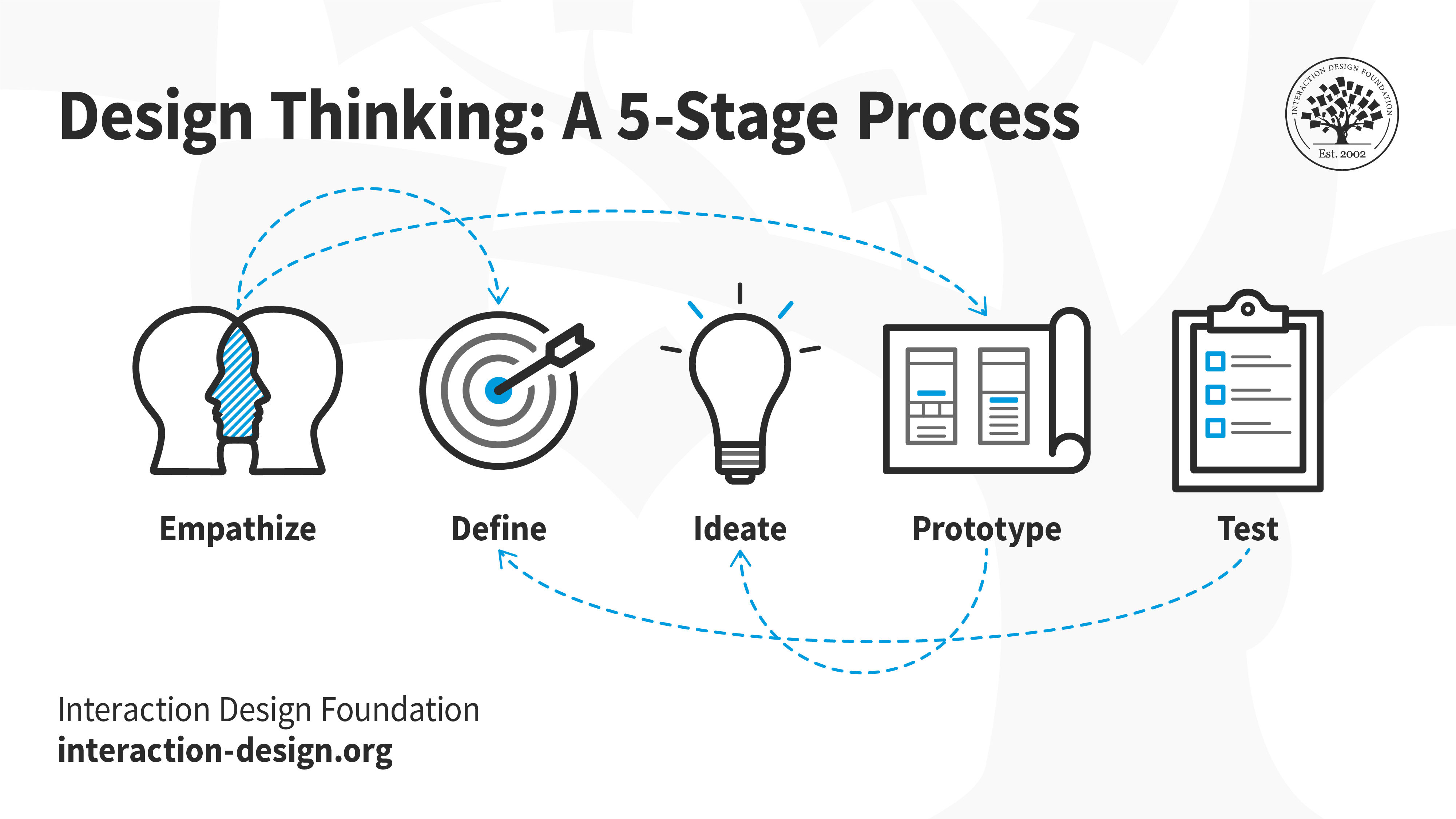
Read the Interaction Design Foundation’s introduction to the stages and its explanation of why they are flexible. Allow about 4 minutes.
The 5 Stages in the Design Thinking Process | IxDF
The Interaction Design Foundation introduces the five-stage model and explains why it should not be treated as a rigid checklist.
In “What are the 5 Stages of the Design Thinking Process,” read from the opening explanation through the five-item stage list: the five stages. Then go to “Did You Know Design Thinking is a Non-Linear Process?” Read from its opening paragraph, which begins by describing a direct and linear process, through the paragraph explaining how later knowledge can inform earlier work: the flexible process. Focus on what each stage helps you learn, not on remembering a compulsory order.
For the delivery example, empathising means learning what information shoppers seek and when they seek it. Defining means stating the specific difficulty the team has evidence for. Ideating means considering more than one way to address it. Prototyping makes a promising approach concrete enough to evaluate. Testing reveals what people actually understand and do. A test may show that the original problem statement was incomplete; returning to research or definition is progress, not failure.
Investigate, then define the problem
Suppose the team suspects that delivery choices are confusing. It could examine where people stop in the existing checkout, review relevant customer-support questions, and observe shoppers attempting to buy something they need by a particular date. Each source answers a different question. Checkout data may show where people leave; support messages and observation may help explain what is difficult. The team should not describe its suspicion as a research finding.
Baymard’s guide offers a user-centred research-and-improvement cycle, followed by an e-commerce example directly relevant to delivery choices. Allow about 8 minutes.
User-Centered Design: Principles and Examples of UCD – Baymard
Baymard describes a research, ideation, validation, and improvement cycle, then shows why delivery information matters in an actual e-commerce example.
In “The User-Centered Design Process,” read from the introductory paragraph through the end of “4. Improvement,” stopping before the sign-up invitation: the four steps. Focus on how learning about users and validating a design connect to later improvement. Then, under “User-Centered Design Examples,” find “6. Amazon Date of Delivery (Desktop).” Read that subsection from its first paragraph, beginning “Sites like Amazon that display delivery dates,” to the paragraph ending with customer-service inquiries and dissatisfied customers: the delivery example. Notice the difference between a shipping-speed label and information about the date a shopper expects the order to arrive.
Baymard reports that shoppers in its usability testing had trouble comparing options expressed as shipping speeds rather than delivery dates. That is useful evidence about a common pattern, not proof that it causes abandonment in our hypothetical store. We would still need to understand this store’s shoppers and checkout.
Imagine that observation in our example shows shoppers repeatedly trying to calculate an arrival date from labels such as “standard shipping” and “express shipping.” A provisional, human-centred problem statement might be:
“Shoppers choosing delivery need to understand when each option is likely to arrive and what it will cost. In the checkout we observed, speed labels make the arrival date difficult for them to judge.”
The qualification matters: this statement is appropriate if observation supports it. It names a user and a difficulty without prescribing a design. “Add a delivery-date badge” is a possible solution, not the problem. “Increase checkout conversion” is a business aim, not an account of what the shopper needs. The next lesson will look more closely at how to consider user goals alongside business goals and constraints.
Explore options before refining the UI
Once the problem is reasonably clear, the team can ask where arrival information would be most useful. It might sketch several possibilities: an estimate in the cart, expected arrival dates beside delivery choices, or a way to compare cost and timing together. The point of ideation is not to produce a large number of attractive screens. It is to avoid treating the first plausible layout as the only answer.
The following video uses a mobile shopping product page, rather than checkout, to show this wider workflow in practice. Its “double diamond” labels differ from the five-stage diagram, but the underlying moves are familiar: investigate broadly, narrow the problem, explore options, and evaluate what to deliver. Allow about 6 minutes for the selected portions.
The UX Design Process explained step by step with a mobile app project
Watch “The UX Design Process explained step by step with a mobile app project” by chunbuns for a practical example of moving from a broad e-commerce brief toward tested design choices.
Watch the project brief to see why “redesign the product page” is too broad to act on immediately. Watch discover and define for the discussion of current experience, evidence, and selecting a focus; this range also introduces exploring design options. Skip the intervening product promotion, then watch sketch and evaluate for a layout example and the discussion of evaluation and revision. As you watch, distinguish information about a problem from an idea for solving it.
For our delivery example, the team could choose one or two promising approaches and make low-fidelity prototypes: perhaps simple checkout screens that let a shopper move from their cart to the delivery choice. The prototype needs enough realistic information—options, costs, and arrival estimates—to expose the decision being tested. It does not yet need a polished visual system.
This is a useful shift from a UI-first workflow. Your interface-design skills still matter: legible costs, clear selection states, and effective hierarchy will affect whether the solution works. But polishing those details after identifying the question makes the work more purposeful. If the question is “Can shoppers compare arrival dates?”, a beautiful delivery card that omits the date cannot answer it.
Test what people understand, then respond
The team can ask people representative of the intended shoppers to use the prototype in a realistic situation: they need to choose delivery for an order they want soon. Rather than pointing out the new arrival-date information, the team watches what people notice, which option they choose, whether they hesitate, and what they think the delivery promise means.
Behaviour and interpretation are different. “A participant paused at the delivery choices and went back to the cart” describes an observation. “The participant found the delivery choices confusing” is an interpretation that needs checking. Perhaps they were looking for the order total instead. Observing the pause gives the team a reason to ask and investigate, not permission to assume the cause.
Test findings can lead to different next moves. If shoppers miss an arrival estimate that is present, the team might revise its placement or wording and test again. If they notice it but distrust it, changing its colour is unlikely to address the real issue; the team may need to learn what makes a delivery estimate credible. If shoppers readily choose an option in a prototype, that is encouraging usability evidence—not a guarantee that a released change will improve sales. Later, the team can also examine how the experience performs in use.
An interview explanation can be concise without making the process sound mechanical:
“I would begin by understanding where shoppers struggle with delivery choices, using available checkout evidence and observation rather than assuming the screen is the problem. If the evidence showed that people cannot judge arrival dates from shipping-speed labels, I would define that as the user problem, explore a few ways to present timing and cost, and prototype the strongest options. I would watch shoppers choose delivery without directing them to the new information, then revise the design based on what they actually do. This is how I would approach the example; I would not present hypothetical findings as research I had conducted.”
That answer explains why each activity follows from the question at hand. In a real interview, you could then distinguish this practice approach from any related decisions you made in your professional UI work.
Key takeaways
Human-centred design begins with the person’s task, not an assumed screen fix. For the delivery-choice example, the process is to investigate the difficulty, define it in user terms, explore possible responses, prototype enough to learn, and test how people actually make the choice. The stages are flexible modes of work: testing can reveal that you need to reconsider an earlier assumption.
Next, we’ll examine an e-commerce problem through three connected lenses—user goals, business goals, and technical constraints—so you can explain not only whether a design is usable, but how a team might choose what to pursue.