Recommended resources
The freely available resources this lesson will direct you to.
- Assumptions: How to Track Them in the UX Design Processwww.youtube.com
- My Uber Whiteboarding UX Challenge // How to approach design whiteboarding exerciseswww.youtube.com
- What are Assumptions? — updated 2026 | IxDFwww.interaction-design.org
- Identifying and Validating Assumptions and Mitigating Biases in User Research :: UXmatterswww.uxmatters.com
Welcome back. Last lesson, you examined an e-commerce problem through user goals, business goals, and technical constraints. You also separated what a team knows from what it merely suspects. Now you will apply that distinction to a wireframe.
A wireframe can look ready for visual polish while leaving important UX decisions unresolved. Today you will inspect a supplied booking wireframe, identify the assumptions behind it, and turn those assumptions into questions that a team can answer before committing to visual design. This is also useful in an interview: instead of immediately redesigning a screen, you can show how you decide what the screen needs to do.
Start with what the wireframe actually shows
Spend a minute looking at the two mobile screens. The left screen has placeholder text, two generically named options, fields labelled “Where,” “When,” and “Guests,” a checkbox, and a bottom button. On the right, the options have become “Hotels” and “Flights.” Hotels appears selected; “Flights” is outlined and circled by a drawn annotation. The fields contain more specific examples, including “Check-in - Check-out” under “When.”
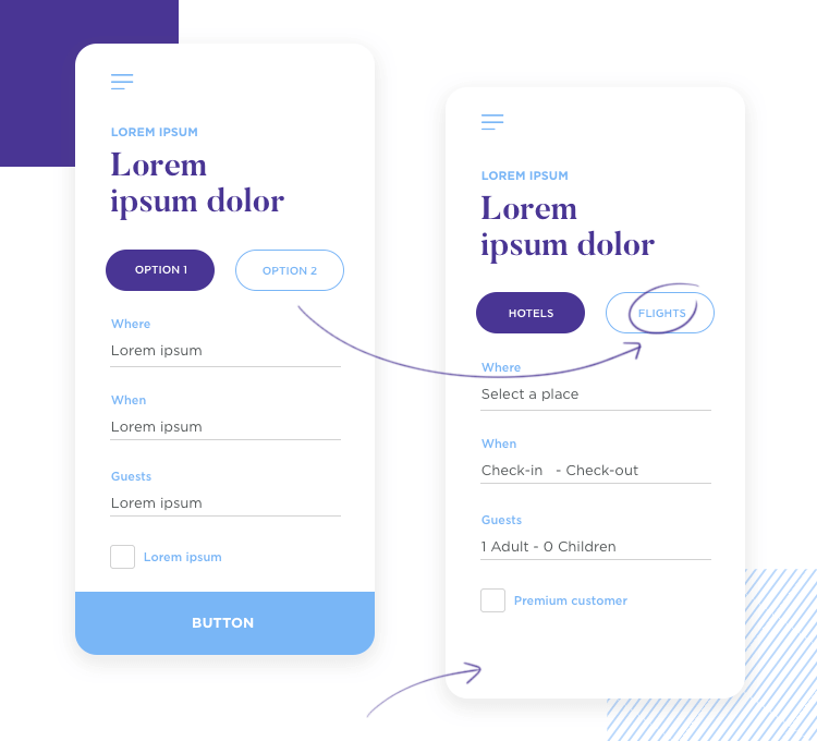
That last distinction matters. The arrow and circle draw your attention to “Flights,” but they do not prove what happens when someone taps it. Nor do these screens tell you why people are using the form, where the button leads, or whether the fields represent real product requirements.
A useful first pass has three parts:
| What you can observe | What you might infer | What you still need to know |
|---|---|---|
| The right screen names two options: Hotels and Flights. | The form may serve two booking tasks. | Does choosing Flights change the fields, and if so, how? |
| “When” says “Check-in - Check-out.” | The visible fields may be intended for hotel stays. | What dates does each booking type require? |
| The left screen shows a bottom button. | Users may submit or continue from this form. | What does the action do, and is there a corresponding action on the right screen? |
Observation is not the same as a product fact. Even the inference that users can book flights is provisional: the wireframe shows a Flights option, not the full flight experience. This discipline prevents a common critique mistake—confidently describing behaviour that the design has not specified.
Recognise the assumption beneath a design choice
An assumption is a belief being used to make a design decision without enough evidence yet to treat it as established. Assumptions are normal; leaving consequential ones invisible is the problem. Read the definition and examples in the Interaction Design Foundation’s Assumptions in UX/UI Design. Allow about 5 minutes.
What are Assumptions? — updated 2026 | IxDF
Read the Interaction Design Foundation’s explanation to distinguish an assumption from an observed fact, then use its examples to widen your scan beyond the visible controls.
In “What are Assumptions in UX/UI Design?”, read the definition. In “How to Understand Design Assumptions,” read the warning about treating beliefs as facts. Then, in “Examples of Assumptions in UX Design,” scan the examples from user needs through accessibility. You can skip the embedded-video transcript notices; focus on the categories of things a team might be taking for granted.
Return to the booking wireframe. If a designer proceeds to style the “Hotels / Flights” control, they might be working from the assumption that people understand they must choose a booking type before entering details. If they style “Where” as a single input, they might be assuming one place is sufficient to begin either task. Both are more useful than saying, “I assume the design will be easy to use,” because each points to a specific decision the team can examine.
To make an assumption actionable, write it in a form that could be wrong:
Assumption: People choosing Flights can understand and start their booking using the information requested by this form.
Then ask what the screen would need to do if that belief is wrong. Perhaps flight search needs departure and destination locations rather than one “Where” field. That is a possibility to investigate, not a finding about these users or a specification to implement immediately.
Your UI experience helps you notice ambiguity in labels, states, and hierarchy. The UX step is to ask which underlying beliefs produced those choices. Making “Flights” more visually prominent, for example, would not resolve uncertainty about what selecting it actually changes.
Turn visible decisions into a question list
A productive wireframe review does not try to invent a complete product from two screens. It identifies the decisions that the team cannot safely make yet. For this example, you can work across the user’s task, the form’s behaviour, and the product rules.
| Wireframe detail | UX assumption it may contain | Question to resolve |
|---|---|---|
| Hotels and Flights share one starting screen. | People arriving here have not already chosen a booking type, and both tasks belong at this entry point. | Where do people come from, what are they trying to book, and is the choice needed here? |
| Hotels appears selected on the right. | A default selection helps rather than sending people down the wrong path. | Is Hotels intentionally the default? What happens if someone starts entering details and then changes to Flights? |
| One “Where” field appears. | The meaning of “Where” is clear for the selected task. | For each booking type, what location information is required, and how do people understand the label? |
| “When” shows “Check-in - Check-out.” | The date field changes or means something appropriate when Flights is selected. | What date choices are required for each type, and what would the Flights state display? |
| “Guests” shows adults and children. | These are the right people-related details to request at this point. | Which details are essential for an initial search, and can they be changed later? |
| The checkbox says “Premium customer.” | People understand what checking it means and why it belongs in this task. | Is this an eligibility declaration, a filter, or something else? Is it needed before searching? |
| The left screen has a bottom button. | The next action and its result will be clear. | What is the action called, where does it lead, and what happens if required information is missing? |
This is a question list, not a claim that every element is faulty. A team may already have answers in existing research, product requirements, or working software. If so, record those answers and their source. If not, the uncertainty remains visible rather than being hidden inside a polished screen.
Also notice what the wireframe cannot establish. The bottom action is visible on the left; a corresponding action is not visible in the portion of the right screen shown. It would be inaccurate to say that the right-hand design has no button. The useful question is whether and how someone continues from that state.
The same care applies to accessibility. A coloured selection treatment is visible, but the image does not establish how the control works with a keyboard, screen reader, or touch target. You can ask how the selected option will be communicated and operated without claiming that the wireframe has already failed an accessibility test.
UXmatters offers a concise way to move from a team’s beliefs to things it can investigate. Allow about 4 minutes for the section below.
Identifying and Validating Assumptions and Mitigating Biases in User Research :: UXmatters
Read the “Identifying Your Team’s Assumptions” section of this UXmatters article for a practical way to turn a discussion about a design into answerable questions.
Under “Identifying Your Team’s Assumptions,” begin with the paragraph opening “Assumptions and prejudices or bias are always present in projects.” Read the discussion and four steps, ending with step 4’s suggestion that new understanding may reveal further questions. Focus on the move from listing beliefs, to phrasing questions, to choosing a way to answer them; stop before “Double-Blind Testing Versus Mitigating Bias.”
The questions in our table deliberately use different verbs. “What is required?” may need a product or engineering answer. “How do people understand it?” needs evidence about users. One method will not answer every question.
Decide which answers you need before polishing
A long question list can delay progress unless you distinguish design-defining unknowns from details that can be refined later. For this wireframe, the booking type and required inputs come first. If Hotels and Flights require different information, that affects the form’s structure, labels, and interaction—not just its colour or spacing. The next action also matters: visualising a primary button is premature if nobody knows whether it searches, continues to another step, or submits a booking.
By contrast, the exact wording of a secondary description might be refined after the team understands the task. The “Premium customer” checkbox may become urgent if it changes which results people can see; if it is optional and unrelated to the initial search, the team might defer its detailed treatment. Priority depends on the consequence of being wrong, not merely on how noticeable a detail looks.
The Interaction Design Foundation suggests weighing an assumption’s impact, uncertainty, and the feasibility of checking it. Read its short prioritisation answer for about 3 minutes.
What are Assumptions? — updated 2026 | IxDF
Return to the same Interaction Design Foundation resource to help decide which unanswered questions should influence the design first.
Find the question “How should you prioritize assumptions for testing in a design project?” Read its answer, stopping before the following Master Class link. Focus on why a high-impact, uncertain assumption deserves attention before a low-impact detail.
For this booking example, an early resolution plan might be:
- Clarify the intended task with the product team. Is this an entry point for searching hotels, flights, or both? What should happen after the primary action?
- Confirm the product rules with relevant specialists. Which fields are required for each booking type? Can entered information be retained when someone switches types? What does “Premium customer” change?
- Check the user-facing uncertainties with people doing the task. Do they notice the booking-type choice, understand the field labels, and know what action they are about to take?
The plan does not presume that every question needs a new study. Existing evidence may answer some of them. Nielsen Norman Group’s short video, Assumptions: How to Track Them in the UX Design Process, shows how a team can keep unresolved questions available to collaborators rather than relying on memory. Allow about 2 minutes.
Assumptions: How to Track Them in the UX Design Process
Watch Nielsen Norman Group’s “Assumptions: How to Track Them in the UX Design Process” for a practical habit: record unknowns that could change a design decision, then actively seek answers.
Watch the questions file to see what belongs on the shared list. Continue through ways to answer, including available metrics and subject-matter expertise. Finish with unresolved gaps to see what to do when those sources cannot provide an answer. Consider which booking-form questions need a product answer and which need evidence from users.
This does not mean visual work must stop until every uncertainty disappears. It means the team should not lock in a visual solution that depends on an unanswered, consequential question. You could explore styles while marking the Flights state as provisional; you should not present a finished flight-booking form as though its required inputs had been confirmed.
In an interview, you can communicate this approach plainly:
“I can see a Hotels and Flights choice, but the wireframe does not show what happens when Flights is selected. Before refining the visuals, I’d clarify the task and required fields for each booking type. I’d also check whether people understand the choice and the next action. Then I could design the selected, changed, and incomplete states around confirmed requirements rather than guessing.”
That answer identifies evidence you have, an assumption you do not treat as fact, and specific ways to resolve it.
Key takeaways
A wireframe shows proposed elements, not proof of user needs or completed behaviour. Start by naming what is visible. Then state the beliefs those elements seem to rely on, turn consequential beliefs into answerable questions, and identify who or what could answer each one. Resolve the questions that could change the form’s structure and core task before committing to visual design; keep any remaining uncertainty explicit.
This completes the module’s shift from UI execution toward UX and product thinking. Next, you will begin a practice research project by forming a focused question about an e-commerce user problem—one way to investigate the kinds of assumptions you have learned to uncover.