Recommended resources
The freely available resources this lesson will direct you to.
Hello! In the last lesson, you distinguished questions about what happened from questions about why it happened, what may happen next, and what an action would change. Before answering any of them, you need to know exactly what the number in the answer means.
“Late deliveries rose to 12%” sounds precise, but it leaves several questions open. Twelve percent of which orders? Late relative to which deadline? Assigned to the week an order was placed or the week it was promised? This lesson shows you how to define a business metric so that another analyst could calculate the same number: specify its formula, grain, dimensions, and reporting window. We will use the delivery question from earlier lessons, then transfer the method to another sector.
A metric is a calculation with a meaning
A business metric is not just a column in a dataset or a number on a dashboard. It is a repeatable calculation tied to a business concept. “Number of late orders” and “late-delivery rate” describe related but different things: the first is a count; the second puts that count in the context of an eligible population.
Watch the short explanation in What are Dimensions and Measures? by ness-intricity101. It introduces the vocabulary we will use, especially the distinction between a numerical measure and the categories used to group it.
What are Dimensions and Measures?
What are Dimensions and Measures? by ness-intricity101 gives a compact introduction to measures, dimensions, and data grain.
Watch dimensions and measures for the distinction between grouping attributes and quantities. Continue with grain, focusing on the question of how detailed a record is. The video discusses data grain; below, we will also specify the grain at which a metric is reported.
Read the opening and “In depth” sections of What Is a Metric? from PowerMetrics, followed by its “Pro tip” under “In depth.” Treat its list of components as a definition to document, not merely a checklist for choosing a chart.
What Is a Metric? Definition, In-Depth & Examples | PowerMetrics
PowerMetrics describes a metric as a calculation whose rules allow people to compare results consistently. Read it to see why a metric definition acts as a shared contract.
Start at the opening definition beneath “Metric” and read through the bullet list in “In depth,” from the core definition. Then, still under “In depth,” read from the paragraph beginning “Clear definitions let different teams” through the “Pro tip” paragraph ending “where teams can find it”: documentation guidance. Notice that filters and scope are part of the definition even though they may not appear in the metric’s name.
A useful way to begin a definition is to complete this sentence: “For each ___, report ___ for ___, using ___.” The blanks force you to identify a reporting unit, a calculation, a population, and a period. The rest of this lesson makes each choice explicit.
Start with the formula—and the population behind it
Suppose a delivery team wants to monitor the share of two-day orders that missed their promised deadlines. A first formula is:
The arithmetic is simple; eligible and late carry most of the meaning. For this version of the metric, make the following business rules explicit:
- Unit counted: one customer order, identified by a unique order ID—not one package, delivery scan, or row in an event log.
- Eligible order: a genuine two-day order dispatched to a customer. Exclude test orders and orders cancelled before dispatch.
- Late order: an eligible order for which the entire order was not confirmed delivered by its promised deadline. An order still undelivered after that deadline counts as late.
- Deadline: the timestamp promised to the customer, rather than an assumed duration calculated from the order date.
These are choices for this metric, not universal definitions of delivery performance. For example, a business might instead track late packages. That could be valid, but its numerator and denominator would need to count packages consistently. If one order has three packages, counting three package records in an order-level denominator would produce a misleading rate.
For a given group , the definition can be written more precisely as:
Both counts must apply the same eligibility and period rules. If 30 of 240 eligible orders missed their promises, the rate is . If there are no eligible orders, the rate is undefined, not 0%: zero would imply performance was observed when there was nothing to measure.
This distinction matters in diagnostic work. A rise in late-order count can reflect more orders even when the rate is steady. Conversely, a rate can rise because late orders increased, eligible orders decreased, or both. The formula tells you what to inspect before proposing an explanation.
Grain: decide what one result represents
The video’s data grain is the level represented by one source record. An orders table might have one row per order; a tracking table might have many scans per package. Neither automatically determines the reporting grain of the metric—the level represented by one calculated result.
For our example, choose a weekly, company-wide late-delivery rate as the headline metric. One reported value represents all eligible orders assigned to one week. An order is counted once in that week, even if its tracking history contains several records. A view broken down by location instead has one value per week and fulfillment location.
State both grains when documenting the metric:
Count distinct eligible orders; report the rate per completed week at the company level, with optional weekly breakdowns by fulfillment location or dispatch carrier.
The first phrase protects the counting unit. The second specifies the level of the reported result. Confusing them often creates plausible-looking errors: joining orders to multiple scans can inflate counts, while combining a monthly target with weekly actuals can compare unlike periods.
Grain also determines how to recombine results. Suppose one location has 20 late orders out of 100, while another has 10 out of 140. Their rates are 20% and about 7.1%. The company rate is:
It is not the simple average of the two location percentages. Recalculate a rate from its summed numerator and denominator whenever you roll up groups that form a non-overlapping partition of the eligible orders.
Dimensions: specify the comparisons that retain the same meaning
A dimension is an attribute used to group or filter observations. For the delivery metric, useful dimensions might be fulfillment location, dispatch carrier, or order type. “Late-delivery rate by carrier” means calculating the same defined numerator and denominator separately for each carrier; it does not create a new definition of late.
A dimension must have an unambiguous value for each counted order. If an order can use multiple carriers, “by carrier” needs an assignment rule—perhaps the carrier responsible at dispatch—or a different counting unit. Otherwise one order may enter multiple carrier groups, and their totals will not add back to the company total. Likewise, if a location changes after dispatch, decide whether the dimension means location at dispatch or location at the time the report is viewed.
The distinction between dimension and filter is useful here. Fulfillment location is an allowed dimension because you intend to compare locations. Exclude test orders is a scope rule because those orders should not enter any location’s rate. A dashboard user selecting one location is applying a filter to a defined metric; they should not silently change the eligibility rules.
Reporting window: say when an order belongs in the result
A metric also needs a rule for assigning observations to periods. For the delivery question, choose the promised-deadline timestamp, not the order-placement or actual-delivery timestamp. An order placed on Sunday with a Monday promise belongs to Monday’s week. That assignment keeps the denominator tied to orders whose promises came due in the period.
Here is a complete reporting-window specification:
Report the last eight completed Monday–Sunday weeks. Assign each eligible order to the week containing its promised deadline, using timestamps expressed in UTC. Use half-open intervals: Monday 00:00 is included; the following Monday 00:00 begins the next week. Publish a week’s result after allowing 48 hours for delivery records to arrive, and label the data-as-of time.
The 48-hour wait is a publication and freshness rule, not an extra two days in which a delivery may be considered on time. The customer’s promised deadline still determines lateness. The delay gives the source system time to record what happened; late-arriving records or corrections may require a previously published value to be revised.
A reporting window has more than one aspect: which periods appear (eight weeks), how each period is bounded (Monday–Sunday in UTC), which event assigns an order to a period (promised deadline), and when the data is considered ready to report. “Weekly” alone answers only part of the question.
The Power BI image below shows why a visual setting cannot stand in for this definition.
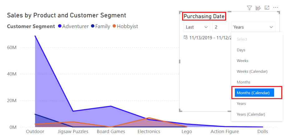
For the delivery rate, a slicer labeled “last eight weeks” still leaves the important questions unanswered. Is the current, incomplete week included? Is it filtering order dates or promised deadlines? Which time zone defines a week boundary? Document those decisions with the metric rather than relying on the report layout to imply them.
Put the definition into a reusable metric card
A metric card should be brief enough to use during a stakeholder conversation but precise enough to implement in SQL, Python, or Power BI. For this delivery example, it would read:
| Field | Definition |
|---|---|
| Name and purpose | Weekly late-delivery rate; monitor whether two-day orders meet customer promises |
| Formula | Distinct eligible orders not fully delivered by their promised deadline, divided by distinct eligible orders; display as a percentage |
| Population and exclusions | Genuine, dispatched two-day orders; exclude test orders and orders cancelled before dispatch |
| Counting and reporting grain | Count each order ID once; report one company-wide result per completed week |
| Dimensions | Optional weekly breakdown by fulfillment location at dispatch or dispatch carrier, provided each order has one assigned value |
| Reporting window | Last eight completed Monday–Sunday weeks in UTC; assign an order by its promised deadline |
| Freshness and caveat | Publish after a 48-hour data-arrival allowance, show data-as-of time, and revise results if delivery records are corrected |
This is a proposed definition to confirm with the decision-maker and the people who own the delivery data. In particular, “fully delivered” requires a reliable rule if orders have multiple packages. Writing the rule down exposes that issue early, before two reports produce different answers.
The same structure transfers across sectors. Consider a service team’s weekly case resolution rate. “Resolved cases divided by cases” is insufficient until you decide whether the denominator is cases opened that week or cases due for resolution that week, whether reopened cases count as resolved, whether the unit is a case or a customer, and whether breakdowns use the team assigned at opening or at closure. The metric card is not bureaucracy added after analysis; it is how you determine what analysis the question actually permits.
Key takeaways
A defensible business metric specifies what is calculated, which observations count, what one reported value represents, which dimensions may be compared, and exactly which observations fall in the reporting window. For rates, retain the numerator and denominator so that grouped results can be checked and rolled up correctly. A chart filter displays a selection; it does not replace these rules.
Next, you will link an organizational objective to its measurable drivers in a metric tree. A clear definition of each metric will keep that tree from connecting numbers that only appear to mean the same thing.