Recommended resources
The freely available resources this lesson will direct you to.
Hello! Welcome to the next lesson in our module, "From Theory to Practice: Knowledge Transfer."
In our last session, we focused on anchoring abstract concepts in concrete examples. We saw how a specific case, like the flawed Chrysler gear shift, could make the abstract idea of a "mental model" unforgettable. This strategy helps ground a new idea in a single, tangible instance.
Today, we'll explore a related and equally powerful technique. Our learning outcome is to create analogies to connect new knowledge (e.g., in data analysis) with your existing design expertise. While an example shows what something is, an analogy explains what something is like. This is a crucial skill for knowledge transfer, as it allows you to build a bridge from the solid ground of what you know (UX/UI design) to the new territory you want to explore (like coding or data analysis). For your goal of improving learning application, this is an invaluable tool.
What is an Analogy and Why Does It Work?
At its core, an analogy is a comparison that serves as an interpretive bridge between a familiar concept and an unfamiliar one. It helps you map the structure of a new idea onto a structure you already understand, making it less intimidating and easier to grasp.
To get started, let's watch a short video that provides a clear and simple introduction to analogies as a teaching and learning tool.
Analogies that teach. Teaching methods
This video, 'Analogies that teach,' offers a straightforward explanation of what analogies are and why they are effective for learning.
Watch from the beginning to 04:22. Focus on the core idea: analogies use comparisons to connect new concepts with what is already known. Also, take note of the important warning about using analogies that are 'too far-fetched.'
As the video highlights, the power of an analogy lies in its ability to connect new information to your "real world experience." For you, this means leveraging your extensive expertise in design as a foundation for learning new, adjacent skills.
This is particularly relevant when dealing with data. Abstract data can be hard to interpret, but framing it with a narrative or comparison makes it accessible. This is the essence of data storytelling, a field where your design and communication skills intersect with data analysis.
Mastering Data Storytelling with Visual Metaphors and Analogies
This article, 'Mastering Data Storytelling with Visual Metaphors and Analogies,' directly addresses how analogies (and metaphors, a type of analogy) make complex data understandable. This is a perfect link between your current skills and a new area like data analysis.
Please read the first two sections: 'What is a Metaphor and Why is it Important in Storytelling?' and 'The Role of Metaphors in Engaging Data Stories'. Focus on how metaphors link the 'unknown to the familiar' and 'simplify complex data.'
How to Construct a Powerful Analogy
Creating a quick comparison is easy, but creating one that genuinely deepens understanding requires a more thoughtful approach. A weak or flawed analogy can create more confusion than clarity.
The "Analogies that teach" video you just watched outlines an excellent six-step strategy for building and testing an analogy. This structured process will be very useful.
A Six-Step Process for Building Analogies
- Introduce the unfamiliar concept: Start with the new idea you're trying to learn.
- Identify features: List the key characteristics of both the new (target) concept and the familiar (analog) concept.
- Check for relevance: Ensure there's enough meaningful overlap between the two concepts.
- Map the features: Explicitly show how the features of the familiar concept correspond to the features of the new one. This is the core of the analogy.
- Show the limits: This is a crucial step. Every analogy breaks down at some point. Identifying where the comparison no longer holds true prevents misconceptions and deepens your understanding of the new concept's nuances.
- Evaluate and conclude: Check if the analogy helped you understand the new information and draw conclusions.
Another way to think about this process comes from the Feynman Technique, which is built on the idea of explaining a concept in simple terms. A key part of that technique is challenging yourself to remove jargon and complex language, which naturally leads you to find analogies.
How to Learn Faster with the Feynman Technique (Example Included)
While this video from Thomas Frank covers the 'Feynman Technique,' its core principles are directly applicable to creating great analogies. It emphasizes the importance of simplification and testing your own understanding.
Watch from 02:37 to 04:50. Pay close attention to two key ideas: Simplifying language (Step 4): The challenge to replace technical terms with simple words is often where analogies are born. 'Explaining to a kid': This mental trick forces you to question your base assumptions and find relatable comparisons.
Practice: Building a Bridge from Design to Data
Let's put this into practice. Imagine you're learning about a fundamental concept in data analysis: standard deviation.
The textbook definition might be: "a measure of the amount of variation or dispersion of a set of values." This is abstract and not very intuitive. Let's use the six-step process to build an analogy from your world of UX design.
- New Concept: Standard Deviation.
- Identify Features:
- Standard Deviation: Measures how spread out data points are from the average (mean). Low SD = data points are clustered tightly around the average. High SD = data points are spread far apart.
- Familiar Concept: Let's use Design System Consistency.
- Check Relevance: This seems relevant. Both concepts relate to uniformity vs. variance within a set of items.
- Map the Features:
- A set of data points is like the set of all buttons in a digital product.
- The average (mean) value is like the ideal, "master" button defined in the design system.
- Low standard deviation is like a product with high design consistency, where all button instances are nearly identical to the master component. They are tightly "clustered" around the ideal.
- High standard deviation is like a product with inconsistent design, where you have buttons of all different sizes, corner radii, and styles. They are "spread far apart" from the ideal defined in the system.
- Show the Limits: The analogy helps grasp the concept of "spread," but it breaks down. Standard deviation is a precise mathematical calculation. Design consistency is often a more qualitative judgment. You can't calculate the "standard deviation" of your buttons in the same way, but the analogy provides the crucial intuition.
- Evaluate: The analogy successfully translates the abstract statistical idea of "dispersion" into the concrete, familiar design problem of "consistency."
The article from Doug Rose provides a fantastic case study of this in action, showing how a data science team can communicate more effectively by using language their audience understands.
Mastering Data Storytelling with Visual Metaphors and Analogies
Let's return to the 'Mastering Data Storytelling' article and look at a practical case study.
Please read the section 'Case in Point'. Notice how the data science team translates their technical findings ('structured and unstructured data') into a metaphor the movie theater managers immediately understand ('friendly chatter,' 'hot tickets'). This is exactly the skill of bridging two domains.
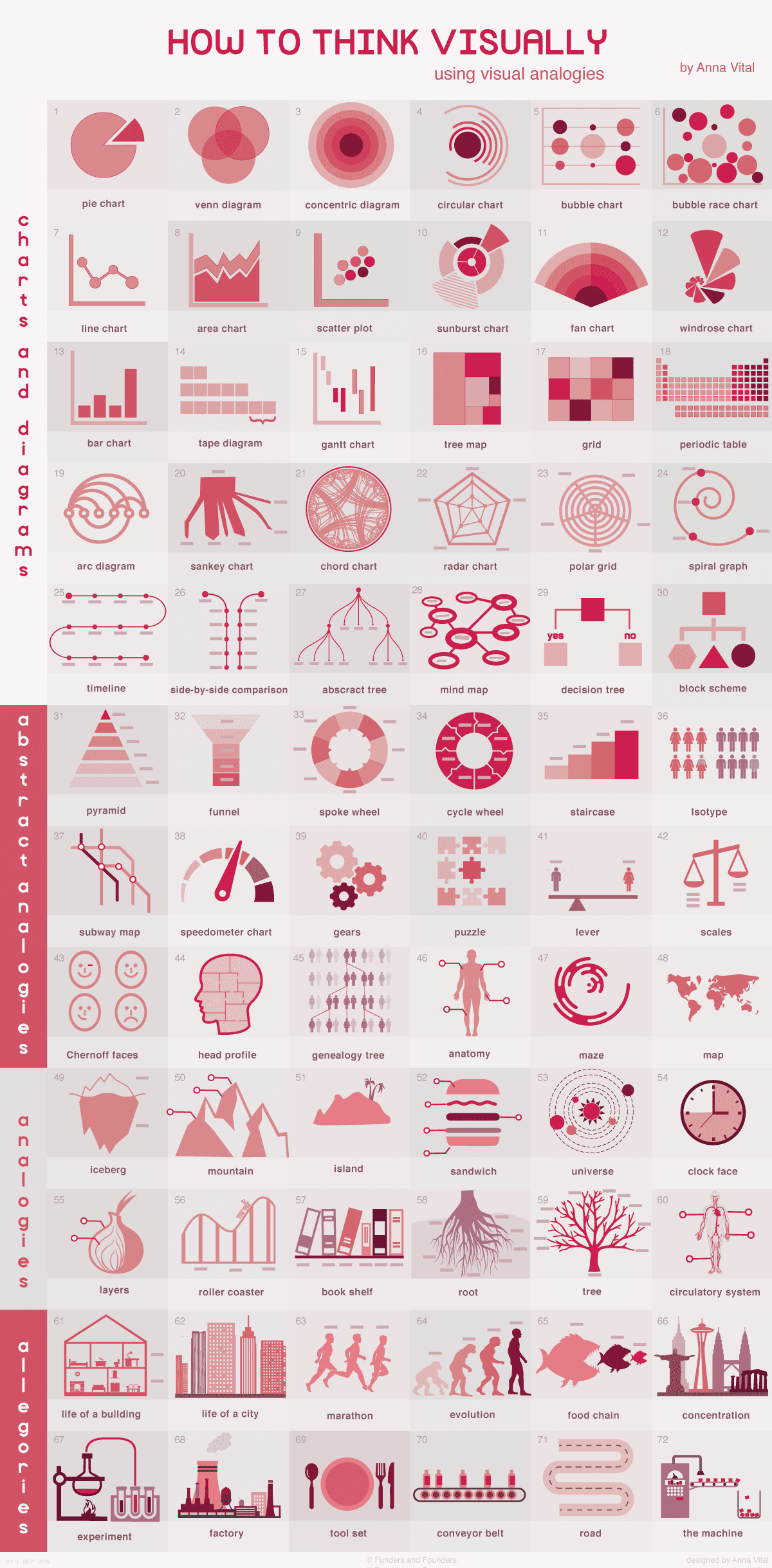
As a designer, you also have a rich palette of visual analogies you can draw upon, especially for data visualization.
Test your understanding!
Let's try one more. A common concept in programming is a 'for' loop, which automates a repetitive task. For example, for each item in this list, do X.
Create a simple analogy to explain a 'for' loop to a fellow designer, drawing from a design-related process. Remember to briefly state where the analogy's limits are.
Show answer
Here's a possible answer:
Analogy: "A 'for' loop is like applying a style change to all matching layers in Figma. Imagine you have 20 cards in a layout, and you want to change the corner radius on all of them. You don't do it one by one. You select all of them and apply the change once. The 'for' loop is the code equivalent of 'for each selected card, set the corner radius to 8px.' It's a way to automate a repetitive action across a group of similar items."
Limits: "The analogy breaks down because a 'for' loop in code can perform much more complex and conditional logic within each repetition (e.g., 'for each user, if they are a new user, send them a welcome email, otherwise, show them the dashboard'). My Figma example is a simple, unconditional action. However, the core idea of automating a repetitive task holds."
Conclusion
Today, we've added a powerful tool to your learning toolkit. By creating analogies, you can demystify complex, abstract topics by connecting them to your deep existing knowledge in design. This not only makes new information easier to understand and remember but also makes it more applicable—a direct line to your goal of improving knowledge transfer.
Key Takeaways:
- Analogies are "interpretive bridges" that connect the unfamiliar to the familiar, making learning more intuitive.
- A strong analogy requires a structured approach: mapping features between the new and old concepts, and, most importantly, identifying the limits where the comparison breaks down.
- Simplifying language and challenging jargon (as in the Feynman Technique) is a great way to generate analogies.
- Your expertise in design is a powerful anchor. You can create analogies to understand new concepts in data analysis, coding, or any other field by relating them to design principles and processes you already know intimately.
What's Next?
So far in this module, we've focused on strategies for understanding and transferring knowledge—using concrete examples to ground ideas and analogies to connect them. In our next lesson, we will shift to deliberate practice. This is a systematic method for skill-building that involves setting specific goals, maintaining high focus, getting immediate feedback, and repetition. It's the engine that drives true mastery of a skill.