Hello! Welcome back to our module on Logo & Symbol Design.
In our last lesson, we identified the different types of logos, from wordmarks to combination marks. You now have a "menu" of options to choose from. Today, we'll learn how to cook. We're moving from what a logo is to what makes a logo feel visually right.
This lesson focuses on two of the most fundamental principles in all of design: balance and proportion. Mastering these will help you create logo concepts that are not just strategically sound, but also harmonious and professional. Your background in mechanical engineering gives you an intuitive grasp of physical balance and precise relationships between parts; we'll be applying that same thinking to visual elements on a page.
Our goal is to apply principles of visual balance and proportion to logo concepts, ensuring your ideas for your woodworking brand have a solid aesthetic foundation.
What is Visual Balance?
Just like a physical object, a design has a "visual weight" distributed across its composition. Balance is the principle of arranging these elements so that the design feels stable and cohesive, not lopsided or chaotic.
Let's start with a short video that introduces this concept and connects it directly to the physical world you're familiar with.
The video 'Balance in Logo Design' by Flux Academy opens by perfectly explaining visual balance using an analogy to product design. This will help ground the concept.
Please watch from the beginning until 01:08. Pay attention to how the narrator defines visual balance as the distribution of visual weight, creating a sense of equilibrium.
Types of Visual Balance
Designers use different types of balance to evoke different feelings and align with a brand's personality. Understanding these types will allow you to make intentional choices.
The article "Achieving Visual Balance in Logo Design" provides a great overview of these types.
Achieving Visual Balance in Logo Design
This article from BrandBucket offers clear definitions for the primary types of balance you'll encounter and use in logo design.
Please read the section titled 'Different Types of Balance in Logo Design'. Focus on understanding the characteristics of Symmetrical, Asymmetrical, and Radial balance.
Let's summarize the key types and their strategic implications:
-
Symmetrical Balance:
- What it is: Elements are mirrored across a central axis (horizontal or vertical). It feels ordered and formal.
- When to use it: Excellent for brands wanting to communicate tradition, stability, reliability, and trust. Think of a financial institution or a luxury heritage brand. For your woodworking brand, symmetry could convey classic, timeless craftsmanship.
-
Asymmetrical Balance:
- What it is: Elements are not identical on both sides but are arranged to have equal visual weight. A large element on one side might be balanced by several smaller elements on the other.
- When to use it: Creates a sense of dynamism, energy, and modernity. It's often more visually interesting and is great for innovative, creative, or forward-thinking brands. The Apple logo is a classic example. This could position your brand as contemporary and artistic.
-
Radial Balance:
- What it is: Elements radiate outward from a central point, like spokes on a wheel or ripples in a pond. It draws the eye to the center.
- When to use it: Perfect for brands that want to suggest connection, unity, or focus on a central idea or product. The BP logo is a good example.
The choice between these depends entirely on your brand's story. Do you want to emphasize heritage and stability (symmetrical) or innovation and dynamism (asymmetrical)?
Proportion: The Silent Partner of Balance
While balance deals with the overall arrangement, proportion deals with the size of elements relative to one another. Getting the proportions right is what makes a design feel harmonious and intentional.
One of the most powerful tools for achieving beautiful proportions is the Golden Ratio, a mathematical principle (approximately 1:1.618) found throughout nature, art, and architecture.
Golden Ratio Grids — A Timeless Logo Crafting Tool
The article 'Golden Ratio Grids' explains why our brains are so drawn to this proportion and how it's used to create timeless designs. It's a fascinating intersection of psychology, nature, and art.
Please read the following three sections: 'Why Designers Obsess Over Proportion (and Why Our Brains Love It)' 'The Connection Between Proportion and the Golden Ratio' 'The Power of the Golden Ratio in Design' Focus on how the Golden Ratio helps achieve balance, harmony, and focus. The numerous examples (Pepsi, National Geographic, Apple) make the concept very clear.
As the article explains, our brains are wired to find this ratio pleasing because it’s so prevalent in the natural world. By using it in design, we tap into a subconscious preference for harmony and order.

Applying These Principles in Practice
Understanding the theory is one thing; applying it is another. Let's look at how these principles translate into the practical construction of a logo.
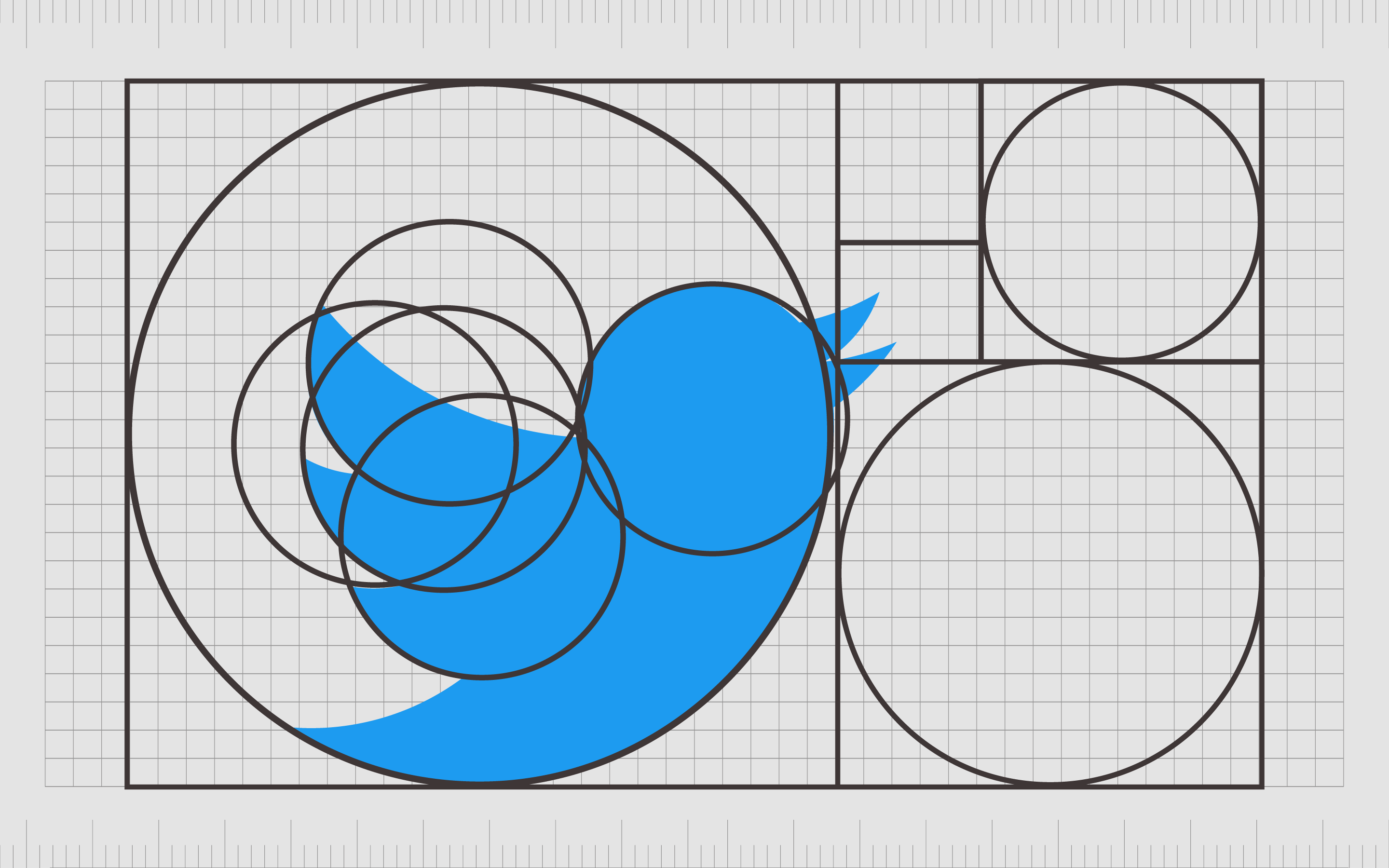
1. Using Grids for Construction
As an engineer, you know the value of a solid framework. Designers use underlying grids and geometric shapes to ensure their logos are precisely balanced and proportioned. This isn't about rigid, uncreative design; it's about creating a strong, harmonious foundation.
2. Balancing Combination Marks
In the last lesson, we discussed combination marks (a symbol paired with a wordmark). A common challenge here is getting the proportion right between the icon and the text. How big should the symbol be? How should it be positioned?
Let's return to the Flux Academy video. This section offers excellent practical advice on proportioning combination marks, both in horizontal and stacked layouts.
Please watch the segment on proportion and gridding from 09:13 to 13:00. Notice the discussion on visual weight (a solid circle feels 'heavier' than text of the same height) and the general rule for sizing type in horizontal versus stacked lockups.
Key takeaways from the video:
- In a horizontal lockup (symbol on the side), the text is usually shorter than the symbol.
- In a stacked lockup (symbol on top), the text is usually as wide or wider than the symbol.
- The goal is often to create an overall logo shape that fits comfortably within a square or slight rectangle for maximum versatility.
Test your understanding!
Imagine you're designing a logo for your woodworking brand, "PaaMoja Woodcraft." You have a symbol of a stylized baobab tree.
If you create a horizontal combination mark, should the word "PaaMoja" be taller or shorter than the baobab tree symbol for the best balance? What about in a stacked version?
Show answer
- In a horizontal layout, the text "PaaMoja Woodcraft" should generally be shorter than the height of the baobab tree symbol to achieve good visual balance.
- In a stacked layout, the text would be placed below the symbol, and its width would typically be equal to or wider than the symbol's width to create a stable base.
3. Creating and Refining Your Concepts
When you start sketching, don't worry about getting the balance perfect on the first try. The process is iterative. Create variations, compare them, and refine.
The Flux Academy video makes two final excellent points:
- Compare versions of your design side-by-side to see which feels more balanced.
- Create alternate lockups (horizontal, stacked, symbol-only) to ensure your logo will be balanced and effective in any context, from a website header to a social media profile picture.
Conclusion
You are now equipped with the core principles for creating visually strong and harmonious logo concepts. By consciously applying balance and proportion, you elevate your designs from merely amateur sketches to professional-level thinking.
Key Takeaways:
- Balance is the distribution of visual weight, and it can be symmetrical (stable, traditional), asymmetrical (dynamic, modern), or radial (unified, focused). Your choice should reflect your brand's personality.
- Proportion is the relative size of elements. The Golden Ratio is a powerful guide for creating proportions that feel naturally beautiful and balanced.
- Application involves using underlying grids, carefully managing the size relationship between symbols and text in combination marks, and creating alternate versions for versatility.
Next Up:
You understand the qualities of a good logo, the different types, and the principles of aesthetic harmony. In our next lesson, we'll bring it all together by learning how to evaluate logo concepts against your brand strategy and target audience preferences. This will ensure that the logo you create doesn't just look good, but also communicates the right message to the right people.