Welcome back! In our last lesson, we focused on the aesthetics of a strong logo, exploring the principles of balance and proportion that make a design feel harmonious and professional. You learned how to use grids and geometric relationships to build visually pleasing concepts.
Today, we shift from "Does it look good?" to the more critical question: "Does it work?" A beautiful logo that communicates the wrong message or fails to connect with your audience is ultimately a strategic failure. This lesson will equip you with a framework to objectively evaluate your logo concepts against the core strategy of your brand and the preferences of your target customers.
Your goal for this lesson is to learn how to evaluate logo concepts against brand strategy and target audience preferences. This process ensures your final logo isn't just a piece of art you like, but a powerful business tool that builds your brand's reputation and connects with premium furniture buyers in East Africa.
The Three Filters of Logo Evaluation
Think of this evaluation process as passing your logo concepts through three critical filters. A successful logo must pass through all three.
- The Strategic Filter: Does it align with your brand's identity?
- The Audience Filter: Does it resonate with your target customers?
- The Functional Filter: Is it practical, versatile, and timeless?
Let's break down each one.
1. The Strategic Filter: Aligning with Your Brand Identity
Before anything else, a logo must be a true visual representation of your brand's core. This goes back to the foundational work we did on brand positioning, personality, and values.
To start, let's read an article that outlines the key criteria for evaluating a logo.
The Ultimate Checklist for Evaluating Logo Design Concepts
The article 'The Ultimate Checklist for Evaluating Logo Design Concepts' by The Logo Creative provides an excellent framework for this process. We'll focus on the sections that tie a logo directly to your brand's strategy.
Please read the following three sections: '1. Alignment with Brand Identity': This is the most crucial first step. '5. Uniqueness and Differentiation': This relates directly to your brand positioning. '6. Emotional Connection': This links to your brand's personality and the feelings you want to evoke. As you read, think about the brand personality you defined for your woodworking studio. Is it more about 'heritage and tradition' or 'modern and innovative'?
As the article highlights, your logo is the face of your brand. It must visually embody your brand's essence. Ask yourself these questions for any concept you develop:
- Personality & Values: Does the logo feel like your brand? If your brand values are 'natural materials' and 'meticulous craftsmanship,' does a sharp, futuristic logo fit? Probably not. The style of the logo—the shapes, the typography—must match the personality you want to project.
- Positioning: How does this logo look next to your competitors? Your goal is to stand out in the premium furniture market in Tanzania and Kenya. A unique logo helps you claim your space and avoid being seen as a "me-too" brand.
- Emotional Response: This connects to your interest in psychology. A logo acts as an emotional anchor. The article
How to Align Brand Identity with Customer Perceptiondescribes this using the concept of semiotics—the study of signs and symbols. Your logo is a symbol that carries meaning. For your premium brand, you likely want to evoke feelings of trust, quality, aspiration, and authenticity.
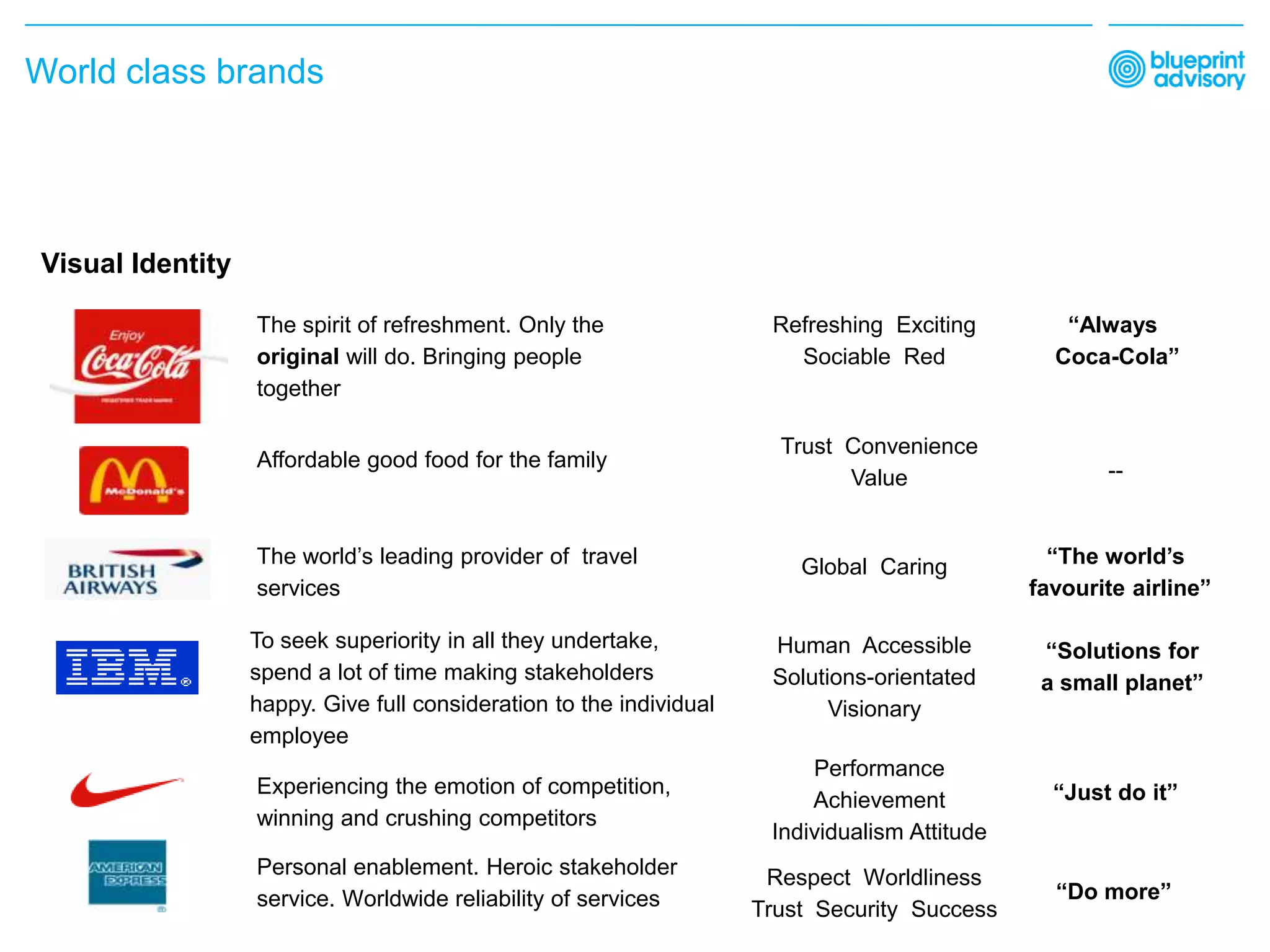
2. The Audience Filter: Speaking to Your Customers
A logo can be strategically perfect but fail if it doesn't speak the language of your target audience. Your design choices must be defined by who you are trying to reach.
This next video explains this concept clearly.
The ONLY Logo Design Guide You’ll EVER Need (2025 Edition)
The video 'The ONLY Logo Design Guide You’ll EVER Need' by Satori Graphics emphasizes that design choices must be audience-driven. It provides great examples of how to tailor a logo's style to its target market.
Please watch from 02:50 to 05:47. Pay close attention to the distinction made between designing for a luxury brand versus a Gen Z fashion brand, and the segment on 'shape psychology'.
The key takeaway is that you are not designing the logo for yourself; you are designing it for your customer. For your CNC woodworking studio, consider:
- Who are your premium furniture buyers in East Africa? What are their values? What does 'premium' and 'craftsmanship' mean to them? Is it minimalist and subtle, or is it rich with cultural symbolism?
- Cultural Context: A symbol that resonates in one culture might mean something different or nothing at all in another. For example, incorporating traditional patterns can signal authenticity and local pride. However, it must be done thoughtfully to align with a modern, premium brand.

Test your understanding!
Imagine you have two logo concepts for your woodworking brand.
- Concept A: A very clean, minimalist wordmark using a geometric sans-serif font.
- Concept B: A logo featuring a stylized symbol of a baobab tree, with earthy colors.
Which one is "better"? How would you use the Audience Filter to decide?
Show answer
Neither is inherently "better." The decision depends on your target audience.
You would ask:
- Which concept would better capture the attention of my ideal customer profile in Nairobi or Dar es Salaam?
- Do they associate "premium" with the sleek, international feel of Concept A, or the authentic, nature-inspired feel of Concept B?
- Would the baobab tree in Concept B be seen as a powerful symbol of longevity and nature, or would it be perceived as too traditional for a modern CNC-based studio?
The right answer comes from understanding your customer's perceptions, not just your own aesthetic preference.
3. The Functional Filter: Real-World Viability
Finally, a great logo must be functional. It needs to work flawlessly across every application, from a tiny social media icon to a large sign on your workshop. Your engineering background will make this filter intuitive—it's about performance under different conditions.
We'll watch another clip from the Satori Graphics video that introduces three simple but powerful tests for this.
The ONLY Logo Design Guide You’ll EVER Need (2025 Edition)
This segment provides three practical, hands-on tests you can perform on any logo concept to check its functional strength.
Please watch from 07:17 to 08:53. Focus on understanding the Blur Test, the 5-Second Recall Test, and the Scalability Test.
Let's combine those tests with a few other key functional criteria to create a final checklist:
- Simple & Memorable: Is the logo's core shape recognizable when blurred? Can someone describe it after seeing it for only five seconds? Simplicity is key to memorability.
- Scalable: How does it look at 16x16 pixels as a favicon? How does it look engraved into wood? A complex logo will lose its detail and become an unreadable mess when scaled down. This is why brands often have simplified versions of their logo.
- Versatile: Does it work in a single color (black and white)? This is a critical test. A logo that relies on color to be recognizable is a weak logo. It needs to be effective on various backgrounds and in different contexts (print, web, physical products).
- Timeless: Does the design rely on a current trend (e.g., a specific gradient style or a currently popular font)? Good logos feel current for decades. Avoid trends to give your brand longevity.
Putting It All Together: Your Evaluation Checklist
When you have your logo concepts, run each one through this comprehensive checklist. Be honest and objective.
1. Strategic Fit
- Does this logo reflect our brand personality (e.g., Modern, Traditional, Artistic, Refined)?
- Does it communicate our core brand values (e.g., Craftsmanship, Sustainability, Innovation)?
- Does it support our brand positioning (e.g., Premium, Accessible, Unique)?
- Does it look distinct from our key competitors?
2. Audience Resonance
- Will this logo appeal to our target customer profile?
- Does it align with what 'premium' means to them in an East African context?
- Does it evoke the right emotions (e.g., Trust, Aspiration, Warmth)?
- Are the symbols and colors culturally appropriate and positive?
3. Functional Viability
- Is it simple and memorable (passes the 5-second and blur tests)?
- Is it scalable (legible when tiny and still looks good when large)?
- Is it versatile (works in one color, on light and dark backgrounds)?
- Is it timeless (avoids passing fads)?
Conclusion
You now have a robust framework for moving beyond personal taste to make strategic, objective decisions about your logo. A logo that successfully passes through the strategic, audience, and functional filters is one that will serve your brand effectively for years to come.
Key Takeaways:
- Evaluating a logo is a systematic process, not just a matter of opinion.
- A successful logo must align with your brand strategy, resonate with your target audience, and be functionally viable.
- Use a checklist to assess each concept against these three core filters: Strategic Fit, Audience Resonance, and Functional Viability.
Next Up:
Once you've used this framework to evaluate your concepts and select a final design direction, the next step is to prepare it for use. In our next lesson, we will define specifications for logo variations (e.g., primary, secondary, icon-only) and create clear usage guidelines. This is how you ensure your brand looks consistent and professional everywhere it appears.