Hello! Welcome back to our module on Logo & Symbol Design.
In our last lesson, we established the four essential characteristics of an effective logo: it must be simple, memorable, appropriate, and scalable. This framework gives you a powerful lens through which to evaluate any logo concept.
Today, we move from the qualities of a good logo to the forms it can take. We will explore the different categories of logos, which will help you make a strategic choice for your own woodworking brand. This lesson directly addresses the learning outcome: Distinguish between different logo types (e.g., wordmark, pictorial mark, combination mark).
Understanding these types is like a chef learning their cuts of meat; each one is suited for a different purpose and delivers a different experience. Your choice will have a significant impact on how your brand is perceived.
The Main Families of Logos
While there are many specific logo types, they can be grouped into three main families:
- Text-Based Logos: Rely on the brand name or initials.
- Image-Based Logos: Use a symbol or icon.
- Combination Logos: Integrate both text and images.
This image provides a great visual overview of the most common types we'll be discussing.

This chart illustrates seven key logo types with well-known examples, from text-based Monograms and Wordmarks to image-based Pictorial and Abstract Marks, and hybrid forms like Combination Marks and Emblems.
Now, let's dive into each category in more detail.
1. Text-Based Logos
These logos rely purely on typography to carry the brand's identity. Your mechanical design background will appreciate the precision required here; every curve and space in the lettering matters.
To get a clear overview of the main logo types, we'll watch segments from the video "9 Types Of Logos For Brand Design & Strategy" by Brand Master Academy.
9 Types Of Logos For Brand Design & Strategy (44 Top Examples)
First, let's explore the two primary types of text-based logos: Wordmarks and Lettermarks.
Please watch the following two segments: Wordmark Logos: from 04:03 to 05:21. Lettermarks (Monograms): from 10:57 to 12:34. Focus on the key difference: a wordmark uses the full brand name, while a lettermark uses its initials.
To solidify your understanding, the following article from Vistaprint offers a detailed breakdown of the pros, cons, and ideal use cases for each.
The 7 Types of Logos And How to Use Them
The article 'The 7 Types of Logos And How to Use Them' provides excellent context for when and why you'd choose one type over another.
Please read the sections titled 'Monogram logos (or lettermarks)' and 'Wordmarks (or logotypes)'. As you read, think about your own brand. Is your brand name short and distinctive enough for a wordmark? Or is it long, making a lettermark a more practical choice?
- Wordmarks (Logotypes): Ideal for new businesses with a short, unique name (like Google or Visa). They build name recognition quickly. For your premium woodworking studio, an elegant, custom-feeling wordmark could convey sophistication and quality.
- Lettermarks (Monograms): Perfect for brands with long names (like IBM for International Business Machines). They are simple, memorable, and work well in small spaces. A monogram could be an excellent choice for a maker's mark to brand onto your furniture.
2. Image-Based Logos
These logos use a graphic symbol to represent the brand, relying on imagery to create an association.
9 Types Of Logos For Brand Design & Strategy (44 Top Examples)
Now let's look at the two main types of image-based logos: those that depict a real-world object and those that are purely abstract.
Please watch the following segments from the same video: Pictorial Marks: from 01:36 to 04:03. Abstract Logo Marks: from 05:21 to 06:42. Notice how pictorial marks are literal (Apple's logo is an apple), while abstract marks create a new, unique meaning (like the Nike swoosh).
- Pictorial Marks (Brand Marks): These are icons that represent a recognizable, real-world object. Think of the Twitter bird or the Target bullseye. For your brand, this could be a stylized representation of a specific local tree, a tool, or a woodworking joint. However, for a new brand, relying solely on a pictorial mark can be risky, as it takes time for customers to connect the image to your company name.
- Abstract Marks: These are custom geometric forms that don't represent a real-world object. They are unique and can be imbued with meaning specific to your brand. For a premium brand, an abstract mark can feel very modern and high-concept, suggesting artistry and innovation.
3. Combination and Emblem Logos
These types merge text and imagery into a single logo, offering the best of both worlds.
9 Types Of Logos For Brand Design & Strategy (44 Top Examples)
Let's explore two powerful types of hybrid logos: Combination Marks and Emblems. These are often excellent choices for brands seeking both recognition and a sense of authority.
Please watch these final two segments: Combination Marks: from 07:45 to 08:55. Emblem Logos: from 08:55 to 09:54. Pay close attention to the structural difference: in a combination mark, the text and symbol can be separated, while in an emblem, they are integrated into a single shape.
The difference between these two is subtle but important.
- Combination Marks: These logos pair a wordmark or lettermark with a pictorial or abstract mark. They are incredibly versatile because you can use the full logo or separate the elements for different applications (e.g., just the symbol for a social media icon). This is the most popular type of logo for a reason.
- Emblems: These logos feature the text inside a symbol or icon, like a badge, seal, or crest. They have a traditional feel and can communicate longevity and quality—highly relevant for a craft-focused business. Brands like Starbucks and Harley-Davidson use emblems to great effect. The main drawback is that their intricate detail can make them less scalable.
Test your understanding!
Let's look at these four logo concepts for furniture brands. Based on what you've just learned, can you identify the logo type for each?
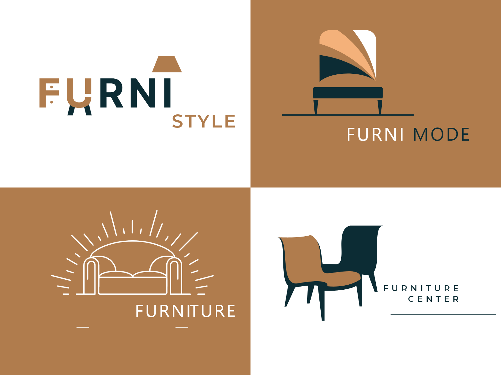
- FURNI STYLE (Top Left)
- FURNI MODE (Top Right)
- FURNITURE (Bottom Left)
- FURNITURE CENTER (Bottom Right)
Show answer
All four of these are Combination Marks. They each combine a wordmark (the brand name) with a pictorial or abstract symbol. This illustrates just how common and flexible this logo type is.
- 1 & 2 pair a wordmark with a pictorial mark (a lamp and a chair).
- 3 & 4 pair a wordmark with a more stylized, almost abstract representation of furniture.
Which Type is Right for Your Brand?
For your premium woodworking studio in East Africa, several types could be effective:
- An Emblem could create a powerful sense of heritage and established craftsmanship, similar to a traditional guild seal or maker's mark.
- A clean, elegant Wordmark could position the brand as modern, minimalist, and premium.
- A Combination Mark offers the most flexibility. You could pair a sophisticated wordmark with a symbol that has local cultural relevance—perhaps an abstract representation of a pattern from Kanga fabric, a stylized Adinkra symbol (if culturally appropriate for the region), or a unique shape inspired by the wood you use.
Mascot logos are generally not appropriate for a premium brand like yours, as they tend to convey a more playful, mass-market feel.
Conclusion
You now have a clear understanding of the primary logo types and the strategic thinking behind choosing one. This isn't just an aesthetic choice; it's a foundational piece of your brand strategy.
Key Takeaways:
- Logos can be broadly categorized as text-based, image-based, or a combination.
- Wordmarks and Lettermarks are typography-focused and build name recognition.
- Pictorial and Abstract Marks use symbols to create a memorable visual hook.
- Combination Marks are the most versatile, pairing text and a symbol that can be used together or separately.
- Emblems integrate text within a shape, conveying tradition and authority but are often less scalable.
- The right logo type for your brand depends on your name, target audience, and desired brand personality.
Next Up:
You now know the characteristics of a good logo and the different forms a logo can take. In the next lesson, we will move from theory to practice by learning how to apply principles of visual balance and proportion to logo concepts. This will equip you with the foundational design skills to start sketching ideas that are not just strategic, but also aesthetically harmonious.