Hello! Welcome to the first lesson in our module on Logo & Symbol Design.
In our last lesson, we put the finishing touches on your brand's typography, establishing precise rules for sizing, spacing, and hierarchy. You learned how to create a robust system that ensures consistency—a key trait of any professional brand. That same need for precision and consistency is central to what we'll discuss today.
This lesson focuses on the foundational principles of good logo design. We will address the learning outcome: Identify the characteristics of an effective logo (memorable, scalable, appropriate, simple). A logo is often the most concentrated form of your brand's identity, and understanding these core characteristics will give you a framework to evaluate your own design concepts effectively.
What is a Logo's Primary Job?
Before we break down the characteristics of a good logo, it's essential to understand its fundamental role. It's tempting to think a logo must explain everything about your business—that a woodworking logo must show a tree, a saw, and a piece of furniture. However, that's not its purpose.
As legendary designer Paul Rand said, “A logo derives its meaning from the quality of the thing it symbolises, not the other way around.”
The Nike "swoosh" didn't mean "performance" or "victory" on day one. It was an abstract shape that gained meaning through years of association with high-performance athletes and inspirational marketing.
With that in mind, the primary goal of a logo is simple: to identify.
To explore this concept further, let's start with a short article from Logo Geek.
8 Characteristics of Successful Logos
The article '8 Characteristics of Successful Logos' clarifies the role of a logo before diving into its characteristics. Understanding this distinction is a crucial first step.
Please read the introduction and the section titled 'What’s the role of a logo?'. Focus on the idea that a logo is an 'empty vessel' that gains meaning over time and that its primary job is identification.
The Core Characteristics of an Effective Logo
Now that we know a logo's job is to identify, we can ask: what makes it good at that job? While design can be subjective, effective logos almost universally share a set of core characteristics.
Let's watch a short video where renowned logo designer Sagi Haviv (who designed logos for Mobil, National Geographic, and Showtime) outlines his three essential rules.
The 3 Rules of Good Logo Design
In this video from The Futur Academy, 'The 3 Rules of Good Logo Design,' Sagi Haviv provides a beautifully concise framework for what makes a logo successful.
Watch from the beginning to 01:52. Pay close attention as he introduces and explains his three principles: being appropriate, distinctive and memorable, and simple.
Sagi Haviv's rules give us a fantastic foundation. We'll use them as a structure, adding one more critical characteristic for the digital age: scalability. Together, these four principles—Simple, Memorable, Appropriate, and Scalable—form a powerful test for any logo concept.
1. Simple
Simplicity is arguably the most important rule. A simple logo is easy to recognize at a glance and easy to remember. Think of the logos for Apple, Target, or McDonald's. Their simplicity is their strength.
From a practical standpoint, a simple design is also more robust. Your engineering background gives you an appreciation for designs that are not "fussy." A complex logo with many fine details or effects can break down when reproduced in different sizes or formats, making identification difficult.
8 Characteristics of Successful Logos
Let's return to the '8 Characteristics of Successful Logos' article to explore the business case for simplicity.
Read the section titled 'Simplicity: Why should a logo be simple?' Notice the important distinction made between 'simple' and 'minimal'. For a premium craft-focused brand like yours, a logo needs to be simple in its core idea, but not necessarily stripped of all character or detail.
For your woodworking brand, this means aiming for one strong, clear idea rather than trying to combine several (e.g., a tree, a saw, a joint, and a letter 'S' all at once).
2. Memorable (and Distinctive)
For a logo to identify your business, people have to remember it. And for them to remember it, it needs to stand out. In a market full of competitors, your logo must be distinctive enough to be noticed and recalled.
8 Characteristics of Successful Logos
The Logo Geek article also explains why differentiation is so crucial.
Read the sections 'Differentiation' and 'Memorability'. Focus on how simplicity and distinctiveness work together to create a memorable mark. The example of swapping brand colors is especially powerful.
Avoid generic concepts. As the "Woodworking Logos" article (resource LINK) points out, simply using a saw blade or a generic tree is not enough. The idea must be executed in a unique and creative way to be memorable.
3. Appropriate (and Relevant)
An effective logo must feel right for the brand it represents. It doesn't need to be literal, but it should convey the correct personality and tone. A logo for a bank should feel trustworthy and stable, while a logo for a children's toy brand should feel fun and playful.
For your premium woodworking studio, the logo should feel like it belongs in that world. It might evoke feelings of craftsmanship, quality, nature, or elegance. This is achieved through the choice of font, shape, and color.
Crucially, "appropriate" is defined by your target audience and their culture. Since your business targets Tanzania and Kenya, you cannot assume that Western visual cues for "premium" or "craftsmanship" will translate directly.
8 Characteristics of Successful Logos
This is perhaps the most nuanced characteristic. Let's look at how visual associations are culturally formed.
Read the section 'Relevancy: Creating a logo that’s appropriate to the industry'. Pay very close attention to the paragraphs about cultural research. The example of the color purple having different meanings in Iran vs. Latin America is a critical lesson.
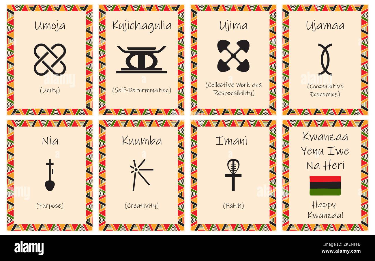
To bring this home, consider the power of culturally specific symbols. The symbols associated with Kwanzaa, rooted in East African harvest festival traditions, are excellent examples of simple, memorable, and culturally appropriate design.
4. Scalable (and Versatile)
A modern logo has to work everywhere. It must be legible as a tiny favicon on a browser tab, clear on a social media profile picture, and still look impressive on a large sign for your workshop or even as a small maker's mark branded onto your furniture.
A logo that is not scalable is a logo that will fail. This is where simplicity pays off again—simple forms are much easier to scale up and down without losing integrity.
Want YOUR Logo To STAND OUT? Watch This Now
This video from The Futur, 'Want YOUR Logo To STAND OUT? Watch This Now', drives home the importance of versatility and testing a logo in multiple applications.
Watch the segment from 02:23 to 03:10. The speaker emphasizes that a logo must look good when scaled down, be versatile, and work in multiple applications like patterns or on different products. This practical advice is key.
When you are designing, constantly test your ideas at different sizes. Zoom way out to see if it becomes an illegible smudge. Imagine it on a business card and on a billboard. An effective logo holds its own in all contexts.
Test your understanding!
You are reviewing a logo concept for your woodworking brand. It's a highly detailed illustration of a baobab tree with intricate bark texture, with the company name in a delicate script font underneath. Which of the four characteristics is this logo most likely to fail on, and why?
Show answer
The logo is most likely to fail on scalability and simplicity. The "highly detailed illustration" and "intricate bark texture" will likely become a muddy, unrecognizable shape when scaled down for a social media icon or a website favicon. The "delicate script font" may also become illegible at small sizes.
Putting It All Together: A Case Study
Let's look at an example that brings these four principles to life in your specific industry.

- Simple: The logo consists of a clean, stylized letter 'S' and a straightforward wordmark. The core idea—the 'S' also suggesting a piece of furniture—is singular and clear.
- Memorable: The unique shape of the 'S' makes it distinctive and easy to recall. It's not a generic symbol.
- Appropriate: The color palette (deep green, warm brown) evokes nature and wood. The overall aesthetic feels modern and premium, suitable for a high-end furniture brand.
- Scalable: The image demonstrates the logo's success across many applications. The stylized 'S' works well on its own as an icon (on the cap), and the full logo is clear on both a sign and a billboard. It is versatile and robust.
This example effectively demonstrates how a logo that adheres to these principles can form the cornerstone of a strong and flexible visual identity.
Conclusion
Today you've learned the fundamental litmus test for an effective logo. It's not about fleeting trends or personal taste, but about a set of durable principles that ensure your logo can do its job: to identify your brand clearly and consistently.
Key Takeaways:
- A logo's primary job is to identify, not to describe. Meaning is built through association over time.
- An effective logo is Simple: It has one clear idea and is easy to recognize.
- An effective logo is Memorable: It is distinctive and stands out from the competition.
- An effective logo is Appropriate: It conveys the right feeling for the brand and its cultural context.
- An effective logo is Scalable: It works effectively at all sizes, from a tiny icon to a large sign.
Next Up:
Now that you have the framework to judge a logo's effectiveness, our next lesson will explore the different forms a logo can take. We will learn to distinguish between different logo types (e.g., wordmark, pictorial mark, combination mark). This will give you a menu of options to consider as you begin to brainstorm concepts for your own brand.