Hello! Welcome back to our work on your brand's typography.
In our last lesson, you learned to apply typographic hierarchy, using tools like size, weight, and spacing to guide a reader's eye and create a clear visual journey. You now understand the principles behind making text effective and organized.
Today, we move from principles to specifications. This lesson is about codifying those principles into a clear, reusable system. Our learning outcome is to establish rules for typography usage (e.g., sizing, line spacing, character spacing) for brand consistency.
Think of this as creating a technical specification sheet for your brand's voice. Just as a mechanical drawing specifies dimensions, materials, and tolerances to ensure every part is made correctly, a typographic style guide specifies sizes, spacing, and weights to ensure every piece of communication looks and feels like your brand. This is a critical section of the brand guidelines you'll eventually hand off.
Part 1: Defining Your Typographic Scale
In the last lesson, you created a hierarchy with primary, secondary, and tertiary levels. Now, let's assign specific, consistent values to those levels. The foundation of this system is a typographic scale—a set of harmonious, predefined font sizes.
We'll start with the most important element for readability: the body text. From there, we can build out the rest of the scale proportionally.
To get some reliable starting numbers, let's look at some industry-standard rules of thumb.
6 Typography Golden Rules (NEED TO KNOW)
The video '6 Typography Golden Rules' from Satori Graphics provides excellent, practical starting points for setting up your typographic scale.
Please watch these two short clips: Body Text Size (00:19 - 00:54): Pay attention to the recommended pixel range for web body text. This will be your baseline. Heading Sizes (02:39 - 03:01): Notice how headings are defined as a percentage of the body text size. This proportional approach is key to creating a harmonious scale.
As the video explains, a great method is:
- Set your body text size: For web design, a size between 16px and 20px is usually a good starting point for optimal readability.
- Calculate heading sizes proportionally:
- Primary Heading (H1): ~180-200% of the body text size.
- Secondary Heading (H2): ~130-150% of the body text size.
For example, if you choose a 18px body text:
- Your H1 would be around 32-36px.
- Your H2 would be around 23-27px.
This creates a visually pleasing and mathematically consistent relationship between your text elements.
A Note on Units: px, pt, em, and rem
Your engineering background gives you an appreciation for precise units of measurement. In design, especially for digital platforms, the units you choose have important implications.
The ULTIMATE Guide To Typography For Beginners
The video 'The ULTIMATE Guide To Typography For Beginners' from DesignSpo offers a clear explanation of the different units used for font size.
Watch the segment on typographic units from 05:08 to 06:53. Focus on understanding the difference between absolute units like px (pixels) and pt (points), and relative units like em and rem. Notice the advantage of relative units for user accessibility and responsive design.
For your brand guidelines, it's common to specify sizes in pixels (px) as a clear, absolute baseline, but it's good to be aware that a web developer might implement them using relative units like rem for flexibility. For now, let's stick with pixels for simplicity.
Part 2: Controlling Vertical Space (Line Spacing / Leading)
Line spacing, known as leading in print typography, is the vertical distance between lines of text. Getting this right is crucial. Too tight, and your text feels cramped and difficult to read. Too loose, and the lines feel disconnected. For a premium brand, generous line spacing helps create a sense of calm, luxury, and breathability.
So, how much is enough? Again, we can use a proportional rule.
Kerning, Leading, and Tracking in Typography Design
This article, 'Kerning, Leading, and Tracking in Typography Design' from Figr.design, provides a solid definition and best practices for leading.
Read the section titled 'Leading in Typography.' Focus on the 'Best Practices for Using Leading' and the general rule of thumb provided (120% to 150% of the font size).
A good rule of thumb is to set your line height to 120%–150% of the font size for body text.
There's also a subtle but important refinement to this rule: the ideal line height is often inversely proportional to font size.
- Large Headlines (H1): Can have tighter line spacing (e.g., 100%–120%) because the reader consumes them in short bursts.
- Body Text: Needs more generous line spacing (e.g., 140%–160%) to help the eye track easily from the end of one line to the beginning of the next.
Test your understanding!
If you set your body text size to 20px, what would be a good line height in pixels, based on a 150% rule?
Show answer
A 150% line height would be 20px * 1.5 = 30px.
Part 3: Refining Horizontal Space (Tracking & Kerning)
Now let's manage the horizontal spacing between letters. This is controlled by two related concepts: tracking and kerning.
- Tracking (or letter-spacing) is the consistent adjustment of space between all letters in a block of text.
- Kerning is the adjustment of space between specific pairs of letters (like 'A' and 'V', or 'T' and 'o') to correct for visually uneven gaps.
For your brand system, you'll primarily be setting rules for tracking. Most high-quality fonts have good built-in kerning, which you'll only need to manually adjust for specific, high-impact uses like your logo.
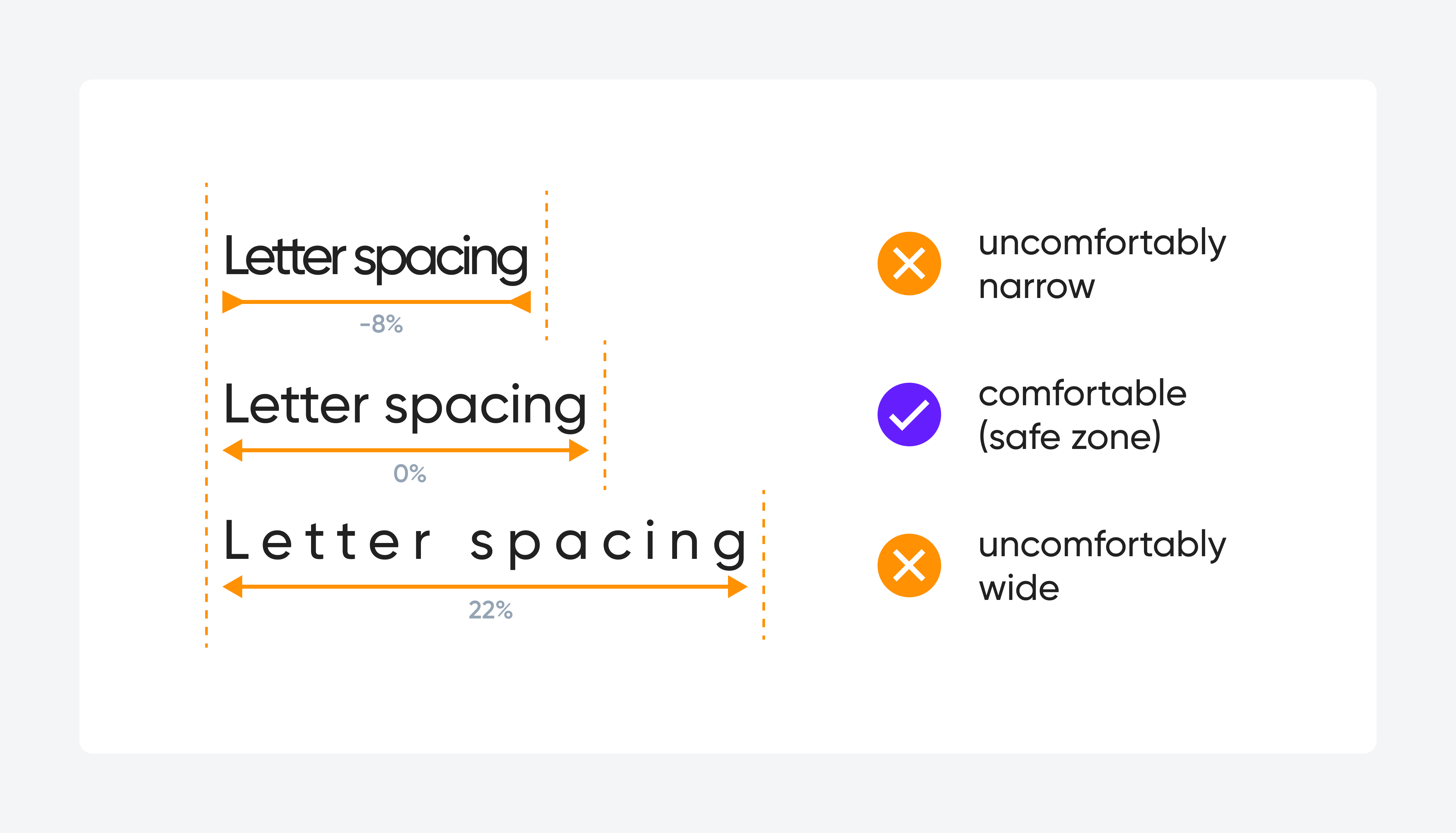
The rules for tracking are also often inversely proportional to size:
- Large Headlines: Can sometimes benefit from slightly tighter tracking (e.g., -1% to -2%) to make them feel more cohesive and impactful.
- Body Text: Can sometimes benefit from slightly looser tracking (e.g., +1% to +2%) to improve legibility at smaller sizes.
- All Caps Text: Almost always requires looser tracking to be readable.
Kerning, Leading, and Tracking in Typography Design
To avoid common pitfalls, it's helpful to see what not to do. The Figr.design article also has a great section on common mistakes.
Read the section 'Common Typography Mistakes and How to Avoid Them.' Pay close attention to the points on leading, kerning, and tracking. This reinforces why setting clear rules is so important.
Part 4: Documenting Your Typographic System
Now, let's bring it all together. The goal of this exercise is to create a document that anyone—a web developer, a social media manager, or the designer you hire—can use to perfectly replicate your brand's typography.
This documentation needs to be clear, precise, and unambiguous.
Typography's Power for Consistent Messaging
The article 'Typography's Power for Consistent Messaging' makes a powerful case for documenting these rules with 'surgical precision.'
Read the sections 'Define Font Roles With Surgical Precision' and 'Document Everything Your Team Needs to Succeed.' These sections drive home the importance of creating clear, actionable guidelines and explaining the 'why' behind your choices.
The output of this process is a typography style guide. Here is a great example of what one looks like:

Your task now is to create the first draft of this for your own brand. Create a simple table with the following columns. Don't worry about getting it perfect on the first try; this is an iterative process.
| Element | Typeface | Weight | Size (px) | Line Height (%) | Letter Spacing (%) | Notes (e.g., Case) |
|---|---|---|---|---|---|---|
| Primary (H1) | [Your Hero] | Bold | 48 | 120% | -1% | Title Case |
| Secondary (H2) | [Your Hero] | SemiBold | 32 | 130% | 0% | Title Case |
| Body Text | [Your Support] | Regular | 18 | 150% | +1% | Sentence case |
| Button Text | [Your Support] | Bold | 16 | 100% | +3% | ALL CAPS |
| Caption | [Your Support] | Regular | 14 | 140% | +2% | Sentence case |
This table is your official set of rules. It’s the blueprint for your brand’s voice.
Conclusion
Congratulations! You've moved beyond the abstract principles of hierarchy and into the concrete practice of building a typographic system. By defining specific rules, you are ensuring the consistency and professionalism that are vital for a premium brand.
Key Takeaways:
- A typographic system starts with a baseline body text size and builds other elements proportionally.
- Line height (leading) is critical for readability and should be set proportionally to the font size (e.g., 140-160% for body text).
- Letter spacing (tracking) refines the texture of your text and can be adjusted to improve legibility at different sizes.
- Documenting these rules with precision in a style guide is essential for maintaining brand consistency.
Next Up:
In our next lesson, we will shift our focus to one of the most important single assets of your brand: the logo. We will begin Module 7 by learning to identify the characteristics of an effective logo (memorable, scalable, appropriate, simple). The typographic rules you've just established will be directly applicable as you consider wordmark or combination mark logos.