Hello!
In our last lesson, we explored the fascinating, fault-tolerant process the browser uses to parse HTML and construct the Document Object Model (DOM). We saw how it's designed to build a usable DOM tree even from malformed markup, prioritizing content delivery for the user.
Today, we'll build on that foundation by focusing on how to make our HTML structures not just syntactically correct, but also semantically meaningful and accessible, especially for one of the most critical parts of any web application: forms. Our goal is to understand how to structure HTML forms so they are fully usable by people relying on assistive technologies, like screen readers. We will cover the essential roles of <label>, <fieldset>, and key attributes from the ARIA specification.
This directly addresses your interest in the "under-the-hood" mechanics by looking beyond the visual appearance of a form to understand the non-visual information structure that powers accessibility.
1. The Accessibility Tree
Before diving into form elements, let's introduce a crucial concept that runs parallel to the DOM: the Accessibility Tree. While the DOM represents the full structure of the document for layout and JavaScript manipulation, the accessibility tree is a simplified version created by the browser specifically for assistive technologies. It only contains the semantic information needed to understand the interface, such as an element's name, role, and state.
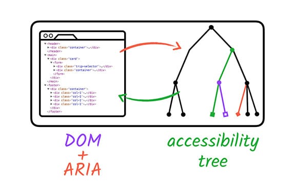
Our job as developers is to provide the right semantic cues in our HTML so the browser can build a useful and accurate accessibility tree. This is the core principle of web accessibility.
2. The Unsung Hero: The <label> Element
The most fundamental building block of an accessible form is the proper use of the <label> element. While it may seem basic, its function is critical.
A label provides three key benefits:
- A visible description for all users.
- A larger click/tap target, improving usability on all devices.
- The "accessible name" for the form control in the accessibility tree. Without it, a screen reader might announce an input field as just "edit text, blank," providing no context to the user.
To start, let's review the best practices for creating accessible forms, with a focus on labels.
The anatomy of accessible forms: Best practices
This article from Deque, a leader in digital accessibility, outlines the core principles of building accessible forms. It provides a great foundation for our lesson.
Please read the first four sections: 'Use native HTML', 'Provide a visible label', 'Include programmatic labels', and 'Provide descriptive labels'. Focus on the distinction between a visible label and a programmatic one, which is achieved using the for and id attributes.
As the article emphasizes, the programmatic link is what matters most for accessibility.
<!-- Incorrect: No programmatic link -->
Email
<input type="email">

<!-- Correct: Programmatically linked -->
<label for="email_field">Email</label>
<input type="email" id="email_field">
Now, let's watch a demonstration of why placeholders are not a substitute for labels and see how to correctly implement them.
Learn Accessibility - Full a11y Tutorial
This segment from a freeCodeCamp tutorial provides a clear, practical look at associating labels with inputs and explains the shortcomings of relying on placeholder text.
Watch from 00:37:42 to 00:44:04. Pay attention to how clicking the label focuses the associated input—a direct result of the for/id connection.
3. Grouping Related Controls with <fieldset> and <legend>
Sometimes, a single label isn't enough. Consider a group of radio buttons or checkboxes. Each one has its own label (e.g., "Yes," "No"), but what is the question they are answering? Sighted users can infer this from a nearby heading, but a screen reader user navigating through the inputs one by one will hear "Radio button, Yes" and "Radio button, No" without the surrounding context.
This is where the <fieldset> and <legend> elements are essential.
<fieldset>groups a set of related form controls.<legend>provides a caption or "group label" for that entire fieldset.
A screen reader will typically announce the legend before each control within the fieldset, providing the necessary context. For example, it would read: "Do you have a passport?: Radio button, Yes".
Learn Accessibility - Full a11y Tutorial
Let's see a quick example of how to apply these tags to a group of radio buttons.
Watch from 00:44:04 to 00:45:55. Notice how these tags semantically group the radio buttons under a single question.
Since you're interested in the underlying mechanics, it's worth knowing that support and announcement behavior can vary between screen readers. Understanding these nuances is key to robust development.
Fieldsets, Legends and Screen Readers
This article from TPGi provides a deep dive into how screen readers like JAWS and Window-Eyes historically handled fieldset and legend. It reveals the 'why' behind their importance.
Read the entire article. It's a bit dated but the core concepts are timeless. Focus on: The User Agent Accessibility Guidelines (UAAG) recommendation for how a legend should be announced. The difference in implementation between JAWS (which prefixes the legend to each control) and the older Window-Eyes behavior. This illustrates why consistent semantic markup is so important—it allows the assistive technology to do its job correctly.
4. Bridging Semantic Gaps with ARIA
While native HTML semantics should always be your first choice, they can't cover every use case, especially in complex, dynamic applications built with frameworks like React. This is where ARIA (Accessible Rich Internet Applications) comes in. ARIA is a set of attributes you can add to HTML elements to provide missing semantic information for the accessibility tree.
A core principle is the First Rule of ARIA: If you can use a native HTML element or attribute with the built-in semantics you need, do so.
The Only Accessibility Video You Will Ever Need
Let's explore this rule and see where ARIA becomes necessary. This video also introduces the powerful accessibility pane in Chrome DevTools, which allows you to inspect the accessibility tree directly.
Watch from 00:01:24 to 00:05:30. Pay close attention to: The difference between aria-label (for adding a label where none is visible) and aria-labelledby (for pointing to another element on the page to serve as the label). The demonstration of the accessibility tree in DevTools. This is an invaluable tool for debugging accessibility issues, allowing you to see exactly what a screen reader 'sees'.
Here are two more key ARIA attributes crucial for accessible forms:
aria-describedby
This attribute links a form control to other text that serves as a description or instruction. This is perfect for things like password format requirements or help text. The primary label (<label>) tells you what the field is, while aria-describedby provides extra information. A screen reader will announce the label first, and then the description.
<label for="pwd">Password</label>
<input type="password" id="pwd" aria-describedby="pwd-hint">
<p id="pwd-hint">Must be at least 8 characters long.</p>
aria-live
Modern forms provide dynamic feedback, like validation errors or success messages, without a full page reload. However, a screen reader user won't know this new content has appeared. The aria-live attribute solves this by marking a region of the page as "live." When content inside this region changes, screen readers will announce the update.

The Only Accessibility Video You Will Ever Need
The aria-live attribute has different settings that control the urgency of the announcement. This is critical for creating a good user experience.
Watch from 00:05:30 to 00:08:03. Understand the difference between aria-live="polite" (waits for a pause) and aria-live="assertive" (interrupts immediately). polite is almost always the correct choice for form validation.
Conclusion
In this lesson, we've established the foundational principles of building accessible forms by focusing on the semantic information consumed by the accessibility tree.
Key Takeaways:
- Programmatic Association is Key: Always link a
<label>to its control using theforandidattributes. This provides the accessible name. - Group Related Controls: Use
<fieldset>and<legend>to provide a shared context for controls like radio buttons and checkboxes. - Prioritize Native HTML: Follow the first rule of ARIA—use semantic HTML elements whenever possible, as they have accessibility built-in.
- Use ARIA to Bridge Gaps: When native HTML is insufficient, use ARIA attributes like
aria-label,aria-labelledby,aria-describedby, andaria-liveto provide the necessary name, description, and state information for the accessibility tree. - Inspect Your Work: Use browser developer tools to inspect the accessibility tree and verify that your controls have the correct names and properties.
What's Next?
In our previous lesson, we saw how the browser handles malformed HTML. In our next lesson, we will dig even deeper into the parser's logic. We will examine the HTML parsing algorithm in more detail, understanding it as a formal state machine and contrasting its forgiving nature with the strict, unforgiving rules of XML parsing. This will complete our foundational understanding of how a browser turns text into a document.