Introduction
Hello again. In our last lesson, we took a detailed look at the core sizing properties of Flexbox: flex-basis, flex-grow, and flex-shrink. We examined the specific mathematical algorithms the browser uses to apply flex-grow to distribute positive space and flex-shrink to handle negative space.
Today, we're going to zoom out and assemble those pieces into a cohesive, high-level conceptual algorithm. Your goal is to explain the conceptual algorithm Flexbox uses to distribute space among items. This will provide you with a predictive mental model of the entire Flexbox layout process, from initial sizing to final alignment, which is crucial for debugging and building complex, robust layouts.
We'll structure this lesson around a four-step process that the browser's rendering engine follows:
- Determine Hypothetical Size: Calculate the initial size of each flex item.
- Distribute Items onto Flex Lines: Group the items into one or more lines.
- Resolve Flexible Lengths: Apply
flex-groworflex-shrinkto size items on each line. - Align: Position the items and lines within the container.
The Flexbox Layout Algorithm: An Overview
The official W3C specification for the Flexbox algorithm is highly detailed and handles many edge cases. However, we can simplify it into a clear, multi-pass process. The article we used previously provides an excellent high-level summary of these steps.
4. CSS3: Flexbox - Books at mixu.net
Let's start with a high-level overview from the '4. CSS3: Flexbox' article by mixu.net. This will frame our discussion.
Read the short section that starts with 'In other words, there are three high level steps that occur in this order:'. This introduces the three main phases of the algorithm, which we will expand into four steps for clarity.
This structure—sizing, line breaking, resizing, and finally aligning—is the key to understanding why Flexbox behaves the way it does. Let's walk through each step.
Step 1: Determine Hypothetical Main Size
The first thing the browser does is determine a "hypothetical" or "ideal" size for each flex item. This size serves as the input for all subsequent calculations.
As we covered, the primary property for this is flex-basis. However, Flexbox is inherently flexible, and this initial size is treated more like a suggestion than a strict command.
An Interactive Guide to Flexbox in CSS - Josh Comeau
Josh Comeau's 'An Interactive Guide to Flexbox in CSS' has a fantastic explanation of this concept.
Read the section titled 'Hypothetical size'. Pay close attention to the idea that in Flexbox, properties like width are treated as suggestions, unlike in the default Flow layout. This is a core philosophical aspect of the algorithm.
This "hypothetical size" is resolved as follows:
- It starts with the item's
flex-basis. - If
flex-basisisauto(the default), the browser uses the item'swidthorheightproperty (depending onflex-direction). - If
width/heightis alsoauto, the browser calculates the item's intrinsic size based on its content.
This "inside-out" sizing, where content can dictate layout, is a fundamental characteristic of Flexbox.
How to take control of Flexbox
Kevin Powell's video 'How to take control of Flexbox' provides a great visual demonstration of this intrinsic, content-based sizing.
Watch from 03:16 to 04:40. Notice how the size of a flex item is determined by the longest unbreakable piece of content within it. This illustrates what happens when flex-basis and width are both auto.
Finally, this hypothetical size is clamped by any min-width/min-height or max-width/max-height constraints on the item. The result of this step is a base size for every item, which the browser uses to figure out wrapping.
Step 2: Distribute Items onto Flex Lines
With a hypothetical size for each item, the browser can now arrange them into one or more flex lines.
The process is straightforward:
- If the container has
flex-wrap: nowrap(the default), all items are collected into a single flex line, regardless of their size. - If the container has
flex-wrap: wrap, the browser iterates through the items, adding them to the current line as long as their combined hypothetical main sizes do not exceed the container's main size. The first item that doesn't fit starts a new flex line.
This entire step happens before any growing or shrinking. The decision to wrap is based purely on the hypothetical sizes calculated in Step 1.
Step 3: Resolve Flexible Lengths
Now that the items are grouped into lines, the browser resolves their final sizes by applying the flex-grow and flex-shrink logic we studied in the last lesson.
This is a critical point: this step is executed independently for each flex line. The items on one line have no knowledge of the items on another line when it comes to space distribution.
For each line, the browser performs these checks:
- It sums the hypothetical main sizes of all items on that line.
- It compares that sum to the container's main size.
- If the sum is less than the container's size, there is positive free space. The browser then uses the
flex-growalgorithm to distribute this extra space among the items on that line. - If the sum is greater than the container's size, there is negative free space (an overflow). The browser uses the
flex-shrinkalgorithm to reduce the size of the items on that line to make them fit.
- If the sum is less than the container's size, there is positive free space. The browser then uses the
An Interactive Guide to Flexbox in CSS - Josh Comeau
Let's revisit Josh Comeau's guide for a conceptual recap of how flex-grow and flex-shrink are two sides of the same coin.
Read the section 'Growing and shrinking', focusing on the summaries for flex-grow and flex-shrink. The key insight is that only one can be active at a time for any given flex line.
After this step, every item on every line has its final, resolved main size.
Step 4: Aligning Items and Lines
With all sizing calculations complete, the final step is to position the items within the container. Flexbox alignment operates along two axes: the main axis and the cross axis.

A crucial conceptual distinction in Flexbox is that alignment on the main axis treats the items as a group, while alignment on the cross axis treats them individually.
An Interactive Guide to Flexbox in CSS - Josh Comeau
The 'kebab vs. cocktail wieners' analogy in Josh Comeau's guide is a brilliant way to build an intuition for this distinction.
Read the section 'Content vs. items'. This explains why we have justify-content and align-items, and why there is no justify-self. This is precisely the kind of 'under-the-hood' conceptual detail you appreciate.
The alignment happens in two stages:
- Main Axis Alignment (
justify-content): The browser takes the group of items on each line and aligns them according to thejustify-contentproperty. This distributes any remaining free space along the main axis.
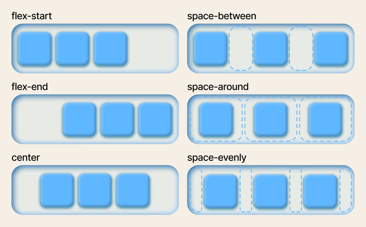
- Cross Axis Alignment (
align-items,align-content):- The browser aligns the items within their line along the cross axis using
align-items(or an individual item'salign-self). - If there are multiple flex lines (from wrapping) and extra space in the container's cross-axis, the browser uses
align-contentto distribute that space among the lines themselves.
- The browser aligns the items within their line along the cross axis using
Algorithm in Practice: The flex: 1 Shorthand
Let's apply this algorithmic thinking to a common pattern: creating equal-width columns using flex: 1.
Kevin Powell's video 'Learn flexbox the easy way' explains exactly why this works, connecting directly to the steps of our algorithm.
Watch from 14:50 to 20:31. Pay close attention to the explanation of what flex: 1 expands to (flex-grow: 1, flex-shrink: 1, flex-basis: 0) and the algorithmic consequence of flex-basis: 0.
Let's trace flex: 1 through our algorithm:
- Determine Hypothetical Size: The shorthand sets
flex-basis: 0. Every item starts with a hypothetical size of 0. - Distribute onto Lines: Since the items have no width, they all fit on a single line (unless wrapping is forced).
- Resolve Flexible Lengths: The browser sums the hypothetical sizes (0), and sees that the entire width of the container is positive free space. It then applies the
flex-growalgorithm. Since all items haveflex-grow: 1, this massive amount of free space is distributed equally among them. - Align: The items now fill the container, so
justify-contenttypically has no visible effect.
This demonstrates how understanding the sequence of operations allows you to reason about why common CSS patterns work the way they do.
Conclusion
You have now constructed a complete conceptual model of the Flexbox layout algorithm. By thinking in this structured, step-by-step manner, you can predict how Flexbox will behave in almost any situation.
Key Takeaways:
- Flexbox layout is a four-step algorithm: Hypothetical Sizing, Line Distribution, Flexible Length Resolution, and Alignment.
- Step 1 (Sizing): Flexbox first determines a
flex-basisor intrinsic content size for each item. This is a "hypothetical" size. - Step 2 (Distribution): Based on hypothetical sizes, items are collected into one or more flex lines.
- Step 3 (Resolution): Sizing logic (
flex-groworflex-shrink) is applied independently to each line to determine final item sizes. - Step 4 (Alignment): Finally, items are positioned.
justify-contentaligns the group on the main axis, whilealign-itemspositions individual items on the cross axis.
What's Next?
We've introduced the alignment properties justify-content and align-items as the final step of the algorithm. In the next lesson, we will perform a deep dive into these properties. We will explore all of their possible values, subtle differences (e.g., space-around vs. space-evenly), and how they interact with flex-direction to give you complete control over positioning.