Introduction
Hello! In our previous module, we established a strong foundation in CSS fundamentals, culminating in a deep dive into the stacking context model that governs the z-index property. We've mastered how to control individual elements and their layering. Now, we shift our focus from individual element control to managing the layout of groups of elements with modern CSS.
Welcome to the module on Advanced CSS Layout. We'll begin with Flexbox, a powerful one-dimensional layout system that revolutionized how we align and distribute space among items in a container.
Today's lesson focuses on the very heart of Flexbox's flexibility. Your learning outcome is to describe how flex-grow, flex-shrink, and flex-basis determine flexible item sizing. Understanding these three properties is the key to mastering how flex items expand, contract, and negotiate for space. We will dissect the underlying algorithm that the browser uses, which will give you a predictive, rather than intuitive, understanding of Flexbox behavior.
The Core of Flex Sizing
The final size of a flex item is not determined by a single property but is the result of a calculation involving three key inputs:
flex-basis: The item's ideal, or starting, size.flex-grow: A factor determining how much the item will grow if there's extra space.flex-shrink: A factor determining how much the item will shrink if there's not enough space.
Only one of flex-grow or flex-shrink can be active at any given time for a set of flex items. Let's break down each component of this system.
flex-basis: The Starting Point
Before a browser can decide how to distribute extra space or handle an overflow, it needs to know the "ideal" size of each item. This is the role of flex-basis.
Think of flex-basis as a more abstract version of width or height. Its key feature is that it always refers to the size in the main axis.
- If
flex-directionisrow,flex-basiscontrols the width. - If
flex-directioniscolumn,flex-basiscontrols the height.
This makes it axis-aware, unlike width and height, which are always horizontal and vertical, respectively.
How Do Flex-Basis, Flex-Grow, Flex-Shrink Work? | CSS Flexbox
To see this in action, let's watch a section of the video 'How Do Flex-Basis, Flex-Grow, Flex-Shrink Work?' by The Code Creative. It clearly demonstrates the role of flex-basis and its relationship with flex-direction.
Watch from the beginning to 04:33. Pay attention to how flex-basis acts as a replacement for width in a row and height in a column. Note the explanation that if both width and flex-basis are set, flex-basis takes precedence.
The default value for flex-basis is auto. When set to auto, the browser looks at the item's width or height property. If that is also auto, it falls back to the item's content size. This is why you can often use width on flex items and have it work as expected. However, explicitly using flex-basis is clearer and more idiomatic.
For a more technical breakdown of how flex-basis is resolved, the following reading is excellent. It details what the spec says and introduces different "modes of operation" based on the value of flex-basis.
The article '4. CSS3: Flexbox' provides a spec-level analysis of flex-basis.
Read the section titled 'flex-basis'. Focus on understanding the definitions for auto, content, and width, and the author's four conceptual 'modes of operation' (e.g., 'purely proportional', 'fixed basis + proportional'). This provides a robust mental model for how the initial sizing step works.
flex-grow: Distributing Positive Free Space
Once the browser calculates the flex-basis for all items, it adds them up. If this total is less than the size of the flex container, there is positive free space. The flex-grow property dictates how this leftover space is distributed.
Key points about flex-grow:
- The default value is
0, meaning items will not grow by default. - It accepts a unitless, non-negative number.
- The value is a proportion, not an absolute measurement.
If all items have flex-grow: 1, the free space is distributed equally among them. If one item has flex-grow: 2 and its siblings have flex-grow: 1, it will receive twice as much of the free space as the others.
The calculation is as follows:
- Calculate free space:
container size - sum of all flex-basis values. - Calculate total grow factor: Sum of all
flex-growvalues. - Distribute space: Each item gets
(item's flex-grow / total grow factor) * free space. - Final size:
item's flex-basis + distributed space.

For the exact algorithmic steps, we'll turn back to our technical resource.
Let's examine the precise algorithm for flex-grow.
Read the section 'Calculations for flex-grow'. Follow the concrete example with the step-by-step math. This demonstrates exactly how the browser resolves the final sizes based on basis and grow factors.
flex-shrink: Absorbing Negative Free Space
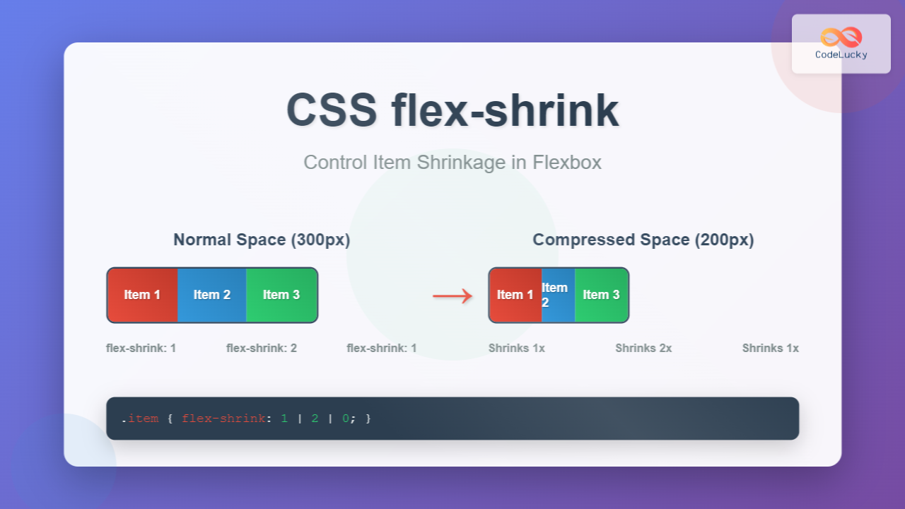
If the sum of the items' flex-basis is greater than the container's size, we have negative free space (an overflow). The flex-shrink property dictates how items shrink to fit.
Key points about flex-shrink:
- The default value is
1, meaning items shrink by default to prevent overflow. - Setting
flex-shrink: 0prevents an item from shrinking. - Like
flex-grow, the value is a proportion.
The calculation for flex-shrink is more complex than for flex-grow. It's not just proportional to the flex-shrink value alone; it's also weighted by the item's flex-basis.
The algorithm is designed this way to ensure that larger items shrink more in absolute terms than smaller items. This prevents a small item from shrinking to zero while a very large item has barely been reduced.
The calculation works like this:
- Calculate negative space:
sum of all flex-basis values - container size. - Calculate scaled shrink factor for each item:
item's flex-shrink * item's flex-basis. - Calculate total scaled shrink factor: Sum of all scaled shrink factors.
- Distribute shrinkage: Each item shrinks by
(item's scaled shrink factor / total scaled shrink factor) * negative space. - Final size:
item's flex-basis - distributed shrinkage.
Let's look at the formal algorithm.
Now for the flex-shrink algorithm. Pay close attention to why its calculation is different from flex-grow.
Read the section 'Calculations for flex-shrink'. Work through the example and, most importantly, read the note from the spec at the end that explains the rationale behind multiplying the shrink factor by the flex base size.
Constraints and Gotchas
The sizing algorithm is powerful, but it doesn't operate in a vacuum. Two important factors can override its results.
1. min-width and max-width
The properties min-width/min-height and max-width/max-height act as clamps on the final size. No matter what flex-grow or flex-shrink calculates, an item will not grow larger than its max-size or shrink smaller than its min-size.
2. The Minimum Size Gotcha
By default, a flex item will not shrink smaller than its intrinsic minimum content size (e.g., the length of the longest word or a form input's default size). This can lead to unexpected overflows where an item with flex-shrink: 1 refuses to shrink.
This is a very common source of confusion. The solution is to override this default behavior.
An Interactive Guide to Flexbox in CSS
Josh Comeau's interactive guide has an excellent section explaining this 'gotcha' and its simple solution.
Read the section 'The minimum size gotcha'. The example of the search form is a classic case. Understand that the solution is to set min-width: 0 (or min-height: 0 for columns) on the flex item to allow it to shrink below its default minimum content size.
Conclusion
You have now dissected the engine of Flexbox sizing. By understanding the distinct roles and calculation methods of flex-basis, flex-grow, and flex-shrink, you can move from trial-and-error to a precise, predictive approach to creating flexible layouts.
Key Takeaways:
flex-basisis the axis-aware starting size of an item before any growing or shrinking occurs.flex-growdistributes positive free space proportionally among items. The calculation is(grow factor / total grow) * free space.flex-shrinkremoves negative space (overflow) from items. The calculation is more complex, weighted by both the shrink factor and the item's basis size to produce more natural scaling.- The browser sizing algorithm first resolves the hypothetical sizes with
flex-basis, then applies eitherflex-groworflex-shrinkdepending on the available space. - Final sizes are always clamped by
min-andmax-size properties, and items won't shrink below their intrinsic minimum size unless you specifymin-width: 0.
What's Next?
With a solid grasp of how flex items are sized, we're ready to look at the complete picture. In the next lesson, we will explore the conceptual algorithm Flexbox uses to distribute space among items, which builds upon what we learned today, and then dive into the alignment properties (justify-content, align-items) that position items along the main and cross axes.