Introduction
Welcome to our next lesson on Flexbox. In our previous session, we deconstructed the four-step conceptual algorithm that browsers use to render flex layouts: determining hypothetical sizes, distributing items into lines, resolving flexible lengths, and finally, alignment. We concluded by touching on alignment as the last crucial step.
Today, we'll perform a deep dive into that final step. Your learning outcome is to explain how flexbox alignment properties (justify-content, align-items, align-self) control positioning along the main and cross axes. We will solidify the mental model of main-axis-versus-cross-axis alignment, explore the specific properties and their values, and understand the "why" behind their design. This will give you precise control over the position of your components.
The Golden Rule of Flexbox Alignment
The most common point of confusion with Flexbox alignment is remembering which property controls which direction. The key is to stop thinking in terms of "horizontal" and "vertical" and start thinking in terms of the main axis and cross axis.
There is a simple rule to remember:
- Properties starting with
justify-control alignment along the main axis. - Properties starting with
align-control alignment along the cross axis.
Everything You Need To Know About Alignment In Flexbox
The article 'Everything You Need To Know About Alignment In Flexbox' from Smashing Magazine starts by stating this rule very clearly. Let's use it to frame our understanding.
Read the section titled 'The Properties'. This section establishes the fundamental distinction between justify- and align- properties.
As a reminder, the physical direction of these axes is determined by the flex-direction property.
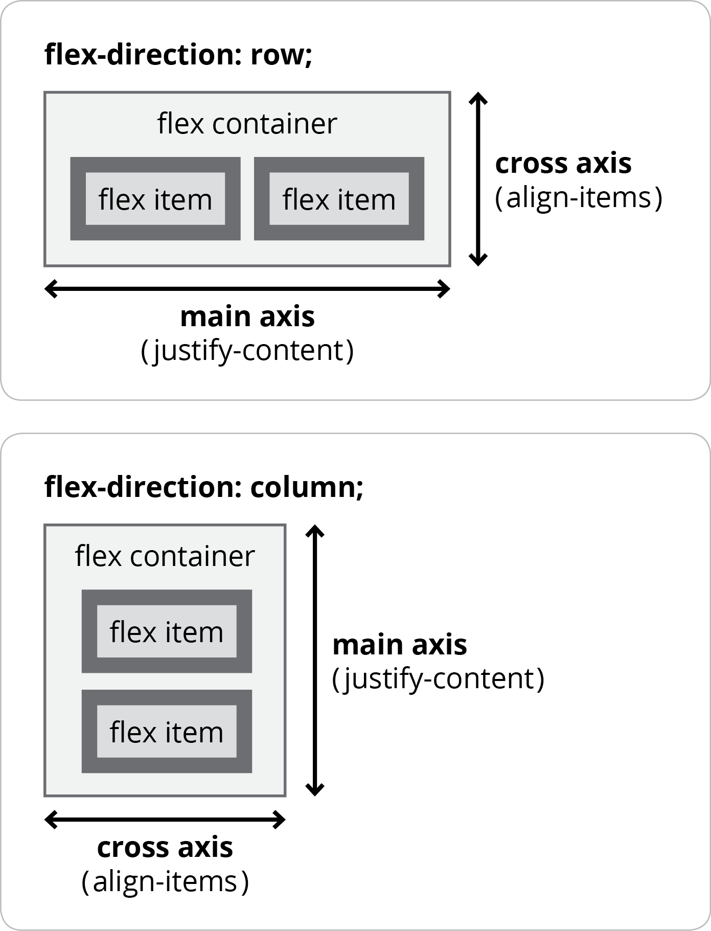
This interaction is the foundation of Flexbox alignment. Before we look at the properties themselves, let's quickly review how flex-direction works, as it's essential for predicting how alignment will behave.
A Comprehensive Guide to Flexbox Alignment
The video 'A Comprehensive Guide to Flexbox Alignment' offers a concise explanation of the axes and the role of flex-direction.
Watch from 01:30 to 07:44. The first part (until 03:09) explains the concept of the main and cross axes. The second part demonstrates how flex-direction changes their orientation. This is a critical concept we'll build on.
With this foundation, let's explore the properties, starting with the main axis.
Main Axis Alignment: justify-content
In the last lesson, we introduced the "kebab" metaphor: on the main axis, items are skewered together and must move as a group. This is the core concept behind justify-content. It doesn't align individual items; it distributes the group of items on a single flex line by managing the free space between and around them.
Flexbox Alignment & Justification Without the Guesswork
Kevin Powell's video 'Flexbox Alignment & Justification Without the Guesswork' provides an excellent mental model for this.
Watch from 03:06 to 04:21. Focus on how he explains justify-content as operating on the 'content' as a single group along the main axis.
The justify-content property is applied to the flex container and accepts several values to control the distribution of space. It only has an effect if there is positive free space on the flex line.
The most common values are:
flex-start(default): Packs items toward the start of the main axis.flex-end: Packs items toward the end of the main axis.center: Packs items in the center of the main axis.space-between: Distributes space evenly between items. The first item is at the start, and the last item is at the end.space-around: Distributes space evenly around each item. This means the space at the ends of the container is half the space between items.space-evenly: Distributes space evenly, so the spacing between any two items and the space to the edges is equal.
The video from Envato Tuts+ that you watched earlier provides a good visual walkthrough of these values. Feel free to re-watch the section on justify-content (14:26 - 18:07) if you need a visual refresher.
Cross Axis Alignment: align-items and align-self
Now, let's turn to the cross axis. Here, our metaphor shifts from a single kebab to multiple, parallel "cocktail wieners." Each item can move along its own track (the cross axis) independently of its siblings. This is why we have properties to align individual items.
The primary property for this is align-items, which is set on the flex container. It establishes a default alignment for all items within each flex line.
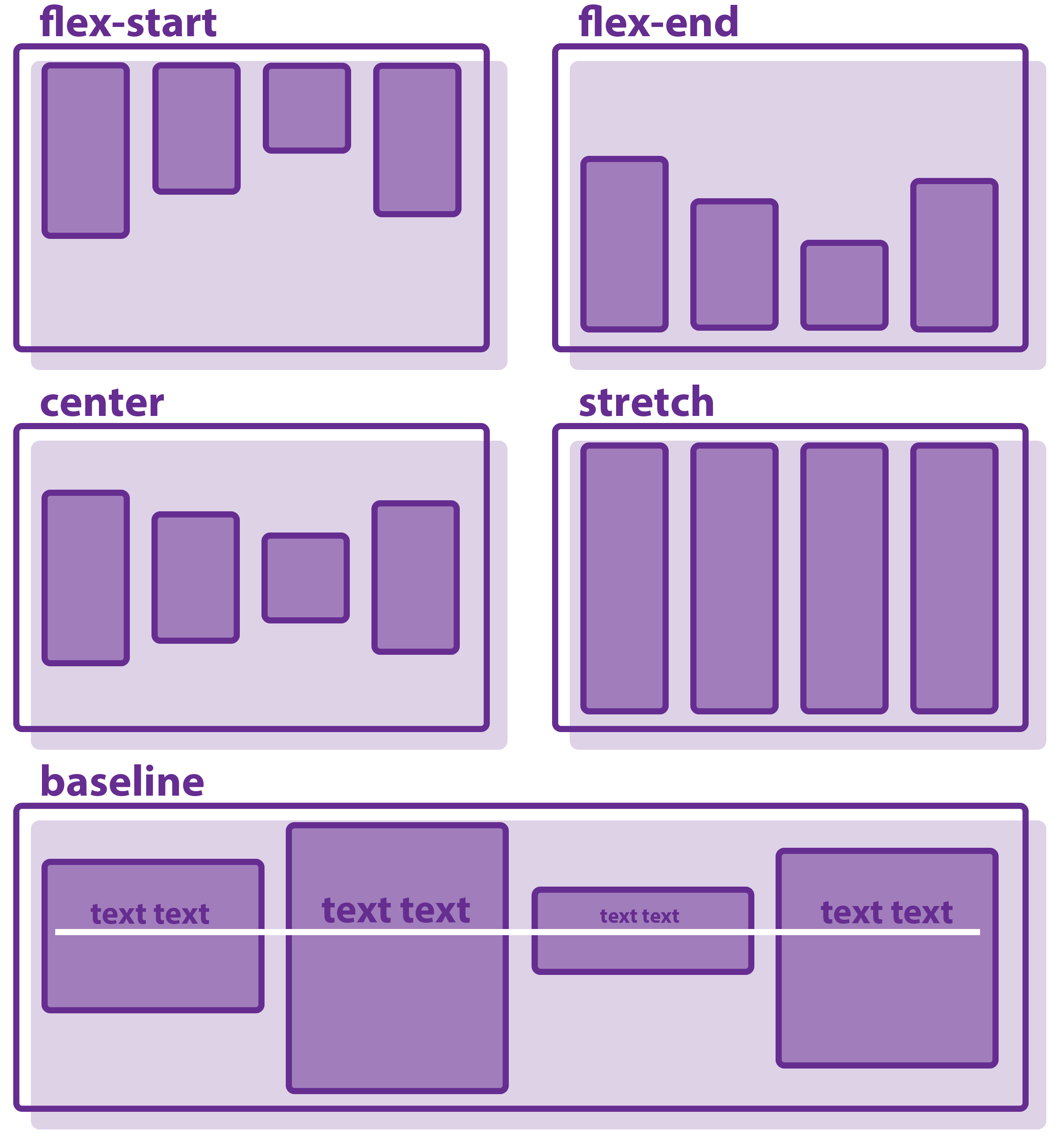
The key values for align-items are:
stretch(default): Stretches items to fill the container's height (or width, ifflex-direction: column).flex-start: Aligns items to the start of the cross axis.flex-end: Aligns items to the end of the cross axis.center: Centers items along the cross axis.baseline: Aligns items based on the baseline of their text content. This is particularly useful for ensuring textual alignment across elements with different padding or font sizes.
Now, let's watch how this works in practice and introduce its counterpart, align-self.
Flexbox Alignment & Justification Without the Guesswork
Let's return to Kevin Powell's video. He follows up the justify-content explanation with a clear distinction for align-items and align-self.
Watch from 04:21 to 06:40. He first explains align-items as working on individual 'items' on the cross axis. Then, he introduces align-self to show how you can override this for a single item. Note his explanation for why justify-self doesn't make sense in this model.
As you just saw, align-self is applied directly to a flex item (a child) to give it a unique alignment on the cross axis, overriding the align-items value set on the container. It accepts the same values as align-items (plus auto, which resets it to the container's align-items value).
From a conceptual standpoint, you can think of align-items as a convenient shorthand that sets the align-self property on all child items simultaneously. This aligns perfectly with your interest in understanding the underlying mechanics.
The Impact of flex-direction
It's crucial to see how these properties behave when the axes are swapped. When you set flex-direction: column, the main axis becomes vertical and the cross axis becomes horizontal.
justify-contentnow controls vertical alignment.align-itemsnow controls horizontal alignment.
This is often where developers get tripped up, but with the "main axis/cross axis" mental model, it remains perfectly consistent.
Flexbox Alignment & Justification Without the Guesswork
Let's watch the final segment from Kevin Powell's video, where he demonstrates this exact swap.
Watch from 06:40 to 08:15. Observe how the behaviors of justify-content and align-self are completely inverted once flex-direction is set to column, yet they remain consistent with the main/cross axis rules.
A Note on Multi-Line Alignment: align-content
While not part of the core learning outcome, it's important to know about align-content to complete your understanding. This property is conceptually similar to justify-content, but it operates on the cross axis when you have multiple flex lines (i.e., when flex-wrap: wrap is in effect and items have wrapped).
align-itemsaligns items within a line.align-contentaligns the lines themselves as a group within the container.
This distinction is a common source of confusion, but it makes sense: when you have multiple lines, they form a "group" or "content" on the cross axis, which can then be distributed, just like justify-content does on the main axis.
You can learn more by reading the section "Cross Axis Alignment With align-content" in the Smashing Magazine article (LINK, section 2) we looked at earlier.
Conclusion
In this lesson, we've dissected the primary Flexbox alignment properties. By anchoring your understanding to the concepts of the main and cross axes, you can now predict and control item positioning with precision.
Key Takeaways:
- The Golden Rule:
justify-properties work on the main axis, whilealign-properties work on the cross axis. justify-contentaligns the group of items on a flex line by distributing free space. It's for the "kebab."align-itemssets the default alignment for individual items within a line on the cross axis. It's for the "cocktail wieners."align-selfis applied to a flex item to override the container'salign-itemsvalue, giving it individual alignment on the cross axis.- Changing
flex-directionfromrowtocolumnswaps the physical orientation of the axes, and thus swaps which properties control horizontal vs. vertical alignment.
What's Next?
We have now thoroughly covered the one-dimensional layout capabilities of Flexbox. In our next lesson, we will transition to its powerful two-dimensional sibling, CSS Grid. We'll start by exploring one of its foundational concepts: the difference between the implicit and explicit grid, which is key to understanding how Grid builds its track system.