Introduction
Hello! In our previous lesson, you learned how grid-template-areas provides a wonderfully intuitive, high-level abstraction for defining layouts by creating a visual map in your CSS. This approach excels at organizing the main sections of a page in a readable and responsive way.
Today, we'll explore another powerful feature of CSS Grid that pushes the boundaries of automatic, responsive layouts. Our focus will be on a common challenge: creating a grid of items, like a photo gallery or a list of product cards, that automatically adjusts the number of columns to fit the available space—without using media queries.
The learning outcome for this lesson is to differentiate the behavior of auto-fill and auto-fit for creating responsive grid layouts. Understanding the subtle yet crucial difference between these two keywords is key to mastering fluid grid systems and will give you precise control over how your components adapt to different viewport sizes. This is a core concept for building modern, flexible UIs.
The Auto-Responsive Grid Pattern
To begin, let's look at the powerful one-line CSS declaration that makes this possible. The general pattern looks like this:
grid-template-columns: repeat(auto-fit, minmax(250px, 1fr));
This line instructs the browser to create as many columns as can fit, where each column must be at least 250px wide but can grow to fill any extra space. This combination of repeat(), minmax(), and a keyword like auto-fit is a cornerstone of modern CSS.
Let's see it in action and build up the pattern from scratch.
The magic of auto-fit and auto-fill (and the difference between them)
The video 'The magic of auto-fit and auto-fill' by Kevin Powell provides an excellent practical introduction to this pattern. We'll start by focusing on auto-fit.
Watch from 03:39 to 07:50. Pay attention to: How repeat(auto-fit, minmax(300px, 1fr)) creates a grid that automatically changes the number of columns. The problem that arises at small screen sizes when the minimum size (e.g., 500px) is larger than the viewport, causing overflow. The elegant solution using the min() function: minmax(min(500px, 100%), 1fr). This is a sophisticated technique that ensures columns never overflow their container.
This pattern is extremely useful, but you've probably noticed it can get quite long and syntactically complex. The video you just watched also offers a memorable way to reconstruct it, which is worth keeping in mind.
The Core Difference: auto-fill vs. auto-fit
So far, we've only used auto-fit. But there's another keyword, auto-fill, that behaves almost identically... until it doesn't. The difference is subtle but has significant implications for your layout's behavior, especially when the number of grid items is less than what could fit in the container.
Let's establish a clear definition for each:
-
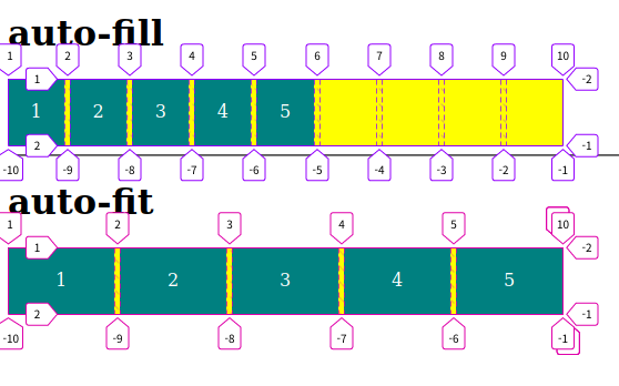
auto-fill: FILLS the row with as many columns as it can fit. If there are not enough grid items to fill these columns, it creates empty, "ghost" columns that still occupy space. This keeps the filled columns at theirminmax()defined size. -
auto-fit: FITS the available grid items into the container. It also calculates how many columns could fit, but if there are empty columns, it collapses them to zero width. The space that would have been used by these empty columns is then distributed among the existing grid items, causing them to grow.
This image provides a perfect visual summary of the distinction:
Now, let's dive deeper into the mechanics.
Auto-Sizing Columns in CSS Grid: `auto-fill` vs `auto-fit`
The article 'Auto-Sizing Columns in CSS Grid: auto-fill vs auto-fit' on CSS-Tricks provides a great textual breakdown of this concept.
Read the sections 'Fill or Fit? What’s the difference?' and the following section that visually describes the behavior (up to the 'Summing up' heading). Focus on the core idea presented: 'To collapse or not to collapse, that is the question.'
To see the "under-the-hood" mechanism in a browser's developer tools, the following video is invaluable. It clearly shows the implicit tracks being created.
CSS Grid - Unlock the Secrets of AUTO-FILL vs AUTO-FIT
The video 'CSS Grid - Unlock the Secrets of AUTO-FILL vs AUTO-FIT' from Optimistic Web offers a fantastic visual explanation using browser dev tools.
Watch from 03:01 to 06:15. Observe how the dev tools reveal the empty columns created by auto-fill and how auto-fit causes the grid lines of empty tracks to collapse onto each other.
Practical Implications and When to Choose
Now that you understand the mechanical difference, the critical question is: when should you use one over the other? The choice depends entirely on the desired user experience, particularly when dealing with a dynamic number of items.
Use Case for auto-fill
Imagine a portfolio page where users can filter projects by category ("All," "Frontend," "Backend").
- When "All" is selected, you might have 8 projects, filling two rows.
- When the user filters to "Backend," there might only be 3 projects.
If you used auto-fit, those 3 projects would stretch to fill the entire width of the container, causing a jarring layout shift. By using auto-fill, the 3 projects would retain their original size, and the remaining space in the row would be occupied by empty, invisible tracks. The layout remains stable and predictable.
Let's see this exact scenario demonstrated.
The magic of auto-fit and auto-fill (and the difference between them)
Let's return to Kevin Powell's video, where he demonstrates this precise use case.
Watch from 11:12 to 14:11. Notice how he explains that auto-fill is preferable for filtering because the layout doesn't change drastically when the number of items is reduced.
Use Case for auto-fit (and a word of caution)
auto-fit is often the default choice when you simply want a gallery of items to be fluid and always occupy the full width of their container, regardless of how many there are. It creates a compact, "squishy" feel.
However, this behavior has a significant downside you must be aware of, especially given your background in building robust systems. What happens if there is only one item in the container? With auto-fit, that single item will expand to fill the entire available width. If the item is a card with an image, this can lead to a disastrously oversized and distorted UI.
A Deep Dive Into CSS Grid minmax()
This important caveat is discussed in the article 'A Deep Dive Into CSS Grid minmax()' by Ahmad Shadeed. It's a crucial piece of knowledge for production-ready CSS.
Read the section titled 'The downside of using auto-fit irresponsibly'. This short section clearly illustrates the problem with a practical example.
This scenario highlights that while these CSS features are powerful, they require a deep understanding of their edge cases to be used effectively and safely in dynamic applications.
Conclusion
In this lesson, you've dissected one of the most powerful and modern patterns in CSS for creating responsive layouts. You now understand not just the syntax but the core behavioral difference between auto-fill and auto-fit.
Key Takeaways:
- The Pattern: The
repeat(auto-keyword, minmax(min-size, 1fr))formula is your tool for creating grids that automatically adjust column counts without media queries. auto-fillPreserves Space: It creates as many columns as possible and leaves empty ones in place, which is ideal for maintaining a stable layout when the number of items changes (e.g., filtering).auto-fitFills Space: It collapses empty columns and expands the existing items to fill the container. This is great for fluid, gapless galleries but can be dangerous if the item count can be very low (e.g., one).- Context is Key: The choice between them is not about right or wrong, but about matching the behavior to the specific user experience you want to create.
What's Next?
You have now explored advanced layout techniques within CSS Grid, from declarative mapping with grid-template-areas to automatic column generation with auto-fit/fill. In our next lesson, we will zoom out and focus on architectural strategy. The learning outcome will be to describe a strategy for combining Grid and Flexbox, explaining when to nest one within the other for page-level versus component-level layouts. This will help you make high-level decisions about which tool to use for the job.