Introduction
Welcome to your next lesson on Advanced CSS Layouts. In our previous session, you mastered the fr unit and the underlying algorithm CSS Grid uses to distribute space among tracks. This gave you precise control over the sizing of your grid. Now, we'll build on that by exploring a more declarative and intuitive way to handle the placement of items within that grid.
Today's learning outcome is to explain how grid-template-areas defines named layout regions. Instead of counting grid lines, you'll learn to create a visual "map" of your layout directly in your CSS. This approach is not only more readable but is also exceptionally powerful for creating maintainable and responsive designs. For you, understanding this isn't just about the syntax; it's about seeing how this high-level abstraction connects to the underlying grid line system we've already touched upon.
The Core Concept: A Visual Map for Your Layout
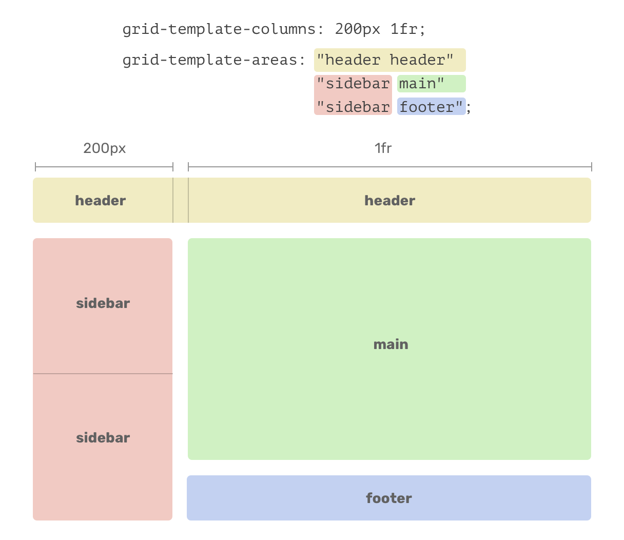
At its heart, grid-template-areas allows you to name the cells of your grid and arrange them in a way that visually resembles your final layout. Think of it as creating an ASCII-art representation of your page structure.
This animated GIF gives a perfect first impression of the concept in action.

The process involves two main steps:
- On the grid container: Use
grid-template-areasto define a grid of named regions. - On the grid items: Use the
grid-areaproperty to assign each item to one of the named regions.
Let's dive into the details with a comprehensive guide.
The article on grid-template-areas from CSS-Tricks provides an excellent, in-depth explanation of this property. We will use it as our primary reference.
First, read the introduction (up to the 'Syntax' heading) to understand the basic concept. Then, read the section titled 'Basic usage'. Focus on how the string syntax creates rows and columns and how the grid-area property on the child elements connects them to the layout.
To reinforce this, let's watch a concise video that walks through this exact two-step process.
Learn CSS Grid - A 13 Minute Deep Dive
The video 'Learn CSS Grid - A 13 Minute Deep Dive' offers a very clear and quick demonstration of setting up and assigning grid areas.
Watch from 08:02 to 09:40. Pay close attention to how the number of quoted strings corresponds to the number of rows, and the number of names within each string corresponds to the number of columns.
The Rules of grid-template-areas
While the concept is intuitive, it operates under a strict set of rules. Understanding these is crucial for building valid and predictable layouts.
-
Rule 1: Areas must be rectangular. You can create an area that spans multiple cells, but it must form a complete rectangle. You cannot create "L" or "T" shaped areas. Repeating a name across rows and columns is how you create these rectangular spans.
-
Rule 2: All rows must have the same number of columns. Every string in your
grid-template-areasvalue must have the same number of cell names. -
Rule 3: Use a dot (
.) for empty cells. To leave a grid cell empty, use a period as a placeholder. You can use multiple periods (...), but a single one is sufficient. This does not create a named area; it simply leaves the cell unoccupied.
Let's refer back to the CSS-Tricks article to see these rules illustrated.
The CSS-Tricks article clearly documents these rules with helpful visuals.
Review the following parts of the article: The image of invalid 'T' and 'L' shaped areas in the introduction (Section 0). The subsection 'Spanning cells and rows' (Section 2) for a recap on creating rectangular areas. The subsections 'We can create gaps...' and 'Rows must have the same number of columns' (Section 3) to understand empty cells and the consistent column count rule.
Under the Hood: Implicitly Named Lines
Given your interest in the mechanics, it's important to understand that grid-template-areas isn't magic—it's syntactic sugar built on top of the grid line system.
When you define a named area, for example main, CSS Grid automatically creates four named grid lines for you: main-start (for the starting row and column line) and main-end (for the ending row and column line).
This mechanism is why grid-template-areas works. Let's see how this is documented and used.
The MDN Web Docs article 'Layout using named grid lines' has a fantastic section that explains this relationship clearly.
Read the section 'Implicit grid lines from named areas'. The diagram is particularly useful for visualizing how an area like 'sd' (sidebar) creates the sd-start and sd-end lines.
Knowing that these lines exist is not just a theoretical exercise. You can actually use them to position other items, which allows for powerful layering effects. For instance, you could place an overlay element to span from main-start to main-end without needing to know the specific line numbers.
Kevin Powell demonstrates this concept beautifully in the following video.
There is a way to overlap grid-template-areas!
In this video, Kevin Powell shows a practical use case for these implicitly created grid lines.
Watch from 03:19 to 04:30. Observe how he uses grid-row: image-section-one / title to position an item using the start line of one area and the start/end line of another. This highlights the power and flexibility this underlying mechanism provides.
This connection between named areas and named lines is a fundamental concept. It also works in reverse: if you manually name grid lines with -start and -end suffixes (e.g., [content-start] and [content-end]), Grid will implicitly create a named area called content for you.
Application: Readable and Responsive Layouts
The primary benefit of grid-template-areas is its ability to create clean, readable, and highly maintainable layouts, especially when dealing with responsive design. Redefining an entire page layout for a different breakpoint becomes trivial—you simply rewrite the "map" inside a media query.
The classic "Holy Grail" layout is the quintessential example of this.
Let's return to the CSS-Tricks article one last time to see a powerful, real-world example.
Read the section 'Example: Responsive Holy Grail layout'. Pay close attention to how the .container's grid-template-areas property is completely redefined within the @media query to transform a simple stacked layout into a complex three-column design.
This ability to change the semantic placement of elements without altering the HTML document order is a cornerstone of modern CSS. It separates content structure (HTML) from presentation (CSS) and makes your components more adaptable and reusable.
Conclusion
You have now learned how grid-template-areas offers a powerful, visual abstraction for defining layouts. By understanding both its simple syntax and its underlying connection to the grid line system, you can build complex, responsive UIs with code that is remarkably clear and easy to maintain.
Key Takeaways:
- A Visual Map:
grid-template-areasallows you to define layouts in a way that visually mirrors the final design. - Two-Step Process: Define named regions on the container with
grid-template-areas, then assign items to those regions using thegrid-areaproperty. - Core Rules: Remember that all defined areas must be rectangular, every row must have the same number of columns, and the
.character is used to denote an empty cell. - Implicit Lines: The property works by creating implicit named lines (e.g.,
main-start,main-end), which provides a conceptual bridge to line-based placement and enables advanced layering. - Responsive Power: The greatest strength of
grid-template-areasis the ability to completely redefine a layout within media queries, making it a first-class tool for responsive design.
What's Next?
With a solid understanding of tracks, sizing, and now named areas, you have a robust toolkit for creating static and responsive grids. In the next lesson, we'll continue exploring responsive techniques by examining how the grid can automatically create tracks based on the container's available space. You will learn to differentiate the behavior of auto-fill and auto-fit for creating responsive grid layouts, another powerful feature for building flexible UIs.