Introduction
In our last lesson, we established the difference between explicit and implicit grid tracks. You now understand how the browser creates the grid's structure, either from your direct instructions (grid-template-*) or automatically (grid-auto-*) to accommodate content.
With that foundation, we can now address a more dynamic question: how does the grid distribute space within that structure? This lesson focuses on one of CSS Grid's most powerful and unique features: the fractional unit (fr). Your learning outcome is to describe how the fr unit functions and how the grid algorithm distributes fractional space.
This isn't just about learning a new CSS unit. For someone with your background, the key is to understand the underlying algorithm the browser uses to calculate and allocate space. This will allow you to predict, control, and debug complex layouts with precision.
The Fractional Unit (fr): A Share of the Pie
At its core, the fr unit represents a fraction of the available space in a grid container. Unlike pixels or percentages, it's a flexible length that tells the browser how to distribute space proportionally among tracks.
Let's start with a simple visual.
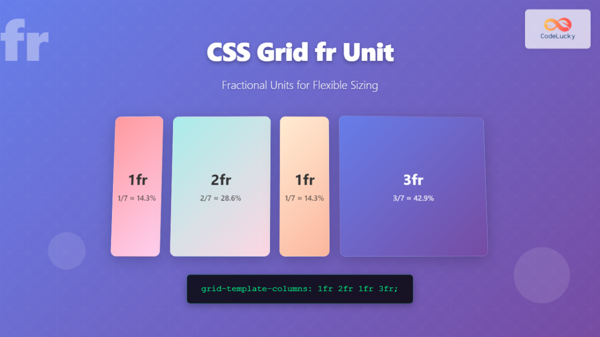
To see this in action, let's watch a brief, clear introduction.
Rachel Andrew, a key figure in the development of CSS Grid, provides a concise explanation of the fr unit's basic function in this video, 'Intro to the CSS Grid fr unit'.
Watch from 00:05 to 01:54. Pay attention to: The basic definition of the fr unit. How changing the fr values alters the proportions. How fr units interact with fixed-size tracks (like pixels) and how grid-gap is subtracted before the fractional space is calculated.
As the video shows, when you mix fixed units with fr units, the browser follows a clear sequence:
- It reserves space for non-flexible tracks (e.g., those defined in
px) and gaps (grid-gap). - The remaining space is the "free space."
- This free space is then divided among the
fr-sized tracks according to their proportions.
The Distribution Algorithm: Under the Hood
You're interested in the mechanics, so let's formalize the algorithm the browser uses when it encounters fr units in a track definition like grid-template-columns: 100px 1fr 2fr;:
- Account for Non-Flexible Items: The browser first allocates space for all tracks with fixed sizes (
100px), content-based sizes (auto,min-content), and gaps. - Calculate Free Space: The total space taken by these non-flexible items is subtracted from the total available space in the grid container. The result is the free space.
- Sum Flex Factors: The browser sums the flex factors of all fractional tracks (in our example,
1 + 2 = 3). - Determine the Value of
1fr: The free space is divided by the sum of the flex factors. This gives the computed value of a single fractional unit. - Distribute Space: Each
frtrack is sized by multiplying its flex factor by the computed value of1fr.
This process is precisely defined in the W3C specification. The section "Flexible Lengths: the fr unit" states that "The total size of such rows or columns [non-flexible ones] is subtracted from the available space, yielding the free space, which is then divided among the flex-sized rows and columns in proportion to their flex factor." We will refer back to this specification for more advanced behaviors.
Let's watch a video that walks through this calculation with clear diagrams.
Become a CSS Grid Pro! Learn EVERYTHING You Need to Know In Detail 🔍
The video 'Become a CSS Grid Pro!' provides an excellent, detailed walkthrough of the fractional distribution algorithm.
Watch from 19:00 to 20:41. The narrator provides a clear, step-by-step example with numbers (1000px container, 8 total fractions) that perfectly illustrates the algorithm described above.
A Critical Nuance: The Influence of Content
So far, fr seems straightforward. However, there's a crucial detail in the sizing algorithm that can lead to unexpected results. What happens if an item's content is larger than the space its fr track is allocated?
For example, consider grid-template-columns: 1fr 1fr 1fr; where one track contains a very long, unbreakable word. You might expect three equal columns, but you won't get them.
This is because 1fr is syntactic sugar for minmax(auto, 1fr). The auto minimum typically resolves to the min-content size of the items in that track. Therefore, the grid sizing algorithm gives precedence to the content's minimum required size.
Let's explore this concept, as it's key to truly understanding fr unit behavior.
How Big Is That Box? Understanding Sizing In CSS Layout
In her article 'How Big Is That Box? Understanding Sizing In CSS Layout' for Smashing Magazine, Rachel Andrew explains this exact behavior.
Read the sections 'fr Units' and 'Making Equal Tracks With minmax'. Focus on: The example with the long word that prevents equal column distribution. The explanation that Grid prioritizes min-content size before distributing fractional space. How minmax(0, 1fr) can be used to override this default behavior and force truly equal distribution, even if it causes overflow.
This reveals a deeper truth about the grid sizing algorithm: it's not a simple one-pass calculation. The W3C specification details a multi-step Track Sizing Algorithm which, in simplified terms, looks like this:
- Initialize Sizes: Set up base sizes and growth limits. Flexible tracks like
frstart with a base size of zero. - Resolve Intrinsic Sizes: The algorithm looks at the content inside the tracks. It increases track sizes to accommodate
min-contentandmax-contentrequirements. This is the step where a long word forces its column to be wider. - Maximize Tracks: The algorithm grows tracks further, respecting their maximum sizing functions.
- Stretch Flexible Tracks: Finally, with all content-based sizing resolved, whatever space is left over is distributed among the
frtracks.
This means that fr units are used to distribute the leftovers, after the grid has already made room for content. Understanding this sequence is vital for predicting layout behavior.
An Edge Case: fr Units in Rows
The behavior of fr can change depending on the context. Its behavior in rows is particularly interesting and highlights the importance of whether the container has a defined size.
Let's look at the two scenarios for grid-template-rows.
Become a CSS Grid Pro! Learn EVERYTHING You Need to Know In Detail 🔍
Returning to 'Become a CSS Grid Pro!', let's examine how fr behaves in rows, which depends on whether the container's height is defined.
First, watch from 22:47 to 25:02. This covers the straightforward case where the grid container has an explicit height. The fr unit works just as it does for columns. Next, watch from 25:02 to 29:27. This explains the more complex but logical behavior when the container does not have a set height. Pay attention to how the browser uses the content size to derive a 'hypothetical 1fr' value, which then determines the size of the rows and the container itself.
This "unexpected" behavior when the container height is not set is a direct implementation of the W3C spec's rule for when available space is "indefinite." The algorithm states that the browser should size the tracks to their contents while retaining their proportions. It does this by finding the largest content size, dividing it by its flex factor to get a "hypothetical 1fr size," and then using that to size all flexible tracks. It's a clever way to maintain proportionality even when the final container size is unknown.
Conclusion
In this lesson, we moved beyond a surface-level understanding of the fr unit and delved into the algorithm that powers it. This conceptual depth is what separates rote knowledge from true mastery of CSS Grid.
Key Takeaways:
- Fraction of Free Space: The
frunit distributes the free space in a grid container—the space remaining after fixed-size tracks and gaps are accounted for. - Content is King: The grid sizing algorithm prioritizes content. A track's minimum size is implicitly
auto(oftenmin-content), meaning a1frtrack will expand to fit its content before fractional distribution occurs. You can override this withminmax(0, 1fr). - The Sizing Algorithm: The distribution of space to
frunits is the final step in a multi-stage process that first resolves fixed and intrinsic (content-based) sizes. - Row Behavior: The way
frunits size rows is dependent on the container. With a defined container height, it's proportional distribution. Without one, the distribution is based on the content of the items within the rows.
What's Next?
You now have a solid grasp of how to create grid tracks (explicitly and implicitly) and how to size them proportionally using fr units. In the next lesson, we will build on this by learning a more declarative and readable way to structure our layouts. We will cover how to explain how grid-template-areas defines named layout regions, allowing you to place components by name rather than by line number, which is invaluable for managing complex UIs.