Hello! Welcome to the final lesson in our module on advanced CSS layouts.
In our last session, you mastered the subtle but powerful difference between auto-fill and auto-fit, giving you a tool to create highly adaptive grids without media queries. That was a deep dive into a specific, powerful feature. Today, we're going to zoom out and focus on layout architecture.
As a software engineer, you're used to making architectural decisions—choosing the right tool for the job, designing components, and understanding how they fit into a larger system. Layout in CSS is no different. The goal of this lesson is to equip you with a robust strategy for using CSS's two premier layout tools, Flexbox and Grid, together.
By the end of this lesson, you will be able to describe a strategy for combining Grid and Flexbox, explaining when to nest one within the other for page-level versus component-level layouts.
The Fundamental Difference: One Dimension vs. Two
The key to knowing when to use Flexbox or Grid lies in understanding their fundamental design philosophies.
-
Flexbox is one-dimensional. It's designed to arrange items along a single axis, either a row or a column. Even when items wrap (
flex-wrap: wrap), each new line is a separate, independent flex container. Flexbox is excellent at distributing space based on the content of the items. -
Grid is two-dimensional. It's designed to arrange items in a grid of rows and columns simultaneously. This allows you to create layouts where items align both horizontally and vertically across the entire structure. Grid is excellent at creating an overall structure defined by the container.
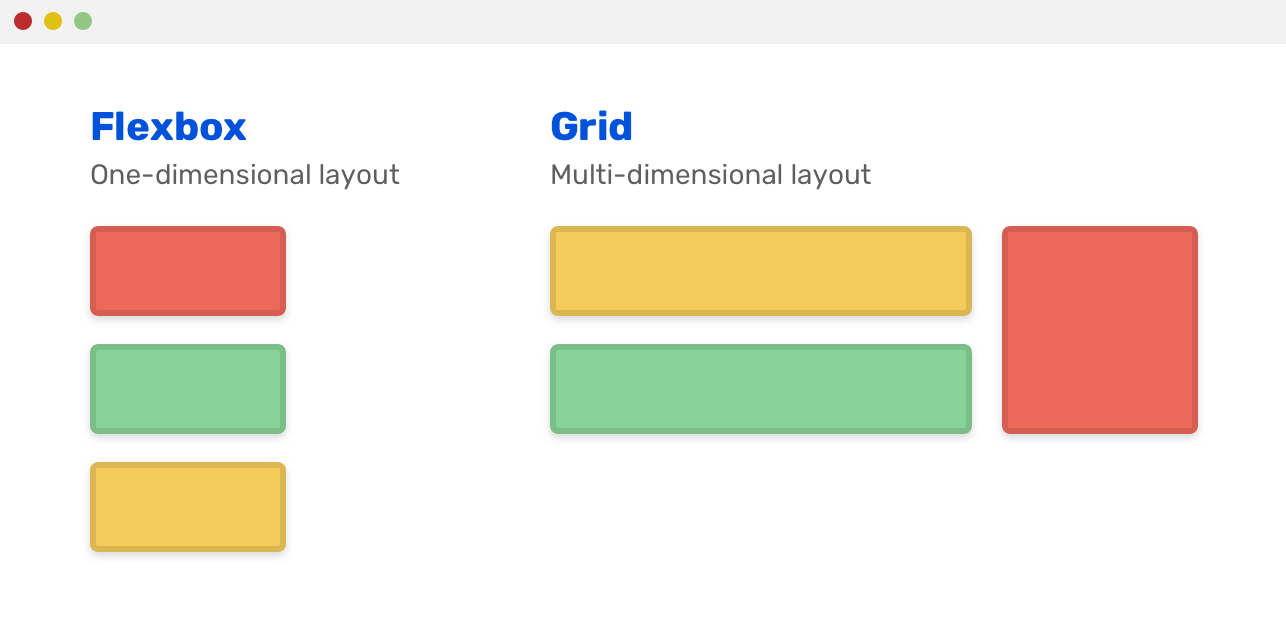
This distinction between content-out (Flexbox) and container-in (Grid) is the most critical concept to grasp.
Flexbox or grid - How to decide?
To see a fantastic breakdown of this core difference, let's watch a segment from Kevin Powell's video, 'Flexbox or grid - How to decide?'. He masterfully explains how each system's default behavior reveals its core purpose.
Watch from the beginning to 10:00. Focus on: How Flexbox defaults to arranging items based on their intrinsic size, making it 'content-aware'. How Grid defaults to creating a structured layout where the parent dictates the space, making it 'container-aware'. The explanation that even when Flexbox wraps, creating a 2D-like appearance, each row is independent and items don't align across rows. This is a crucial point.
The "Grid for Macro, Flexbox for Micro" Strategy
With this 1D vs. 2D distinction in mind, a clear and powerful strategy emerges, used by countless developers to build complex, maintainable UIs:
Use Grid for the macro-layout of a page, and use Flexbox for the micro-layouts within individual components.
Think of it this way:
- Grid is for your page's skeleton. It defines the main content areas: header, sidebar, main content, and footer. It's the architectural blueprint.
- Flexbox is for the items within those areas. It arranges the links in your navigation bar, the buttons in a card's footer, or the fields inside a form group. It handles the component-level details.

This isn't a strict rule, but a powerful heuristic that will guide you to the right solution most of the time.
CSS Grid + Flexbox Mastery: Build Responsive UIs Faster
The article 'CSS Grid + Flexbox Mastery' offers a great explanation of this 'division of labor'.
Read the first two sections of the article, up to 'Flexbox: The Component Layout Workhorse'. The author provides a concise mental model that will help solidify this strategy.
Nesting in Action: A Practical Example
Let's see this strategy in action. We'll examine a common pattern: a responsive gallery of cards. Grid will handle the overall gallery layout, and Flexbox will handle the internal layout of each card.
Using Flexbox + CSS Grid Together: Easy Gallery Layout
The video 'Using Flexbox + CSS Grid Together' by Jen Simmons provides a perfect, real-world demonstration of nesting Flexbox inside a Grid container.
Watch from 01:25 to 04:53. Pay close attention to: Macro-Layout (Grid): How display: grid is applied to the <main> element to arrange the <article> cards into a responsive grid. Micro-Layout (Flexbox): How display: flex and flex-direction: column are applied to each <article> to control the vertical arrangement of its internal elements (image, title, text, etc.). The Power of Combination: Notice how each tool is doing what it does best, without fighting its nature. Grid creates the columns, and Flexbox manages the content flow and reordering within a single grid item.
This ability to make a grid item a flex container (or vice versa) is not a hack; it's a core feature of how these layout modules were designed to work together. The Smashing Magazine article "Best Practices With CSS Grid Layout" confirms this: "You can also make a Grid Item and Flex Container or a Flex Item a Grid Container — none of these things are a problem!"
Real-World Patterns and a Decision Framework
To build your intuition, let's look at more production-ready patterns that combine Grid and Flexbox.
CSS Grid + Flexbox Mastery: Build Responsive UIs Faster
Let's return to the 'CSS Grid + Flexbox Mastery' article. It contains excellent, commented code examples for common UI patterns.
Read the section 'Combining Grid and Flexbox: Real-World Patterns'. Analyze the code for 'The Dashboard Layout', 'The Card Component', and 'The Responsive Form'. For each pattern, identify which part is handled by Grid and which by Flexbox, and why that choice was made.
To make the right choice consistently, it helps to have a mental checklist. When approaching a new layout problem, ask yourself these questions:
- Is this a one-dimensional or two-dimensional problem? (Arranging items in a line vs. a strict grid).
- Does the layout depend on the content size, or should the container dictate the size? (Content-out vs. container-in).
- Do items need to stay aligned across rows/columns? (If yes, it's a job for Grid).
- Is this a page-level structure or a component-level arrangement? (Macro vs. Micro).
These questions, also adapted from the dev.to article, provide a systematic way to apply the strategy we've discussed.
Conclusion
You've now moved beyond individual properties to understand the architectural philosophy behind modern CSS layout. This strategic knowledge is far more valuable than memorizing syntax, as it allows you to solve new and complex layout challenges with confidence.
Key Takeaways:
- 1D vs. 2D: Flexbox is for one-dimensional, content-driven layouts. Grid is for two-dimensional, container-driven layouts.
- The Core Strategy: Use Grid for macro-level page structure and Flexbox for micro-level component arrangement.
- Nesting is Standard Practice: Combining the two by making a grid item a flex container is the intended and most powerful way to build complex UIs.
- Develop a Framework: Use a set of guiding questions to analyze layout problems and choose the right tool for the job.
What's Next?
With this module, you have built a formidable understanding of how to structure any layout with CSS. You can create rigid or flexible grids, and you know how to combine them for maximum effect.
In the next module, we'll shift our focus from static structure to dynamic behavior and optimization. The first lesson will be "Describe the difference between CSS transitions and keyframe animations and their use cases." We'll explore how to add motion and life to your components, building upon the solid foundation you've established here.