Hello! Welcome to the final lesson of our module, "Visual Design and the Brain."
Over the last five lessons, we have built a powerful toolkit for understanding how the brain processes visual information. We've explored everything from the fundamental building blocks of color and shape, to the Gestalt principles that create coherence, to the automatic attention patterns and the magnetic pull of human faces.
Today, we bring it all together. This lesson is designed to help you achieve the final learning outcome for this module: Analyze a marketing visual (e.g., a logo or ad) and critique its effectiveness based on principles of visual processing.
We will move from theory to practice by:
- Establishing a practical framework for analyzing the neurological impact of an ad.
- Applying this framework to deconstruct and critique real-world examples, from logos to a full advertising campaign.
- Learning how to communicate your analysis effectively to a non-scientific audience.
By the end of this lesson, you will be able to look at any marketing visual and not just say whether you like it, but explain why it works (or doesn't) on a neurophysiological level.
1. A Framework for Analysis: The Four Powers
To effectively critique a visual, it helps to have a structured approach. A highly practical model used in the neuromarketing industry breaks an ad's effectiveness down into four key components. This model, developed by neuromarketing firm Neurons Inc., provides a clear way to connect visual design to business goals.
To learn about this framework, please read the following section from the article "How to use neuromarketing to design better ads."
How to use neuromarketing to design better ads
This article introduces a powerful model for evaluating ad effectiveness. We will use this as our primary framework for today's analysis.
Read the section titled 'From the neuromarketing point of view, what makes a visual ad as powerful and memorable as possible?' Focus on understanding the definitions of the 'four main powers': Stopping Power Persuasion Power Transmission Power Locking Power Take note of how each 'power' is measured (e.g., eye-tracking for Stopping Power).
To summarize, our analytical framework looks like this:
- Stopping Power: Does the visual grab attention?
- Principles involved: Color contrast, novelty, movement, and the powerful use of faces.
- Persuasion Power: Does it create the right emotional connection?
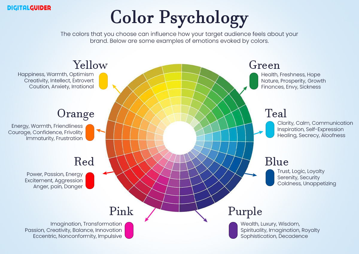
- Principles involved: Color psychology, emotional expressions on faces, imagery that evokes positive associations.
- Transmission Power: Is the message clear and correctly linked to the brand?
- Principles involved: Gestalt principles for clarity, gaze cueing to direct attention, and effective logo placement.
- Locking Power: Is the ad and, crucially, the brand memorable?
- Principles involved: Simplicity, emotional impact, and natural brand integration.
Now, let's put this framework to work.
2. Deconstructing Logos: The Power of Gestalt
Logos are the most condensed form of visual marketing. Their success often hinges on how well they leverage the brain's automatic tendency to find patterns and create order from chaos. As we learned in a previous lesson, these tendencies are described by the Gestalt principles.

Let's see these principles in action. The following video does an excellent job of analyzing famous logos and explaining how they use Gestalt theory to communicate their brand identity effectively.
3. The Psychology of Logo Design: Gestalt Theory | Theory
The video 'The Psychology of Logo Design' from Canva provides clear, real-world examples of Gestalt principles in action.
Watch the video from 01:43 to 04:32. As you watch, pay close attention to how each principle is applied in a well-known logo: Figure-Ground: Amazon, dictionary.com Proximity: Unilever Similarity: NBC Closure & Negative Space: WWF, FedEx Continuity (Common Fate): Mastercard, Coca-Cola
Test your understanding!
Imagine you're in a meeting with a marketing team. Your task is to explain why the arrow in the FedEx logo is such a brilliant piece of design, using the language we've just reviewed. How would you explain it?
Show answer
You could say something like this:
"The genius of the FedEx logo is that it uses our brain's own processing shortcuts to embed a message of speed and direction. It leverages two key psychological principles:
- Figure-Ground: Our brain automatically separates a main object (the 'figure') from the background (the 'ground'). In this case, we see the letters 'E' and 'x' as the figure.
- Closure: Our brain has a strong tendency to 'fill in the gaps' and see complete shapes even when they aren't fully drawn.
The space between the 'E' and the 'x' forms a perfect arrow. Our brain perceives this 'negative space' as a shape in its own right due to the principle of closure. This makes us feel the concepts of forward motion and delivery efficiency without a single word. It’s a message that our unconscious mind picks up instantly."
3. In-Depth Ad Critique: A Case Study
Now, let's apply our full Four Powers framework to a more complex visual: an entire ad campaign. We'll analyze Pepsi's 2022 holiday campaign, #PilkandCookies, which promoted mixing Pepsi with milk.
This is a perfect case study because it was intentionally provocative, playing with emotions of potential disgust to generate buzz. A neuromarketing agency actually studied its effectiveness, giving us a behind-the-scenes look at how consumers' brains really reacted.
CASE STUDY: How Pepsi's Bold Marketing Tactics Turn Disgust into Delight
This case study from CoolTool breaks down the neuro-reactions to Pepsi's controversial 'Pilk' ad. It's a fantastic real-world application of the measurement techniques we've discussed.
Please read the article from the beginning down to the end of the 'Moment-to-moment likability feedback' section. As you read, try to find the answers to these questions using our Four Powers framework: Stopping Power: What made the ad stand out and keep viewers engaged? Persuasion Power: What was the emotional journey of the viewer? How did the use of a celebrity (Lindsay Lohan) influence this? Transmission Power: Where did viewers focus their attention? Was the branding clear? Locking Power: Did the ad's controversial nature harm or help the brand's perception in the end?
Let's synthesize the findings from that case study using our framework:
Critique of the Pepsi "Pilk" Ad
-
Stopping Power: High
- The core concept of "Pilk" is novel and unusual, immediately creating what we've previously called an orienting response. Viewers are compelled to watch to figure out what's going on.
- The article confirms this, noting the storyline "has the ability to keep users engaged and focused better than the average."
-
Persuasion Power: High (but risky)
- The ad skillfully manipulates emotions. It starts by inducing disgust or confusion at the moment the milk is mixed with Pepsi.
- It then resolves this negative tension using two powerful tools:
- Facial Expression & Human Imagery: Lindsay Lohan's face shows enjoyment after tasting the drink.
- Social Proof: A trusted celebrity endorses the strange behavior, telling the viewer's brain, "This is okay, even desirable."
- The emotional arc from negative to positive creates a more memorable and engaging experience than a simple, purely positive ad would have.
-
Transmission Power: Moderate
- The main message ("Try Pilk and Cookies") is clear.
- However, the article notes a potential weakness. During some scenes (like the final product shot), attention from the female audience dropped. This highlights a key point from the LINK resource: ads must be interesting within seconds. A long, static shot at the end risks losing the viewer. The message was transmitted, but the delivery could have been optimized for sustained attention across all demographics.
-
Locking Power: High
- The ultimate goal of an ad is to strengthen the brand. Did the initial feeling of disgust harm Pepsi?
- The case study concludes: "no, it didn’t harm." In fact, it enhanced brand perception, reinforcing attributes like "youth," "festive," "joyful," and "cool." The risk paid off, successfully locking in a positive, modern brand association.
4. Communicating Your Analysis
Your ultimate goal is to translate these scientific insights into actionable business advice. When presenting a critique to a client or stakeholder who isn't a neuroscientist, you need to be clear, concise, and practical.
Here’s a simple template for structuring your feedback:
- Start with the Objective: "The goal of this ad was to [e.g., increase brand awareness, drive sales for a new product]."
- Highlight the Strengths (The "What Works"): "The ad does an excellent job of grabbing attention because it uses [principle, e.g., a high-contrast color scheme, the face of a baby]. This is effective because our brains are wired to notice..."
- Identify Weaknesses (The "What Could Be Improved"): "The main message is getting lost because the logo is placed in the 'corner of death'—the bottom right—where viewers rarely look. Furthermore, the model is looking away from the product, failing to guide the viewer's eye."
- Provide Actionable Recommendations: "To improve this, I suggest we A/B test a version where we move the logo to the top left and change the model's gaze to look directly at the call-to-action button. This should use the 'gaze cueing' effect to increase focus on our key objective."
This approach anchors your feedback in brain science but delivers it as practical, testable marketing advice.
Conclusion
Congratulations on completing the "Visual Design and the Brain" module! You have now assembled a comprehensive set of tools to understand and influence the most powerful sense in marketing.
Key Takeaways:
- A Solid Framework: We can systematically analyze any visual by evaluating its Stopping, Persuasion, Transmission, and Locking Power.
- Principles in Practice: We saw how Gestalt principles are the foundation of effective logo design and how a combination of color, faces, emotion, and attention guidance determines the success of a complex ad.
- Analysis is Actionable: The goal of a critique is not just to identify flaws but to provide clear, science-backed recommendations for improvement.
Preview of the Next Lesson:
We are now moving into one of the most fascinating and potent areas of neuromarketing—the other senses. Our next module is "Sensory Marketing: Sound, Scent, and Touch," which you've expressed a keen interest in.
In our very next lesson, we will explore the most primal and emotionally-connected sense of all: smell. Our learning outcome will be to explain the unique neural pathway of smell and its direct link to memory and emotion centers in the brain. You'll discover why a scent can trigger a vivid memory from 20 years ago and how retailers use this powerful connection to shape your in-store experience.