Hello! In our last lesson, we ensured your webpage's content would be understood correctly by browsers worldwide by setting the character encoding to UTF-8. We're now going to address another crucial aspect of modern web development: making sure your site is usable and looks great on devices of all sizes, from wide desktop monitors to small mobile phones.
This lesson tackles the viewport meta tag. You'll discover why a webpage designed for a desktop often looks tiny and unreadable on a phone, and you will learn to implement the simple line of code that fixes it. This is your first and most important step into the world of responsive web design, a practice aimed at creating websites that adapt gracefully to any screen size.
The Problem: A Desktop Page on a Mobile Screen
Imagine the early days of smartphones. Websites were designed exclusively for desktop computers with large screens. To make these sites "work" on a tiny phone screen, mobile browsers came up with a clever trick: they would pretend to be a wide desktop browser (often around 980 pixels wide), load the entire page onto this virtual canvas, and then shrink the result to fit the physical screen.
The result? The entire desktop layout is visible, but the text and images are so small that you have to pinch and zoom constantly to read or interact with anything. This is a frustrating user experience.
The image below perfectly illustrates this problem. On the left, you see a mobile phone trying to display a webpage without any guidance on how to handle the screen size. On the right, you see the same page after we've given the browser the correct instructions.
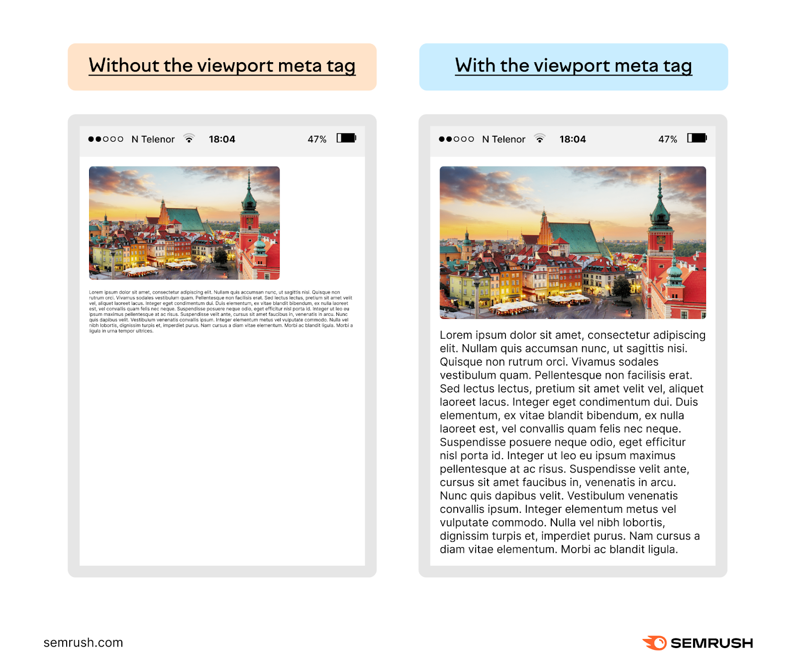
Our goal is to always achieve the result on the right. We do this by giving the browser a specific instruction within the <head> of our HTML document.
The Solution: The Viewport <meta> Tag
To fix this, we need to add another <meta> tag to our document's <head>. This one tells the browser to stop pretending it's a desktop and to instead pay attention to the actual size of the device's screen.
The standard viewport meta tag looks like this:<meta name="viewport" content="width=device-width, initial-scale=1.0">
This might look a bit complex, but it's just two simple instructions combined into one tag:
name="viewport": This tells the browser that the metadata we're providing is about the viewport (the visible area of the web page).content="...": This contains the actual instructions.width=device-width: This is the crucial part. It overrides the browser's default behavior and says, "Set the width of the viewport to the width of the device's screen." On an iPhone, the viewport becomes about 375 pixels wide, not 980.initial-scale=1.0: This sets the initial zoom level.1.0means 100%, or no zoom. It ensures the page loads at its natural size without being zoomed in or out.
The following video provides an excellent and concise explanation of this exact issue and how the viewport meta tag solves it.
Get your media queries working with the meta viewport HTML tag
In this video, web developer Kevin Powell explains the historical reason for the "shrinking site" problem and walks through adding the viewport meta tag step-by-step.
Please watch the following segments: The problem explained: This covers the "shrinking site" issue we just discussed. Adding the tag: Watch as he adds the meta tag and explains the width=device-width and initial-scale=1 properties. The result: See the immediate effect of adding the tag. The page layout now responds correctly to the screen size.
Best Practices: Don't Disable Zoom!
You might sometimes see an extra property in the viewport tag: maximum-scale=1. Adding this, along with initial-scale=1, effectively prevents users from being able to pinch-and-zoom on your website.
While this might seem tempting to maintain perfect control over your design, it is a very bad practice for accessibility and usability. Users with low vision rely on the ability to zoom in to read content. Disabling this feature can make your site unusable for them. Always allow your users to zoom.
To learn a bit more about the different properties, let's turn to a short article.
Setting the Viewport Meta Tag: HTML & CSS Tutorial
This article from Noble Desktop reinforces what we've learned and provides clear definitions for the initial-scale and maximum-scale properties.
Please read the sections titled "More About Initial-Scale" and "Disabling Zoom". This will solidify your understanding of why we use initial-scale=1 and why we should avoid disabling zoom.
Your Turn: Update Your Webpage
Now it's time to add this essential tag to your own project. By adding the viewport tag, you are making your document "responsive-ready," allowing the CSS you'll learn later to adapt the layout for different screen sizes.
- Open your
index.htmlfile. - Inside the
<head>element, right after the<meta charset="UTF-8">tag, add the viewport meta tag.
Your file's structure should now be complete with all the fundamental metadata:
<!DOCTYPE html>
<html lang="en">
  <head>
    <meta charset="UTF-8">
    <meta name="viewport" content="width=device-width, initial-scale=1.0">
    <title>My First Web Page</title>
  </head>
  <body>
    <h1>Hello, World!</h1>
    <p>This is my very first webpage, built from scratch.</p>
  </body>
</html>
Save the file. Although you won't see a visible change on your desktop browser, you have now laid the critical foundation for a mobile-friendly website.
Bonus: Testing the Mobile View
You can see the effect of this tag right in your desktop browser!
- Open your
index.htmlfile in Chrome or Firefox. - Right-click anywhere on the page and choose "Inspect". This opens the developer tools.
- In the developer tools panel, look for an icon that looks like a phone and a tablet (
Toggle device toolbarin Chrome). Click it. - Your page will now be displayed in a simulated mobile view. Try turning this mode on and off after commenting out the viewport meta tag to see the difference firsthand!
Conclusion
In this lesson, you've taken a massive step toward building modern, professional websites. By adding a single line of code, you've instructed browsers on how to render your page correctly on mobile devices, preventing the dreaded "tiny text" problem and paving the way for responsive design.
Key Takeaways:
- The viewport is the user's visible area of a webpage.
- By default, mobile browsers shrink desktop layouts to fit on small screens, making them unreadable.
- The
<meta name="viewport" content="width=device-width, initial-scale=1.0">tag is essential for modern web development. width=device-widthtells the browser to match the screen's width.initial-scale=1.0sets the default zoom to 100%.- Never disable user zooming, as it is a critical accessibility feature.
With the fundamental structure and metadata of your HTML document now in place, our next lesson will cover how to add comments to your code—a simple but vital practice for communicating with your future self and other developers.