Hello! Welcome back to our course.
In the last lesson, we dissected the fundamental grammar of CSS: the selector, property, and value. You learned to read a CSS rule and understand its intent, a core skill for "code literacy." You then practiced this by writing a rule to style your <h1> heading.
So far, the styles we've written are static. They look the same on a giant desktop monitor as they do on a tiny phone screen. As a designer, you know this is a problem. A layout designed for a wide screen often becomes cramped and unusable on a narrow one. Today, we'll learn how developers solve this.
1. What We Are Learning
This lesson is all about making your web page responsive. You will learn how responsive CSS and media queries adapt a layout for different screen sizes. We'll cover what responsive design means in code, the syntax of media queries, and the "mobile-first" design strategy.
2. Why This Matters
You live and breathe responsive design in tools like Figma, using constraints and Auto Layout to define how elements should behave. Media queries are the CSS equivalent of those rules.
Understanding them is critical for our AI-powered workflow because:
- You can prompt the AI effectively: Instead of just saying "make it responsive," you can give specific instructions like, "Generate a mobile-first design where the navigation becomes a hamburger menu on screens smaller than 768px."
- You can debug the AI's output: When the AI generates a layout that breaks on tablets, you'll be able to look at the CSS, find the relevant media query, and understand why it's breaking. This moves you from being a passive user of AI to an active director of it.
3. Step-by-Step Instructions
Step 1: Responsive Design & Breakpoints
In design, responsive means a layout fluidly adapts. In code, this is achieved with a combination of flexible layouts (which we've touched on with concepts like the box model) and specific rules that trigger at certain screen sizes. These trigger points are called breakpoints.
Think of breakpoints as the screen widths you define in Figma for 'Desktop,' 'Tablet,' and 'Mobile.' When the browser window hits one of these widths, we can use CSS to apply a completely different set of styles.
The key tool we use to define these breakpoints is the media query.
Step 2: What is a Media Query?
A media query is essentially an if statement for your CSS. It tells the browser: "If the screen meets a certain condition (like being a certain width), then apply these specific styles."
Here's a visual breakdown of what the code looks like for different devices.
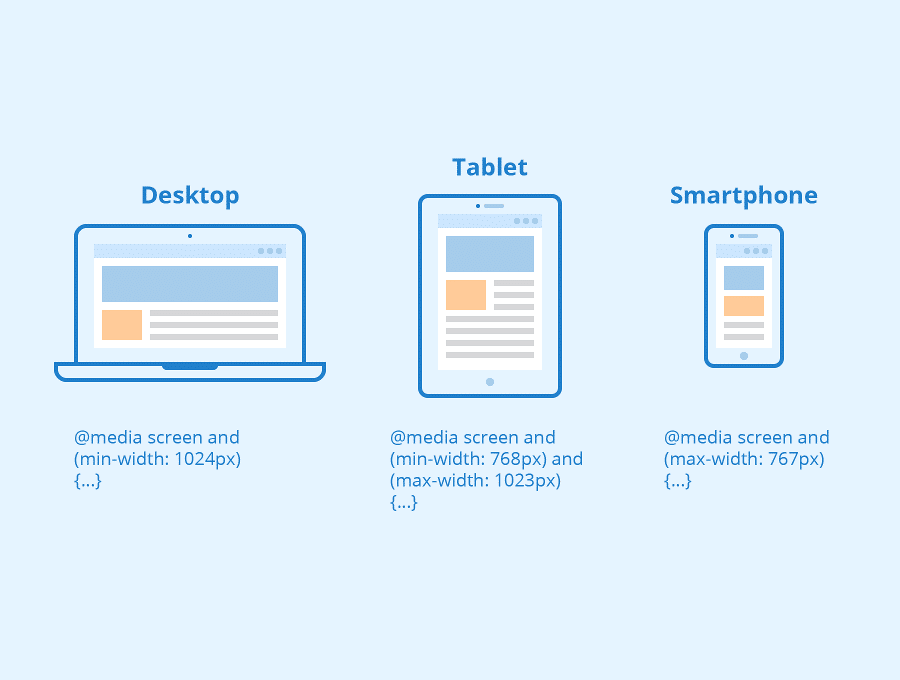
The syntax for a media query is simple. You wrap your normal CSS rules inside an @media block.

The most common conditions you'll use are max-width and min-width:
@media (max-width: 600px) { ... }: The styles inside this block will apply ONLY when the browser's viewport is 600 pixels wide or less. This is perfect for targeting mobile devices.@media (min-width: 901px) { ... }: The styles inside this block will apply ONLY when the browser's viewport is 901 pixels wide or more. This is great for targeting desktops.
Let's read a short article that defines these key terms clearly.
Responsive web design best practices and examples - 2025 guide
The article "Responsive web design best practices" from Webflow provides excellent, designer-friendly definitions for the core concepts of responsive design.
Please read the section titled "Key responsive web design terms." Focus on the definitions for Breakpoints and Media queries. Also, notice the terms Fluid grids, rem and em units, and Mobile-first, as we'll be revisiting them.
Step 3: See It in Action
Let's watch a short video that demonstrates this concept visually. It's one thing to read about it, but seeing a website change its styles as the screen resizes makes the concept click.
Master Responsive CSS Media Queries in easy way
This video, "Master Responsive CSS Media Queries in easy way," quickly demonstrates the problem and the solution. It uses a simple background color change to make the effect of the media query obvious.
Watch from the beginning to 01:31. Pay attention to: The initial problem: the site looks fine on desktop but is broken on a phone. The simple media query syntax used to fix it, specifically using max-width.
Step 4: A Better Strategy: Mobile-First Design
You could create styles for a desktop and then use max-width queries to "fix" them for smaller screens. This is known as a "desktop-first" or "graceful degradation" approach.
However, a more modern and widely-accepted best practice is mobile-first design.
With this approach, you write your base CSS to look good on a small mobile screen. Then, you use min-width media queries to add complexity and adjust the layout for larger screens like tablets and desktops.
This has several benefits:
- It forces you to prioritize content for the most constrained environment.
- Mobile devices download a simpler, smaller CSS file, which can improve performance.
Let's see this approach explained.
Master Responsive CSS Media Queries in easy way
Let's return to the same video, which does a great job of explaining the mobile-first approach and why it's so important.
Watch the segment from 02:16 to 03:17. Focus on the distinction between the mobile-first and desktop-first approaches, and why mobile-first (using min-width) is often preferred.
4. What Could Go Wrong
- Problem: My media query styles are not applying.
- Reason 1: Syntax Error. You might have forgotten the
@symbol, the parentheses(), or the curly braces{}. Double-check your syntax against the examples. - Reason 2: Confusing
min-widthandmax-width. This is very common. Remember:max-widthtargets screens up to a size (think mobile).min-widthtargets screens from a size upwards (think desktop). - Reason 3: Specificity. A more specific CSS rule outside the media query might be overriding the one inside it. For example, a rule targeting
.my-classis more specific than a rule targetingdiv. We will cover specificity in more detail later, but for now, just be aware that it can be a factor.
- Reason 1: Syntax Error. You might have forgotten the
5. Mini Exercise
Let's put this into practice. We will add a simple media query to change the styles of your page on small screens.
- Open your
my-landing-pageproject in VS Code. - Make sure your Live Server is running so you can see your changes.
- Open
styles/style.css. - At the very bottom of the file, add the following media query. We will use a
max-widthbreakpoint to target mobile-sized screens./* This is a CSS comment. The browser ignores it. It's for us humans! */ /* Styles for screens 600px wide or smaller */ @media (max-width: 600px) { body { background-color: #f5f5f5; /* A light gray */ } h1 { font-size: 32px; /* A smaller font size for the heading */ } } - Save the
style.cssfile. - Now, go to your browser window that's showing
index.html.- If your window is wide, the background should be white and the heading should be large (
48pxfrom our last lesson). - Slowly make your browser window narrower. As you cross the
600pxthreshold, you should see the background turn light gray and the heading text shrink. Widen it again, and it should change back.
- If your window is wide, the background should be white and the heading should be large (
You've just created your first responsive style change!
6. Checklist Before Moving Ahead
- I can explain that "responsive design" means a website's layout adapts to the screen size.
- I understand that a "breakpoint" is a specific screen width where the layout changes.
- I can describe what a media query does (applies CSS styles based on a condition like screen width).
- I know the difference between
max-width(for screens up to a size) andmin-width(for screens from a size up). - I have completed the exercise and saw my
h1andbodystyles change when I resized my browser.
Excellent work! You've just unlocked the fundamental technique behind all responsive websites. You now understand how a single codebase can produce layouts that look great on any device.
A Look Ahead: We've covered the core concepts of HTML structure and CSS styling. Now it's time to shift our focus to the "design" part of our "design-to-code" workflow. In the next lesson, we'll dive into Figma and learn how to prepare your designs for a smooth, clean translation into code, whether it's done by an AI or a developer.