Hello! Welcome back.
In our last lesson, we explored responsive design through CSS media queries. You learned how developers write rules that change a website's appearance based on screen size. This was a crucial step in "code literacy," enabling you to understand how a single codebase can adapt to different devices.
Now, we're going to shift our focus back to your area of expertise—Figma—and look at it through a new lens. To get high-quality code out of an AI, we need to provide high-quality design data in.
1. What We Are Learning
Today, you'll learn how to structure Figma frames and layers with clear, semantic naming for better code output. This isn't about organizing for your own visual clarity; it's about preparing a blueprint that an AI can read and understand perfectly. We'll cover why naming matters, a set of best practices for naming, and how this applies to components.
2. Why This Matters
As a designer, you organize your layers to keep your files tidy. But for an AI-powered workflow, your layer list is more than an organizational tool—it's the primary source of information. The AI doesn't "see" your design; it reads your layer names and structure to understand your intent.
Think of it like this:
- A layer named
Rectangle 12is like telling a builder to "place that rectangular thing somewhere." - A layer named
Button/Primary/CTAis like telling the builder to "place the main call-to-action button here."
One is ambiguous, the other is a clear instruction. Mastering this will allow you to guide the AI to generate code that is clean, correct, and maintainable.
3. Step-by-Step Instructions
Step 1: Context is the New Code
The core principle is simple: your layer names must describe the meaning and purpose of an element, not just its shape. This is called semantic naming. Let's start with a short article that explains this concept in the context of AI tools.
Best Practices in Figma for AI-Driven Code Generation - Stackademic
This article, "Best Practices in Figma for AI-Driven Code Generation," directly explains our main topic. It introduces the idea that for an AI, the context you provide in your design file is just as important as the code itself.
Please read from the beginning down to the end of the section 'Consistency between design and code'. Focus on the 'Poor example' vs. 'Proper semantic example' and how that naming structure provides 'layers of meaning' for an AI.
Step 2: Practical Rules for Semantic Naming
So, what does this look like in practice? Let's establish some simple, powerful rules for naming your layers.
Rule 1: Use a Hierarchical Structure with Slashes (/)
Figma uses slashes to create groups, which is perfect for building a logical hierarchy. This should feel natural, as it mirrors how you already group elements visually.
- Bad:
Header,Logo,Nav Linksas separate, top-level frames. - Good:
Header(the main frame)Header/LogoHeader/Navigation/Home-LinkHeader/Navigation/About-Link
This structure tells the AI that the logo and navigation belong inside the header. This visual comparison shows how a clear Figma hierarchy translates directly to development tools.

Rule 2: Avoid Generic, Default Names
This is the most important rule. Always rename default layers.
Rectangle 5should becomeCard-Image-Border.Group 23should becomeForm-Input-Group.Frame 1021should becomeSection-Testimonials.
Rule 3: Be Consistent with Capitalization
Decide on a convention and stick to it. The most common and useful for web development is kebab-case, because it maps directly to CSS class names.
- kebab-case:
primary-button(Recommended) - PascalCase:
PrimaryButton - snake_case:
primary_button
Let's read a quick summary of these best practices.
Naming Layers & Widgets: Best Practices for Designers & Developers
This article, "Naming Layers & Widgets: Best Practices," provides an excellent checklist of practical rules to follow.
Please read just the section titled "Figma Naming Best Practices." It's a concise summary of the rules we're discussing.
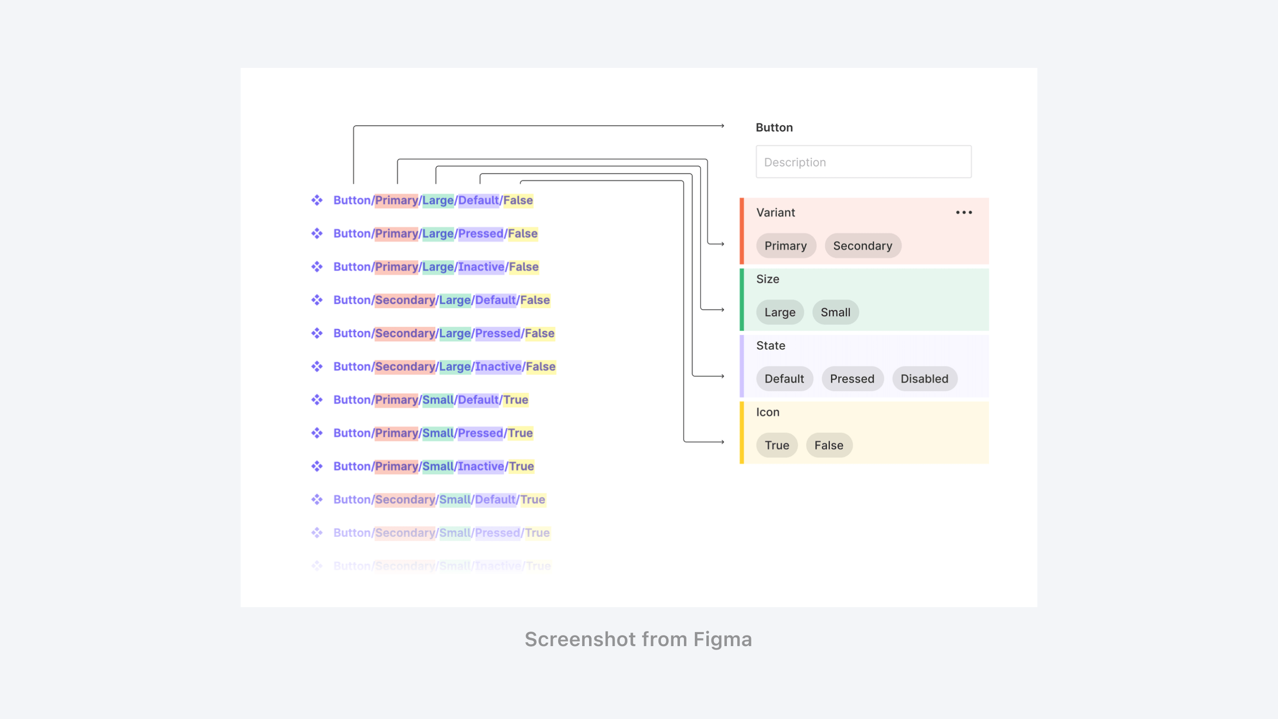
Step 3: Naming Component Variants
This hierarchical naming is especially powerful for components. When you name your variants semantically, you create an explicit map that the AI can follow.
For a button component, you might have properties for its type, state, and size. Your variant names should reflect this.
Step 4: The Real-World Impact
To see why this effort is so crucial, let's watch a video that shows the difference in code quality between a poorly structured and a well-structured design.
Setting up your Figma Design File for High Quality Code
This video from Locofy provides a perfect demonstration. It shows code being generated from two visually identical designs that have very different internal structures.
First, watch from 00:55 to 03:54. Notice the dramatic difference between the generated website for the 'poorly structured' vs. the 'well structured' designs. Then, watch the specific section on layer naming from 11:58 to 13:22, which directly reinforces the rules we've just discussed.
4. What Could Go Wrong
- Problem: This feels tedious. I'm not sure what to name everything.
- Solution: Start broad and get more specific. The goal is clarity, not instant perfection. Naming a frame
Hero-Sectionis a huge improvement overFrame 87. You can refine it later. Start with the big container frames (Header,Footer,Main-Content) and work your way in.
- Solution: Start broad and get more specific. The goal is clarity, not instant perfection. Naming a frame
- Problem: My naming is inconsistent (e.g., I used
btnin one place andbuttonin another).- Solution: This is a common issue. For now, just try to be mindful. As you work, you'll develop a personal preference. As we noted earlier, picking a convention like kebab-case (
primary-button) and sticking to it is a great habit to build. There are also Figma plugins like "Rename It" that can help you fix inconsistencies in bulk later on.
- Solution: This is a common issue. For now, just try to be mindful. As you work, you'll develop a personal preference. As we noted earlier, picking a convention like kebab-case (
5. Mini Exercise
Time to apply these concepts in Figma.
- Open a recent design file or create a simple, new component. A user profile card is a perfect example (it should contain an avatar image, a name, a username, and a "Follow" button).
- Duplicate the component frame so you have a "before" and "after."
- In the duplicated frame, go through every single layer and rename it using the principles we've discussed:
- Use a hierarchical structure.
- Use descriptive, semantic names in kebab-case.
- Eliminate all default names like
Ellipse 1orGroup 5.
- Example Structure:
user-card(the top-level frame)user-card/avatar-imageuser-card/user-info(a group for the text)user-card/user-info/display-nameuser-card/user-info/username
user-card/follow-button
Compare the layer lists of your "before" and "after" frames. The "after" version is now a clean, readable blueprint for an AI.
6. Checklist Before Moving Ahead
- I can explain why clear layer names are critical for AI code generation.
- I can apply a hierarchical naming convention using slashes (e.g.,
section/element). - I will avoid using generic, default layer names like
Frame 101orRectangle 5. - I understand how consistent naming for components (e.g.,
Button/Primary/Default) helps create predictable code. - I have completed the exercise of renaming the layers of a component.
Fantastic work. You've just learned one of the most important steps in the design-to-code process. This discipline of structuring your designs with code in mind is what separates a designer who can effectively use AI from one who will be frustrated by its output.
A Look Ahead: We've given our layers meaningful names, which defines what they are. In the next lesson, we'll focus on defining how they behave. We'll dive into Figma's Auto Layout, the tool that allows you to create responsive structures that are the direct design equivalent of the media queries you learned about.