Hello! Welcome back to our journey from design to code.
In the last lesson, we established a crucial foundation: how to structure and name your Figma layers semantically. You learned that giving layers meaningful names (header/logo instead of Group 5) provides a clear blueprint for an AI to read and understand your design's intent. You've learned the "what."
Now, it's time to define the "how."
1. What We Are Learning
Today's lesson is all about applying Figma's Auto Layout to create responsive structures with proper constraints. We'll move beyond static positioning and tell our design elements how they should behave and adapt to different screen sizes. This is one of the most powerful features in Figma for bridging the gap between design and development.
2. Why This Matters
Remember the CSS media queries we looked at? Developers use them to write rules like "on a small screen, stack these columns vertically." Auto Layout is the designer's equivalent. It lets you build those rules visually, directly in your design file.
When an AI code generator sees a design built with Auto Layout, it doesn't just see a picture; it sees a set of instructions. It understands the relationships between elements, how they should space themselves, and how they should grow or shrink. Mastering Auto Layout is the single most effective way to ensure the AI generates code that is not just visually accurate, but also genuinely responsive and robust.
Think of it as the difference between giving a builder a photograph versus giving them an architectural blueprint with structural rules. The blueprint is what allows them to build a house that stands up; Auto Layout is your blueprint for a website that works on any device.
3. Step-by-Step Instructions
Step 1: The Mental Model — Thinking in Boxes
Before clicking any buttons, let's adjust our thinking. The web isn't a freeform canvas; every element—a button, a line of text, an image—lives inside a box. These boxes are then nested inside other boxes, each with its own set of rules for spacing and alignment.
This "box model" is exactly how developers build layouts with a technology called CSS Flexbox. The good news is that Figma's Auto Layout is a direct visual implementation of Flexbox. When you master Auto Layout, you're essentially thinking like a front-end developer.
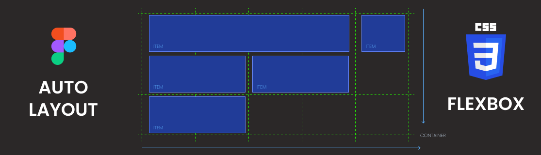
To solidify this mental model, let's read the first part of an excellent article that explains this concept.
Auto-layout isn't broken. Your mental model is!
This article, "Auto-layout isn't broken. Your mental model is!" explains the foundational concept of the 'Box Model' and how it relates to Auto Layout. Understanding this will make everything else click into place.
Please read 'Part 1: Think in terms of “boxes”' and 'Part 2: Auto-layout is “Flexbox” in disguise'. Focus on how every element is a box and how the 'Parent' (Auto Layout Frame) sets rules for the 'Children' (elements inside).
Step 2: The Core Mechanics of Auto Layout
Now let's get our hands dirty. Applying Auto Layout is simple: select one or more objects and press Shift + A. This wraps them in an Auto Layout frame. This frame now gives you a new set of controls in the right-hand panel.
The main properties you'll control are:
- Direction: Stacks children horizontally or vertically.
- Spacing: The gap between children.
- Padding: The space between the children and the edge of the frame.
- Alignment: How children are positioned within the frame (e.g., top-left, center).
This short video gives a great visual overview of these basic mechanics.
Learn Figma Auto Layout in 10 Minutes (Everything You Need To Know)
The video "Learn Figma Auto Layout in 10 Minutes" provides a quick, clear demonstration of the fundamental Auto Layout properties.
Watch from the beginning until 04:04. Pay attention to how Shift + A is used to create an Auto Layout frame and how the presenter adjusts the direction, spacing, and padding in the right-hand panel.
Step 3: The Key to Responsiveness — Resizing & Spacing
This is the most critical part. For each element inside an Auto Layout frame, you must define its resizing behavior. You have three choices for both width and height:
- Fixed: The element stays at a specific size (e.g., "this icon is always 24px wide").
- Hug Contents: The frame resizes to fit whatever is inside it (e.g., "this button grows as I type more text").
- Fill Container: The element stretches to fill all available space in its parent container (e.g., "this text column should take up the full width of the card").
Additionally, the parent frame's spacing can be set to "Packed" or "Space between". "Space between" is what you use for things like navigation bars, where you want items to spread out evenly.
Understanding the interplay between Hug, Fill, and Space between is the key to creating any responsive layout. Let's watch a detailed breakdown.
Figma Tutorial: Master Auto Layout in 30 Minutes | Auto Layout (+ Practice File)
The video "Figma Tutorial: Master Auto Layout in 30 Minutes" has excellent, focused sections on these critical concepts.
Please watch these two specific segments: Spacing Mode (Packed vs. Space Between): Watch from 14:15 to 16:38. This explains how to make elements spread out automatically. Resizing (Fixed, Hug, Fill): Watch from 16:38 to 22:34. This is the most important part of the lesson. Pay close attention to the difference between Hug Content and Fill Container.
Step 4: Building Complex Structures with Nesting
You can't build a whole interface with one Auto Layout frame. The real power comes from nesting them. You create a small Auto Layout group, then place it inside another, and another.
The best way to approach this is "inside-out":
- Group the smallest related elements first (e.g., an icon and a label).
- Put that group into a larger group (e.g., a row of icon/label pairs).
- Put that row into an even larger container (e.g., a card).
This video demonstrates exactly that process to build a fully responsive card.
Figma Tutorial: Master Auto Layout in 30 Minutes | Auto Layout (+ Practice File)
Let's continue with the same video to see how these concepts come together to build a real-world component.
Watch from 22:34 to 27:32. Notice how the presenter groups small elements first (like the titles) before combining them into a larger responsive card. See how Fill Container is used to make the content responsive.
4. What Could Go Wrong
- Problem: I resize my main frame, but the elements inside don't change!
- Solution: This is the most common issue. Select the elements inside the frame. Their horizontal resizing is likely set to "Fixed" or "Hug Contents." Change it to "Fill Container" and try resizing the parent frame again. An element can only fill the space if you tell it to.
- Problem: My navigation items are all bunched up on the left. I want them to spread out.
- Solution: Select the parent navigation frame. In the Auto Layout panel where you set the spacing between items, click the dropdown and change the value to "Auto" (this is the "Space between" mode).
- Problem: I'm getting lost in all the nested frames.
- Solution: This is why we practiced semantic naming in the last lesson! If your frames are named
card/content/title-group, it's much easier to navigate the hierarchy in the layers panel. Remember the "inside-out" approach: group the smallest, most related items first.
- Solution: This is why we practiced semantic naming in the last lesson! If your frames are named
5. Mini Exercise
Let's apply this. We'll take the user profile card from our previous exercise and make it fully responsive with Auto Layout.
- Open Figma and create a simple user profile card. It should have:
- An avatar (a circle or square image).
- A display name (e.g., "Jane Doe").
- A username (e.g., "@janedoe").
- A "Follow" button.
- Use the inside-out approach:
- Select the
display-nameandusernametext layers. Apply Auto Layout (Shift + A). Set the direction to Vertical. Name this frameuser-info. - Select the
avatarand your newuser-infoframe. Apply Auto Layout. Set the direction to Horizontal. Name this frameprofile-header. - Select your
profile-headerand theFollowbutton. Apply Auto Layout. Set the direction to Horizontal. Name this frameuser-card.
- Select the
- Now, make it responsive:
- Select the parent
user-cardframe. In the Auto Layout panel, change the spacing to "Auto" (Space between). This will push the button to the right. - Add some padding to the
user-cardframe (e.g., 16px). - Select the
profile-headerframe inside. Set its horizontal resizing to "Fill Container".
- Select the parent
- Test it: Drag the edge of your main
user-cardframe to make it wider or narrower. You should see theprofile-headerstretch, keeping the button locked to the right.
6. Checklist Before Moving Ahead
- I can explain why Auto Layout is essential for creating responsive designs that translate well to code.
- I know how to apply Auto Layout to a selection using
Shift + A. - I can explain the difference between
Fixed,Hug Contents, andFill Container. - I know how to use "Space between" (
Autospacing) to distribute elements. - I have completed the exercise and built a simple responsive card by nesting Auto Layout frames.
Excellent work. This is a huge leap forward. You've now equipped your designs with both semantic meaning (naming) and structural intelligence (Auto Layout). You are creating designs that don't just look right; they behave right.
A Look Ahead: With these skills, you can build almost any component. In our next lesson, we'll focus on making these components reusable and consistent. We'll explore how to organize them as design tokens (for colors, fonts) and components with variants, which is the final step in preparing our design system for clean, efficient code generation by our AI assistant.