Hello! Welcome back.
In our last two lessons, you mastered two fundamental skills for preparing a design for code: giving your layers semantic names so they have meaning, and using Auto Layout to give them responsive structure. You've essentially created a well-labeled, intelligent blueprint.
Today, we're going to build the materials list for that blueprint.
1. What We Are Learning
This lesson is about organizing your design's core elements into a systematic library. We'll cover three key concepts that form the heart of any modern design system:
- Design Tokens: Creating a central source of truth for all your primitive design values, like colors, spacing, and font sizes.
- Components: Turning reusable interface elements (like buttons and cards) into master templates.
- Variants: Defining all the different states and styles of a component (e.g., a primary button, a disabled button, a button in its hover state) in one organized place.
2. Why This Matters
This is the single most important lesson for achieving our goal of a smooth, AI-powered workflow. Here’s why:
When an AI tool like GitHub Copilot reads your Figma file via the Model Context Protocol (MCP), it's not just looking at pixels. It's looking for structure and intent.
- Without a system: If you use a hard-coded hex value like
#3b82f6for all your buttons, the AI will generate code with that value scattered everywhere. If you decide to change that blue, a developer (or you) would have to hunt down and change every single instance. - With a system: If you define a design token called
color-brand-primaryand use it everywhere, the AI generates code that references that single token. Changing the color is as simple as updating the token's value once, and the change propagates everywhere automatically.
Think of it this way: You're not just handing the AI a drawing; you're handing it an entire library of pre-defined, named parts with instructions on how they fit together. This is what enables the AI to generate code that is clean, scalable, and maintainable—the kind a professional developer would write. As the article "How to Use Figma MCP" points out, a file organized with these principles produces developer-friendly code, while a messy file yields messy code.
Let's start by understanding these concepts from a high level.
Figma + developer workflows | design systems, Code Connect, MCP, and Make
This video from Figma's official channel introduces the idea of 'named abstractions'—how we give names to design decisions like colors (variables/tokens) and reusable elements (components).
Please watch the first two minutes (from 00:00 to 02:03). Focus on how Jake from Figma describes variables, components, and styles as the building blocks for communicating your design intent.
3. Step-by-Step Instructions
Step 1: Create a Source of Truth with Design Tokens (Variables)
A design token is just a name for a design decision. Instead of "16px", we say spacing-md. Instead of #FFFFFF, we say color-surface-base. In Figma, the tool for creating these tokens is called Variables.
For our AI workflow, this is non-negotiable. It's how we tell the AI to use our design system's values instead of hard-coding them.
Bridging Design and Code: A Comprehensive Guide to Figma MCP
This article provides an excellent guide on how to structure your Figma file for AI generation. We'll start with its first best practice: using variables for design tokens.
Please read the section 'Best Practice 1: Use Figma Variables for Design Tokens'. Pay close attention to the examples of good vs. poor variable names and how they are organized into collections (Color, Spacing, etc.).
To summarize the key points from that reading:
- Organize into Collections: Group your variables logically (e.g., Colors, Spacing, Corner Radius).
- Use Semantic Names:
color-primaryis meaningful.blue-500is not, because "primary" might change to green later. - Apply Everywhere: Once you define a variable, you must apply it. Go to a shape's fill, click the four dots, and select your color variable. Do the same for spacing, corner radius, and other properties.
Here is what the Variables panel looks like in Figma, showing how tokens are organized into groups and modes (like light and dark theme).
Step 2: Build Reusable Elements with Components and Variants
You're already familiar with components as a designer. The key shift here is understanding how component properties (variants) in Figma translate directly into code properties (props) for the AI.
When you create a Button component with a Style property that can be Primary or Secondary, you are telling the AI to create a single <Button> component in code that accepts a style prop, like <Button style="secondary">. This is infinitely better than the AI generating two completely separate PrimaryButton and SecondaryButton components.
This next reading explains this concept perfectly.
Bridging Design and Code: A Comprehensive Guide to Figma MCP
Let's continue with the same article. These sections cover how to use Figma's component features to create the flexible, reusable elements that AI tools understand best.
Please read these two sections: 'Best Practice 4: Component Organization', focusing on the subsections 'Component Variants' and 'Variant Properties'. 'Best Practice 6: Interactive States'. Notice the clear 'Good' vs. 'Poor' examples and how defining properties for 'State' (Default, Hover, etc.) is crucial.
As the article shows, you should aim to create a single master component with clearly defined properties for every possible variation. This includes visual style, size, and, most importantly, interactive states.
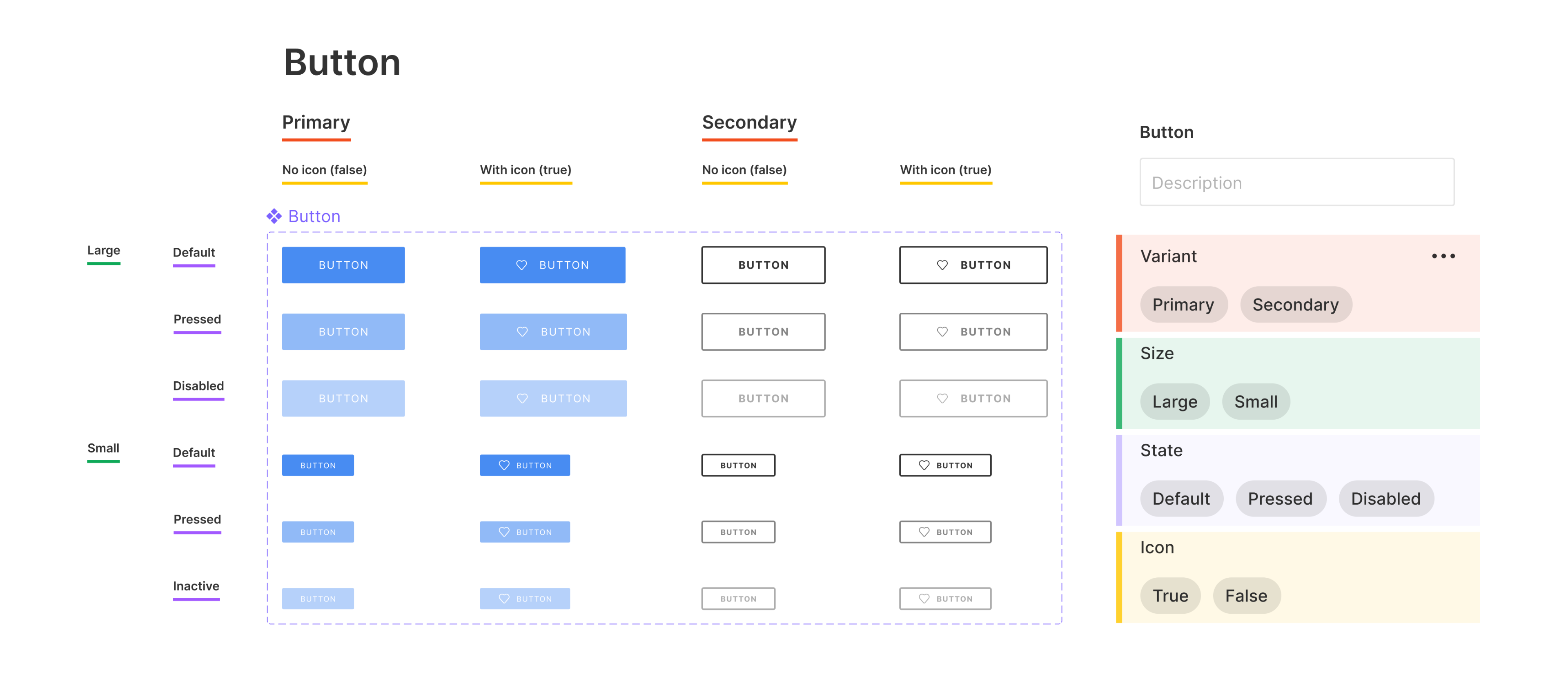
A common and highly effective naming convention, recommended by Figma, is to use slashes to organize components and their variants, such as Button/Primary/Default. MCP understands this and can use it to create a logical structure in the code.
4. What Could Go Wrong
- Problem: The generated code has hard-coded hex values (e.g.,
background-color: #3b82f6;) instead of variables.- Solution: You defined the Variable, but you forgot to apply it. Select your element in Figma, go to the design panel (e.g., the
Fillproperty), click the four-dot "style" icon, and select the appropriate variable from your library.
- Solution: You defined the Variable, but you forgot to apply it. Select your element in Figma, go to the design panel (e.g., the
- Problem: The AI created multiple, separate button components (
<RedButton>,<BlueButton>) instead of one flexible component.- Solution: This is the classic sign of not using variants. You likely have separate components in Figma (
Red Button,Blue Button). You need to combine these into a single component namedButtonand add a property calledColorwithRedandBlueas its values.
- Solution: This is the classic sign of not using variants. You likely have separate components in Figma (
- Problem: The button in the browser doesn't change when I hover over it.
- Solution: The AI can't invent interactions. You must define them visually. In your Figma
Buttoncomponent, you need to add a property (e.g.,State) with variants forDefaultandHover. Then, design how theHovervariant looks. MCP will read this and generate the necessary CSS for the hover effect.
- Solution: The AI can't invent interactions. You must define them visually. In your Figma
5. Mini Exercise
Let's put all three concepts together. We'll upgrade the simple "Follow" button from our last exercise into a proper, systemized component.
- Define Tokens:
- In Figma, open the "Local Variables" panel.
- Create a new Color variable named
color/button/primary-bgand set it to a blue color. - Create another color variable
color/button/primary-textand set it to white. - Create a Number variable for spacing, e.g.,
spacing/md, and set it to16.
- Create the Component:
- Create your button's text and frame.
- Apply your new variables: use
color/button/primary-bgfor the frame's fill,color/button/primary-textfor the text color, andspacing/mdfor the left/right padding. - Select the button and turn it into a component (
Option + Command + Kor right-click > "Create Component"). Name itButton.
- Add Variants:
- With the new
Buttoncomponent selected, go to the Properties section in the right-hand panel and click the+icon. Select Variant. - Figma will create a new property. Rename it from "Property 1" to
State. - You now have one variant called "Default". Click the
+icon below it to add a new variant. Name this oneHover. - You'll now have two versions of your button on the canvas. Select the
Hoverversion and change its background color to be slightly darker to show a visual difference.
- With the new
- Bonus - Add Another Property:
- Select the component set again. Add another Variant property and name it
Style. - Change the default value from "Default" to
Primary. - Select both your
DefaultandHoverstate buttons. In the variants panel on the right, you'll see yourStyleproperty. It should say "Primary". - Now, duplicate those two buttons. Select the new duplicates. In the variants panel, click "Primary" and type
Secondaryto create and assign a new variant. - Restyle these two
Secondarybuttons to have an outline and transparent background.
- Select the component set again. Add another Variant property and name it
You now have a single Button component with four variations, all driven by design tokens!
6. Checklist Before Moving Ahead
- I can explain what a design token is and how to create one using Figma Variables.
- I understand the difference between creating separate components vs. a single component with variants.
- I know how to add properties (like
StateorStyle) to a Figma component to create variants. - I have completed the exercise and created a
Buttoncomponent withStateandStylevariants, using variables for its colors and padding.
This was a dense but incredibly important lesson. You have now learned the three core pillars of preparing a design for a modern, AI-assisted development workflow: semantic naming, responsive structure, and a systematic component library. This investment in organizing your file will pay off tenfold by dramatically improving the quality of the code you generate.
A Look Ahead: There's just one last preparation step before we start using our AI tools. In the next lesson, we will cover how to properly prepare and export assets like images and icons in web-friendly formats.