Hello! Welcome back.
In our last lesson, we gave our webpage a meaningful structure using semantic HTML tags like <header>, <main>, and <footer>. We learned that this structure isn't just for organization—it's vital for accessibility and SEO.
Today, we're shifting our focus from the meaning of our content to its physical space on the page. This is where your design expertise will feel right at home.
1. What We Are Learning
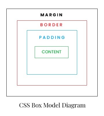
This lesson is all about the CSS Box Model. You will learn to understand the four layers that make up every element on a page: content, padding, border, and margin, and see how they directly relate to layout.
2. Why This Matters
As a product designer, you live and breathe spacing. You meticulously define padding within components, set border styles, and manage the margins between elements to create a balanced, readable layout. The CSS Box Model is the code-level implementation of these exact concepts.
Understanding this model is fundamental to "code literacy." It will allow you to:
- Read CSS and understand why elements are sized and spaced the way they are.
- Effectively debug layout issues in AI-generated code.
- Translate your design mockups into code with precision, because you'll be speaking the browser's language of space.
Every single element on a webpage—a button, an image, a block of text—is a rectangular box. The Box Model is the rulebook that defines the properties of that box.
3. Step-by-Step Instructions
Step 1: The Picture Frame Analogy
Before we dive into the technical details, let's start with an analogy that should feel very familiar.
This article from web.dev provides a perfect analogy for the box model that will resonate with your design background: a framed picture on a wall.
Read the sections titled "The areas of the box model" and "A useful analogy". This will introduce you to the four layers and connect them to real-world objects.
To summarize that brilliant analogy:
- Content: The artwork itself.
- Padding: The matting board, creating space between the artwork and the frame.
- Border: The picture frame itself.
- Margin: The empty space on the wall between this frame and any others.
This mental model is your key to understanding layout in CSS.
Step 2: Exploring the Layers in Detail
Now let's see how these layers work in practice. We'll watch a video that uses browser developer tools to visualize each part of the box model. This is like using Figma's inspect panel, but for a live website.
CSS Box Model explained (padding, border, margin)
This video from Coder Coder provides a fantastic visual breakdown of each component of the box model. We'll watch it in a few short segments.
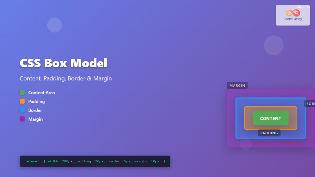
Watch the video from the beginning (around 00:25) up to 15:47. Don't worry about memorizing all the shorthand properties for now; focus on the core concept of each layer: Content (00:50): The text or image itself. Padding (02:31): The space inside the border. Notice how the element's background color extends into the padding. Border (09:06): The visible "stroke" or frame around the padding and content. Margin (11:16): The invisible space outside the border, pushing other elements away.
Here's a quick summary to solidify the difference between the two most important spacing properties:
- Padding: Affects the space inside an element. Think of it as the internal breathing room of a component. It expands the element and its background.
- Margin: Affects the space outside an element. It's used to create space between different elements. It's always transparent.
Step 3: The Sizing "Gotcha" and the border-box Solution
This next concept is one of the most important in all of CSS, especially for designers. By default, when you set an element's width in CSS, that width applies only to the content box. The padding and border are then added on top, making the element's final visible width larger than what you set.
This is not how design tools work. If you create a 300px frame with a 10px stroke in Figma, the final width is 300px, not 320px. Thankfully, CSS has a way to fix this.
CSS Box Model explained (padding, border, margin)
Let's continue with the Coder Coder video, which explains this problem and its solution perfectly.
Watch from 15:34 to the end (21:29). Pay close attention to the difference between the default box-sizing: content-box and the much more intuitive box-sizing: border-box.
The key takeaway is that box-sizing: border-box tells the browser to make the width and height properties include the padding and border. This makes layouts far more predictable and aligns with how you think about sizing in design software.
Because this is so much more intuitive, it's a best practice to apply this behavior to every element on the page. You'll see this snippet at the top of almost every modern CSS file:
*,
*::before,
*::after {
  box-sizing: border-box;
}
This is a "universal reset" that makes sure all elements follow the more logical border-box model.
4. What Could Go Wrong
-
Problem: I'm still confused about when to use
paddingvs.margin.- Reason: This is the most common point of confusion. They can sometimes create similar-looking results.
- Solution: Use this rule of thumb:
- Need to increase the space inside a component, pushing its content away from its own edge (e.g., more space around text inside a button)? Use padding.
- Need to increase the space between two separate components (e.g., move a button further away from a title)? Use margin.
-
Problem: The element I styled is wider than I set it to be.
- Reason: You've run into the default
box-sizing: content-boxbehavior. - Solution: Add the universal
box-sizing: border-boxreset to the very top of yourstyles/style.cssfile. This will make your element widths behave exactly as you expect them to.
- Reason: You've run into the default
5. Mini Exercise
Time to get hands-on. We'll apply these concepts to a new element in your project.
- Open your
my-landing-pageproject in VS Code. - In your
index.htmlfile, inside the<main>section, add a new<div>with a class name. Inside it, put a short paragraph.<div class="box-model-demo"> <p>This is a box.</p> </div> - Now, open your
styles/style.cssfile. - First, add the
border-boxreset to the very top of the file. This is step zero for almost any new CSS file.*, *::before, *::after { box-sizing: border-box; } - Next, let's style our new box. Add the following CSS rule. We're targeting the element using the class name we gave it (preceded by a dot
.):.box-model-demo { width: 300px; background-color: #f0f0f0; /* A light gray */ /* Now, add and change these values one by one and save to see the effect */ padding: 20px; border: 5px solid #cccccc; /* A 5px solid gray border */ margin: 40px; } - Launch your Live Server and open the page in your browser.
- Experiment! Change the values for
padding,border, andmargin. Notice how:paddingchanges the space inside the gray box.borderchanges the thickness of the frame.marginchanges the space around the gray box, pushing it away from the other elements.
- Bonus: Open your browser's developer tools (Right-click on the box -> Inspect), find the "Layout" or "Computed" tab, and you'll see a visual representation of the box model for your element, just like in the videos!
6. Checklist Before Moving Ahead
- I can name the four layers of the CSS Box Model (Content, Padding, Border, Margin).
- I can explain that
paddingis inner space andmarginis outer space. - I can explain why
box-sizing: border-boxis essential for predictable layouts. - I have added the universal
border-boxreset to my stylesheet. - I have completed the exercise and visually observed the effect of changing padding, border, and margin values on an element.
Excellent work. You've just grasped one of the most foundational concepts of web layout. Your ability to look at a design and see the underlying boxes, padding, and margins will be invaluable as we move forward.
A Look Ahead: In the next lesson, we'll formalize what you just did in the exercise. We will learn how to read and write a complete CSS rule, breaking down its parts: the selector, the property, and the value. This will complete our initial tour of "code literacy" for HTML and CSS.