Hello! In our last lesson, we learned how to have a "conversation" with our AI assistant, using refined prompts to correct visual details and enforce our design system's rules by referencing specific Figma components and Auto Layout properties.
Today, we're going to add another layer of sophistication to our instructions. We'll move beyond just visual accuracy and learn how to tell the AI to build the web page using modern, professional standards.
1. What We Are Learning
This lesson focuses on how to instruct the AI to use semantic HTML and a mobile-first responsive approach. We'll learn why these two concepts are foundational to high-quality web development and how to embed them into our prompts.
Our Analogy:
- If the last lesson was a design review for visual polish, this lesson is a technical review for structural integrity and performance.
- You're not just telling the junior designer "make the button blue"; you're telling them "build the house on a solid foundation and make sure the floor plan works for a small cabin before you plan the mansion."
2. Why This Matters
Telling the AI to use these principles is crucial for moving from a simple design-to-code translation to creating a professional, robust website.
Semantic HTML is about using the right tool for the job:
- Accessibility: It provides a clear structure for screen readers used by people with visual impairments, making your site accessible to everyone. This is like adding braille to signs in a building.
- SEO (Search Engine Optimization): Search engines like Google can better understand the content and hierarchy of your page, which can improve your site's ranking.
- Readability: The code becomes easier to read and maintain, which is invaluable for future updates. It’s the code equivalent of having clearly named and organized layers in your Figma file instead of hundreds of layers named "Group 123."
A Mobile-First approach is the modern standard for responsive design:
- Content Prioritization: It forces you to decide what's most important by starting with the smallest screen.
- Performance: It ensures a faster, lighter experience for mobile users, as the browser loads the simplest styles first and only adds more complex ones for larger screens.
- Future-Proofing: It's a more efficient and scalable way to build for the ever-increasing number of devices and screen sizes.
3. Step-by-Step Instructions
Part A: Understanding Semantic HTML
At its core, semantic HTML means using HTML tags that describe the meaning of the content they contain. Instead of using generic boxes (<div>) for everything, we use specific tags like <header>, <nav>, <main>, and <footer>.
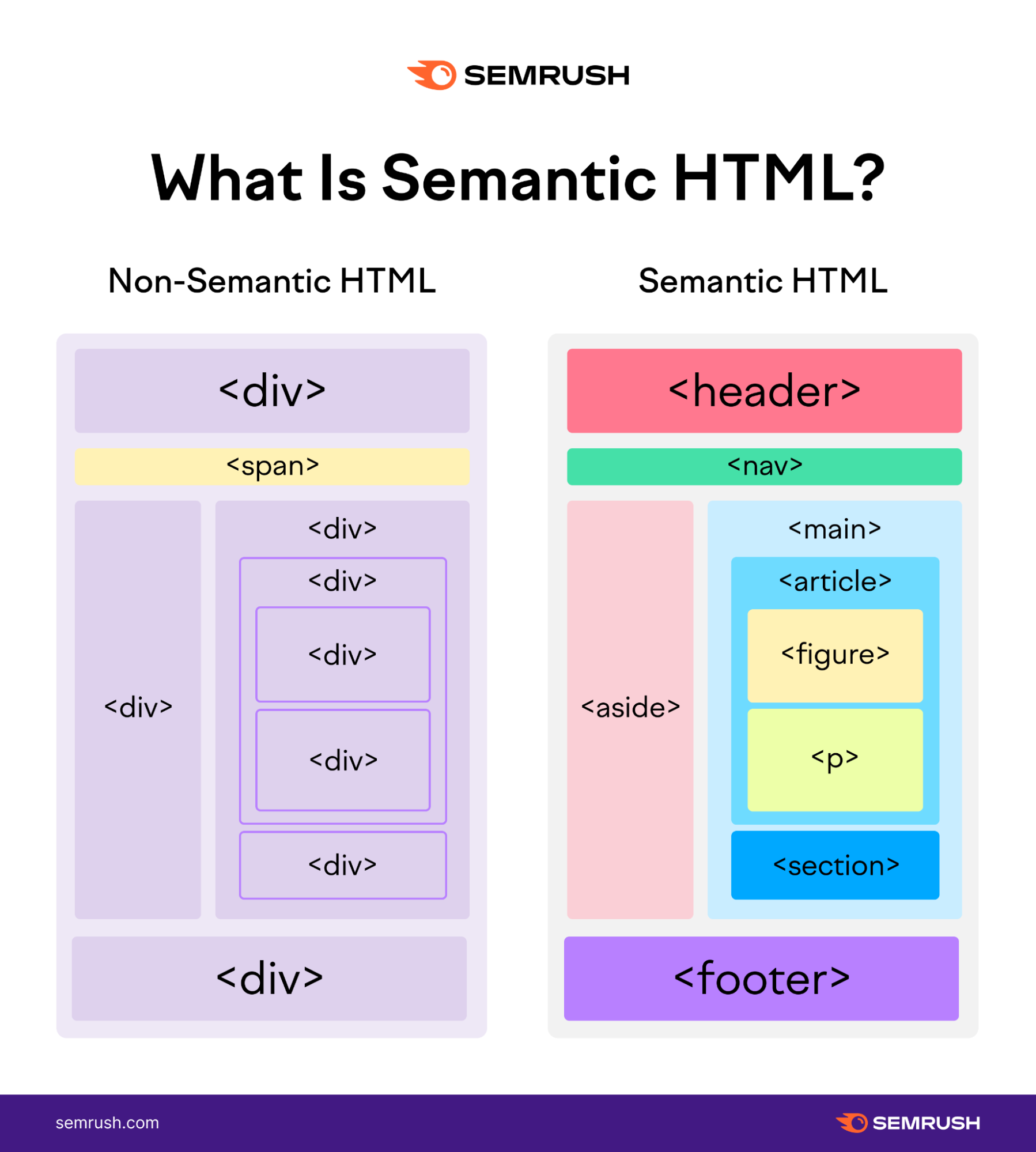
To get a quick and clear overview of this concept, let's watch a short video.
Explained in 4 minutes: Semantic HTML
This video from onjsdev provides a concise explanation of what semantic HTML is, which elements to use, and why they are so important for modern web development.
Please watch the entire video (it's under 4 minutes). Pay close attention to the three main benefits it highlights: accessibility, SEO, and developer readability.
Part B: Understanding the Mobile-First Approach
You're already familiar with responsive design. Mobile-first is a specific strategy for achieving it. Instead of designing for a large desktop screen and then "shrinking" the design down, we start with the mobile view and "progressively enhance" it for larger screens.
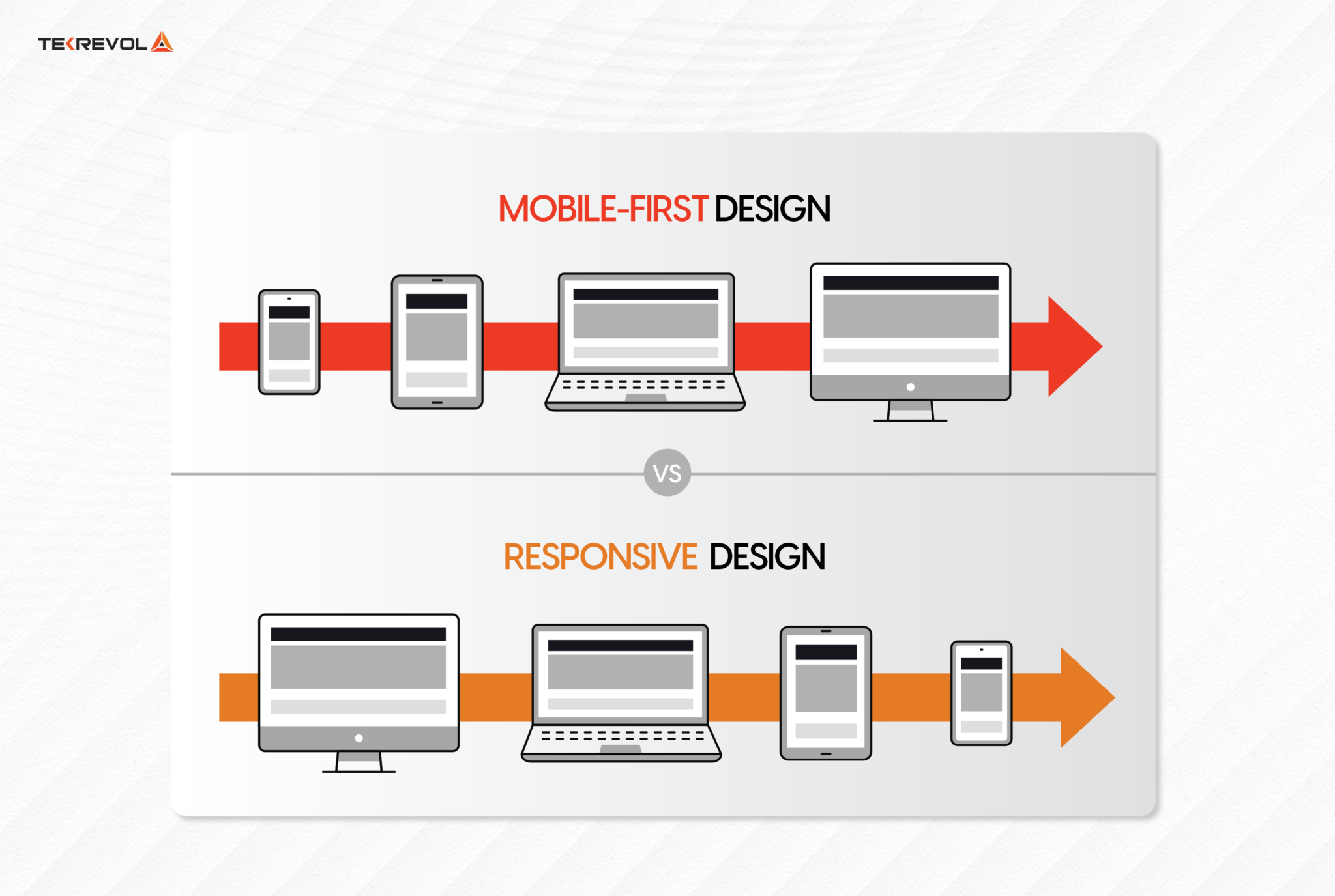
To get the best results from our AI, our Figma files should also reflect this thinking.
Figma to Code - Design like a developer, generate HTML/CSS with AI (Cursor + Figma MCP Server)
This video from Code with Chris the Freelancer is a fantastic demonstration of how to structure a Figma design like a developer. This approach is exactly what the AI needs to generate clean, responsive code.
Please watch from 09:55 to 22:29. The key takeaway is seeing how the presenter creates separate frames for desktop and mobile, using the same underlying Auto Layout structure. This preparation in Figma is crucial for telling the AI how to build a responsive site.
By creating both a mobile and a desktop version of your design in Figma—using the same well-named, Auto Layout-driven layers— you're giving the AI a perfect blueprint to follow for its mobile-first code.
Part C: Prompting for Semantics and Responsiveness
Now, let's combine these concepts into our prompts. The key is to be explicit.
A great prompt acts like a detailed creative brief. Let's look at a template for writing one.
How AI Turns Figma into Code - The Prompting Process
This article from the Design Systems Collective has a brilliant section on writing a 'high-quality prompt'. We'll use its structure as our new standard.
Read the section titled 'The Prompting Process'. Focus on the bullet points: Set the Scene & Goal, Provide Business Context, Define the Tech Stack, Dictate Structure and Naming, and Point to the High-Fidelity Data. This is our template.
Based on that structure, here’s how we can build a powerful prompt:
You are a senior front-end developer specializing in accessible and responsive websites. Your task is to create a production-ready HTML and CSS component based on the provided Figma design.
- Structure: Use semantic HTML5 elements like
<section>,<header>, and<article>where appropriate instead of just<div>s.- Responsiveness: Implement a mobile-first responsive approach. The base styles should be for small screens, and you should use
@media (min-width: ...)queries to add styles for larger screens.- Data Source: Here is the link to the Figma design:
[Figma link]. Pay close attention to the auto-layout properties for spacing and use the design tokens for all colors, fonts, and radii.
For smaller, more specific tasks, we can use simpler prompts.
Generative AI Prompts for Web Developers
This HubSpot blog post offers several direct, actionable prompts that we can learn from.
Review prompts #2 ('Accessible Navigation Bar'), #3 ('About Page Generator'), and #10 ('Mobile-First Grid Layout Helper'). Notice how they explicitly ask for 'semantic' elements or a 'mobile-first' setup.
The lesson is simple: if you want the AI to do something, you have to ask for it directly.
4. What Could Go Wrong
- The AI still uses generic
<div>tags. Sometimes, the AI needs a reminder. A good follow-up prompt would be: "You used a<div>for the page's main header. Please refactor that to use a semantic<header>tag." - The layout looks good on desktop but is broken on mobile. This means the AI ignored the mobile-first instruction. Correct it with: "The CSS seems to be desktop-first. Please rewrite it to be mobile-first. The base styles should target small screens, and then use media queries with
min-widthto adapt for larger screens." - Your Figma file isn't structured for responsiveness. This is the "garbage in, garbage out" problem. If your design doesn't use Auto Layout or has a messy, illogical layer structure, the AI will struggle to generate good responsive code, no matter how good your prompt is. Always ensure your Figma file is as structured as the code you want to receive.
5. Mini Exercise
Imagine you have a Figma design for a testimonial card.
- The main frame is named
testimonial-card. - You have created two versions in Figma:
testimonial-card-mobileandtestimonial-card-desktop. - The card contains a user's photo, their name, their quote, and their company title.
Your Task: Write a single, comprehensive prompt to generate the HTML and CSS for this card. Your prompt must instruct the AI to:
- Act as a specific type of developer.
- Use semantic HTML for the card's structure (e.g.,
<figure>,<blockquote>,<figcaption>). - Use a mobile-first responsive approach, referencing your two Figma frames.
- Reference the Figma selection you would provide.
Click here to see my example prompt
You are an expert front-end developer focused on creating accessible and semantic web components. Please generate the HTML and CSS for the component in the provided Figma selection.
- Structure: Please use semantic HTML. The entire component should be a
<figure>with a class oftestimonial-card. The user's quote should be inside a<blockquote>element, and their name and title should be inside a<figcaption>.- Responsiveness: Implement a mobile-first approach. The base styles should match the
testimonial-card-mobileframe. Use a media query to adjust the layout for larger screens to match thetestimonial-card-desktopframe.- Data Source: Here is the link to the Figma selection:
[Figma link to selection]. Ensure you use the design tokens for all colors, fonts, and spacing defined by Auto Layout.
6. Checklist Before Moving Ahead
- I can explain what semantic HTML is and why it's important for accessibility and SEO.
- I can explain what a "mobile-first" approach is and why it's a modern best practice.
- I know how to explicitly ask the AI to use semantic HTML and a mobile-first strategy in my prompts.
- I understand that a well-structured Figma file is essential for getting high-quality responsive code from the AI.
Fantastic! You've now learned to instruct your AI assistant not just on what the page should look like, but on how it should be built. This is a major step toward generating truly professional, production-quality code.
A Look Ahead:
We're now able to write a great initial prompt and refine it with specific feedback. But what happens when the AI gets something wrong? In the next lesson, we will focus on the iterative loop: using follow-up prompts to have the AI analyze, correct, and explain its own code, solidifying your role as the director of this process.