Hello! In our last lesson, we laid the groundwork for an accessible website by structuring our pages with semantic HTML landmarks and headings. This gives assistive technologies a clear map of your page. Now, we'll focus on ensuring that users can actually interact with all the elements on that map using only a keyboard.
Today's lesson directly addresses the learning outcome: Ensure all interactive elements are keyboard accessible and have visible focus states. This is a non-negotiable aspect of meeting Web Content Accessibility Guidelines (WCAG) and is fundamental to creating the professional, trustworthy website you aim to build.
We'll cover two interconnected topics:
- Keyboard Operability: Making sure every link, button, and form field can be reached and activated without a mouse.
- Visible Focus: Providing a clear visual indicator of which element is currently active, which is the keyboard user's equivalent of a mouse cursor.
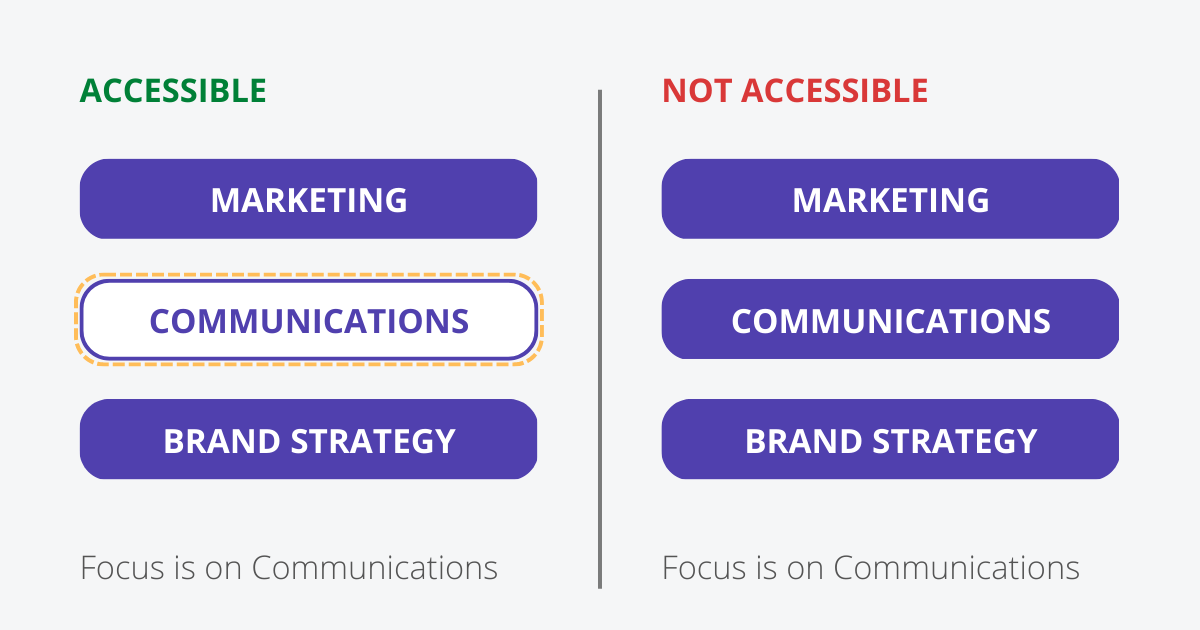
The image below perfectly illustrates the difference this makes. On the left, it's clear the "COMMUNICATIONS" button is selected. On the right, a keyboard user would be completely lost.
Part 1: The Foundation of Keyboard Accessibility
Keyboard accessibility starts with a simple premise: a user should be able to navigate to and operate every interactive piece of your website using the Tab key (to move forward), Shift+Tab (to move backward), and Enter or Space (to activate).
Native Elements are Your Best Friends
The easiest way to achieve this is by using native HTML interactive elements whenever possible. Elements like <a>, <button>, <input>, <select>, and <textarea> are built with keyboard accessibility from the ground up. The browser handles their focusability and activation automatically. This is a core reason to prefer <button>Click Me</button> over <div class="button">Click Me</div>.
Tab Order: The Path of Navigation
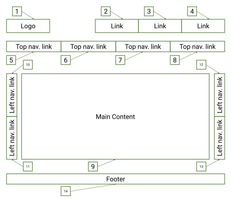
By default, the order in which the Tab key moves through elements follows their order in the HTML source code. This is why the semantic structure you learned about in the previous lesson is so important—a logical document structure naturally leads to a logical tab order.
Making Custom Components Accessible
As a UI Engineer, you frequently build custom components that aren't native HTML elements, like a custom dropdown or a modal's close icon made from an SVG. These are not focusable or interactive by default. To make them accessible, you need two key tools: the tabindex attribute and JavaScript event handlers.
The following video provides an excellent, hands-on demonstration of this process.
Web Accessibility Tutorial (A11y) - Keyboard Navigation, Aria Tags, Contrast, Semantics and more!
Watch this segment from the "Web Accessibility Tutorial" by RoadsideCoder. It clearly shows the problem with custom components and the exact steps to fix it using tabindex and event listeners.
Watch from 02:24 to 05:43. Pay close attention to: How a custom star rating component is initially skipped by keyboard navigation. The use of tabindex="0" to make a <span> element focusable. The necessity of an onkeydown event handler to listen for "Enter" and "Space" key presses.
As the video demonstrates, the solution involves two steps:
- Add
tabindex="0": This attribute inserts a non-native element into the natural tab order of the page without disrupting it. - Add an
onkeydownEvent Listener: This script listens for key presses and triggers the element's action (e.g., submitting a form, opening a modal) when the user pressesEnterorSpace.
In the same video, the presenter also discusses other values for tabindex, which are important to know:
tabindex="0": The element becomes focusable and is reachable via the natural tab order. This is what you'll use 99% of the time for custom interactive controls.tabindex="-1": The element becomes focusable via JavaScript (using.focus()), but is not included in the natural tab order. This is useful for managing focus programmatically, like moving focus to a modal window when it opens.tabindex="1"(or any positive integer): Avoid this. It creates a separate, explicit tab order that overrides the natural document flow, which is almost always confusing for users and a maintenance nightmare.
Test your understanding!
You've created a custom "close" button for a pop-up banner using an SVG icon inside a <div>.
<div class="close-button">
  <svg>...</svg>
</div>
What two essential attributes/properties would you add to the <div> to make it accessible to a keyboard user?
Show answer
You would need to add tabindex="0" to make it focusable, and a role="button" to tell screen readers it's a button. You would then attach a JavaScript click and keydown event listener to handle activation.
<div class="close-button" tabindex="0" role="button">
  <svg>...</svg>
</div>
const closeButton = document.querySelector('.close-button');

// Function to close the banner
const handleClose = () => {
  // logic to hide the banner
};

closeButton.addEventListener('click', handleClose);

closeButton.addEventListener('keydown', (event) => {
  // The 'Enter' and 'Space' keys should trigger the button's action
  if (event.key === 'Enter' || event.key === ' ') {
    handleClose();
  }
});
We'll cover the role attribute in more detail in the next lesson!
Part 2: Creating Visible and Usable Focus States
Making an element focusable is only half the battle. If users can't see which element is focused, they are navigating blind. This is why the CSS rule * { outline: none; } is so infamous—it single-handedly breaks keyboard navigation.
The Problem with Default Focus and the :focus-visible Solution
Historically, designers have disliked the browser's default focus outline because it appears even when you click an element with a mouse. This created a conflict between aesthetics and accessibility.
Modern CSS has an elegant solution: the :focus-visible pseudo-class. It allows the browser to intelligently show a focus indicator only when it's needed—primarily during keyboard navigation.
This short video from web development expert Kevin Powell explains the concept perfectly.
Quick guide to CSS focus states
In this "Quick guide to CSS focus states", Kevin Powell clearly demonstrates the UX problem and how :focus-visible solves it.
First, watch from 00:00 to 00:59 to understand the core issue with removing outlines. Then, skip to 03:18 and watch to 05:49 to see how :focus-visible provides a much better user experience.
So, instead of applying styles with :focus, you should now use :focus-visible. This ensures keyboard users get the indicators they need, while mouse users get the cleaner interface designers want.
Designing a WCAG-Compliant Focus Indicator
Simply having a focus style isn't enough for true accessibility. For your professional accounting website, the focus indicator must be clearly visible to meet WCAG standards. This means it needs sufficient size and color contrast. Browser defaults often fail this test on sites with custom color palettes.
The following article by Sara Soueidan is a masterclass on this topic. We'll read it in two parts to build a robust, professional focus style for your project.
A guide to designing accessible, WCAG-conformant focus ...
First, let's understand the rules. This part of Sara Soueidan's guide defines what a compliant focus indicator is according to WCAG.
Read the sections 'What exactly is a focus indicator?', 'Browser default focus indicators', and 'WCAG 2.1 and WCAG 2.2 focus indicator accessibility requirements'. Focus on understanding the core requirements: Contrast Ratio: At least 3:1 against adjacent colors. Minimum Area: The indicator must be at least as large as a 2px thick perimeter around the component.
The key takeaway is that a professional focus indicator isn't just a matter of opinion; it's a technical requirement based on contrast and size.
Now, let's look at a practical, bulletproof solution from the same article that meets these requirements on almost any background.
A guide to designing accessible, WCAG-conformant focus ...
Now for the solution. This next part of the article provides a 'universal' CSS recipe for a highly visible focus indicator that you can use directly in your project.
Read the sections 'A ‘universal’ focus indicator' and 'Showing the focus indicator only for keyboard users'. Pay close attention to the CSS code provided for creating a black-and-white outline using outline and box-shadow.
Here is the brilliant and practical CSS pattern from the article. You can add this to your global stylesheet in Astro to instantly apply a compliant and highly visible focus style across your entire site.
/* In your global.css file */

:focus-visible {
  /* A 2px white outline */
  outline: 2px solid white;

  /*
    A 4px black 'shadow' that acts as a second outline.
    It's 2px larger than the white outline to appear around it.
  */
  box-shadow: 0 0 0 4px black;

  /* Make sure the outline doesn't get clipped */
  outline-offset: 1px;
}
This two-color approach ensures that whether your component is on a light or dark background, at least one of the outlines will have sufficient contrast to be clearly visible.
Part 3: Accessibility in the Astro Ecosystem
Knowing how to build these features from scratch is essential. However, it's also smart to leverage the work of others. The Astro ecosystem has libraries dedicated to providing accessible components out of the box.
accessible-astro-components is a library built specifically for this purpose. It provides pre-built components that already have keyboard navigation, focus management, and other accessibility features baked in.
incluud/accessible-astro-components
Take a moment to look over the README for this Astro component library. It's a great example of how the principles we've discussed are applied in a real-world project.
Read the 'Our mission', 'Component features', and 'Available components' sections. Notice how features like 'Full keyboard support with focus management' are highlighted as core selling points.
For your project, you can choose to implement your own robust focus styles globally, or you can use a library like this for complex components like modals or tabs, knowing that the heavy lifting of accessibility has already been done for you.
Conclusion
You have now learned the critical skills to make your website's interactive elements usable for everyone. This moves beyond static structure into the dynamic, interactive experience that is essential for a modern web application.
Key Takeaways:
- Prioritize Native Elements: Use
<button>,<a>, and<input>to get keyboard accessibility for free. - Make Custom Components Focusable: Use
tabindex="0"and JavaScriptkeydownevent listeners for elements created fromdivs orspans. - Never Remove Outlines: Do not use
outline: nonewithout providing a clear, visible alternative. - Use
:focus-visible: Apply focus styles intelligently to serve keyboard users without altering the experience for mouse users. - Design for Visibility: Ensure your focus styles meet WCAG requirements for contrast (3:1) and size (at least 2px). The two-color
outline/box-shadowpattern is a robust solution.
Up Next:
We've made our components focusable and visible. In the next lesson, we will dive deeper into ARIA (Accessible Rich Internet Applications). You'll learn how to apply ARIA attributes to enhance the accessibility of custom interactive components, communicating their state (e.g., expanded/collapsed) and properties to screen readers.