Hello! In our last lesson, we made sure all your site's interactive elements are operable with a keyboard and have clear, visible focus states. We made them focusable. Now, it's time to make them understandable.
This lesson focuses on the learning outcome: Apply ARIA attributes to enhance the accessibility of custom interactive components. While keyboard access allows users to reach your custom components, ARIA (Accessible Rich Internet Applications) gives them the context they need to understand what those components are and how to use them, especially for users of assistive technologies like screen readers.
We will cover:
- What ARIA is and how it works with the "accessibility tree."
- The fundamental rules of using ARIA to avoid common pitfalls.
- The practical application of ARIA roles, states, and properties to build accessible custom components.
1. What is ARIA and How Does it Work?
In the previous lesson, we briefly used role="button" to tell a <div> to act like a button. That role attribute is part of ARIA.
When a browser renders a webpage, it creates the Document Object Model (DOM), which you're familiar with from your JavaScript work. In parallel, it creates another structure called the accessibility tree. This tree is a simplified version of the UI, containing only the semantic information that assistive technologies (AT), like screen readers, need.

ARIA attributes allow you to modify this accessibility tree. You can add missing information, like a div's role, or describe relationships between elements that aren't apparent from the DOM alone.
This next diagram shows the flow of information. Your code (DOM and JavaScript) is interpreted by the browser, which exposes information via an Accessibility API to assistive technologies. ARIA provides the critical roles, states, and properties that make this translation meaningful.
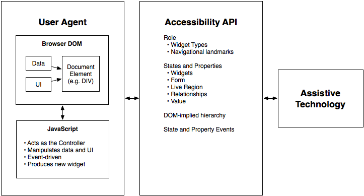
To solidify this concept, let's read a short introduction.
Accessibility Series: An Unreasonably Long Introduction To ARIA
This article provides a fantastic, developer-focused introduction to ARIA. We'll start with the sections that define what ARIA is and, just as importantly, what it is not.
Please read the sections 'What Is ARIA' and 'What Can’t ARIA Do?'. Pay close attention to the idea that ARIA only affects the accessibility tree and does not add keyboard functionality or change visual styles—those are separate jobs you must handle, as we discussed in the last lesson.
2. The Golden Rules of ARIA
Before you start adding aria- attributes everywhere, it's crucial to understand the principles of using them correctly. Misusing ARIA can make a website less accessible than having no ARIA at all. The W3C, the organization that defines web standards, has established five core rules for this.
Accessibility Series: An Unreasonably Long Introduction To ARIA
The same article lays out these rules clearly. Internalizing them is key to writing professional, maintainable, and truly accessible code.
Read the section 'The Rules Of ARIA'. Focus on understanding the spirit of each rule, especially Rule #1.
Here's a quick summary of those vital rules:
- Don’t use ARIA. This sounds contradictory, but it's the most important rule. If you can use a native HTML element (
<button>,<nav>,<input type="checkbox">), do it. Native elements have accessibility built-in for free. Only use ARIA when a native element isn't sufficient for your design. - Don’t change native semantics. Don’t take a
<button>and give itrole="heading". This confuses everyone and breaks expected behavior. - All interactive controls must be keyboard accessible. We covered this in the last lesson. If you add
role="button"to a<div>, you must also addtabindex="0"and akeydownevent handler. - Don’t hide focusable elements. An element that can receive focus must not have
aria-hidden="true". - Interactive elements must have an accessible name. A button must have text, or an
aria-label, to tell users what it does.
As a UI Engineer building custom components, you will often find yourself in situations where Rule #1 doesn't apply, and that's precisely where the rest of the rules—and ARIA itself—become your essential toolkit.
3. The ARIA Toolkit: Roles, States, and Properties
ARIA attributes can be grouped into three categories. Understanding this classification makes it easier to know which attribute to reach for.
Why you should start using ARIA Attributes in HTML
This short video provides a great overview of the different types of ARIA attributes and when you might use them.
Watch from 00:17 to 02:14. The presenter gives a clear explanation of what roles are and how they relate to semantic HTML.
-
Roles: Define the type or purpose of a UI element.
- Examples:
role="button",role="dialog",role="tablist",role="checkbox". - This tells a screen reader, "This
divisn't just a generic container; it's a button."
- Examples:
-
Properties: Define characteristics or relationships. They tend to be static and don't change often.
- Examples:
aria-label,aria-labelledby,aria-describedby,aria-controls. aria-label="Close"gives an accessible name to a button that only has an "X" icon.aria-controls="content-panel"tells a screen reader that this button manages an element with the IDcontent-panel.
- Examples:
-
States: Define the current condition of an element. These are dynamic and must be updated with JavaScript in response to user interaction.
- Examples:
aria-expanded,aria-checked,aria-pressed,aria-hidden. aria-expanded="true"tells a screen reader that a collapsible section is currently open.aria-checked="true"indicates a custom checkbox is ticked.
- Examples:
Practical Example: Building an Accessible Accordion
Let's apply these concepts to a common interactive component: an accordion, or a collapsible section. This is a perfect use case for ARIA because there is no native <accordion> element in HTML.
Here is a typical inaccessible implementation:
<!-- Inaccessible Accordion -->
<div>
  <h3>Section 1</h3>
  <div>Content of the first section</div>
</div>
A screen reader user has no idea that the h3 is supposed to control the visibility of the content. A keyboard user can't operate it at all.
Now let's see the accessible version using ARIA, based on a pattern from the "ARIA attributes in HTML" guide.
ARIA attributes in HTML: A comprehensive guide 🌐
The following article gives clear, practical code examples for common custom components. We'll focus on its accordion menu example.
Read the section 'Practical examples of using ARIA attributes', focusing specifically on the 'Accordion menu' code snippet and its explanation. Note how aria-expanded, aria-controls, and role="region" are used together.
Let's break down the accessible structure from the article:
<!-- Accessible Accordion Structure -->
<div id="accordion">
  <h3 id="section1-heading">
    <button aria-expanded="false" aria-controls="section1">
      Section 1
    </button>
  </h3>
  <div id="section1" role="region" aria-labelledby="section1-heading">
    Content of the first section
  </div>
</div>
Here's what each ARIA attribute is doing:
<button>: We use a real<button>element, following Rule #1! This gives us keyboard accessibility for free.aria-expanded="false"(State): This tells assistive tech that the region controlled by this button is currently collapsed. You will toggle this betweentrueandfalsewith JavaScript.aria-controls="section1"(Property): This explicitly links the button to the content panel it controls (<div id="section1">).role="region"(Role): This designates the content panel as a significant, landmark region on the page.aria-labelledby="section1-heading"(Property): This gives the region an accessible name by pointing to the heading that contains the button.
Since you're experienced with React, you can see how this maps directly to component state. An isOpen state variable would directly control the aria-expanded attribute and the visibility of the content panel.
Test your understanding!
You are building a custom switch component in React. It uses a <div> that the user can click to toggle a setting.
const CustomSwitch = ({ label, isChecked, onToggle }) => {
  const labelId = "switch-label";

  return (
    <>
      <span id={labelId}>{label}</span>
      <div onClick={onToggle}>
        {/* Visuals for the switch handle go here */}
      </div>
    </>
  );
};
What ARIA attributes and other HTML attributes are needed on the <div> to make it behave like an accessible checkbox or switch?
Show answer
To make the <div> fully accessible, you need to provide its role, state, name, and make it interactive via keyboard.
role="switch": This is the most specific role.role="checkbox"would also be acceptable. It tells AT what the element is.aria-checked={isChecked}: This state attribute communicates whether the switch is on (true) or off (false). It must be updated based on theisCheckedprop.aria-labelledby={labelId}: This property gives the switch an accessible name by referencing the<span>that holds the label text.tabindex="0": As we learned last lesson, this makes thedivfocusable.onKeyDownhandler: You also need to add a keyboard event handler to toggle the switch when the user pressesSpaceorEnter.
Here is the improved component:
const CustomSwitch = ({ label, isChecked, onToggle }) => {
  const labelId = "switch-label";

  const handleKeyDown = (event) => {
    if (event.key === ' ' || event.key === 'Enter') {
      event.preventDefault(); // Prevents page scroll on spacebar
      onToggle();
    }
  };

  return (
    <>
      <span id={labelId}>{label}</span>
      <div
        role="switch"
        aria-checked={isChecked}
        aria-labelledby={labelId}
        tabindex="0"
        onClick={onToggle}
        onKeyDown={handleKeyDown}
      >
        {/* Visuals for the switch handle go here */}
      </div>
    </>
  );
};
Conclusion
You now have the tools to communicate the meaning and state of your custom components to all users. By combining the keyboard interactivity from our last lesson with the semantic information provided by ARIA, you can build complex, modern UI components that are robustly accessible.
Key Takeaways:
- ARIA bridges the gap between your custom UI and assistive technologies by enriching the accessibility tree.
- Always follow the first rule of ARIA: use native HTML elements whenever you can.
- For custom components, use ARIA to define Roles (what it is), Properties (its relationships), and States (its current condition).
- Interactive states like
aria-expandedandaria-checkedare not magic; they must be dynamically updated with JavaScript to reflect the component's actual state.
Up Next:
In the final lesson of this module, we will bring everything together. You will learn how to audit your site for color contrast ratios and other WCAG compliance issues. This involves using automated tools and manual checks to systematically find and fix accessibility problems, ensuring your website meets the professional standards required for your project.