Hello! Welcome back to our course on building a professional accounting website with Astro.
In the last lesson, you did an excellent job setting up a scalable design system using CSS custom properties. We now have a single source of truth for our colors, typography, and spacing. Today, we'll build on that foundation to add a layer of polish and interactivity that defines a premium user experience.
This lesson continues our work in the Styling and Professional Design module. Your learning outcome is to apply CSS transitions for hover and focus states on interactive elements. We will make buttons, links, and other interactive elements feel responsive and refined by animating the changes between their states, moving beyond the abrupt, default browser behavior.
Part 1: Adding Smoothness with CSS Transitions
When a user hovers over a button and it instantly changes color, the interaction feels jarring. A professional website guides the user's attention with subtle, smooth animations. This is where CSS transitions come in.
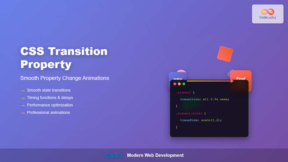
A CSS transition allows the browser to smoothly "tween" between an element's initial state and a new state (e.g., triggered by a :hover pseudo-class) over a specified duration.
To understand the core mechanics, let's start with a foundational guide.
CSS Transitions: The Complete Guide to Smooth Web ...
The article 'CSS Transitions: The Complete Guide to Smooth Web Animations' from dev.to provides a fantastic overview of what transitions are, why they matter, and the properties you'll use to create them.
Please read the introduction, 'The Building Blocks: Your Transition Toolkit,' and 'The Handy Shorthand.' Focus on understanding the four key properties and how they combine into the single transition property we will be using.
The transition Shorthand Property
As the article explained, while you can define transitions with four separate properties, you will almost always use the shorthand transition property in practice. The syntax is:
transition: <property> <duration> <timing-function> <delay>;
property: Which CSS property to animate (e.g.,background-color,transform,opacity). You can useallto animate any property that changes, but it's more performant to be specific.duration: How long the transition takes (e.g.,0.3sor300ms).timing-function: The "easing" of the animation (e.g.,ease-in-outfor a natural feel).delay: An optional pause before the transition starts.
Practical Application: Animating a Button
Let's apply this to the Button.astro component we discussed in the previous lesson. We'll make its background color change smoothly on hover and add a subtle "lift" effect using the transform property.
Open src/components/Button.astro and update the <style> block:
<!-- src/components/Button.astro -->
<style>
  .button {
    display: inline-block;
    background-color: var(--color-accent);
    color: var(--color-white);
    padding: var(--space-sm) var(--space-lg);
    border-radius: var(--border-radius);
    text-decoration: none;
    font-weight: var(--font-weight-semibold);
    border: 2px solid transparent; /* Added for visual consistency with focus state */

    /* Define the transition on the base element */
    transition: background-color 250ms ease, transform 250ms ease;
  }

  .button:hover {
    /* The browser will animate to these new values */
    background-color: var(--color-brand-primary);
    transform: translateY(-2px);
  }
</style>
Notice a few key details here:
- The
transitionproperty is defined on the base.buttonclass, not on the:hoverstate. This tells the browser to animate the properties both when the mouse enters and when it leaves. - We are transitioning two properties,
background-colorandtransform, separated by a comma. This is more performant than usingall. - We're using our design tokens (
var(...)) from the last lesson, ensuring consistency.
Part 2: Accessibility is Key - Styling Focus States
While hover is for mouse users, focus is its crucial counterpart for keyboard users and anyone using assistive technology. A visible focus state shows which element is currently selected and ready for interaction. Your goal of meeting WCAG guidelines makes this non-negotiable.
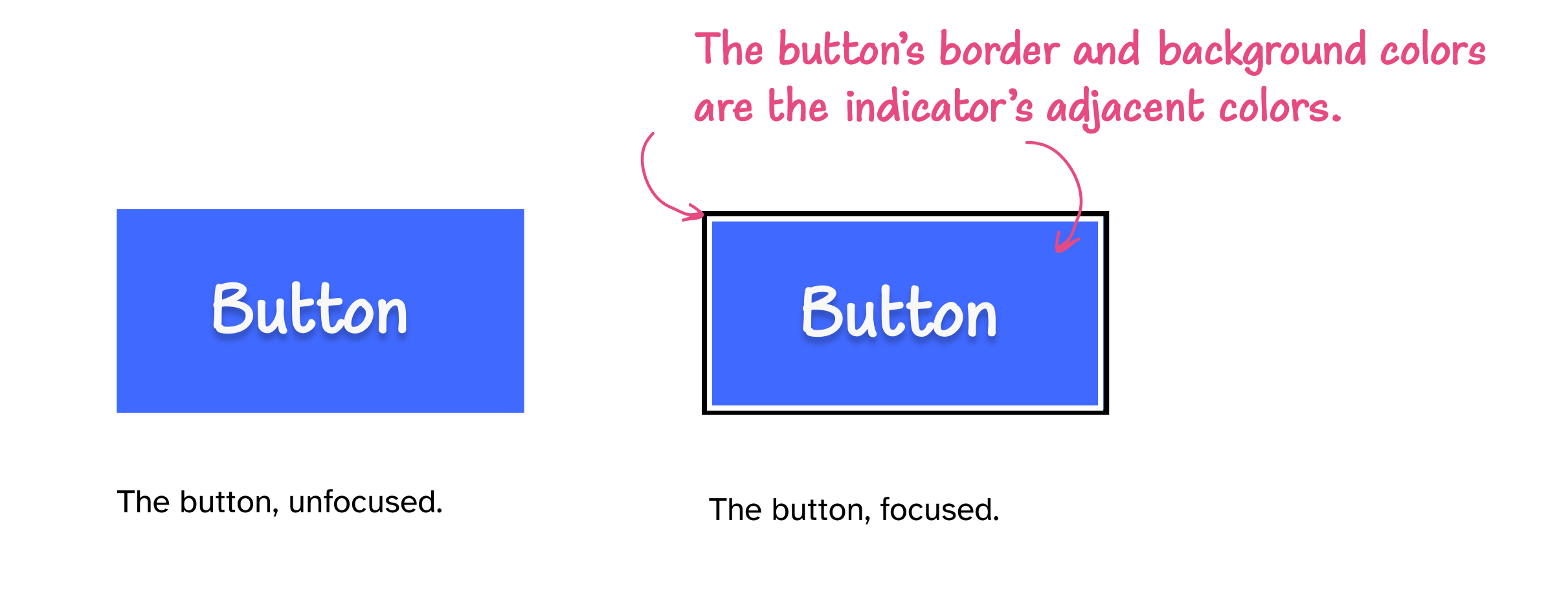
Designing good focus states requires more care than just replicating the hover effect. Let's explore the best practices.
Focusing on focus states. Some things I've learned about…
The article 'Focusing on focus states' by Dave House is an essential read for any professional frontend developer. It dives into the accessibility implications of focus styles and provides robust, production-ready solutions.
Read the sections 'What is a focus state?', 'Browser defaults and WCAG', and 'Custom styles can make things worse too'. Pay extremely close attention to the sub-sections 'The worst thing you can do' and 'The fix'. This is one of the most common accessibility mistakes in web development.
The Cardinal Sin: outline: none;
As the article passionately argues, the single worst thing you can do is outline: none; or outline: 0;. While you might do this to remove the browser's default "ugly blue ring," you've now made your site inaccessible to keyboard users unless you provide a clear replacement.
A robust technique is to use a box-shadow to create a custom, visually appealing focus ring while providing a transparent outline as a fallback for high-contrast modes.
Let's update our button again:
/* In src/components/Button.astro <style> block */

.button:focus {
  /* This is a fallback for Windows High Contrast Mode */
  outline: 2px solid transparent;
  outline-offset: 2px;

  /* This is our custom, branded focus ring */
  box-shadow: 0 0 0 3px var(--color-bg-primary), 0 0 0 5px var(--color-brand-primary);
}
This creates a beautiful "double outline" effect that works on any background and ensures accessibility. The inner shadow matches the background, creating a gap, and the outer shadow is our brand color.
Part 3: The Modern Approach with :focus-visible
There's one lingering issue: with the :focus selector, the focus ring will appear even if you just click the button with a mouse. This can be visually distracting. The modern solution is the :focus-visible pseudo-class, which applies styles only when the browser determines the focus indicator is needed (i.e., for keyboard navigation).
Let's read about this final refinement.
Focusing on focus states. Some things I've learned about…
The same article on focus states also covers the modern :focus-visible pseudo-class.
Read the section 'Keyboard only focus styles'. This explains the difference between 'transitional' and 'retained' focus and how to use :focus-visible correctly.
Now, we can put it all together for a truly professional, accessible button component.
<!-- src/components/Button.astro -->
---
const { href, text } = Astro.props;
---
<a href={href} class="button">
  {text}
</a>

<style>
  .button {
    display: inline-block;
    padding: var(--space-sm) var(--space-lg);
    border: 2px solid transparent; /* Reserve space for potential border changes */
    border-radius: var(--border-radius);
    background-color: var(--color-accent);
    color: var(--color-white);
    font-weight: var(--font-weight-semibold);
    text-decoration: none;
    cursor: pointer;

    /* Define the transition on the base element */
    transition: background-color 250ms ease, transform 250ms ease;
  }

  .button:hover {
    background-color: var(--color-brand-primary);
    transform: translateY(-2px);
  }

  /* Hide the default focus ring only when :focus-visible doesn't match */
  .button:focus {
    outline: none;
  }

  /* Style the focus state ONLY for keyboard users and other assistive tech */
  .button:focus-visible {
    outline: 2px solid transparent;
    outline-offset: 2px;
    box-shadow: 0 0 0 3px var(--color-bg-primary), 0 0 0 5px var(--color-brand-primary);
  }
</style>
This is a production-ready pattern. It provides visual feedback on hover, a clear and accessible focus indicator for keyboard users, and avoids showing that indicator on simple mouse clicks.
Part 4: Respecting User Preferences
One final touch of professionalism is to respect users who prefer not to see animations, often due to vestibular disorders. CSS provides a simple media query for this.
Let's add this to our global stylesheet, src/styles/global.css.
/* src/styles/global.css */

/* ... add this at the end of the file ... */

@media (prefers-reduced-motion: reduce) {
  /* Disable animations and transitions for users who prefer reduced motion */
  *,
  *::before,
  *::after {
    animation-duration: 0.01ms !important;
    animation-iteration-count: 1 !important;
    transition-duration: 0.01ms !important;
    scroll-behavior: auto !important;
  }
}
This snippet, recommended in the dev.to article on transitions, effectively disables all transitions across your site for users who have this preference set in their operating system.
Test your understanding!
Consider a standard hyperlink (<a> tag) on your site. For the premium feel you're targeting, you want to create a custom animated underline effect on hover and focus.
Instead of the default underline, you want a 2px tall underline that starts with 0 width and grows to 100% width on interaction. How would you approach this using a CSS pseudo-element (::after), transitions, and the focus techniques we've learned?
Show answer
Here is one excellent way to achieve this:
a {
  position: relative; /* Required for positioning the pseudo-element */
  text-decoration: none; /* Remove the default underline */
  color: var(--color-accent);
}

/* Create the pseudo-element that will act as our underline */
a::after {
  content: '';
  position: absolute;
  bottom: -2px; /* Position it just below the text */
  left: 0;
  width: 100%;
  height: 2px;
  background-color: var(--color-brand-primary);

  /* Start it at 0 width and position it to grow from the center */
  transform: scaleX(0);
  transform-origin: center;

  /* The transition that will animate the underline's growth */
  transition: transform 250ms ease-in-out;
}

/* On hover or focus-visible, scale the underline to full width */
a:hover::after,
a:focus-visible::after {
  transform: scaleX(1);
}

/* Ensure focus-visible is styled for accessibility, even if minimal */
a:focus-visible {
  outline: none; /* Can be removed if you want a subtle default ring */
}
This technique creates a very modern and clean effect. It uses transform: scaleX() which is highly performant and applies the effect on both :hover and :focus-visible for a consistent and accessible experience.
Conclusion
Fantastic work today! You've just added a significant layer of polish and professionalism to your project. By moving from static states to smooth, considered transitions, you're elevating the user experience from merely functional to genuinely delightful.
Key Takeaways:
- CSS Transitions provide smooth animations between element states, enhancing UX. Use the
transitionshorthand on the base element for best results. - Prioritize performant properties like
transformandopacityfor animations. - Focus states are critical for accessibility. Never use
outline: none;without providing a clear, visible, and high-contrast alternative. - Use the
:focus-visiblepseudo-class to provide focus styles primarily for keyboard users, creating a cleaner experience for mouse users. - Always respect user needs by implementing the
prefers-reduced-motionmedia query to disable non-essential animations.
Up Next:
We've mastered animating the state of individual components. In the next lesson, we will zoom out and learn how to animate entire page navigations. You will leverage the Astro View Transitions API to create smooth, animated page transitions, giving your multi-page site the fluid feel of a single-page application.