Hello! Welcome back.
In our last lesson, we laid the conceptual groundwork for our website's visual identity by defining a professional color palette and a harmonious typography scale. This was a crucial design exercise. Today, we'll bridge the gap between design and development by translating those decisions into a flexible and maintainable codebase.
This lesson continues our journey through the Styling and Professional Design module. Your learning outcome is to implement a consistent design system using CSS custom properties for colors, fonts, and spacing. This is the secret to building sites that are not only beautiful but also scalable and easy to manage—a core tenet of the clean architecture you're aiming for.
We will transform the color hex codes and font sizes from our plan into "design tokens," which function much like variables in a programming language, creating a single source of truth for your entire site's styling.
Part 1: What Are Design Tokens?
Before we write any code, let's clarify what we mean by "design tokens" and why they are so powerful. In essence, design tokens are named entities that store design-related values—like a color, a font size, or a spacing unit. Instead of hard-coding #2A4365 everywhere you need your primary brand color, you would instead use a token named something like --color-primary.
This approach has several advantages that will resonate with your experience as a developer:
- Maintainability: If the brand color changes, you only need to update the value in one place.
- Consistency: It ensures the same values are used everywhere, eliminating "magic numbers" and slight variations.
- Collaboration: It creates a shared language between design and development.
To get a deeper understanding of this concept, let's review a short article that breaks it down.
Better Know a Design System - Design Tokens!
The article 'Better Know a Design System - Design Tokens!' by Ryan Trimble provides a clear, developer-friendly introduction to what design tokens are and how they are categorized.
Read the introduction and the sections on 'Types of tokens' and 'Naming design tokens'. Pay close attention to the distinction between global, semantic, and component tokens. This will help you structure your own tokens logically.
Primitive vs. Semantic Tokens
As the article hints, there's a powerful way to organize tokens.
- Primitive Tokens: These are the raw values. For example,
--blue-500: #2A4365;. They don't have any contextual meaning. - Semantic Tokens: These reference primitive tokens and give them a context-specific name. For example,
--color-brand-primary: var(--blue-500);.
This layering makes your system even more flexible. For instance, you could later introduce a dark mode by just changing what primitive token a semantic token points to.

Part 2: Implementing Tokens with CSS Custom Properties
The technology that powers design tokens in the browser is CSS Custom Properties, often called CSS Variables. Their syntax is straightforward and will feel familiar given your programming background.
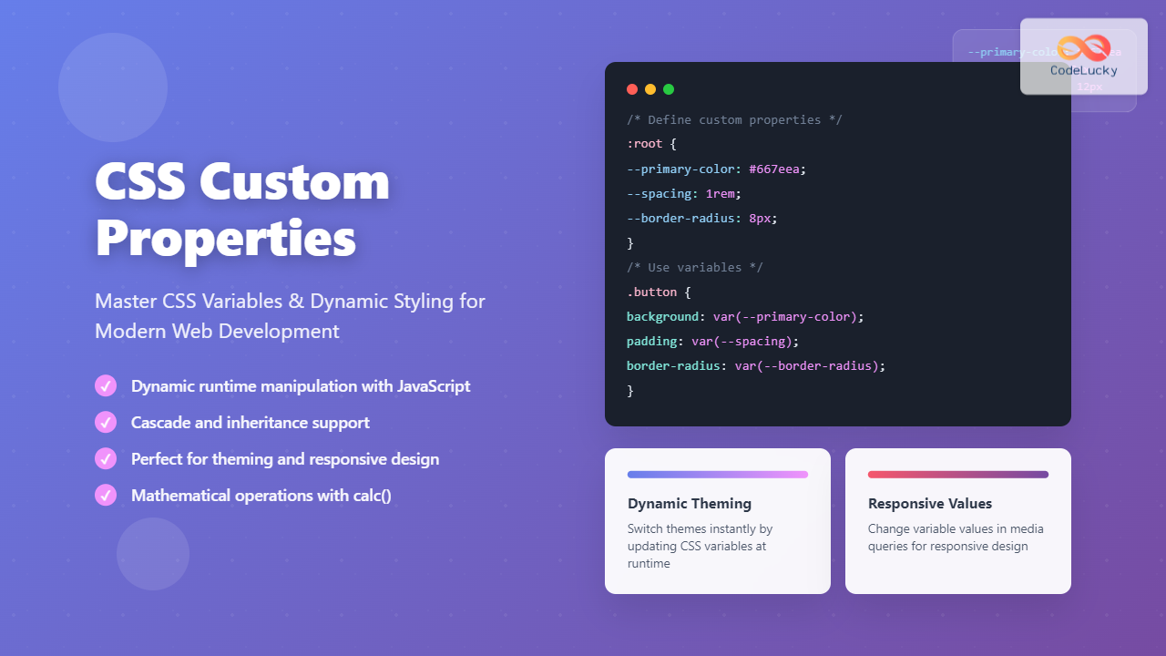
Let's now put this theory into practice in our Astro project. We'll create a central stylesheet for our design tokens and apply them globally.
Step 1: Create a Global Stylesheet
First, create a new file in your project: src/styles/global.css. This file will be the home for your entire design system.
Step 2: Define Your Design Tokens
Now, let's open src/styles/global.css and define the color and typography systems from the previous lesson as CSS custom properties. We will define them inside the :root pseudo-class to make them available everywhere in our project.
We will also add a spacing scale. A consistent spacing scale is just as important as color and typography for creating a polished, rhythmic layout. We'll use a simple scale based on multiples of a base unit (e.g., 4px or 8px).
/* src/styles/global.css */

:root {
  /* 1. Color Palette */
  /* Primitive Colors */
  --color-white: #FFFFFF;
  --color-gray-100: #F8F9FA;
  --color-gray-700: #6C757D;
  --color-gray-900: #212529;
  --color-blue-700: #2A4365;
  --color-green-500: #38A169;
  --color-red-500: #E53E3E;

  /* Semantic Colors */
  --color-bg-primary: var(--color-white);
  --color-bg-secondary: var(--color-gray-100);
  --color-text-primary: var(--color-gray-900);
  --color-text-muted: var(--color-gray-700);
  --color-brand-primary: var(--color-blue-700);
  --color-accent: var(--color-green-500);
  --color-feedback-success: var(--color-green-500);
  --color-feedback-error: var(--color-red-500);

  /* 2. Typography */
  --font-sans: 'Inter', sans-serif; /* Assumes you've imported Inter from Google Fonts */
  --font-size-base: 1rem; /* 16px */
  --font-size-sm: 0.875rem;
  --font-size-h4: 1.3rem;
  --font-size-h3: 1.75rem;
  --font-size-h2: 2.35rem;
  --font-size-h1: 3.15rem;

  --font-weight-regular: 400;
  --font-weight-semibold: 600;
  --font-weight-bold: 700;

  /* 3. Spacing Scale */
  --space-xs: 0.25rem;  /* 4px */
  --space-sm: 0.5rem;   /* 8px */
  --space-md: 1rem;     /* 16px */
  --space-lg: 1.5rem;   /* 24px */
  --space-xl: 2rem;     /* 32px */
  --space-2xl: 3rem;    /* 48px */

  /* 4. Other Globals */
  --border-radius: 0.25rem;
}
Step 3: Import and Apply Global Styles
With our tokens defined, we need to do two things:
- Import the stylesheet into our project.
- Apply the tokens to base HTML elements to set up smart defaults.
The best place to do this is in your main layout file, which we'll assume is src/layouts/BaseLayout.astro.
First, let's add some base styles to global.css that use our new tokens. This ensures every page starts with our design system applied.
/* src/styles/global.css */

/* ... add this below the :root block ... */

body {
  font-family: var(--font-sans);
  font-size: var(--font-size-base);
  color: var(--color-text-primary);
  background-color: var(--color-bg-primary);
  line-height: 1.6;
}

h1, h2, h3, h4 {
  margin: var(--space-2xl) 0 var(--space-md);
  line-height: 1.2;
}

h1 {
  font-size: var(--font-size-h1);
  font-weight: var(--font-weight-bold);
}

h2 {
  font-size: var(--font-size-h2);
  font-weight: var(--font-weight-bold);
}

h3 {
  font-size: var(--font-size-h3);
  font-weight: var(--font-weight-semibold);
}

h4 {
  font-size: var(--font-size-h4);
  font-weight: var(--font-weight-semibold);
}

p {
  margin-bottom: var(--space-md);
}

a {
  color: var(--color-accent);
}
Now, import this file into your layout.
// src/layouts/BaseLayout.astro
---
// Import the global stylesheet. Astro handles the bundling.
import '../styles/global.css';

// ... other props like title, description
---
<html lang="en">
  <head>
    <meta charset="utf-8" />
    <meta name="viewport" content="width=device-width" />
    <!-- You would also import your 'Inter' font here from Google Fonts -->
    <link rel="preconnect" href="https://fonts.googleapis.com">
    <link rel="preconnect" href="https://fonts.gstatic.com" crossorigin>
    <link href="https://fonts.googleapis.com/css2?family=Inter:wght@400;600;700&display=swap" rel="stylesheet">
    <title>{Astro.props.title}</title>
  </head>
  <body>
    <!-- The <slot /> renders the content of the page that uses this layout -->
    <slot />
  </body>
</html>
By importing global.css here, you've made your entire design system available to every single page and component in your project. This is a huge step towards achieving a maintainable architecture.
For a detailed guide on how Astro handles global styles and CSS variables, the following resource is very helpful.
Astro UI Framework [Full Book]
The 'Astro UI Framework' guide explains several ways to handle styling. This section specifically covers how to use a global CSS file and CSS variables for theming, which is exactly what we are doing.
Read the section titled 'Theming via CSS Variables'. This will reinforce the pattern we just implemented: defining variables on the html or :root selector in a global CSS file and then using var() to apply them.
Part 3: Using Tokens in Components
Your design system is now active. All your basic HTML elements are styled correctly by default. The real power, however, comes when you start building new components.
Imagine you're creating a Button.astro component. Instead of guessing at padding values or hex codes, you can now use your tokens.
<!-- src/components/Button.astro -->
---
// Component props, e.g., for the link URL and text
const { href, text } = Astro.props;
---
<a href={href} class="button">
  {text}
</a>

<style>
  .button {
    display: inline-block;
    background-color: var(--color-accent);
    color: var(--color-white);
    padding: var(--space-sm) var(--space-lg);
    border-radius: var(--border-radius);
    text-decoration: none;
    font-weight: var(--font-weight-semibold);
  }
</style>
Look at how readable and intention-driven that CSS is! You're no longer styling with cryptic values; you're styling with decisions from your design system. This makes your component code cleaner, more consistent, and infinitely easier to update.
Test your understanding!
You need to create a Callout component for displaying important information on a page. The background of this Callout should be distinct from the main page background but not distracting.
- Which color token would you use for the
background-colorof this component? - Which spacing token would you use for the
paddinginside the component? - How would you ensure the corners are slightly rounded, consistent with other elements like buttons?
Show answer
- For the
background-color,--color-bg-secondaryis the perfect choice. Its semantic name indicates it's for secondary backgrounds, providing a subtle contrast against the primary page background (--color-bg-primary). - For
padding,--space-lgor--space-xlwould be appropriate to give the content inside the callout ample breathing room. - To round the corners, you would use the
--border-radiustoken, applying it withborder-radius: var(--border-radius);. This ensures its corner rounding is identical to any other element using this token.
Conclusion
Excellent work! You have now successfully implemented a robust and scalable design system in your Astro project using CSS Custom Properties. You've moved from abstract design ideas to a concrete, code-based system that will serve as the foundation for every page and component you build from now on.
Key Takeaways:
- Design tokens are named variables that store UI design values (colors, fonts, spacing).
- CSS Custom Properties (
--var-name: value;) are the standard web technology for implementing design tokens. - Define global tokens inside the
:rootpseudo-class in a central stylesheet (e.g.,src/styles/global.css). - Import the global stylesheet into your main layout to make tokens available site-wide.
- Consume tokens in your CSS using the
var()function (e.g.,color: var(--color-primary);). This makes your styles semantic, consistent, and easy to maintain.
Up Next:
With our design system in place, our site is consistent but still static. In the next lesson, we will bring it to life by applying CSS transitions for hover and focus states on interactive elements. This will add a layer of polish and professional interactivity, enhancing the user experience and making the site feel more responsive and premium.