Introduction
In our last lesson, you took a significant step by creating and distributing a survey to validate the core problem your product idea addresses. This moved you from assumption to initial evidence. Today, we elevate that validation to a much higher standard by testing not just interest, but intent. This lesson is about building a simple landing page to see if people are willing to make a small commitment—their email address—in anticipation of your solution.
This technique, often called a "smoke test," is the final and most powerful validation step in this module. It directly measures whether your value proposition is compelling enough to make someone take action. Given your background in digital marketing and e-commerce, the process of creating a page to generate a "conversion" (in this case, an email signup) will be a familiar concept. We will focus on the strategy and the simple, free tools you can use to execute it quickly. The results from this exercise will be the final data point you need before deciding which type of digital product to build.
The Smoke Test: Validating with Commitment
Before you invest significant time and resources into building a product, you need to know if people will actually "show up" for it. A survey is a good start, but a smoke test provides much stronger evidence. The term comes from engineering, where a quick test is run to see if a new piece of hardware smokes when turned on. In product development, it means marketing a product before it's built to see if there's real market demand.
The goal is to move beyond hypothetical questions and ask for a tangible sign of interest.
The Ultimate Guide to Smoke Testing & Why It's Necessary
This article from DevSquad provides an excellent overview of using smoke testing for product validation.
First, read the introduction and the section on smoke testing for validation to solidify the concept. Then, jump to the section "How to do smoke testing for SaaS product validation". Focus on steps 6 and 7, which cover making a landing page and getting waitlist signups. Finally, review the real-world examples from Buffer, CoSchedule, and Dropbox. Notice how they all used a simple page or video to validate demand before building their now-famous products.
As you can see, the core idea is to create a simple marketing website that presents your product as if it's real. When a potential customer clicks the call-to-action, instead of a purchase flow, they are invited to join a waitlist.

Pre-Selling as a Validation Strategy
A powerful variation of the smoke test is the "pre-sale." This is exactly what it sounds like: you sell the product before you've created it, often at a discount. While asking for money is the ultimate validation, a simple email signup is a fantastic, low-friction starting point for a side hustle. The business publisher Foundr uses this exact strategy to validate their online courses.
How We Validated 12 Online Courses Without Spending a Cent
This article from Foundr details their three-step process for validating online course ideas. Step 3 is directly relevant to our lesson today.
Please read the section "Step 3: Pre-Sell the Course". Pay attention to their reasoning: "if no one shows any real interest in buying, then we know that a given course isn’t the right fit." Also, observe the simplicity of their pre-sale landing page.
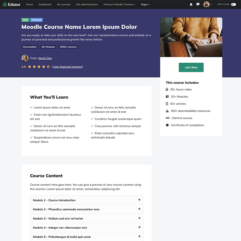
The Foundr example demonstrates that even for a significant product line, the initial validation page doesn't need to be complex. It needs a clear promise and a way to capture commitment.
Action Plan: Build and Launch Your Waitlist Page (35-45 minutes)
Now it's time to build your own smoke test. Your experience with Canva and digital marketing campaigns will make this process very efficient. We will use a combination of Canva for the visual design and Mailchimp to build and host the landing page and collect emails, both of which have robust free tiers.
The following video provides a fantastic, step-by-step guide through this exact process.
HOW TO CREATE A WAITLIST LANDING PAGE-FULL GUIDE
This tutorial by Simple Answers is a practical walkthrough of creating a waitlist page using Canva and Mailchimp.
First, watch the section on designing in Canva. Since you're already familiar with Canva, you can focus on the general approach to creating a simple visual for your page. Next, watch the main section on building the page in Mailchimp. This will show you how to start a new landing page, upload your Canva design, and add the crucial email sign-up form. Finally, quickly review the part on publishing and getting your link, which is the final step to make your page live.
Follow these steps to create your landing page:
-
Define Your Offer & Write Your Copy:
- Based on your survey results from the last lesson, crystallize your product idea into a single, compelling sentence. This will be your headline. Example: "The 30-Day System for Moroccan Artisans to Sell Crafts Globally."
- Write 2-3 sentences that expand on this promise. This is your subtitle/description. Focus on the outcome or transformation for the user.
- Write the text for your call-to-action button. Keep it direct. Examples: "Join the Waitlist," "Get Early Access," "Notify Me at Launch."
-
Create a Visual in Canva (5-10 mins):
- Following the video's guidance, create a simple, clean graphic that represents your product. This could be a mock-up of a course dashboard, an abstract design, or a title card. Don't spend too much time here; the goal is to have something that looks professional, not to create a masterpiece.
- Download your design as a PNG or JPG file.
-
Build Your Landing Page in Mailchimp (15-20 mins):
- Sign up for a free Mailchimp account if you don't have one.
- Follow the video's steps to create a new landing page.
- Use a simple, single-column template. Delete any unnecessary pre-filled blocks.
- Upload your Canva graphic as the main image.
- Add a Signup Form block. Configure it with your headline, description, and CTA button text from Step 1.
- Preview the page to ensure it looks good on both desktop and mobile.
-
Publish and Get Your URL:
- Follow the final steps in the video to publish your page. Mailchimp will provide you with a shareable URL.
- Your task for this lesson is complete once you have this live URL.
For now, the goal is to build the page. In a later module on marketing funnels, we would connect this to a targeted ad campaign. Given your expertise, you can already see how you could drive traffic from Facebook to this page to get a real cost-per-waitlist-signup, a powerful metric for gauging viability.
Conclusion
Congratulations! You have now built the most important tool for validating a product idea: a mechanism to measure true purchase intent. You've moved beyond asking what people think and created a way to see what they do. This landing page is more than just a simple webpage; it's an experiment that will provide you with hard data.
In our next lesson, we will conclude this foundational module. You will synthesize all the evidence you've gathered—from your competitor analysis, customer avatar, survey responses, and the number of signups on your new waitlist page—to make an informed decision on which digital product to build first: an online course, a coaching offer, or a no-code app.