Introduction
Welcome back! In our last lesson, you learned how to create powerful supporting visuals like user flow diagrams and before/after comparisons to make your case study more compelling. We briefly touched on annotated mockups, and today, we're going to do a deep dive into this crucial skill.
Your goal for this lesson is to create annotated screen mockups to explain the rationale behind specific design choices. This is where your analytical mindset, honed during your finance and audit career, becomes a design superpower. Just as an audit report justifies its findings with evidence, annotated mockups provide the evidence for your design decisions. You'll learn how to articulate the "why" behind your work, demonstrating to clients that you're not just a designer, but a strategic problem-solver.
1. The Power of "Why": Articulating Your Design Rationale
An unannotated mockup shows what you designed. An annotated mockup explains why you designed it that way. This distinction is what separates a junior designer from a senior one. It proves you make intentional, evidence-based choices rather than just arranging pixels until they "look good."
In a case study, your rationale tells the story of your process and connects every decision back to the project's goals or the user's needs.
Advice for explaining design rationale
To start, let's explore the strategic importance of design rationale. The video "Advice for explaining design rationale" by femke.design offers a superb overview.
Please watch these key sections: Where to talk about rationale: Notice the key insight here—rationale isn't a final step; it's the narrative thread woven throughout your entire case study. Using annotations: This part directly addresses our topic, explaining how annotations provide essential context for anyone viewing your work. Tying rationale to the problem or research: This is the most critical part. It explains how to ground your decisions in logic, connecting them to user pain points, business objectives, or research findings.
As you can see, strong rationale isn't just about personal preference. It's a blend of different types of logic.
Design Rationale Documentation
This article from Pencil & Paper provides a clear framework for thinking about different types of rationale.
Read the first section, "What does it mean to document your design rationale?". Pay attention to how it breaks down logic into three types: Designer-y: Decisions based on visual principles, aesthetics, and brand consistency. Strategy: Decisions tied to business goals or user needs. Feasibility: Decisions based on technical constraints or development efficiency. A good annotation often blends these together. For example: "We chose this button style (designer-y) because it's part of the established design system (feasibility) and has a high-contrast ratio that meets accessibility standards for our user base (strategy)."
2. The Anatomy of an Annotated Mockup
Now that you understand the "why," let's look at the "what." An annotated mockup can range from a simple callout to a comprehensive design audit.
Here are two examples of what this looks like in practice:
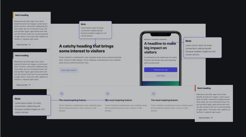

To create professional-grade annotations efficiently, it's best to use a structured system.
Annotating Design Files in Figma - by Bhawna Nagpal - Zeta Design
This fantastic article by the design team at Zeta explains how they built a professional annotation framework in Figma to improve communication with their entire team.
Focus on these sections: Read the introduction to understand the problem they were solving: making designs understandable for everyone, not just designers. Study the section "What does the improved Annotations Framework include?" to see the components they created: Section Headers, Main Journey Component, Versioning, and Specific Notes. This is a complete system you can adapt. Most importantly, under "A gift for the design community🎁", you'll find a link to their actual Figma Community file. Please open this link and duplicate the file into your Figma account. This is an invaluable, ready-to-use toolkit.
Having this component-based system allows you to add clear, consistent, and professional annotations directly in your Figma files. The next video will show you the general mechanics of organizing your file to accommodate these annotations.
Organize Your Figma File Like a PRO
The video "Organize Your Figma File Like a PRO" shows some practical techniques for adding annotations within your design file.
Watch the segment on annotations, from Sectioning flows. Pay attention to how the creator uses text, arrows, and status tags to clarify the design's intent and readiness for development.
3. A Practical Walkthrough
Let's tie this all together with a detailed example that shows rationale being applied at different stages of fidelity.
Design Rationale Documentation
Let's return to the Pencil & Paper article. This time, we'll focus on their excellent example.
Read the section "Example of design rationale (from concept to design details)." Follow the scenario and observe how they document their thinking for: Flow Rationale: Explaining the logic for the overall user journey. Low Fidelity Home Screen Rationale: Justifying choices for core elements like navigation and data tables. High Fidelity Test Confirmation Screen Rationale: Detailing the reasoning behind a specific component like a progress indicator. After the example, also read the section "Where do you document design rationale?". It reinforces the best practice of keeping your notes as close to the design as possible, using tools like floating text layers in Figma—which is exactly what the Zeta framework helps you do.
4. Your Turn: Create an Annotated Mockup
It's time to apply these techniques to one of your own projects. For this activity, you'll take a screen you've already designed and add a layer of professional annotations to explain your rationale.
Activity: Annotate Your Hero Section (25 minutes)
Let's use the high-fidelity hero section you designed in Module 3.
-
Set Up Your File:
- Open the Figma file containing your hero section design.
- Open the Zeta Annotations Framework file you duplicated from the Figma Community.
-
Add Annotations:
- Copy and paste components from the Zeta framework file into your design file.
- Use the Section Header or Main Journey component to give your mockup a title and a brief description of its purpose (e.g., "Hero Section - High Fidelity").
- Use the Note components (or simple text boxes with arrows) to annotate at least five specific elements in your hero section.
-
Articulate Your Rationale:
- For each annotation, explain the why. Don't just state what the element is; state why you designed it that way.
- Try to connect your rationale to different types of logic:
- Visual/Aesthetic: "Typography uses a 1.618 ratio (Golden Ratio) to create a harmonious visual hierarchy between the headline and sub-headline."
- Business/User Goal: "The primary Call-to-Action (CTA) button uses the brand's brightest color to draw user attention and drive conversions."
- Usability/Psychology: "The CTA is placed on the right side, following the typical user's F-shaped scanning pattern, making it a natural end-point for their gaze."
- Technical/System: "This card component is built with Auto Layout, allowing its content to adapt without breaking the design."
Your final output should be a single, polished screen mockup that not only showcases your visual design skills but also clearly communicates the strategic thinking behind it.
Conclusion
Today you've learned one of the most important skills for leveling up as a designer: articulating your rationale through annotated mockups. This practice transforms your design files from simple pictures into valuable documents that build trust with clients and enable smooth collaboration with developers.
Key Takeaways:
- Design rationale is the story of why you made certain decisions, and it should be woven throughout your case study.
- Strong rationale connects your design choices back to business goals, user needs, and established design principles.
- Professional annotation systems, like the one from Zeta, use components in Figma to create clear, consistent, and easy-to-understand documentation.
- Annotating your mockups demonstrates strategic thinking and attention to detail, positioning you as a more valuable freelance partner.
Preview of the Next Lesson:
You have now mastered the art of creating all the essential components of a high-impact case study: a compelling narrative, powerful supporting visuals, and now, professionally annotated mockups. With your story and evidence complete, the final step is to build the stage. In our next lesson, we will compare portfolio platform types (e.g., Behance, Webflow, personal site) for freelance positioning to help you choose the best home for your work.