Introduction
In our last lesson, you did some fantastic rapid ideation, using paper sketches and the Crazy Eights technique to explore a wide variety of layouts for your product page. You now have a set of raw, creative ideas. Today, we will transition from the fluid world of paper sketching to the structured environment of Figma, turning your best sketch into a mid-fidelity wireframe.
This lesson is about building the digital "bones" of your design. We'll focus on creating a clear, organized layout using placeholder content and basic, reusable components. For you, this process should feel like a natural bridge between your creative entrepreneurial side and your structured, analytical background from finance. We are taking a concept and giving it a precise, logical framework. Mastering this stage is crucial for a freelancer, as mid-fidelity wireframes are a standard deliverable used to get client sign-off on a layout before any time is invested in detailed visual design.
Defining the Mid-Fidelity Wireframe
Before we start building, let's clarify what a mid-fidelity wireframe is. It occupies the space between a rough sketch and a fully designed mockup. Its primary job is to define structure, hierarchy, and layout with more precision than a sketch, but without the "distraction" of colors, final fonts, or detailed imagery.
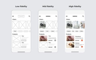
A mid-fidelity wireframe typically has:
- A greyscale color palette.
- Clearly defined spacing and alignment, often using a layout grid.
- Placeholder text (like "Lorem Ipsum") or simple labels.
- Basic shapes (like grey boxes with an 'X') to represent images.
- Simple, reusable components for elements like buttons and input fields.
When assembled, these wireframes provide a clear blueprint of an entire website's structure, as shown in the example below.

Key Concepts for Mid-Fidelity Design
To build an effective mid-fidelity wireframe, we'll rely on a few powerful Figma features. The following article provides an excellent overview of the core techniques we'll be using today.
Figma Designer's Guide: From Wireframes to Prototypes
This reading introduces the key concepts for creating structured, mid-fidelity designs in Figma.
Please read the section titled "Phase 2: Adding Structure & Content — Mid-Fidelity Design with Figma’s Power." Pay special attention to the descriptions of Auto Layout, Layout Grids, and Text Styles. These are the foundational tools for this stage.
Building Your Wireframe: A Step-by-Step Guide
Now, let's get practical. We will use a comprehensive video tutorial to guide us through the process of building a wireframe in Figma. I will break it down into steps, and after each one, you will apply the technique to your own project.
Your Task: Choose your favorite or most promising sketch from the Crazy Eights exercise in the last lesson. We will build it out digitally as a mid-fidelity wireframe for your "Custom Wedding Hoops" product detail page.
Step 1: Setting Up Your Workspace
First, we need to prepare our Figma canvas with the right frame and a layout grid. This grid provides the underlying structure that ensures our design is aligned and well-proportioned—a concept that should resonate with the structured nature of your CA work.
How to Wireframe in Figma in 2026
This video from Codex Community provides a clear, step-by-step walkthrough of the wireframing process in Figma. We'll start with setting up the file and a basic style guide.
Watch from the beginning to the style guide setup. This will cover: Creating a Desktop frame. Applying a 12-column layout grid for structure. Creating a basic greyscale color palette and saving them as Color Styles for consistency. Action: Follow along and set up your own Figma file with a desktop frame, a 12-column grid, and your new greyscale color styles.
Step 2: Creating Content Placeholders
With our canvas ready, we can start blocking out the layout. We'll use simple shapes and text to represent the different content elements from your sketch. This is where you translate the rough boxes and squiggles from your paper sketch into defined digital elements.
How to Wireframe in Figma in 2026
Let's continue with the same video to learn how to create standard placeholders for text, images, and icons.
Watch the following segments: Adding Text: Notice the two methods shown. For mid-fidelity, using actual placeholder text (like "Headline Text Here") is preferable to just using grey blocks. Adding Images: The classic "box with an X" is the universal symbol for an image placeholder. Adding Icons: Simple circles are perfect for representing icons or user avatars at this stage. Action: Using these techniques, start building the layout of your product detail page. Place the elements (image gallery, product title, price, description, etc.) on your frame according to your chosen sketch. Use the grid to guide your alignment.
Step 3: Building Basic, Reusable Components
To work efficiently, we don't want to redraw common elements like buttons over and over. Instead, we'll create a Component. This is a master element that you can reuse. If you decide to change the design of your button later, you only need to edit the master component, and every copy (or "instance") will update automatically. This principle of creating a single source of truth is incredibly efficient and scalable.
How to Wireframe in Figma in 2026
This part of the video will show you how to turn your basic shapes into reusable components, focusing on a button.
Watch from creating button components. Pay close attention to how a simple rectangle and text are combined and then turned into a component with different variations (variants). Action: Create a basic button component for your "Add to Cart" call-to-action. You can try creating a "default" and maybe a "secondary" style as shown in the video. Then, drag an instance of this component into your wireframe design.
A Note on Auto Layout
As you place elements, you'll want to group them and manage their spacing. The most powerful tool for this in Figma is Auto Layout (Shift + A).
When you apply Auto Layout to a set of items, they become a flexible container. You can instantly control the spacing between them, add padding, and change their direction (vertical or horizontal). If you change the text in a description, the button below it will automatically move down to maintain the correct spacing.
As you build your wireframe, I encourage you to experiment with it:
- Select a few related elements (e.g., your product title and price).
- Press
Shift + A. - Use the Auto Layout panel on the right to adjust the spacing and alignment.
This will make your wireframe far more robust and easier to adjust later.
Conclusion
Congratulations! You've successfully made the leap from a paper sketch to a structured digital wireframe. This is a huge step in the design process and a core skill for any UI/UX designer. You've not only laid out the blueprint for your page but also done so using professional, efficient techniques.
Key Takeaways:
- Mid-fidelity wireframes are greyscale blueprints that focus on structure, layout, and hierarchy.
- Layout Grids are essential for creating well-aligned and professional-looking designs.
- Using placeholder content (shapes for images, basic text for copy) keeps the focus on structure.
- Creating basic components for repeatable elements like buttons is key to working efficiently and maintaining consistency.
- Auto Layout is a powerful tool for creating organized, flexible, and easily editable layouts.
Preview of the Next Lesson:
Your wireframe now shows what is on the page and where it is. But it doesn't yet explain how things work. In our next lesson, you will learn how to annotate your wireframes. We'll add notes and descriptions to communicate interaction behaviors, content rules, and other specifications, preparing the design for handoff to a client or developer.